Chart Your Course
In many cases, the best way to convey business intelligence is through business graphics. Bar charts, pie charts, and line graphs are useful tools for giving meaning to endless volumes of data. They can quickly reveal trends and patterns to aid in data analysis. They compress lines upon lines of numbers into a format that can be understood in a moment.
In addition, charts can increase the reader’s interest in your information. A splash of color excites the reader. Where endless lines of black on white lull people to sleep, bars of red and blue, and pie wedges of purple and green wake people up.
You create charts in Reporting Services using the chart report item. The chart report item is a data region like the table, matrix, and list report items. This means the chart can process multiple records from a dataset. The table, matrix, and list report items enable you to place other report items in a row, a column, or a list area, which is repeated for every record in the dataset. The chart, on the other hand, uses the records in a dataset to create bars, lines, or pie wedges. You cannot place other report items inside a chart item.
In the next sections of this chapter, we explore the many charting possibilities provided by the chart report item.
The Fuel Price Chart
Features Highlighted
-
Creating a report using the chart report item
-
Refining the look of the chart to best present the information
Business Need Galactic Delivery Services needs to analyze the fluctuations in the price of neutron fuel from month-to-month. The best way to perform this analysis is by creating a chart of the price over time. The user needs to be able to select the year from a drop-down list.
Task Overview
-
Create the Chapter06 Project, a Shared Data Source, a New Report, and Two Datasets
-
Place a Chart Item on the Report and Populate It
-
Refine the Chart
Fuel Price Chart, Task 1: Create the Chapter06 Project, a Shared Data Source, a New Report, and Two Datasets
-
Create a new Reporting Services project called Chapter06 in the MSSQLRS folder. (If you need help with this task, see the section “The Transport List Report” in Chapter 5.)
-
Create a shared data source called Galactic for the Galactic database. (Again, if you need help with this task, see the section “The Transport List Report” in Chapter 5.)
-
Add a blank report called FuelPriceChart to the Chapter06 project. (Do not use the Report Wizard.)
-
Select <New Dateset…> from the Dataset drop-down list. The Dataset dialog box appears.
-
Enter FuelPrices for the name in the Dataset dialog box.
-
Galactic will be selected for the data source by default. Click OK. You return to the Data tab, which now displays the Generic Query Designer.
-
Type the following in the SQL pane:
SELECT Description AS FuelType, PriceStartDate, Price FROM FuelPrice INNER JOIN Propulsion ON FuelPrice.PropulsionID=Propulsion.PropulsionID WHERE (YEAR(PriceStartDate)=@Year) AND (Description='Neutron') ORDER BY FuelType, PriceStartDate
-
Click the Run button in the Generic Query Designer toolbar to run the query and make sure no errors exist. Correct any typos that may be detected. When the query is correct, the Define Query Parameters dialog box appears. Enter 2005 for the @ Year parameter and click OK.
-
The business needs for the report specified the user should select the year from a drop-down list. We need to define a second dataset to populate this drop-down list. Select <New Dateset…> from the Dataset drop-down list. The Dataset dialog box appears.
-
Enter Years for the name in the Dataset dialog box.
-
Galactic is selected for the data source by default. Type the following in the Query string area of the dialog box:
SELECT DISTINCT YEAR(PriceStartDate) AS Year FROM FuelPrice
-
Click OK. The Generic Query Designer now displays the Year dataset. Run the query to make sure it is correct. You see a list of the distinct years from the FuelPrice table.
Task Notes We created two datasets in the FuelPriceChart report—one to populate the Year drop-down list and the other to provide data for the chart. Only one of these two datasets can be displayed on the Data tab at a time. You use the Dataset drop-down list to switch between the two datasets on the Data tab.
You have undoubtedly noticed that both datasets for this report were created by typing a query, either into the SQL pane of the Generic Query Designer or into the Query string area of the Dataset dialog box. The graphical tools of the Graphical Query Designer are helpful if you are still learning the syntax of SELECT queries or if you are unfamiliar with the database you are querying. However, it is more efficient to simply type the query into the SQL pane or the Dataset dialog box. In addition, some complex queries must be typed in because they cannot be created through the Graphical Query Designer.
Throughout the remainder of this book, we type our SELECT statements rather than create them using the Graphical Query Designer. This enables us to quickly create the necessary datasets, and then concentrate on the aspects of report creation that are new and different in each report. As you create your own reports, use the interface—Graphical Query Designer or Generic Query Designer—with which you are most comfortable.
Fuel Price Chart, Task 2: Place a Chart Item on the Report and Populate It
-
Switch to the Layout tab.
-
Select Report | Report Parameters from the menu. The Report Parameters dialog box appears.
-
A report parameter called Year has been created to correspond to the @Year parameter from the FuelPrices dataset.
-
Select Available Values: From Query.
-
In the Dataset drop-down list, select Years. Select Year from both the Value Field drop-down list and the Label Field drop-down list. Click OK to exit the Report Parameters dialog box.
-
Click-and-drag the edges of the report layout area, so the layout area fills the available space on the screen.
-
Select the Chart report item in the Toolbox window and place it on the report layout. The chart should cover almost the entire report layout because it will be the only item on the report.
-
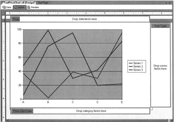
The chart has three areas where you can drop fields: Drop Data Fields Here, Drop Series Fields Here, and Drop Category Fields Here. If these areas are not visible, double-click the center of the chart to display them. You may also need to scroll the layout window to see each of the drop areas.
| Note | If you need to move the chart after you place it in the report layout, click the report layout so the chart is not selected, and then click the chart item so it is selected but the three “Drop fields here” areas are not visible. Now you can click the edge of the chart item to drag it to the appropriate location. Click the chart item one more time to get the three “Drop fields here” areas to reappear. |
-
In the Datasets window, expand the FuelPrices dataset entry. Drag the FuelType field and drop it on Drop Series Fields Here.
-
Drag the PriceStartDate field and drop it on Drop Category Fields Here.
-
Drag the Price field and drop it on Drop Data Fields Here.
-
Right-click the chart and select Chart Type|Line|Simple Line from the Context menu. The report layout should appear similar to the following illustration.
-
Select the Preview tab. Select 2005 from the Year drop-down list, and then click View Report. Your report appears similar to this:
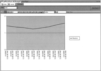
Task Notes You have now seen how easy it is to create a chart using the chart report item. Simply drag-and-drop the fields from your dataset onto the appropriate locations, select the type of chart you want, and you have a functioning chart. In the next sections, we explore ways to manipulate the properties of the chart to create more complex results.
The field you dropped in the Data Fields area (the Price field in this report) provides the values for the data points. The field you dropped in the Category Fields area (the PriceStartDate field in this report) provides the labels for the x-axis of the chart. This category field also groups the rows from the dataset into multiple categories. One entry is created on the x-axis for each category. In our Fuel Price Chart, we used the PriceStartDate field to create our categories. Because we are looking at data for a single year and because there is one record for each month, we get 12 distinct values for PriceStartDate in our dataset and 12 categories along the x-axis of our chart (one category for each month in the year we are charting).
One series of categories is created for each distinct value in the field you dropped in the Data Series area. Each series is usually charted in its own color: one series in green, one series in blue, and so on. The legend, located to the right in this chart, tells the reader which color has been assigned to each series. Our dataset contains only one fuel type, Neutron. Therefore, we get only one series of data points on our chart.
Now let’s use some of the properties of the chart to refine our results.
Fuel Price Chart, Task 3: Refine the Chart
-
Select the Layout tab.
-
Right-click the chart and select Properties from the Context menu. The Chart Properties dialog box will appear.
-
On the General tab, type Fuel Prices for Title.
Caution Do not confuse Title with Name. Title contains the text that appears above the chart on the report, whereas Name contains the name of the chart report item itself.
-
Click the Style button (the paint brush and paint pail) next to Title.
-
Set the following properties on the Style Properties dialog box:
Property
Value
Size
14pt
Weight
Bold
Decoration
Underline
-
Click OK.
-
Select the Data tab.
-
Click Edit (next to Values). The Edit Chart Value dialog box appears.
-
Select the Appearance tab. Check the Show Markers check box, and then select Diamond to place a diamond shape at each data point.
-
Click OK to return to the Chart Properties dialog box.
-
Select the X Axis tab. Set the following properties:
Property
Value
Title
=Parameters!Year. Value
Format code
MMM
Numeric or time-scale values
(checked)
-
Select the Y Axis tab. Set the following properties:
Property
Value
Title
Price in Dollars
Scale, Minimum
0
Scale, Maximum
6
-
Click OK.
-
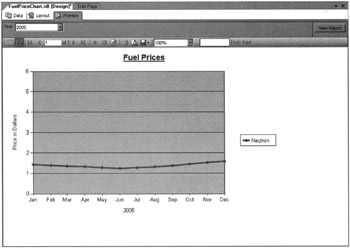
Select the Preview tab. Select 2005 from the Year drop-down list, and then click View Report. Your report appears similar to the illustration.
-
Click Save All in the toolbar.
Task Notes As you have seen, the Chart Properties dialog box provides a great deal of control over the appearance and function of the chart. It is divided into seven different tabs, as shown in the following table, each controlling a different aspect of the chart.
| Tab | Charting Aspect Controlled |
|---|---|
| General | Name of the report item, title, chart type, and color palette. (Chart type can also be selected from the chart item Context menu.) |
| Data | Dataset fields used to control the data values, categories, and series. |
| X Axis | Title and scale of the x-axis. |
| Y Axis | Title and scale of the y-axis. |
| Legend | If and where a legend containing information on the chart series is included. |
| 3-D Effect | Whether the chart appears as a two-dimensional or three-dimensional object. |
| Filters | Filtering conditions applied to the data. |
We look at more of the settings available on the Chart Properties dialog box as we create additional charts in this chapter. You can also experiment with these settings to get exactly the chart format you need.
The format code MMM is a date-formatting code. It causes the chart to use only the first three characters of the month name for the x-axis labels.
The Fuel Price Chart, Version 2
Features Highlighted
-
Creating a report using the chart report item with multiple series
-
Using the union operator in a SELECT statement
-
Using a WHERE clause to return records of one type or of all types
Business Need GDS now needs to analyze the fluctuations in the price of all fuel types from month-to-month. Allow the user to select a single fuel type or all fuel types from a drop-down list.
Task Overview
-
Create a New Dataset for the Second Drop-down List and Revise the FuelPrices Dataset to Allow for Multiple Fuel Types
Fuel Price Chart, Version 2, Task 1: Create a New Dataset for the Second Drop-down List and Revise the FuelPrices Dataset to Allow for Multiple Fuel Types
-
Reopen the Chapter06 project if it was closed. Double-click the FuelPriceChart report in the Solution Explorer, if it does not open automatically.
-
Select the Data tab.
-
Choose <New Dataset…> from the Dataset drop-down list. The Dataset dialog box appears.
-
Enter FuelTypes for Name in the Dataset dialog box.
-
Galactic is selected for Data Source by default. Click OK. You return to the Generic Query Designer in the Data tab.
-
Type the following in the SQL pane:
SELECT 'All' AS FuelType, '_All' AS SortField UNION SELECT Description, Description FROM Propulsion ORDER BY SortField
-
Run the query to make sure it is correct. You see a list of the distinct fuel types from the FuelPrice table. There is also a record for “All”.
-
Choose FuelPrices from the Dataset drop-down list.
-
Change the SELECT statement to the following (the only change is in the second half of the WHERE clause):
SELECT Description AS FuelType, PriceStartDate, Price FROM FuelPrice INNER JOIN Propulsion ON FuelPrice.PropulsionID=Propulsion.PropulsionID WHERE (YEAR(PriceStartDate)=@Year) AND ((Description=@PropulsionType) OR (@PropulsionType—'All')) ORDER BY FuelType, PriceStartDate
-
Run the query to make sure it is correct. The Define Query Parameters dialog box appears. Enter 2005 for the @Year parameter, All for the @PropulsionType parameter, and click OK.
-
Select the Layout tab.
-
Select Report|Report Parameters from the Main menu. The Report Parameters dialog box appears.
-
A report parameter called PropulsionType is created to correspond to the @PropulsionType parameter from the FuelPrices dataset. Select this parameter in the Parameters list box.
-
Select Available Values: From Query.
-
In the Dataset drop-down list, select FuelTypes. In the Value Field drop-down list, select FuelType. In the Label Field drop-down list, select FuelType. Click OK to exit the Report Parameters dialog box.
-
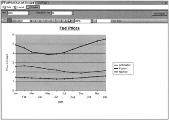
Select the Preview tab. Select 2005 from the Year drop-down list, select All from the PropulsionType drop-down list, and then click View Report. Your report appears similar to the illustration.
-
Click Save All in the toolbar.
Task Notes The query that creates the FuelTypes dataset is two SELECT statements combined to produce one result set. The first SELECT statement returns a single row with the constant value “All” in the FuelType column and a constant value of “_All” in the SortField. The underscore is placed in front of the word “All” in SortField to make sure it sorts to the top of the list. The second SELECT statement returns a row for each record in the Propulsion table. The two result sets are unified into a single result set by the UNION operator in between the two SELECT statements.
When result sets are unioned, the names of the columns in the result set are taken from the first SELECT statement in the union. That is why the FuelTypes dataset has two columns named FuelType and SortField rather than Description. When SELECT statements are unioned, only the last SELECT statement can have an ORDER BY clause. This ORDER BY clause is used to sort the entire result set after it has been unified into a single result set.
The UNION operator can be used with any two SELECT statements as long as the following is true:
-
The result set from each SELECT statement has the same number of columns.
-
The corresponding columns in each result set have the same data type.
In fact, the UNION can be used to combine any number of SELECT statements into a unified result set as long as these two conditions hold true for all the SELECT statements in the UNION.
The field we chose for our series field, FuelType, has three distinct values in the dataset when the “All” option is chosen for the PropulsionType report parameter. When this option is selected, the chart contains three series of data points. The legend tells the reader the green series represents the data for antimatter, the blue series represents the data for fusion, and the purple series represents the data for neutron. Each series contains 12 categories. Three series multiplied by 12 categories means we have 36 data points on our chart.
It is important that you understand categories and series as we get into more complex charting. If you are a bit fuzzy on this, review the first part of this chapter before moving on.
The Business Type Distribution Chart
Features Highlighted
-
Creating a report using a pie chart
-
Using the Data Label property
-
Changing the chart palette
-
Using the 3-D effect
Business Need The Galactic Delivery Services marketing department needs to analyze what types of businesses are using GDS for their delivery services. This information should be presented as a pie chart.
Task Overview
-
Create a New Report and a Dataset
-
Place a Chart Item on the Report and Populate It
Business Type Distribution Chart, Task I: Create a New Report and a Dataset
-
Reopen the Chapter06 project if it was closed. Close the FuelPriceChart report.
-
Add a blank report called BusinessTypeDistribution to the Chapter06 project. (Do not use the Report Wizard.)
-
Select <New Dateset…> from the Dataset drop-down list. The Dataset dialog box appears.
-
Enter CustomerBusinessTypes for the name in the Dataset dialog box.
-
Galactic (shared) is selected for the data source by default. Click OK. You return to the Data tab, which now displays the Generic Query Designer.
-
Type the following in the SQL pane:
SELECT Name AS CustomerName, Description AS BusinessType FROM Customer INNER JOIN CustomerToBusinessTypeLink ON Customer.CustomerNumber = CustomerToBusinessTypeLink.CustomerNumber INNER JOIN BusinessType ON CustomerToBusinessTypeLink.BusinessTypeCode = BusinessType.BusinessTypeCode
-
Run the query to make sure no errors exist. Correct any typos that may be detected.
Task Notes The CustomerBusinessTypes dataset simply contains a list of customer names and their corresponding business type. Remember, some customers are linked to more than one business type. That means some of the customers appear in the list more than once.
This dataset is used to populate a pie chart in the next task. The BusinessType field is used to create the categories for the pie chart. The items in the CustomerName field are counted to determine how many customers are in each category.
Business Type Distribution Chart, Task 2: Place a Chart Item on the Report and Populate It
-
Switch to the Layout tab, and then click-and-drag the edges of the report layout area, so the layout area fills the available space on the screen.
-
Select the Chart report item in the Toolbox window and place it on the report layout. The chart should cover almost the entire report layout because it is the only item on the report.
-
Right-click the chart and select Chart Type |Pie| Simple Pie from the Context menu.
-
In the Datasets window, expand the CustomerBusinessTypes dataset. Drag the CustomerName field from the Datasets window and drop it on Drop Data Fields Here.
-
Drag the BusinessType field and drop it on Drop Category Fields Here.
-
Right-click the chart and select Properties from the Context menu. The Chart Properties dialog box appears.
-
On the General tab, type Customer Business Types for the title.
-
Click the Style button (next to the Title). The Style Properties dialog box appears.
-
Set the following properties on the Style Properties dialog box:
Property
Value
Size
14pt
Weight
Bold
Decoration
Underline
-
Click OK to exit the Style Properties dialog box.
-
Select Semi-Transparent from the Palette drop-down list.
-
Select the Data tab.
-
Click Edit (next to Values). The Edit Chart Value dialog box appears.
-
Select the Point Labels tab. Check the Show Point Labels check box.
-
Click the Expression button (the button with fx on it) next to the Data Label entry area. The Edit Expression dialog box appears.
-
Type the following in the Expression area:
=Fields!BusinessType.Value & vbcrlf & "(" & CSTR(Count(Fields!CustomerName.Value)) & ")" -
Click OK to exit the Edit Expression dialog box.
-
Click Label Style. The Style Properties dialog box appears.
-
Select Bold from the Weight drop-down list.
-
Click OK to exit the Style Properties dialog box.
-
Click OK to exit the Edit Chart Value dialog box.
-
Select the Legend tab.
-
Uncheck Show Legend.
-
Select the 3-D Effect tab.
-
Check Display Chart with 3-D Visual Effect.
-
Click OK to exit the Chart Properties dialog box.
-
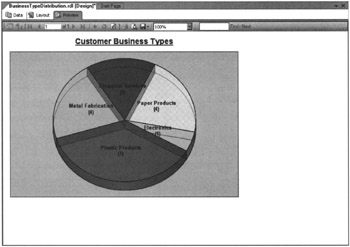
Select the Preview tab. Your report appears similar to the illustration.
-
Click Save All in the toolbar.
Task Notes By default, the pie chart uses a legend to the side of the chart to provide labels for each wedge in the pie. In the Business Type Distribution chart, we changed this default behavior. We used the Show Legend check box on the Legend tab to turn off the legend. We used the Data Label entry area on the Point Label tab to put a label for each wedge right on the pie chart itself.
We are using the data label to do double duty for us. It is displaying both the business type for each pie wedge and the number of companies of that business type. This provides the reader with both a graphical representation of the data, in the form of the pie wedge, and the underlying numbers for additional reference. The expression in the Data Label area concatenates the business type and the count of the number of customers with a carriage return/linefeed (vbcrlf) in between. The carriage return/linefeed causes the business type and the count to each appear on its own line.
In this chart, we are also using the 3-D effect. The 3-D effect can help to add interest to a chart by taking a flat graphic and lifting it off the page.
Now let’s try one more chart before looking at incorporating images in reports.
The Days in Maintenance Chart
Feature Highlighted
-
Creating a report using a 3-D, stacked column chart
Business Need The Galactic Delivery Services transport maintenance department is looking to compare the total maintenance downtime for each year. They would also like to know how that maintenance time is distributed among the different transport types. They would like a graph showing the number of days that each type of transport spent “in for repairs.” This information should be presented as a 3-D, stacked column chart. The underlying data should be displayed as a label on each column in the chart.
Task Overview
-
Create a New Report, Create a Dataset, Place a Chart Item on the Report, and Populate It
Days in Maintenance Chart, Task 1: Create a New Report, Create a Dataset, Place a Chart Item on the Report, and Populate It
-
Reopen the Chapter06 project if it was closed. Close the BusinessTypeDistribution report.
-
Add a blank report called DaysInMaint to the Chapter06 project. (Do not use the Report Wizard.)
-
Select <New Dateset...> from the Dataset drop-down list. The Dataset dialog box appears.
-
Enter DaysInMaint for the name in the Dataset dialog box.
-
Galactic (shared) is selected for the data source by default. Click OK. You return to the Data tab, which now displays the Generic Query Designer.
-
Type the following in the SQL pane:
SELECT Description AS PropulsionType, YEAR(BeginWorkDate) AS Year, DATEDIFF(dd, BeginWorkDate, EndWorkDate) AS DaysInMaint FROM Repair INNER JOIN Transport ON Repair.TransportNumber = Transport.TransportNumber INNER JOIN TransportType ON Transport.TransportTypeID = TransportType.TransportTypeID ORDER BY PropulsionType, Year
-
Run the query to make sure there are no errors. Correct any typos that may be detected.
-
Switch to the Layout tab.
-
Set the following properties of the Body:
Property
Value
Size: Width
7.5in
Size: Height
4.375in
-
Select the Chart report item in the Toolbox window and place it on the report layout. The chart should cover almost the entire report layout because it is the only item on the report.
-
In the Datasets window, expand the DaysInMaint dataset. Drag the PropulsionType field from the Datasets window and drop it on Drop Series Fields Here.
-
Drag the Year field and drop it on Drop Category Fields Here.
-
Drag the DaysInMaint field from the Datasets window and drop it on Drop Data Fields Here.
Note The following uses a more abbreviated format for specifying which items need to be changed for the chart. A table is provided for each dialog box or for each tab within a dialog box. Simply navigate to the appropriate dialog box or tab and change the items specified. Navigation hints are provided with some of the tables for certain dialog boxes and tabs that are a little harder to find.
-
Right-click the chart and select Properties from the Context menu. The Chart Properties dialog box appears. Set the chart properties, as follows, in the General tab:
Property
Value
Title
Days in Maintenance
Chart sub-type
Stacked column chart
-
Click the Style button (paintbrush and bucket) next to Title on the General tab to access the Style Properties dialog box. Then set the following properties for Report Title:
Property
Value
Size
14pt
Weight
Bold
Decoration
Underline
-
Click the Edit button next to the Values list on the Data tab to access the Edit Chart Value dialog box. Set the following property on the Values tab:
Property
Value
Series label
=Sum(Fields!DayslnMaint.Value)
-
Click the Point Labels tab in the Edit Chart Value dialog box and set these properties:
Property
Value
Show point labels
(checked)
Data label
=Sum(Fields!DaysInMaint.Value)
-
Click the Edit button next to the Category Groups list on the Data tab to access the Grouping and Sorting Properties dialog box. Set the following property for Category Groups:
Property
Value
Label
="Total Maint. Hours -" & Sum(Fields!DayslnMaint.Value) & vbcrlf & vbcrlf & Fields! Year. Value
-
Click the Edit button next to the Series Groups list on the Data tab to access the Grouping and Sorting Properties dialog box. Set the following property for Series Groups:
Property
Value
Label
=Fields! PropulsionType.Value &" Total Maint. Hours (All Years)"
-
Click the X Axis tab and set the following property:
Property
Value
Title
Year
-
Click the Style button (paintbrush and bucket) next to Title on the X Axis tab to access the Style Properties dialog box. Set the following properties for X Axis Title:
Property
Value
Size
12pt
Weight
Bold
-
Click the Y Axis tab and set the following property:
Property
Value
Title
="Days in” & vbcrlf & “Maintenance” & vbcrlf & “Hanger”
-
Click the Style button (paintbrush and bucket) next to Title on the Y Axis tab to access the Style Properties dialog box. Set the following properties for Y Axis Title:
Property
Value
Size
12pt
Weight
Bold
-
Click the Legend tab and set the following property:
Property
Value
Position
(Select the square in the center of the bottom row of the Position selector.)
-
After you make all these modifications, click OK to exit the Chart Properties dialog box.
-
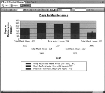
Select the Preview tab. Your report appears similar to this:
-
Click Save All in the toolbar.
Task Notes The stacked column chart is a good choice to fulfill the business needs for this report, because it can graphically illustrate two different pieces of information at the same time. Each colored section of the graph shows the number of maintenance days for a given propulsion type. In addition, the combined height of the three sections of the column shows the fluctuations in the total maintenance days from year to year.
Above and beyond the graphical information provided in the chart, several additional pieces of information are provided numerically on the chart. This includes the category labels along the x-axis, the legend at the bottom of the graph, and the detail data displayed right on the column sections themselves. The values on the columns are the result of the expression entered for the data label on the Point Labels tab.
| Tip | If the legend does not display completely, you may need to make the chart area wider on the Layout tab. |
The expression entered for the data label uses the SUM() function to add up the values from the DaysInMaint field. It may seem this sum should give us the total values from the DaysInMaint field for every row in the dataset. The reason this does not occur is because of the scope in which this expression is evaluated. The scope sets boundaries on which rows from the dataset are used with a given expression.
The data label expression operates at the innermost scope in the chart. This means expressions in the data label are evaluated using only those rows that come from both the current category and the current series. For example, let’s look at the column section for Star Lifters for the year 2002. This column section is part of the Star Lifter series. It is also part of the year 2002 category. When the report is evaluating the data label expression to put a label on the Star Lifter/year 2002 column section, it uses only those rows in the result set for the Star Lifters in the year 2002. Using this scope, the report calculates the sum of DaysInMaint for Star Lifters in the year 2002 as 68 days.
Next, let’s consider the summary data that appears in the column labels along the x-axis. These entries are the result of the expression entered for the label in the category groups. This expression also uses the SUM() function to add up the values from the DaysInMaint column. However, it calculates different totals because it is operating in a different scope.
In this case, the calculations are being done in the category scope, which means the expression for the label in the category group is evaluated using all the records from the current category. For example, let’s look at the column label for the year 2002 column. This column is part of the year 2002 category. When the report is evaluating the label expression to put a label below this column, it uses all the rows in the result set for the year 2002. The propulsion type of each row does not make a difference, because it is not part of this scope. Using the year 2002 category scope, the report calculates the sum of DaysInMaint for the year 2002 as 211 days.
Finally, we come to the summary data that appears in the legend below the chart. These entries are the result of two expressions that are concatenated when the report is created. The first expression comes from the label in the series groups. The second expression comes from the Series label on the Values tab. If you leave the label in the series group empty, a generic series label (Series 1, Series 2, and so on) is created by default. If the Series label on the Values tab is left blank, it is ignored. When both the label in the series group and the Series label on the Values tab contain expressions, the results of the two expressions are concatenated with a dash in between.
The expression in the Series label on the Values tab of our current chart also uses the SUM() function to add up the values from the DaysInMaint column. Once again, it is working in a different scope, so it comes up with different results. Here, the calculations are being done in the series scope. That means the expressions for both the Series label on the Values tab and the label in the series group are evaluated using all the records from the current series. For example, let’s look at the entry in the legend for the Star Lifter series. When the report is evaluating the Series label expression from the Values tab and the label expression from the series group to put a label in the legend, it uses all the rows in the result set for Star Lifters. The year of each row does not make a difference, because it is not part of this scope. Using the Star Lifter series scope, the report calculates the sum of DaysInMaint for the Star Lifters as 332 days.
In a number of the expressions used in this chart, we are concatenating together several strings to create the labels we need. This is being done using the Visual Basic string concatenation operator (&). You may notice several of the fields being concatenated are numeric rather than string fields. The reason these concatenations work is the & operator automatically converts numeric values to strings. In this way, we can take “Total Maint. Hours -” and concatenate it with 211 to get the first line of the year 2002 column label. The 211 is converted to “211”, and then concatenated with the rest of the string.
The final noteworthy item on this report is the expression used to create the label on the y-axis. To have this label fit nicely along the y-axis, we used our old friend the carriage return/linefeed to split the label onto three lines. Because the text is rotated 90 degrees, the first line of the label is farthest from the y-axis, the next line is to the right of the first line, and the last line is to the right of the other two.
EAN: 2147483647
Pages: 115