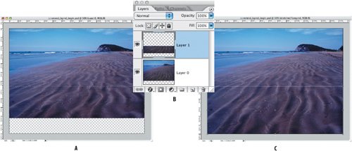
| In the step-by-step examples that follow, I'll show you some practical layer techniques, the kind of stuff that is bread and butter to a Photoshop artisan. Let's begin with an easy one. Extending an Image Often you wish that the edge of an image extended fartherperhaps because you want to put type or other image elements over this area or you want the image to conform to the aspect ratio of your page. Using layers, it's a cinch to extend one or more sides of an image, so long as the area you're trying to extend doesn't contain significant detail and you're not trying to extend it too much. This technique breaks the rules. It involves upsampling and distorting a portion of the image, two things that are definitely not kosher because they diminish image integrity and resolution. However, if you'll indulge me in a cliché (and it wouldn't be the first time), you can't make an omelet without breaking eggs. 1. | Open the Mazatlan image.
Figure 3.33. The original image (example A) and the image with the foreground extended (example B).


| | | 2. | Convert the Background layer into a normal layer so that when you increase the canvas size in step 3 the added area will be transparent rather than opaque. Option/Alt-double-click the Background layer thumbnail.
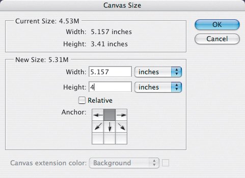
| 3. | Increase the canvas size to give the image expansion room by choosing Image > Canvas Size (Command/Ctrl-Option/Alt-C). In this instance, we want to add canvas at the bottom of the image so click the top center proxy square to indicate the position of the existing image within the new canvas size. I increased the height of the image from 3.41 inches to 4 inches. You can also express this dimension as a percentage, which is sometimes useful. Click OK.
Figure 3.34. Adding extra canvas to the bottom of the image. 
| 4. | Make a marquee selection of the foreground area, making sure you drag from one edge of you canvas to the other. This area is going to be stretched to fill the empty canvas at the bottom of the image. The bigger the selection the better, but avoid any areas of detail that will be adversely affected by the stretching.
| 5. | Copy this selection to a new layer by pressing Command/Ctrl-J or choosing Layer > New > Layer via Copy.
| | | 6. | Select the copied layer, and using Free Transform (Command/Ctrl-T or Edit > Free Transform), pull down from the bottom center handle to stretch this layer to the bottom of the image canvas.
|
Figure 3.35. A marquee selection of the area (example A) that will be copied to a new layer (example B) and then stretched using Free Transform (example C). 
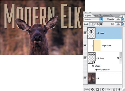
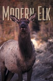
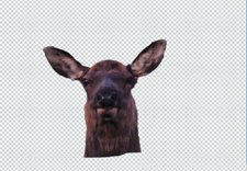
Creating a Layer Sandwich Here's a super simple, super-effective technique you see all the time used on magazine mastheads, but it's applicable any time you want to sandwich one layer between two parts of an image. Figure 3.36 shows the finished version. Figure 3.36. The finished image with the elk head overlapping the magazine "masthead. 
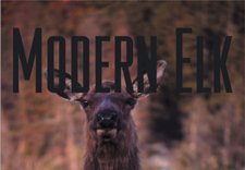
Starting out with my elk image, I placed the Modern Elk masthead (an Illustrator file) as a vector Smart Object. That way I can resize the masthead as necessary without degrading its quality. The masthead now sits on top of the elk's head. Figure 3.37. The masthead placed as a Smart Object. 
This step isn't strictly necessary, but I include it here to make a point about Smart Objects. I can't fill my masthead with another color because it is a Smart Object. However, I can create a new layer above the masthead, fill that layer with a color and then choose Layer > Create Clipping Mask or Command/Ctrl-Option/Alt-G so that the color is visible only in the type areas. For more on clipping masks, see "Masking with Transparency" in Chapter 4, "Layer Masks." Figure 3.38. Putting a color fill layer above the masthead and making it into a clipping mask to affect the color of the Smart Object. 
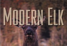
| | 1. | Select the elk layer and make a selection of the head. I used the Pen tool and then converted the path to a selection, but the Magnetic Lasso is also a good choice. With the selection active I press Command/Ctrl-J (or Layer>New>Layer via Copy) to copy it to a new layer.
Figure 3.39. A selection of the elk head copied to a new layer. 
| 2. | Drag the copied layer above the masthead, and there you have it: a layer sandwich.
|
Figure 3.40. The copied layer dragged above the masthead in the layer stacking order. 
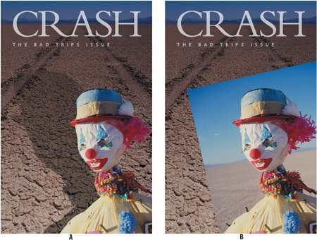
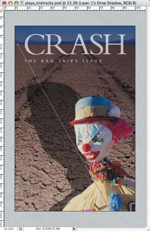
Creating a Cast Shadow There are several variations on this technique, but the basic principles are these: Start with a Drop Shadow layer style, make it into an independent layer, and then distort it and adjust its opacity to your liking. 1. | Open the Clown image.
Figure 3.41. The finished image with a cast shadow (example A) and our starting point (example B).


| | | 2. | Mask the clown as the first step in Making a Shadow. To save time, I've included a saved alpha channel with this file. To load it as a selection, Command/Ctrl-click on the Clown alpha channel thumbnail in the Channels palette. To use this selection as a layer mask, select the Clown layer and then click on the Add layer mask icon at the bottom of the Layers palette (third one from the left).
Figure 3.42. The clown, masked with a layer mask. 
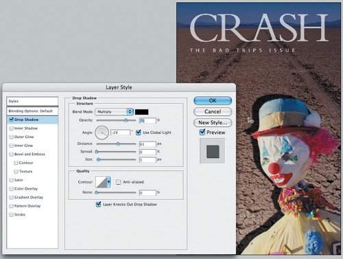
| 3. | Add a basic drop shadow as a starting point by either double-clicking the Clown layer thumbnail or selecting Drop Shadow from the Layer Effects icon at the bottom of the Layers palettethe one with the "f" on it. Click the Drop Shadow check box in the list on the left. Because this shadow shape is only a starting point, it's not necessary to set options. In other contexts, it might be useful to move your pointer into the image area and drag to position the shadow relative to the layer. Click OK.
| | | 4. | To control the shadow shape, choose Layer > Layer Style > Create Layer. This puts the shadow on its own layer, which is no longer attached to the Clown layer.
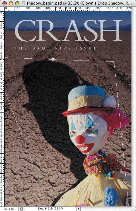
| 5. | Select the Clown's Drop Shadow layer, choose Free Transform (Command/Ctrl-T) and holding down the Command/Ctrl key to distort the shape, pull the shadow to cast it over the clown's right shoulderor wherever you like.
Figure 3.43. Transforming the shadow layer. 
| | | 6. | To make the density of the shadow less uniform, lock the transparency of the shadow layer, press D to restore your foreground and background colors to their default black and white, and paint with a Foreground to Background Gradient across the shadow shape. I dragged from bottom right to top left so that the shadow dissipates as it gets farther from the subject. You may need to try this a few times before you get a result you want. If you go wrong, press Command/Ctrl-Z to undo and try again.
Figure 3.44. Painting over the shadow with a black-to-white gradient. 
| 7. | Adjust the opacity of the shadow layer to your liking.
| 8. | Optionally, blur the shadow more by choosing Filter > Blur > Gaussian Blur.
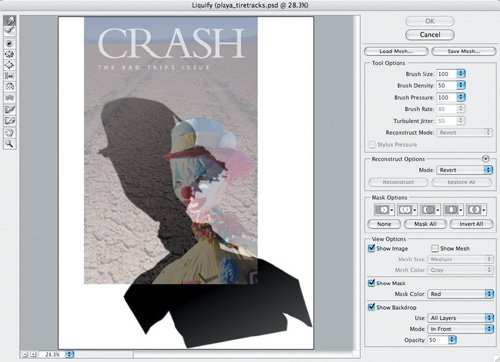
| | | 9. | To distort the shadow shape, either try Edit > Free Transform > Warp or using the Liquify filteryou'll need to unlock the layer's transparency for this to work. I used Liquify (Filter > Liquify or Command/Ctrl-Shift-X) and painted over some of the edges with the Forward Warp tool, the default tool, at the top left of the Liquify tool palette. I selected Show Backdrop (bottom right) to see shadow layer in the context of the whole composition.
|
Figure 3.45. Distorting the shadow shape using the Liquify filter. 
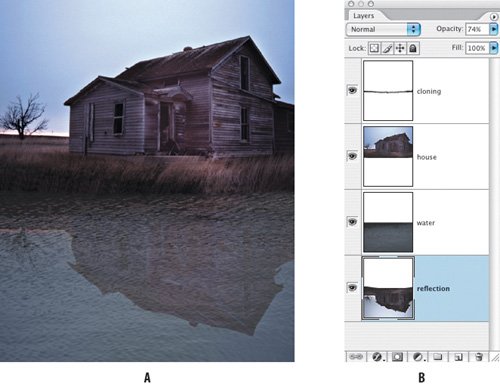
Adding a Reflection A complementary technique to casting a shadow is adding a reflection. You can use pretty much any image to try this out. In the example shown (Figure 3.46), I increased the canvas height to 200%. Next, I duplicated the layer, moved it into position, flipped it vertically, and reduced its opacity to 75%. To make the house look as if it were reflected on water, I specifically avoided the Ripple and the Ocean Ripple filters, which tend to look fake. Instead, I used an image of water (it's a good idea to build your own library of textures), which I put on a layer above the upside-down house and then experimented with its opacity (I used Luminosity 78%). I cloned over the seam where the two houses meet using the Clone Stamp tool to give the impression of a riverbank. To clone from one layer and paint the cloned pixels to another I checked Sample all layers in the Clone Stamp options. Finally, I used the Liquify filter on the reflected layer (as in Step 8 in the "Creating a Cast Shadow" example) to make sure that the reflection didn't look like an exact duplicate of the house. Figure 3.46. A cast reflection (example A) and the file's layer palette (example B) showing how the image is constructed. 
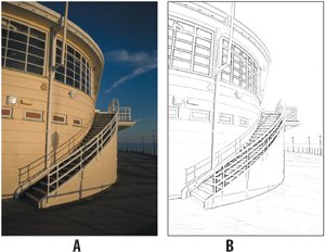
Converting an Image to Line Art There are various techniques for doing this, but this is possibly the simplest and works well with images that have well-defined contours and contrast. 1. | Open the Worthing Pier image.
Figure 3.47. The original image (example A) and the finished line art version (example B).


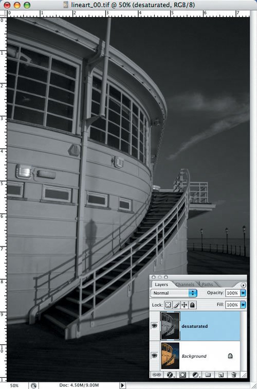
| | | 2. | Duplicate the layer (Command/Ctrl-J) and then choose Image > Adjustments > Desaturate (Command/Ctrl-Shift-U) to Desaturate the new layer.
Figure 3.48. The background layer is duplicated and desaturated. 
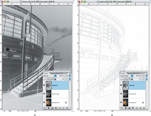
| | | 3. | Duplicate the desaturated layer and then choose Image > Adjustments > Invert to invert the layer. Switch the blending mode of the inverted layer to Color Dodge (this will cause the layer to turn white), and then apply a Gaussian Blur filter to the layer. The higher the radius the more gray values you introduce into your line artI chose a radius of 15.
Figure 3.49. A duplicate of the desaturated layer is inverted (example A), its blending mode converted to Color Dodge, and a Gaussian Blur applied (example B). 
| 4. | As an optional final step you may need to increase the contrast of the image. Merge your three layershold down Option/Alt-Shift and choose Merge Visible from the Layers palette. If you want to preserve your background layer, make a duplicate of it first. Increase the contrast on this layer by choosing Image > Adjustments > Levels and moving the black and white input sliders towards each other.
|
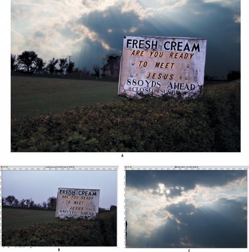
Adding Film Grain Adding noise to all or part of a composition can effectively disguise differences in image characteristics. The Add Noise filter simulates film grain and can be used either to help blend in retouched areas or just to create a different visual mood. However, the Add Noise filter is destructiveadd too much noise and there's no way to remove itexcept by blurring, which creates as many problems as it solves. Using layers with the Overlay blending mode, we can add the noise to a separate layer without harming the original image. In the example shown I've replaced the flat sky of the original image with a more expressive sky. The original image was shot on ISO 400 slide film and is consequently quite grainy; the new sky is a digital image shot at ISO 100 with no discernible grain. So I need to add some grain to the new sky. Figure 3.50. The finished composition (example A). The original image and the replacement sky (examples B and C). Because the sky is a digital image, it lacks the grain in the sign image, shot on slide film. 
| | 1. | Open the layered image, "Fresh Cream." This is a composition in progress, with a new sky layer visible in the Layers palette.
| 2. | Create a new, empty layer above the sky layer and name the layer Noise.
Figure 3.51. To apply noise nondestructively, fill a layer with neutral gray, change its blending mode to Overlay, and then apply the noise to that layer rather than to the image itself.


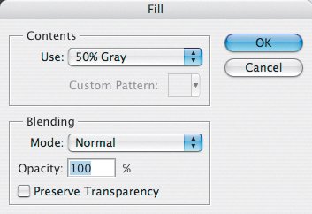
| 3. | Fill the layer with neutral gray (Edit > Fill, and from the pull down menu choose 50% Gray), because the Add Noise filter needs some pixels to work with.
| 4. | Change the blending mode of the Noise layer to Overlay. Here's the trick with the Overlay blending mode: as I mentioned in "Contrast Blend Modes" earlier in the chapter, Overlay makes the darks darker and the lights lighter. And it leaves the neutrals unaffected. The Noise layer now becomes invisible until we apply the next step.
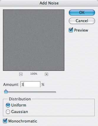
Figure 3.52. The Add Noise filter. 
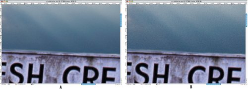
| | | 5. | Choose Filter > Noise > Add Noise. I chose Uniform noise with an amount of 3%. The filter adds a grain that also adds contrast because half of it is darker than 50% and half is lighter, and the noise now shows up in the sky, making it more closely match the structure of the rest of the image. The effect is subtle, but clearly discernible on zooming in.
|
Figure 3.53. A close-up of the sky before (example A) and after (example B) the noise is applied. 
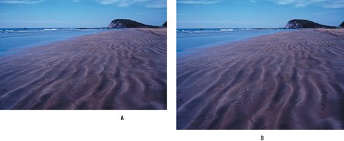
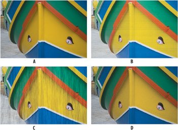
In this example we added noise to an Overlay layer; you can use this technique to add any kind of texture to your image in a nondestructive way. Here's an example of applying different filters to a neutral gray layer set to Overlay mode and experimenting with the opacity of that later: Figure 3.54. The original image (example A). Filter > Texture > Texturizer > Patchwork (example B). Filter > Texture > Texturizer > Fibers (example C). Filter > Render > Sandstone (example D). 
Dodging and Burning an Image Here's another use of the Overlay blending mode that works on the same principle as the previous example. The Tool palette features Dodge and Burn tools that respectively lighten or darken areas of an image. But there's a better, nondestructive way of getting the same result. Apply dodging and burning to a separate layer using the Overlay blending mode. Here's how. 1. | Open the Nathalian image.
Figure 3.55. In example A, the subject's face is in shadow and the highlights in the background are too strong. In example B, I've used a dodge and burn layer to "dodge" the shadows on the face and "burn" some of the background highlights.


| 2. | Create a new layer above the Background layer and name it Dodge and Burn.
| 3. | Fill this layer with neutral Gray (Edit > Fill, and choose 50% Gray from the Use pull-down menu).
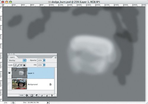
| 4. | At the top of the Layers palette, change the blending mode of the Dodge and Burn layer to Overlay. The Overlay blending mode ignores neutral gray pixels.
| 5. | Make white your foreground color. Choose a soft-edge brush and an opacity of around 25%, and "dodge" the shadows on the face. Change your brush size and opacity as necessary. Be careful not to go too far when dodging deep shadows because this reveals unsightly noise in these areas and may look fake. When you're satisfied with the result, switch your foreground color to black and "burn" any highlights in the background that are distracting. If the highlights are blown out, that is, if the RGB values in the highlight read 255, 255, 255 on your Info palette, the burning will have no effect.
|
Figure 3.56. The Dodge and Burn layer viewed by itself: Where the pixels are darker than 50% gray the subject is darkened; pixels lighter than 50% lighten, and neutral gray has no effect. 
Retouching on a Separate Layer Layers play a valuable role when combined with Photoshop's retouching tools: They let you add retouching elements to a separate layer and keep your original image intact. Without such an approach, if an error to your retouching is outside your number of history states, your image may be permanently damaged, or at best, require a lot of work to fix the error. Retouching on a separate layer lets you view just that layer to see exactly where the retouching has been applied, and delete or soften as needed any retouching that isn't working, or just trash the whole layer and start again if things are beyond redemption. Of the major retouching toolsthe Healing Brush, Spot Healing Brush, Patch tool, and Clone Stampall but the Patch tool give you a Sample All Layers option so that you can simultaneously clone from one layer or more layers and paint to another. (Even when using the Patch tool, you can get around this shortcoming by first copying the area you are patching to a separate layer using Layer via Copy (Command/Ctrl-J). Let's see how retouching on a separate layer works in practice with the Healing Brush tool. When the Healing Brush samples, it analyzes the texture, color, and luminosity of the source area. Unlike the Clone Stamp, which literally duplicates the clone source and paints it over the original information, the Healing Brush merges the texture from the sample area into the color and luminosity of the destination area. 1. | Open the Retouching image.
Figure 3.57. The original, unretouched image.


| 2. | Create a new layer above the Background layer and name it Retouching.
| 3. | Choose the Healing Brush tool. In the tool options, make sure that Source is set to Sampled, and that Aligned and Sample All Layers are both checked.
Figure 3.58. The Healing Brush options. 
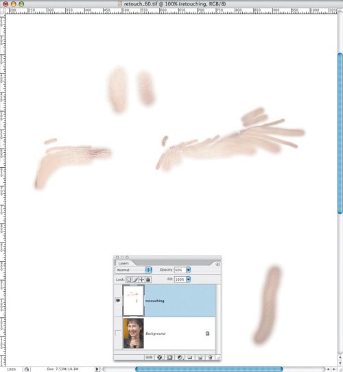
| | | 4. | Zoom in so that you can comfortably see the wrinkles around the eyes. The Healing Brush adds a 1012-pixel spread to the brush, so start with a brush hardness of about 75% and a brush size of 30 pixels. Option/Alt-click a short distance from a wrinkle line to sample the "good" pixels, and then reposition your pointer over the wrinkle and paint. For best results, make many short strokes rather than long sweeping ones. Don't try to cover too much ground with one stroke. Also, avoid frequently resampling the source area as you may be accustomed to doing with the Clone Stamp tool. When working near edges where there is a transition in color or texturefor example, at the edge of the face in this imageit's helpful to first make a selection of the area you are healing. A selection helps you avoid sampling colors from outside the area. If you go wrong, choose the Eraser tool to paint away any retouching lines you don't want. Just for kicks (and sometimes this can be helpful), view the retouching layer by itself.
Figure 3.59. Viewing just the Retouching layer. 
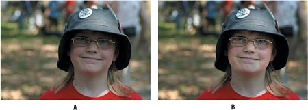
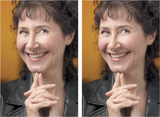
| | | 5. | Once you have applied the retouching, soften the effect by reducing the opacity of the retouching layer. After all, wrinkles add character, and we don't want people to look as if they've been ironed.
|
Figure 3.60. The result of the retouching layer set to 100% opacity (example A) and 60% (example B). 
|
