Chapter 29. Graphics Transforms
| In Chapter 27, I showed you a couple of XAML files that displayed the same Polygon figure with two different FillMode settings. Rather than having different sets of coordinate points in the two Polygon elements, I defined the coordinate points just once in a Style element. The two different figures were then displayed in two different parts of the Canvas with different Canvas.Left properties. These properties effectively provided offsets to the X and Y coordinates in the Polygon. Toward the end of Chapter 28 I did something similar for a program that applied a drop shadow to a text string. While it's sometimes convenient to use Canvas.Left and Canvas.Top for this purpose, it's also beneficial to have a more generalized and systematic approach to changing all the coordinate points of a particular graphical object. These approaches are called transforms. Not only is it useful to offset coordinate points, but sometimes the need arises to make a figure larger or smaller, or even to rotate it, and the transforms do that as well. Transforms are particularly useful when animation is involved. Suppose you want to move a Polygon from one location to another. Does it make more sense to animate all the coordinate points in the same way, or to animate only a translation factor that is applied to the whole figure? Certain techniques, particularly those involving rotation, are not easy at all without the help of transforms. You can apply a transform to any object that derives from UIElement. UIElement defines a property named RenderTransform that you set to an object of type Transform. Search a little further and you'll find that FrameworkElement defines its own property of type Transform. This property is called LayoutTransform. One of the primary objectives of this chapter is to help you to understand the difference between RenderTransform and LayoutTransform, and when to use which. The RenderTransform and LayoutTransform properties are similar in that they are both of type Transform. You can see the abstract Transform class and its derivatives in this class hierarchy: Object I have arranged the derivatives of Transform in the order in which I cover them in this chapter. Also of great importance is the Matrix structure. Matrix will remain behind the scenes for much of this chapter, but eventually emerge as an important data structure in its own right. Of the classes that derive from Transform, four are quite easy to use: TranslateTransform, ScaleTransform, SkewTransform, and RotateTransform. They provide an easy way to alter the location or appearance of an element, as this stand-alone XAML file demonstrates:
Without the transforms, these five buttons would sit in a simple row across the window. The second button has its RenderTransform property set to an object of type TranslateTransform that moves its location down and to the left. The third button is subjected to a ScaleTransform that enlarges its width by 1.5 and its height by a factor of 4. The fourth button is skewed along its vertical axis by 20 degrees, making it a parallelogram rather than a rectangle. The fifth button is rotated 30 degrees counterclockwise. All the buttons otherwise remain entirely functional. In a C# program you can set the properties of the Transform classes just as in a XAML file, but these classes are all supplied with useful constructors as well, as the following C# program demonstrates. The program created from the following TransformedButtons.cs file is functionally equivalent to TransformedButtons.xaml.
If you have experience with graphics transforms in other graphical programming environments (including Win32 or Windows Forms), you're going to find some differences in the way transforms are implemented in the Windows Presentation Foundation. In other graphical environments, transforms are properties of a drawing surface, and anything drawn on the surface is subjected to the current transform. In the WPF, transforms are properties of the elements themselves, and effectively transform the element relative to itself. Sometimes this difference in perspective is not noticeable, and sometimes it is. The difference is most noticeable in the rotated button. All that has been specified here is an angle. In a conventional graphical environment, the rotation would be centered around the origin of the drawing surfacethat is, the point (0, 0) on the Canvas. However, the WPF rotation is relative to the origin of the Button itself. The rotation occurs around the button's upper-left corner rather than the canvas's upper-left corner. I mentioned that any class that derives from FrameworkElement has two properties of type Transform. These are RenderTransform and LayoutTransform, and both programs shown so far have focused on RenderTransform. In either the XAML file or the C# file you might want to globally replace RenderTransform with LayoutTransform and see the difference. You'll find that now the translated button isn't translated at all, but instead remains in its location at the point (200, 100). You'll also find that the rotated button is still rotated, but it has moved down a bit so that it really occupies the original area implied by the Canvas.Left and Canvas.Top attached properties. The reasons for these peculiarities will become evident as this chapter progresses. I'd like to examine these various types of transforms in more detail with little XAML programs that you can experiment with. Let's begin with the simplest of these Transform derivatives, which is TranslateTransform. TranslateTransform defines two properties named X and Y. They are backed by dependency properties, so they are animatable and bindable. The following stand-alone XAML file encloses within a StackPanel two ScrollBar controls labeled "X" and "Y" with their Minimum properties set to 300 and Maximum properties set to 1000. Two TextBlock elements are bound to the Value properties of the scrollbars to display the current scrollbar values. The last elements of the StackPanel are a Canvas panel containing two lines that intersect at the point (100, 100) relative to the upper-left corner of the Canvas, and a Button, which is positioned at the point (100, 100). Toward the bottom of the file, the RenderTransform property of the Button is assigned a TranslateTransform with the X and Y properties bound to the two scrollbars.
When the program begins, the upper-left corner of the Button is positioned at the point (100, 100). As you manipulate the two ScrollBar controls, the Button moves around the Canvas. The position of the upper-left corner of the button is obviously the original position plus the X and Y properties of the TranslateTransform object. Let's try to formalize this process with convenient mathematical notation. The original position of the Button is (x, y) and the X and Y values of the TranslateTransform can be symbolized by dx and dy (where the d stands for delta, mathematically meaning change). The rendered position of the button is (x', y'). That rendered position can be expressed like so: x' = x + dx y' = y + dy Notice that dx and dy can be negative. As you move the second scrollbar in the program to the left, you can even force the Button to escape the confines of the Canvas panel in which it is supposedly positioned and climb up over the scrollbars! Now go into the XAML file and change the two occurrences of the property element Button.RenderTransform to Button.LayoutTransform. You'll find that the Button doesn't budge at all, no matter how ferociously you tug on the scrollbars. You may be disappointed, but the lesson you learned earlier is now reinforced: A TranslateTransform object applied to the LayoutTransform property has no effect on the location of the element. The ScaleTransform class defines the four properties ScaleX and ScaleY (which both have default values of 1) and CenterX and CenterY (which both have default values of 0). These properties provide you with a means to increase or decrease the size of an element. The InteractiveScaleTransform.xaml file creates four scrollbars for these four properties and a ScaleTransform binds its properties to these scrollbar values.
You'll also notice that toward the bottom of the file, the ActualWidth and ActualHeight properties of the Button are displayed in the upper-left corner of the Canvas. Try manipulating the ScaleX and ScaleY scrollbars first. These scrollbars increase or decrease the size of the Button by the scaling factor. For example, a ScaleX value of 2 doubles the width of the Button, while a ScaleY value of 0.5 halves the height. You can make ScaleX negative, in which case the Button flips around its left side, and the text of the button becomes a mirror image. You can also make ScaleY negative, and the Button flips around its top edge. Negative scaling is sometimes called reflection. Notice that the ActualWidth and ActualHeight properties of the Button never change. Another property that doesn't change is RenderSize, which the element's OnRender method uses to draw the element. Transforms always occur after the element has rendered itself. If the two scaling factors ScaleX and ScaleY are symbolized by sx and sy, the formulas that describe the scaling effect are: x' = sx · x y' = sy · y And here let me emphasize again that both (x, y) and (x', y') are points relative to the upper-left corner of the untransformed Button. The point (0, 0) is transformed to the point (0, 0). That's why the upper-left corner of the button remains in the same place regardless of the ScaleX and ScaleY settings. In some cases you might prefer that this not be the case. For example, you might want to double the size of an element, but you want the element to remain centered at the same spot. In other words, you don't want the element to expand just to the right and downward. You want the element to expand in all four directions. This is the purpose of the CenterX and CenterY properties of ScaleTransform. Try setting the CenterX scrollbar to approximately half the width of the button and the CenterY scrollbar to approximately half the button height. (That's the second reason why the program displays the ActualWidth and ActualHeight properties of the Button.) Now when you increase the ScaleX and ScaleY properties, the Button expands in all four directions. If you set CenterX to the ActualWidth of the Button and CenterY to 0, the right side of the Button will always occupy the same horizontal position. If you also set CenterY to the ActualHeight of the Button, the bottom right corner of the Button always remains in the same position. If the CenterX and CenterY properties of the ScaleTransform are symbolized by csx and csy, the complete scaling formulas are actually x' = sx · (x - csx) + csx y' = sy · (y - csy) + csy You can verify these formulas with an example or two. Suppose an element is 80 units wide and you set CenterX (that is, csx) to 40 and ScaleX (or sx) to 3. All points of the form (40, y), which is the horizontal center of the button, are transformed to (40, y). The center of the button is unchanged. All points of the form (80, y), which is the right side of the button, are transformed to (160, y). All points of the form (0, y), the left side of the button, are transformed to (80, y). The button is 240 units wide, which is 3 times the original width, but it's still centered at the same point. It's actually a little better to write the complete scaling formulas like this: x' = sx · x + (csx - sx · csx) y' = sy · y + (csy - sy · csy) This form clarifies that the complete transformation is actually just a single factor multiplied by the original coordinate combined with a translation. If you edit InteractiveScaleTransform.xaml and change both occurrences of Button.RenderTransform to Button.LayoutTransform, you'll discover that the ScaleX and ScaleY scrollbars still function in making the button larger and smaller, even flipping it around its horizontal or vertical axis. However, the button always remains in the same place. The button is always just underneath and to the right of the point (100, 100) where those two lines cross. This is most noticeable when you give the button negative scaling factors. The button flips, but it remains in the same place. The CenterX and CenterY scrollbars have no effect on the LayoutTransform because those scrollbars essentially provide translation factors, and it's already been established that LayoutTransform ignores translation. On to the SkewTransform. The SkewTransform defines four properties named AngleX, AngleY, CenterX, and CenterY, all of which have default values of 0. As the names imply, AngleX and AngleY are angles. Angles within the range 90 degrees to 90 degrees produce unique results; angles outside that range simply duplicate effects inside the range.
As you move the AngleX scrollbar, you'll see that the Button remains the same height, and the top of the button remains in the same place, but the bottom of the Button is shifted to the right for positive angles and to the left for negative angles. This is known as horizontal skew or horizontal shear. The button is distorted because it's no longer a rectangle. It's a parallelogram. Set AngleX back to 0. Now move the AngleY scrollbar. The Button remains the same width, and the left side of the button remains in the same place, but the right side of the button shifts down for positive angles and up for negative angles. This is vertical skew. In both cases, the upper-left corner of the button remains anchored at the point (100, 100). If AngleX and AngleY are symbolized by αx and αy, the skewing formulas are: x' = x + tan(αx) · y y' = y + tan(αy) · x Notice that both x' and y' are functions of both x and y. This is what makes the skewing formulas different from the translation formulas and the scaling formulas. Let me convince you that these formulas are correct. In InteractiveSkewTransform.xaml, set the AngleX and AngleY scrollbars to 0. This is the default case. The tangent of 0 is 0, so x' equals x and y' equals y, and the button is entirely normal. Now change AngleX (symbolized by αx in the formulas). You can see that the value you set on the scrollbar is the angle that the left side of the button makes with the vertical axis. Set the angle to 45 degrees. The tangent of 45 degrees is 1, so the formulas simplify to x' = x + y y' = y The upper-left corner of the button is the point (0, 0), which has been transformed to (0, 0). If the width of the button is W, the upper-right corner of the button is (W, 0), which has been transformed to (W, 0). If the height of the button is H, the lower-left corner is (0, H). The skewing transform has shifted that corner right by an amount equal to the height of the button. It has become (H, H), and the skewing formulas have predicted that. The lower-right corner of the button is normally (W, H) and it has been transformed to (W + H, H), also predicted by the formulas. As the angle gets very large, the button becomes skewed beyond the point of recognition. The tangent of 90 degrees is infinity and, fortunately, the transform doesn't "blow up" at that point, but it no longer makes any visual sense to display the button. Now try this: Set the AngleX scrollbar to a positive number between 50 and 80. Set AngleY to the negative of that number. You'll see the button assume its normal rectangular shape. It will be larger than the original button and it will be rotated counterclockwise by AngleX, but it will no longer be distorted. Rotation, which is a combination of horizontal skew and vertical skew, is normally done in such a way as to preserve the original size. As you've seen, changing the AngleX and AngleY properties always leaves the upper-left corner of the button in its original location. You can override that by changing the CenterX and CenterY properties. As with the same-named properties in the ScaleTransform class, these properties indicate the coordinates of the button that remains unaltered. But in practice these properties work a little differently for skew. If you're just setting horizontal skew (AngleX) to a non-default value, all points of the form (x, CenterY) remain unaffected by the skew. Similarly, for vertical skew used by itself, all points (CenterX, y) remain unaffected by changes in AngleY. For default 0 values of AngleX and AngleY, CenterX and CenterY do not affect the position of the element. If CenterX and CenterY are represented by ckx and cky (k stands for skew because s already stands for scale), the complete skewing formulas are x' = x + tan(αx) · ( y - ckx) y' = y + tan(αy) · ( x - cky) Once again, let's see how LayoutTransform is different. Edit InteractiveSkewTransform.xaml and replace Button.RenderTransform with Button.LayoutTransform. You might have predicted that AngleX and AngleY still skew the button, but the button always remains in the same areabelow and to the right of the point (100, 100). CenterX and CenterY have no effect because the LayoutTransform doesn't respond to translation. The RotateTransform class defines the familiar CenterX and CenterY properties, but unlike SkewTransform, RotateTransform defines just a single property named Angle.
I've set the range of the Angle scrollbar to a minimum of 0 and a maximum of 360 degrees, but negative angle values and angles outside that range are perfectly acceptable. The Angle value specifies a clockwise rotation and by default the rotation occurs around the upper-left corner of the element. The CenterX and CenterY properties indicate the point relative to the upper-left corner of the element around which the rotation occurs. Set these properties to half the width and height of the element, and the rotation will occur around the element's center. The element always remains the same size. Once again, edit the file and change Button.RenderTransform to Button.LayoutTransform. The button still rotates, but it remains below and to the right of the point (100, 100) where it was originally positioned. The WPF graphics and layout system handles RenderTransform and LayoutTransform very differently. With RenderTransform, the system takes the image drawn by the element's OnRender method, applies the transform, and slaps the image on the screen. If that image happens to overlay some other control in the program (or be buried underneath), it doesn't matter. The element will be clipped to the border of the application's window, but it's otherwise free to roam. Any change in an element's LayoutTransform, however, precipitates a new layout pass with calls to MeasureOverride and ArrangeOverride so that the transform can be respected when the element is accommodated in the layout. The MeasureOverride, ArrangeOverride, and OnRender methods don't need to know about the LayoutTransform, but certain values are finagled to account for layout. The DesiredSize property of an element's child reflects the LayoutTransform, for example, even though the child's MeasureOverride method doesn't take the transform into account. The difference between RenderTransform and LayoutTransform is most obvious in a StackPanel, or in an auto-sized cell of a Grid, or in UniformGrid. The following stand-alone XAML program provides a dramatic illustration of that difference. The program assembles two three-by-three UniformGrid panels containing nine Button controls each. The center button in each grid is given a RotateTransform with an Angle property of 45 degrees. In the top UniformGrid, the RotateTransform is applied to the button's RenderTransform property. In the bottom grid, the RotateTransform is applied to LayoutTransform.
In the top grid, the rotated button doesn't affect anything else in the program. The UniformGrid is arranged as if the button weren't rotated at all. The button appears on top of elements created before it and behind elements created after it. In the bottom grid, however, the entire UniformGrid has been adjusted to accommodate the size that the rotated button requires in the cell. You'll notice that the Button in the second UniformGrid is smaller than the other buttons in that grid. An element that is transformed is given the size it returns from MeasureOverride, rather than the size assigned to it by its parent's ArrangeOverride method. You should run this little program whenever you momentarily forget about the difference between RenderTransform and LayoutTransform. (Chapter 30 has an animated version of this program that reveals the difference even more dramatically.) If you are transforming an element in the context of a layout, and you want the transformed element to be reflected in that layout, you'll probably be using LayoutTransform. If the transform is set just once and doesn't change, there's really no performance difference between RenderTransform and LayoutTransform. However, if you're animating a transform or binding the transform to something that could change a lot, you'll probably want to use RenderTransform for the sake of efficiency. Any translation applied to a LayoutTransform is ignored, so when you're setting a LayoutTransform, you needn't bother with translation or any CenterX or CenterY properties. The enlarged, skewed, or rotated element is always positioned in the space allocated for it during layout. As you'll note, setting the RenderTransform property in the preceding XAML file causes the button to rotate around its top-left corner. You probably want the freedom to rotate the element around its center (for example). But to do that, you need to set the CenterX and CenterY properties of the RotateTransform. To set these properties to the center of the element, you need to know the element's size, and in the general case, that size is dependent on layout, which occurs during run time and which you, the XAML coder, cannot anticipate. And that is why the WPF developers were both prescient and kind enough to include a property in UIElement named RenderTransformOrigin. You use this property as an alternative means to set an origin for the RenderTransform. The coordinates are fractions relative to the size of the element. (This scheme is similar to the default coordinate system for gradient brushes.) For example, in the XAML program just shown, if you want the top button to be rotated around its center, include a RenderTransformOrigin attribute for that button. That top rotated button is currently the element that looks like this: <Button Content="Button"> <Button.RenderTransform> <RotateTransform Angle="45" /> </Button.RenderTransform> </Button> Change that element to this: <Button Content="Button" RenderTransformOrigin="0.5 0.5"> <Button.RenderTransform> <RotateTransform Angle="45" /> </Button.RenderTransform> </Button> Now the button is rotated around its center. Here's a program that uses RenderTransformOrigin to display one unrotated button and four buttons rotated around each of the button's corners.
To avoid a lot of repetition, a Style element defines properties for all five buttons, including HorizontalAlignment and VerticalAlignment values that position the buttons in the center of the Grid cell. The unrotated Button is just <Button /> The other Button elements have both a RenderTransformOrigin and a RenderTransform set to rotate the element around one of its four corners. When you're dealing with elements such as Line, Path, Polygon, and Polyline on a Canvas, you can probably set the CenterX and CenterY properties of the transform rather than rely on RenderTransformOrigin because you already know the size and locations of these objects. However, you should be aware of how these rotation origins work when you're dealing with elements with explicit coordinate points. For example, consider the following element: <Line Stroke="Black" X1="100" Y1="50" X2="500" Y2="100" /> If you apply a RotateTransform to the RenderTransform property of the element, by default the CenterX and CenterY properties are 0. The rotation will occur around the point (0, 0)that is, the point 100 units to the left and 50 units above the starting point of the line. If you want the rotation to occur relative to the start point of the line, set CenterX to 100 and CenterY to 50. If you want the rotation to occur relative to the center of the line, set CenterX to 300 and CenterY to 75. However, if you're intent on using RenderTransformOrigin to specify the rotation origin, you need to know that the element is considered to occupy the rectangle that stretches horizontally from 0 to 500 (the maximum X coordinate) and vertically from 0 to 100 (the maximum Y coordinate). The RenderTransformOrigin of (0, 0) corresponds to the point (0, 0), not to the leftmost coordinate of the line, which is the point (100, 50). A RenderTransformOrigin of (1, 0) corresponds to the coordinate point (500, 0). The following C# program shows two different ways to rotate a bunch of lines so that they seem to form the spokes of a circle.
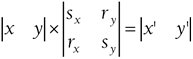
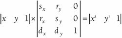
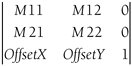
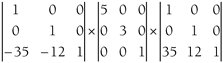
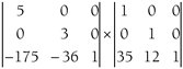
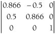
In the wheel and spokes combination on the left, 72 Line elements are created starting at (150, 150), which is the center of the "wheel," and ending at (250, 150), which is the rightmost edge. These are all given a RotateTransform. The first argument of the RotateTransform constructor indicates the Angle property, and the second two arguments are CenterX and CenterY, which are set to (150, 150). Each line is rotated a different number of degrees around the point (150, 150). The second rendition takes a different approach. Each Line element begins at (0, 0) and ends at (100, 0). The RotateTransform doesn't require CenterX and CenterY properties because the defaults of 0 indicate that line is to be rotated around the point (0, 0). However, the lines require Canvas.SetLeft and Canvas.SetTop properties to position the lines in the center of the second circle. Of course, I could have written WheelAndSpokes as a XAML program rather than a C# program, but in that case, the file would have included 144 Line elements, and that seems contrary to my programming instincts. As programmers, we recognize the wisdom of keeping repetitive code to a minimum so that changes are as painless as possible. There's a reason why programming languages have loops such as for. Still, at times you'll want to put several similar elements that differ only by a transform in a XAML file. As the RotatedButton.xaml file demonstrates, a Style element helps keep the repetition to a minimum. You'll also soon see some shortcuts in setting the transform itself on the individual elements, but it requires some further knowledge of the nature of these transforms. If the Angle property of RotateTransform is symbolized by α without a subscript, the simple rotation formulas (without the influence of CenterX and CenterY) are x' = cos(α) · x - sin(α) · y y' = sin(α) · x + cos(α) · y If the CenterX and CenterY properties are represented by crx and cry (the r stands for rotate), the complete rotation formulas are x' = cos(α) · (x - crx) - sin(α) · (y - cry) + crx y' = sin(α) · (x - crx) - cos(α) · (y - cry) + cry The point (crx, cry) remains unchanged in these transforms. Despite the seeming complexity of the final rotation formulas, all the transforms are of the general form x' = sx · x + rx · y + dx y' = ry · x + sy · y + dy where sx, sy, rx, ry, dx, and dy are constants that define the particular transform. The s constants are scaling factors, the d constants are translation (delta) factors, and I've given the other two factors names of rx and ry to suggest rotation, but they are also responsible for skew. These two formulas represent a two-dimensional affine transform, which is a transform that preserves colinearity. Although x' and y' are functions of both x and y, these formulas don't involve powers of x or y or anything like that. These transforms will always transform a straight line to another straight line. Straight lines never become curved. A pair of parallel lines will never be transformed to non-parallel lines. Objects that are the same size will be the same size under the same transformation. Parallelograms will always be transformed to parallelograms, ellipses will always be transformed to ellipses, and Bézier splines will always be transformed to Bézier splines. For convenience in manipulating transforms, it is common to express the transform as a matrix, which is a rectangular array of numbers. Matrices always have a certain number of rows and columns. Here's a matrix with three columns and two rows: Matrices are usually symbolized by capital letters, so the following symbolizes a multiplication of two matrices: A x B = C In a matrix multiplication, the number of columns in A must be equal to the number of rows in B. The product C has a number of rows equal to the number of rows in A, and a number of columns equal to the number of columns in B. The number in the ith row and jth column of C is equal to the sum of the products of the numbers in the ith row of A times the corresponding numbers in the jth column of B. Matrix multiplication is not commutative. The product A x B does not necessarily equal the product B x A. If we weren't dealing with translation, we could represent the transform as a 2 x 2 matrix: The transform calculation can then be shown by a 1 x 2 matrix containing the point (x, y) multiplied by the transform matrix to obtain another 1 x 2 matrix containing the point (x', y'): Under the standard rules of matrix multiplication, that expression is equivalent to x' = sx · x + rx · y y' = ry · x + sy · y Of course these formulas are not quite complete because they are missing the translation factor. To get the matrix multiplication to work properly with translation, the matrices containing (x, y) and (x', y') must be expanded to 1 x 3 matrices, and the transform itself to a 3 x 3 matrix: Here are the resultant complete transform formulas, which are the same as those shown earlier: x' = sx · x + rx · y + dx y' = ry · x + sy · y + dy The type of transform that can be represented by a matrix like this is often called a matrix transform. The default matrix transform doesn't do anything. It has scaling factors of 1 and rotation and translation factors of 0: This is called the identity matrix. The transform matrix is encapsulated in a structure named Matrix. The Matrix structure has six read-write properties named M11, M12, M21, M22, OffsetX, and OffsetY, which correspond to the cells of the transform matrix like this: The values in the third column are fixed and cannot be changed. The Transform classfrom which TranslateTransform, ScaleTransform, and the others derivedefines a read-only property named Value of type Matrix. This property indicates the transform matrix that results from the transform. For example, suppose you set a TranslateTransform in code with this constructor: TranslateTransform xform = new TranslateTransform(27, 55); Or, you set it in XAML like so: <TranslateTransform X="27" Y="55" /> In either case, the Value property of the TranslateTransform object will be this Matrix object: Similarly, you can create a ScaleTransform in code: ScaleTransform xform = new ScaleTransform(5, 3); Or you can do it in XAML: <ScaleTransform ScaleX="5" ScaleY="3" /> Again, in either case, the Value property of the ScaleTransform object will reveal this equivalent Matrix object: These are the easy ones! As you've seen, you can also specify offset factors with the ScaleTransform. You do it in code like this: ScaleTransform xform = new ScaleTransform(5, 3, 35, 12); In XAML you set the CenterX and CenterY properties: <ScaleTransform ScaleX="5" ScaleY="3" CenterX="35" CenterY="12" /> The matrix transform that results from these settings is actually a composite of three transforms. First, a translation moves the point (CenterX, CenterY) to the origin. Then the scaling is performed, followed by another translation that moves the origin back to the point (CenterX, CenterY). The composite transform is the product of these three matrices: Multiply the first two matrices together using the standard matrix multiplication rules: Then multiply those two matrices: That's the matrix corresponding to the ScaleTransform with ScaleX and ScaleY properties set to 5 and 3, and the CenterX and CenterY properties set to 35 and 12. If you're skeptical, you can go back to the InteractiveScaleTransform.xaml file and insert the following element at the very bottom of the Canvas element: <Label Canvas.Right="0" Content="{Binding ElementName=btn, Path=RenderTransform.Value}" /> This Label displays the resultant Value property of the RenderTransform property of Button. It will appear as a string of six numbers in the order M11, M12, M21, M22, OffsetX, and OffsetY. Use the scrollbars to select the approximate values I've been discussing, and you'll see the resultant matrix. Rotation by α degrees results in the following matrix: If you set CenterX and CenterY to non-default values, a matrix multiplication is involved that is similar to the one shown earlier for scaling. In the first program shown in this chapterthe TransformedButtons.xaml filethe rotated button had the following markup: <Button Canvas.Left="650" Canvas.Top="100"> Rotated <Button.RenderTransform> <RotateTransform Angle="-30" /> </Button.RenderTransform> </Button> The cosine of 30 degrees is approximately 0.866 and the sine is 0.5, so the matrix that corresponds to this transform is Another class that derives from Transform is MatrixTransform. This class defines a property named Matrix of type Matrix, and if you know the values of the matrix you want, you can instead achieve the same transform with this markup: <Button Canvas.Left="650" Canvas.Top="100"> Rotated <Button.RenderTransform> <MatrixTransform> <MatrixTransform.Matrix> <Matrix M11="0.866" M12="-0.5" M21="0.5" M22="0.866" /> </MatrixTransform.Matrix> </MatrixTransform> </Button.RenderTransform> </Button> My intuition tells me that unless you're a transform wizard from way back, you do not prefer this alternative to RotateTransform. However, there's a shortcut you can use. Instead of defining the Matrix element within a MatrixTransform.Matrix property element, you can set the Matrix property of MatrixTransform directly with a string containing the six values of the matrix starting with the top row: <Button Canvas.Left="650" Canvas.Top="100"> Rotated <Button.RenderTransform> <MatrixTransform Matrix="0.866 -0.5 0.5 0.866 0 0" /> </Button.RenderTransform> </Button> But wait! It gets even better, for you can set the RenderTransform or LayoutTransform property directly to this string: <Button Canvas.Left="650" Canvas.Top="100" RenderTransform="0.866 -0.5 0.5 0.866 0 0"> Rotated </Button> And this form may be concise enough to entice you to use it for some simple transforms, particularly when you have several elements that are identical except for the transform. (Examples are coming up.) The final class that derives from Transform is TransformGroup. The crucial property that TransformGroup defines is Children, which is a collection of other Transform objects. For example, suppose you want to scale a button to twice its size and also to rotate it 45 degrees. Here's the markup: <Button.RenderTransform> <TransformGroup> <ScaleTransform ScaleX="2" ScaleY="2" /> <RotateTransform Angle="45" /> </TransformGroup> </Button.RenderTransform> In this particular case, the order of the ScaleTransform and RotateTransform doesn't matter, but in general it does. TransformGroup effectively performs a multiplication of the child transforms. However, this isn't a one-time-only deal. You can define a binding for Angle or you can animate Angle, and the composite transform will reflect that updated value. The Geometry class defines a property named Transform of type Transform, so you can apply a transform directly to a geometry object. This is useful if you're using a Geometry object for clipping, for example. You can also set the transform even if the Geometry object is part of a Path. In effect, the geometry transform is applied before any possible RenderTransform or LayoutTransform of the Path itself. Because the geometry transform affects the coordinates and sizes that make up the Path, the transform will be reflected in layout. Here's a program that shows two rectangles side by side. The first is a Rectangle element with a width and height of 10 units and a RenderTransform property that increases its size by a factor of 10. The second is a Path element that renders a RectangleGeometry object, also with a width and height of 10 and a Transform property that also increases its size by a factor of 10.
On the screen the two elements look very different in a way that you might not have anticipated. The red line that surrounds the Rectangle element is affected by the RenderTransform and is 10 units wide. The red line that surrounds the Path element is only one unit wide. A Render Transform or LayoutTransform applied to an element affects everything about the elementincluding the line widths. A Transform applied to a geometry object only affects the coordinates of that geometry. An untransformed line is then drawn on the transformed coordinates. As you know from the previous chapter, you can define a Canvas of a particular size to use as a drawing surface. However, you might also prefer that the origin of this Canvasthe point (0, 0)be not at the upper-left corner but perhaps somewhere else. Some graphics programmers prefer a drawing surface where the origin is the lower-left corner and increasing Y coordinates go up the screen. This scheme mimics the upper-right quadrant of a conventional Cartesian coordinate system. Some applicationsfor example, an analog clockseem to cry out for a coordinate system in which the origin is in the center. You can implement these alternative coordinate systems by setting the RenderTransform of the Canvas itself. If you want, that Canvas can go inside a Viewbox (as shown in the ScalableFace.xaml program in Chapter 27) to make it stretchable. The stand-alone CanvasModes.xaml file demonstrates four different Canvas coordinate systems.
A Style for the Canvas sets the Width and Height to 100 units and HorizontalAlignment and VerticalAlignment to Center. Each of the four Canvas panels sits in the center of a cell of a four-column Grid. The Style for the Path includes an EllipseGeometry centered around the point (0, 0) and colored red. Thus, the red dot always indicates the origin of the drawing surface. The Polyline outlines the 100-unit-square coordinate system. For the first two coordinate systems, in which the origin is in the corner, this outline begins at (0, 0) and extends to (100, 100). A black line is drawn from the origin to the point (100, 100). For the second two coordinate systems, the origin is in the center. The square outline begins at (50, 50) and extends to (50, 50). The black line is drawn from the origin to the point (50, 50). Watch out: Whenever you create a coordinate system in which values of Y increase going up, any text you display on the Canvas will be upside down! If that's not what you want, you'll have to compensate by setting a ScaleTransform on the element displaying the text. In addition, rotations based on positive angles are counterclockwise rather than clockwise. Add another property to the Canvas style like this: <Setter Property="Background" Value="Aqua" /> You may be a little shocked. For the second two transforms, it appears as if the drawing surface is mostly off the actual Canvas. The corner of the Canvas is always the point (0, 0), so the only way to make (0, 0) the center is to move the Canvas to one corner. Let me assure you that this is OK. Because these transforms are applied to the RenderTransform property of the Canvas, the layout system still believes the Canvas to be located in the middle of the Grid cell, despite the Canvas not being rendered in that area. If you want to use one of these alternative coordinate systems, you can set a matrix string directly to the RenderTransform attribute of the Canvas. For the second Canvas in the program where the origin is in the lower-left corner and increasing values of Y go up, the string is RenderTransform="1 0 0 -1 0 100" For an origin in the center where increasing values of Y go down, the string is RenderTransform="1 0 0 1 50 50" For the full-fledge Cartesian coordinate system, it's RenderTransform="1 0 0 -1 50 50" Keep in mind that these are all based on a total size of 100 units square. If you use something else, the offsets are increased proportionally. The following program, which draws a flower, uses a 200-unit-square Canvas within a Viewbox.
There are eight petals, each of which is based on two Bézier splines and rotated by a multiple of 45 degrees. To keep the markup bulk down, I've used matrix strings for each rotation. The values of 0.7 are gross approximations of half the square root of 2, but they seem to work fine. One common application of TranslateTransform is the drop shadow. I did a drop shadow in the previous chapter by offsetting the shadow with the Canvas attached properties. Applying a TranslateTransform to the RenderTransform property is more versatile because you can do it in any type of panel. The following program displays a text drop shadow in a cell of a Grid panel.
Notice that the Style is so extensive that the foreground TextBlock is an empty element! The background shadow is offset by five units. Often shadows are made gray, but this one achieves its shadowy affect with a 50-percent opacity. The most important rule for shadows is to put them behind the text, not in front. The following program shows a technique similar to a drop shadow but with a very different visual effect. The program displays gray text (actually SystemColors.GrayTextBrush) in the background and white text (actually SystemColors.WindowBrush) in the foreground with an offset of just two units.
The two effects are basically the same, except that the offset is negative in the second example. Because we are accustomed to light sources that come from above, we interpret an apparent shadow that appears on the bottom and right of the characters to be the result of raised text. That's the "Emboss" string. A shadow on the top and left seems to result from sunken textthe "Engrave" string. If the shadow is skewed, the text appears to be standing on a surface like a floor. That's the effect I tried to achieve in the following program.
This XAML file applies both a ScaleTransform and a SkewTransform to the shadow. The ScaleTransform increases the shadow height by a factor of 3 while the SkewTransform tilts it right 45 degrees. But if you run this program, it won't look right. The shadow is clearly behind the foreground text, but it doesn't seem to be in the correct position, and the more you look at it, the more you'll probably come to the conclusion that the baselines of the foreground and shadow text strings should be aligned. You can fix that little problem by altering the values of the CenterY attributes for both the ScaleTransform and the SkewTransform. They should both be set to the same value, and you might want to experiment a bit trying to find what the value should be. (This program isn't called EmpiricalTiltedTextShadow.xaml because I like big words!) You want the shadow to align with the foreground text at the bottom of the h character. Portions of the other characters actually dip a bit below the baseline, so they're going to have slightly funny shadows anyway. Work at this a bit and you'll find that a value of 131 seems to achieve the best result. What is that value of 131? It's the distance in device-independent units from the top of the text string to the baseline. That's the Y coordinate of the shadow that should be unaffected by the two transforms, so that's why it's set to the CenterY properties of the transforms. Although you've now discovered a good value, of course it won't work for other font sizes. It won't even work for other font families, because every font apportions a different amount of its total height above and below the baseline. Try Arial, for example. If you were coding this in C#, you'd calculate the value to use based on the FontSize property of the TextBlock and the Baseline property of the FontFamily class. The Baseline property is the distance from the top of the font characters to the baseline as a fraction of the font size. For a FontFamily object based on Times New Roman, for example, the Baseline property is approximately 0.91. Multiply that by the font size of 144 used in the EmpiricalTiltedTextShadow.xaml program and you get 131. Of course, that Baseline value of 0.91 isn't any good to a XAML programmer unless the FontSize is 1. You need to multiply the Baseline value by the FontSize, and there's no facility in XAML to perform a multiplication. Or is there? We've actually been performing multiplications and additions in XAML during this entire chapter. That's exactly what the transforms do, and you can use transforms to perform arbitrary calculations in a XAML file. Of course, these calculations won't be as clean and pretty as their equivalent C# code. In fact, they're appallingly convoluted. But if you're coding a stand-alone XAML program and you prefer that it not require any C# code just to do a calculation or two, transforms are definitely the solution. For the particular task of calculating the baseline offset, you'll first want to define a FontFamily object as a resource: <FontFamily x:Key="fntfam"> Times New Roman </FontFamily> You'll also need a resource for the font size you want to use: <s:Double x:Key="fntsize"> 144 </s:Double> You'll also need a namespace declaration for the System namespace, of course. Following the definitions of the resources for the font family and font size, you define a resource for a TransformGroup containing two ScaleTransform objects: <TransformGroup x:Key="xform"> <ScaleTransform ScaleX="{Binding Source={StaticResource fntfam}, Path=Baseline}" /> <ScaleTransform ScaleX="{StaticResource fntsize}" /> </TransformGroup> The ScaleX property of the first ScaleTransform is bound to the Baseline property of the fntfam resource. The second is simply the fntsize resource. The product of the two values ends up in the xform resource, but it's buried a bit. You'll recall that TransformGroup inherits a property named Value from Transform. The Value property is a Matrix object, and the M11 property of this Matrix object will store the product of the font size and the Baseline property. You set the CenterY properties of the shadow's ScaleTransform and SkewTransform like this: CenterY="{Binding Source={StaticResource xform}, Path=Value.M11}" Here's the complete program.
Notice that the Style for the TextBlock now references the font family and font size resources. If you want to change either value, just change it once toward the top of the Resources section and the change ripples through the rest of the code. (Just like a real program!) The tilted drop shadow calculated with the Baseline property won't look quite right if the text you display has descenders. The FontFamily class also includes a property named LineSpacing, which is the suggested value to use for spacing successive lines of text as a fraction of the font size. LineSpacing is typically greater than 1 because the em size of a font is the approximate distance between the tops of the ascenders and the bottom of the descenders. Line spacing must also account for capital letters than contain diacritical marks. The following program uses the LineSpacing property rather than Baseline for positioning the shadow for the word quirky. It comes close, but I don't think it works exactly.
You've already seen rotated buttons, so rotated text might not be as big a thrill as it once was. The following program rotates 18 TextBlock objects, each containing the same text, around a common point. Notice the use of RenderTransformOrigin set to the point (0, 0.5) to indicate the left edge of the TextBlock and the vertical center. The text itself is padded with four blank characters so that the initial letters aren't a complete jumble.
I wrote that program in C# because I felt reluctant to repeat an element 18 times that varied only by a transform. Let's go back to XAML for the following program, which displays the same text with four different combinations of horizontal and vertical scaling factors set to 1 and 1. These scaling values create reflected images, and the text string is reflected horizontally and vertically. As in TiltedTextShadow.xaml, this program multiplies the font size by the Baseline property of the FontFamily to set the CenterY property of two transforms.
The following XAML is similar to the previous one except that it also rotates the reflected text by 45 degrees using a RotateTransform that's part of a TransformGroup.
Think about all the ways in which graphical objects have been manipulated in this chapter. I have just one sentence to tempt you to continue on to the next chapter: Everything is animatable. |
 ================================================== TransformedButtons.xaml (c) 2006 by Charles


EAN: 2147483647
Pages: 72