PUTTING TOGETHER A GRAPHICAL USER INTERFACE
Your program's GUI is like a professional calling card. It is the first thing that users see when they activate your program. Years of experience using Windows GUIs have set a certain level of expectation among users, and your application will be measured against what they have used before. One of the most important things that users expect is a clean, well-organized layout. Controls and information should be arranged in orderly and related groups. This makes the user's workflow faster and more efficient.
Another aspect of interface design that users like to see is logical tab ordering. Tab ordering determines which controls are activated when the users selects the Tab key to jump between them. Although most users interact with your program with the mouse, power users—those who become extremely proficient at using your application—appreciate shortcuts. A sensible tab ordering helps them navigate through and activate controls without having to spare the time to reach for their mouse.
Status Strips that can generate important messages are another popular feature that users like to see. Status Strips give the user feedback at a glance on the state of the application. The useful thing about them is that they can provide information that the user wants to know without interrupting the user's workflow.
There are other features that, while not strictly expected, are nice to see in an application. One that shortens the learning curve to using your application is ToolTips, which are helpful information boxes that appear when the mouse pointer is placed over a control. Another is a uniquely identifiable icon that distinguishes your program and can be represented as a distinct desktop or Start Menu icon. Depending on the nature of your application, users might also want to see that icon posted in the System Tray, which is typically on the right side of the Windows Taskbar.
In this chapter, you learn how to implement each of these features in your application. Two of the most popular features, however—menus and toolbars—have enough detail that I will save them for Chapter 4, "Working with Menus and Toolbars."
Specifying a Windows Starting Position
By default, Windows chooses the location where your application's windows are displayed. This can be, depending on Windows' own internal logic, in the middle of the screen or in some other location entirely. You can, however, control this behavior and ensure that your application always starts in the same position each time it is launched. The form's StartPosition property controls this behavior. You can set its values to any of the values shown in Table 3.1.
| Property | Description |
|---|---|
| Manual | The form's Location property determines where the form is displayed, and the form's Size property specifies what its bounds are. |
| CenterScreen | The form is centered in the middle of the screen, and the form's Size property specifies its bounds. |
| WindowsDefaultLocation | This displays the form at a location that Windows chooses, but the form's Size property specifies its bounds. |
| WindowsDefaultBounds | This displays the form at a location that Windows chooses using bounds (size) that Windows chooses. |
| CenterParent | The form is centered within the bounds of its specified parent, which could be the Windows desktop or another form in the application. |
The various options shown in Table 3.1 give you design time control over where the application will appear. They also allow you to determine whether your window's size relates to the bounds of the screen resolution that Windows is running in or an initial size that the application determines.
Specifying Windows Border Style
By default, users can, at runtime, resize the border of an application you create with Visual C++. Although this lets users customize the application to their liking, it can result in some undesired consequences. As you can see in Figure 3.6, an application that is resized can suddenly look unprofessional. The careful spacing you create the application with can be changed, resulting in far too much empty space on any given side of the window.
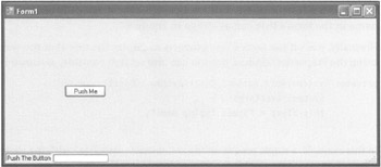
Figure 3.6: Unless you specify otherwise, Visual C++ allows users to alter the size of your application's window.
You can prevent this situation by controlling the form's border style using the FormBorderStyle property. Table 3.2 lists the available FormBorderStyle properties that your application can use.
| Value | Description |
|---|---|
| None | Displays the form without a border |
| FixedSingle | Sets up a fixed single-line form border |
| Fixed3D | Sets up a fixed three-dimensional form border |
| FixedDialog | Sets up a thick fixed-form border |
| Sizable | Sets up a resizable border |
| FixedToolWindow | Sets up a tool window border that cannot be resized |
| SizableToolWindow | Sets up a tool window border that can be resized |
| Hint | A tool window is one that does not appear in the Windows Taskbar when the application is running. |
Dynamically Altering Title Bar Messages
Chapter 2, "Navigating the Visual C++ 2005 Express Edition Environment," introduced you to the form's Text property. This field controls the display of the application or window's name in the form's title bar, as shown in Figure 3.7.
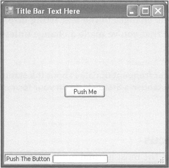
Figure 3.7: By default, Visual C++ displays a form's name in its title bar.
Normally, you set the form's Text property to display the title that you want at design time, using the Properties window. But you can also set it at runtime, as shown in the next listing.
private: System::Void button1_Click(System::Object^ sender, System::EventArgs^ e) { this->Text = "Speed Typing Game"; } In this example, a single programming statement is associated with the click event for button1. When the user clicks the button, the code updates the text in the title bar by assigning the string shown in quotes to the Text property, as illustrated in Figure 3.8.
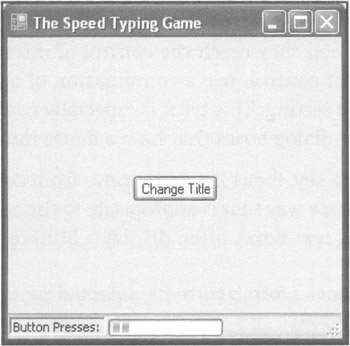
Figure 3.8: Programmatically changing the text string displayed in the window's title bar.
| Trick | Note the use of the keyword this in the previous example. The this keyword in Visual C++ is used inside of an object to gain access to the object's own properties and code. In the previous listing, using this inside of the button1_Click function of form1 gives you access to all of form1's properties and functions. |
Changing the contents of the text string for your application dynamically at runtime can be useful. You could, for instance, update a form's name to reflect the name of the file that a user has loaded. Microsoft Excel and Microsoft Word are two examples of applications that employ this technique whenever a user loads a new document. The advantage of doing this is that you use valuable and limited screen real estate to convey important information, but you do so without disturbing the user.
If you do use this capability, however, you should do so consistently and sparingly. In many applications, users do not expect dynamic changes to the text string displayed on the title bar. As such, they might not even notice that you've made a change unless changes are an expected convention of your application.
| Trick | If you want to send the user frequent updates about the status of his work in an application, you should establish a Status Strip on your form, as discussed later in this chapter. |
Controlling Tab Order and Focus
When users begin using your application, the most normal mode of interaction is to use the mouse to click or select the program's individual controls. However, in time, many users learn to use shortcuts to speed up their workflow. One such shortcut, used in many applications, is tabbing between controls. By pressing the Tab key on the keyboard, users can instantly switch to different controls. When they reach the control of interest, these power users normally, depending on the type of control, use a combination of arrow keys or the Enter key to set the control to the desired setting. This trick is especially common in applications that have numerous dialog boxes or dialog boxes that have a dense number of controls.
When the user repeatedly presses the Tab key, focus is said to move from control to control. The control in focus gives visual feedback in a way that is appropriate to the control's function. Buttons, for example, highlight, whereas text boxes often display a blinking cursor.
| Hint | Focus is the state that defines a form's currently selected control, which accepts and processes keyboard input. |
The tab ordering is determined by the way that you add controls to the form. Visual C++ keeps track of each control you place on a form by assigning it a tab index number. This means that the first control placed on a form is assigned an index number of zero, and subsequent controls are given a number that increases by one. So in theory, you could control the tab ordering on your application by keeping track of how you add controls to its form. But in practice, programmers find this a headache to manage. Instead, most prefer the freedom of designing their GUIs in a more freeform manner, adding, arranging, and even deleting controls as necessary and then specifying tab ordering later.
| Trick | If you change the default setting of a control's TabStop property, you can cause the control to be skipped when the user tabs through your controls. By default, each control's TabStop property is set to True; setting the property to False causes your application to exclude it from its internal List. |
One way that you can specify tab ordering is to do so manually. After you've added a control to a form, you can click on the control, open the Properties window, and locate the TabIndex property. By setting the property's value, you can control in which order your application gives it focus. If, for example, you give a control the value of 0, it is the first in focus when your application launches. You can then set the next control to a value of one higher, causing it to be the next in focus when the user presses the Tab key.
Manually assigning each control's TabIndex property has its drawbacks, however. One problem is that it can be a slow process to click on each control and scroll down to the correct property. Another is that it can be confusing to try to remember the ordering as you go along, which becomes more true when you build applications with many controls. The worst problem, however, is that manual specification doesn't prevent you from accidentally giving two or more controls the same index number. Visual C++ does not issue an error message in this case; instead, it reverts to some internal ordering scheme.
A faster way to specify the tab ordering is to place the IDE in a special mode that allows you to determine the order with a single mouse click on each control. To activate this mode, select the Tab Order option from the View menu. This tells Visual C++ to display boxed numbers in the upper-left corner of each control, which represent the ordering. See Figure 3.9 for an example.
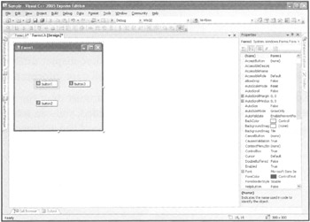
Figure 3.9: Modifying the default tab order of the controls Located on a Visual C++ form.
When the Tab Order viewing mode is selected, you can't move or otherwise edit your controls. When you click a control, however, you automatically alter its TabIndex property. The first control you click is assigned the value of 0, and each one thereafter is assigned a value of one greater. When you have clicked all controls, the count begins again, causing any control you click next to be assigned 0. After you are finished ordering all your controls, you can exit the Tab Order viewing mode by selecting its option a second time from the View menu.
Adding a Status Strip to Your Application
A great feature that can keep your users up to date on their work in your application is the Status Strip. A Status Strip is a window that displays real-time information as your application runs. It is typically located near the bottom of your application's window, but it can be positioned anywhere you expect the user to glance frequently as he is using your program. The information that is appropriate to put in a Status Strip depends on the type of application. A word processor, for instance, might show its user the current page number and line number, whereas a financial application might display the date and time of a particular transaction. Any information that you think the user will constantly want to know but not want to constantly look up is a good candidate for a Status Strip.
The StatusStrip control replaces the StatusBar control found in previous versions of Visual C++. It expands on the capabilities of the standard status bar by adding the ProgressBar, DropDownButton, and SplitButton controls.
| Trick | Although the IDE automatically places the Status Strip at the bottom of the form by default, you can move it to any edge of the form by setting the Dock property, which supports any of the following values: Right, Left, Top, Bottom, and Fill. |
A Status Strip can display different types of information, including hints, error messages, and icons. It can also be divided into panels that allow you to display different types of information. Figure 3.10 illustrates a form displaying time and date information.
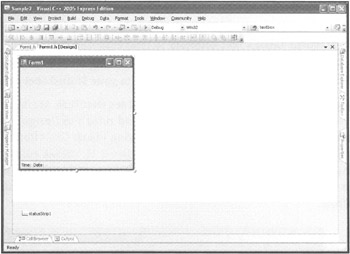
Figure 3.10: A Windows Status Strip displaying a time and date in two separate panels.
To add a Status Strip to your Visual C++ application, you must drag the StatusStrip control from the Toolbox to your application's form. After it's added, you can select the type of control you want to appear in the Status Strip by choosing one of the options shown in Table 3.3.
| Control | Description |
|---|---|
| StatusLabel | A text string to be displayed in the Status Strip |
| ProgressBar | A visual meter that you can fill to reflect the portion of a task that has been completed |
| DropDownButton | A vertical list containing programmer-defined options that the user can select from |
| SplitButton | A programmer-defined menu of buttons that can have submenus of buttons |
To better understand the Status Strip, let's create an example that uses two controls: StatusLabel and ProgressBar. This example shows you how to update text and the progress indicator dynamically.
-
Create a new Visual C++ application.
-
Add a Button control and a StatusStrip control to your application's form.
-
Modify the button's Text property to Push Me.
-
Select the statusStrip1 control, click the drop-down arrow, and select the StatusLabel control. This control, named toolstripStatusLabel1, is now part of your Status Strip.
-
Modify the Status Label's Text property to read Push the button.
-
Next, select the ProgressBar control by again clicking on the drop-down arrow. You will now have a ProgressBar control next to your StatusLabel control.
Press the F5 key to run your application. You should see that Push the button is displayed on the left in the Status Strip. Stop your application and return to Design mode. Now you will edit the controls you've added to the Status Strip using Visual C++'s Items Collection Editor. The Items Collection Editor, which is shown in Figure 3.11, makes editing controls easy. It groups all the information found in each control's Properties window in one screen and allows you to organize the position of controls. It also allows you to conveniently add and subtract controls.
-
Click on the Status Strip control. (Be sure not to select one of the controls within it.)
-
Under Data, locate the property named Items.
-
Click the word (Collection) to reveal the ellipsis (…) button, and select it. The Items Collection Editor dialog box appears, as shown in Figure 3.11.
-
Select the control named toolstripStatusLabel1.
-
Set the BorderSides property to All.
-
Modify the BorderStyle property from Flat to Sunken.
-
Click on OK to close the Items Collection Editor.
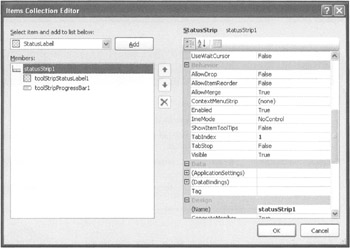
Figure 3.11: You can modify Status Strip controls directly or by using the Items Collection Editor.
| Trick | You can also activate the Item Collections Editor by right-clicking on a Status Strip and selecting Edit Items. |
Press F5 to run your application. The StatusLabel you added to your Status Strip is isolated in its own box, as is common in many applications. But the changes you can make to your Status Strip at design time are limited. To make the Status Strip truly useful, you must be able to alter its contents dynamically as your program runs. You can only do this in code.
To see an example of this, let's change the sample application's Status Strip information whenever the button is clicked. Double-click the button to bring up Visual C++'s Code Editor. Add the following code, shown in bold, which changes the text of the toolstripStatusLabel1 and toolstripProgressBar1 controls.
private: System::Void button1_Click(System::Object^ sender, System::EventArgs^ e) { toolStripStatusLabel1->Text = "Button Presses: "; toolStripProgressBar1->PerformStep(); } Press F5 to run your application again. The code you've added updates the ProgressBar dynamically by causing two of its controls to change in value each time the button1_Click function is activated. If you click on the button, you see the text within the status bar change to read Button Presses. Also, each time you press the button, the ProgressBar increments until the bar is filled. Figure 3.12 shows the result of several button presses.
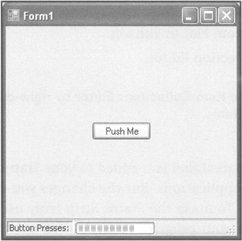
Figure 3.12: Status Strips provide an effective means of communicating important information as the application runs.
| Trick | If you want, you can create Status Strip controls that respond to user clicks. Just as with any control, you can double-click on the controls you've added to a Status Strip. Visual C++ activates the Code Editor and generates a click event function for the control you want to edit. For example, you could alter the toolstripStatusLabel1 control in the previous example to change the wording when clicked.
private: System::Void toolStripStatusLabel1_C1ick (System::Object^ sender, System::EventArgs^ e) { toolStripStatusLabel1->Text = "Label Clicked!"; } |
Posting a Notify Icon in the System Tray
The NotifyIcon control allows you to update the System Tray with an icon, as shown in Figure 3.13. Placing an icon in the System Tray gives your user an alternative means of receiving updates or communicating with your Visual C++ applications. You might, for example, want to post an icon in the System Tray to allow your application to inform the user that an error has occurred. Or you might create an application that manages the user's screen resolution and which appears in the System Tray each time Windows is started. You can even program your application to perform certain behaviors when your user clicks on the icon.
![]()
Figure 3.13: The Windows System Tray provides single- and double-click access to various Windows utilities, processes, and applications.
| Hint | The System Tray is the area of the Windows Taskbar that contains icons and is positioned on the right side, usually just to the left of the system clock. By default, it contains volume control options and any number of other icons based on active system processes or utilities and applications you have installed. |
You can add a NotifyIcon control to your application by selecting it from the Toolbox and dropping it onto your form. The NotifyIcon control, like the Timer control you added to the Click Race game in the previous chapter, appears just below your form, in the Component Tray. After it's added, you can access its properties, which include the following:
-
Icon. Specifies the name and location of the icon to be displayed n the System Tray
-
Text. Specifies text to be displayed as a ToolTip when the user moves the pointer over the icon
-
Visible. Enables or disables the display of the icon in the System Tray
By default, the Visible property is set equal to True at design time. This means that your application automatically posts the icon when it runs. However, even if you set the Visible property, you need to associate an icon with your application.
Here's an example to help illustrate how this works. Let's modify the sample application created in the previous section. When you follow the steps in the next section, the application posts an icon to the System Tray. It also can close when the user clicks the icon.
-
Add a NotifyIcon control from the Toolbox to the form. It appears in the Component Tray.
-
In the Properties window, set the Visible property to True.
-
Currently the application has no System Tray icon associated with it. Next to the Icon property, click the word None. Then click the ellipsis button (…) that appears.
-
In the Open File dialog box that appears, locate the file app.ico in the project's directory.
-
Select the file, and select Open.
-
Set the Text property to the name of your project. In this example, I'm simply using "Chapter 3 Example 1," but you can set the property to whatever message you like.
Try running your application by pressing F5. When the application launches, you see the icon appear in the System Tray. When you place your mouse cursor over it, you should also see the message you set in the Text property. Now let's add code to make it close the application when clicked.
Double-click the NotifyIcon control. This action causes Visual C++ to generate the notify Icon1_MouseDown function within Code Editor. Add the following code, in bold:
private: System::Void notifyIcon1_MouseDown(System::Object^ sender, System::Windows::Forms::MouseEventArgs^ e) { Close(); } Again, press F5 to run the application. When the icon appears in the System Tray, click it. The application should close as a result. Obviously, this simple example isn't very useful, but it illustrates that you can control your program through the icon you post in the System Tray.
Leveraging the Convenience of Built-In Dialog Boxes
Many applications need to interact with their user to display information dynamically. Applications can present this information on a form or within a separate window. Visual C++ provides a convenient way of implementing separate windows in the form of dialog boxes. Often, you can initiate dialog boxes with minimal code. This section covers one of the simplest and easiest to implement.
The MessageBox::Show Method
You learned in previous chapters how to alter TextBox and Label controls to display information to the user as your application runs. But what if you need to give important information to them that you want to make certain they don't miss? A dialog box can be especially useful in this case. Applications frequently use dialog boxes to show information such as alerts, notices, and error messages.
To show a dialog box that displays a message, Visual C++ uses the MessageBox::Show method. The MessageBox::Show method is functionality provided by the .NET Framework to display standard Windows notification dialog boxes. It displays a window, an icon, and an optional number of buttons, as shown in the example in Figure 3.14.
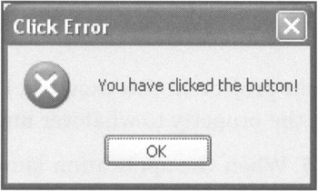
Figure 3.14: The MessageBox——Show method is perfect for displaying a small amount of text.
The MessageBox::Show method comes in a wide variety of formats. You can send it a simple text message consisting of a single line of text, or you can control the title of the message, the number of buttons, and the type of icon it uses. Actually, the MessageBox::Show method has exactly 21 different variants. Each of these variants indicates a different way to use the method. As an example, look at Figure 3.15 to see what happens when you type MessageBox::Show( (type just the opening parenthesis). IntelliSense activates, offering guidance on the possible formats. Note the up and down arrows bordering the text reading 1 of 21. You can use both arrows to scroll through all the different format possibilities.
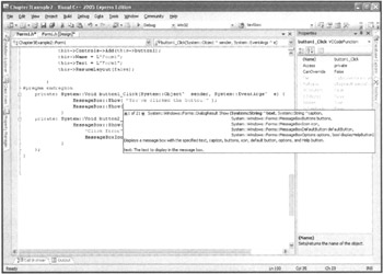
Figure 3.15: Twenty-one different formats of the MessageBox——Show methods are supported.
Regardless of which format you choose to use, all require the same basic information to execute. Table 3.4 illustrates the parameters required.
| Parameter | Description |
|---|---|
| Text | The text string to be displayed in the pop-up window |
| Caption | The text string to be displayed in the pop-up window's title bar |
| Buttons | The button or group of buttons to be displayed in the pop-up window |
| Icon | The type of icon to be displayed in the pop-up window |
| DefaultButton | The button to serve as the default button |
| Options | Display options that affect how the pop-up window and its text are displayed |
The Text and Caption parameters are simply text strings. You can place any message you like in quotes. The dialog box attempts to accommodate the size of the text you supply for the Text option of the message, but you should try to keep the message brief. This is even truer for the Caption option, which is limited to the width of the title bar and might be cut off if it's extremely long.
The Buttons parameter is slightly more complex. You can use it to specify any of six different sets of buttons. However, you access the options through a namespace that holds each of the button choices. To access this namespace, you must type MessageBoxButtons::, which reveals the types of buttons that the message box understands. IntelliSense automatically activates to show all options within the namespace. To create a dialog box with an OK button, for instance, type MessageBoxButtons::OK. Table 3.5 shows the available options.
| Button | Description |
|---|---|
| AbortRetrylgnore | Displays an Abort, a Retry, and an Ignore button |
| OK | Displays an OK button |
| OKCancel | Displays an OK and a Cancel button |
| RetryCancel | Displays a Retry and a Cancel button |
| Yes/No | Displays a Yes and a No button |
| YesNoCancel | Displays a Yes, a No, and a Cancel button |
| Hint | A namespace holds and hides information that relates to a specific programming task, such as defining message box buttons. You access the hidden information by using the name of the namespace, followed by two colons. |
| Trick | Whenever you see two colons dividing two words in Visual C++ code, you are seeing a namespace being used. Namespaces are a central feature of Microsoft Visual C++ 2005 Express Edition that provides access to almost all the functionality of .NET. IntelliSense reveals all the code and data options available within a namespace as soon as you type a namespace it recognizes followed by two colons. |
The MessageBox::Show method also allows you to display an icon. Icons provide users with quick visual feedback as to the nature of the dialog box you have presented. You access the message box icons through the MessageBoxIcon namespace. If you type MessageBoxIcon::, IntelliSense activates, showing several options. For example, to have your dialog box display an error icon, you type MessageBoxIcon::Error. Table 3.6 identifies the various icons supported.
| Button | Description |
|---|---|
| Asterisk | Displays an Asterisk icon |
| Error | Displays an Error icon |
| Exclamation | Displays an Exclamation Mark icon |
| Hand | Displays a Hand icon |
| Information | Displays an Informational icon |
| None | Displays the pop-up window without displaying an icon |
| Question | Displays a Question Mark icon |
| Stop | Displays a Stop icon |
| Warning | Displays a Warning icon |
Visual C++ also allows you to specify which button is the default. This is a convenience that allows the users to simply press Enter to select the most likely response to the dialog box you present them with. You specify which button to make the default button by position, prefacing the button name with MessageBoxButton::.If, for instance, you have a dialog box that has both an OK and a Cancel button and you want the focus to be on the Cancel button by default, specify MessageBoxButton::Button2. (You might need to look at how each dialog box uses the various button options to determine which is the first, second, and if applicable, third button.) Table 3.7 lists the available selections.
| Button | Description |
|---|---|
| Button1 | Makes the first button the default |
| Button2 | Makes the second button, if present, the default |
| Buttons3 | Makes the third button, if present, the default |
You can also specify any of the values listed in Table 3.8 for the Options parameter. You must preface these by the specifying code MessageBoxOptions::. For example, if you want to right align the text, specify MessageBoxOptions::RightAlign.
| Button | Description |
|---|---|
| DefaultDesktopOnly | Displays the pop-up window on the active desktop |
| RightAlign | Displays the text in the pop-up window as right aligned |
| RtlReading | Displays the text in the pop-up window as left aligned |
To help make the Messagesox:: Show method a bit easier to understand, look at a few code examples that you can use in your own code. The first creates a pop-up window that asks the user a question, displaying Yes and No buttons and the Stop icon. The Yes button is the default button, and the text is aligned to the right (including the caption text).
MessageBox::Show("Click on Yes to continue or No to Stop.", "MessageBox::Show Example 1", MessageBoxButtons::YesNo, MessageBoxIcon::Stop, MessageBoxDefaultButton::Button1, MessageBoxOptions::RightAlign); When executed, this example generates the pop-up window shown in Figure 3.16.
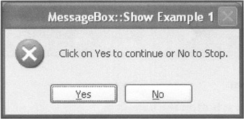
Figure 3.16: Prompting the user for permission to continue.
Next, let's look at an example using only two parameters. As the following statements show, the MessageBox::Show method is supplied with only the Text and Caption parameters.
MessageBox::Show("This is an informational message.", "MessageBox::Show Example 2"); When executed, this example generates the pop-up window shown in Figure 3.17.
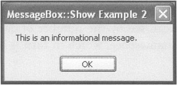
Figure 3.17: Displaying a simple informational message.
In addition to displaying informational messages, you can use the MessageBox::Show method to capture the user's response, as demonstrated in the following example.
Windows::Forms::DialogResult buttonClicked; button Clicked = MessageBox::Show("Please click on a button", "MessageBox::Show example 3", MessageBoxButtons::AbortRetryIgnore); MessageBox::Show( String::Concat( "You clicked on the ", buttonClicked, " button." ) ); In this example, the user is asked to click on one of the three buttons that the pop-up window displays. A value representing the button that the user clicked is assigned to a variable name buttonClicked. When the user selects from the three buttons that are presented, a second MessageBox::Show method is called to display the user's response. Figure 3.18 shows the first dialog box displaying the three available options, and Figure 3.19 illustrates one of the choices being made.
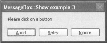
Figure 3.18: Prompting the user to select from three options.
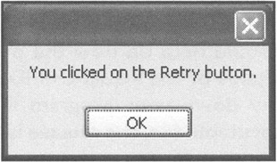
Figure 3.19: Viewing the results of the button selection the user made.
| Hint | A variable stores data (such as a string or integer) needed by your application as it runs. |
As you can see in Figure 3.19, the MessageBox::Show method displays the name of the button clicked. Table 3.9 defines the range of values that the MessageBox::Show method might perform. These values are found in the DialogResult namespace. To access this namespace, type Windows::Forms::DialogResult. (As you can see by the number of double semicolons, DialogResult is contained within the Forms namespace, which in turn is contained within the Windows namespace.)
| Value | Description |
|---|---|
| OK | The OK button was pressed. |
| Cancel | The Cancel button was pressed. |
| Abort | The Abort button was pressed. |
| Retry | The Retry button was pressed. |
| Ignore | The Ignore button was pressed. |
| Yes | The Yes button was pressed. |
| No | The No button was pressed. |
| None | The dialog box was closed without a button being pressed. |
EAN: N/A
Pages: 131
- Using SQL Data Definition Language (DDL) to Create Data Tables and Other Database Objects
- Using SQL Data Manipulation Language (DML) to Insert and Manipulate Data Within SQL Tables
- Working with Functions, Parameters, and Data Types
- Understanding SQL Subqueries
- Understanding Transaction Isolation Levels and Concurrent Processing