Layouts
Overview
Layouts can be used to manage the position and size of children in composites. This chapter provides a brief overview and definition of layouts. Then you learn about four standard layouts and one custom layout provided in SWT:
- FillLayout
- RowLayout
- GridLayout
- FormLayout
- StackLayout
The last section of this chapter explains how to create your own layouts.
Introduction to Layouts
A layout can be used to control the position and size of children of a composite. For a composite without a layout, you, the developer, have to set the bounds of each of its children one by one. When the composite is resized, you have to update the position and size of its children. Layouts relieve you of the tedious task of controlling positioning and sizing. If you're used to layouts in Swing, SWT layouts should be refreshingly easy to use.
General Terms
A layout defines an algorithm positioning children of a composite into its client area. In SWT, all layouts must extend the org.eclipse.swt.widgets.Layout class. SWT provides four standard layouts, which are covered later in this chapter. Before going into detail about layouts, you need to understand a few terms that are used frequently when discussing layouts:
- Client area: The client area of a composite is the area that is capable of displaying data. Usually, the size of the client area is the size of the composite's bounds minus its trim, as shown in Figure 6-1.
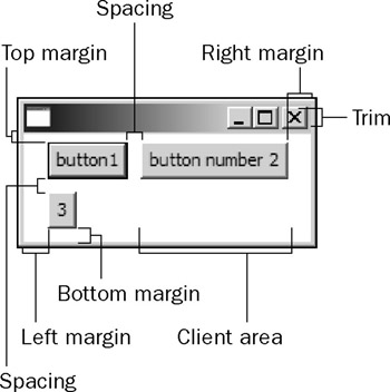
Figure 6-1 - Margins: A margin specifies the number of pixels that will be placed on a certain side between the edge of the layout and the border of the composite's client area. Some layouts such as the RowLayout allow you specify all of the four margins: the top margin, the bottom margin, the left margin, and the right margin. Other layouts allow you to specify only the horizontal margin and the vertical margin because the size of the top margin is equal to that of the bottom margin and the same rule applies to the left margin and the right margin.
- Spacing: Spacing specifies the number of pixels between the edges of children of a composite.
- Preferred size: The preferred size of a control is the size that it would best be displayed at.
Usually, this preferred size is also the minimum size that is required to display the control. If a control is a composite, its preferred size is computed in this way: The layout is asked to compute the "best" size of a client area where its children will be displayed, and the preferred size is determined by adding the preferred client area and the trim.
Setting Layouts
You can use the following methods to get and set a composite's layout:
 public Layout getLayout()
 public void setLayout(Layout layout)
By default, a composite does not have any layout. To set a layout for a composite, you need to pick a proper layout and pass an instance of the selected layout class to the composite's setLayout method. To remove the layout of a composite, you can call the setLayout method with null as the argument.
Layout Data Objects
Some layout classes have corresponding layout data classes to enable you to achieve fine UI layout control over children of composites. You can associate a layout's data to a specific child control. For example, the following code enables the text control to grab excess horizontal space:
 Shell shell = new Shell();
 shell.setLayout(new GridLayout()); // Only with GridLayout you can use GridData
 Text text = new Text(shell, SWT.SINGLE);
 Text.setLayoutData(new GridData(GridData.GRAB_HORIZONTAL));
The methods in the Control class to get and set layout data are:
 public Object getLayoutData()
 public void setLayoutData(Object layoutData)
The corresponding layout data, if any, for each standard layout will be introduced in the next few sections.
Laying Out Children of a Composite
In most cases, you do not have to explicitly lay out children of a composite. For example, when a composite is resized, its layout is automatically called and lays out its children according to the new size.
Sometimes, you may need to explicitly force the layout to lay out the children — for example, if the contents of a composite change. The following method can be used to lay out the children of a composite:
public void layout(boolean changed)
Setting the changed flag to true forces the layout to refresh any cached information about its children. If the changed flag is false, the layout may rely on the cached information. On Windows, the information about the children is always updated regardless of the value of the changed flag. The following method of the Composite class is equivalent to layout(true):
public void layout()
Figure 6-2 shows the sample application. When the user clicks the "Add new button" button, a new button is created and put into the composite on the left.
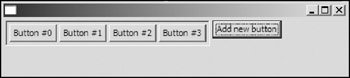
Figure 6-2
The code snippet for the sample application is as follows:
 Display display = new Display();
 Shell shell = new Shell(display);
 shell.setLayout(new RowLayout());

 final Composite composite = new Composite(shell, SWT.BORDER);
 composite.setLayout(new RowLayout());
 composite.setBackground(display.getSystemColor(SWT.COLOR_YELLOW));

 Button buttonAdd = new Button(shell, SWT.PUSH);
 buttonAdd.setText("Add new button");
 buttonAdd.addSelectionListener(new SelectionAdapter() {
 public void widgetSelected(SelectionEvent e) {
 Button button = new Button(composite, SWT.PUSH);
 button.setText("Button #" + (count++));
 shell.layout(true);
 }
 });
When the buttonAdd button is clicked, a new button is created with the composite as its parent. Then shell.layout(true) is called, which causes the shell to lay out its children, i.e., the composite and the buttonAdd button. The layout of the shell finds that the preferred size of the composite has changed. The layout then allocates new space for the composite. After the layout of the shell finishes setting size and location for the composite and the buttonAdd button, it then notifies the composite to resize itself. The layout of the composite then lays out all of its children in a similar way.
If you change the shell.layout(true) line to composite.layout(true), the composite will not resize and thus you will not be able to see the newly created button because the layout of a composite has no effect on the composite's parent.
Changing the shell.layout(true) to shell.pack(true) makes the shell resize itself to its preferred size before its children are laid out.
What about composite.pack(true)? If you use composite.pack(true), the composite resizes itself as expected; however, it does not take care of the buttonAdd button. After one or two buttons are added, the buttonAdd button will be hidden behind the composite. This is not desired, so you should use shell.layout(true) or shell.pack(true) here.
As a general guideline, if the content of a control changes, you should perform the layout operation on its ancestors instead of the control itself.
Using FillLayouts
FillLayout is a very simple layout. It lays out controls of a composite into a single row or column (without wrap) and forces all the children to be the same size. A FillLayout lays out the children into the whole client area of a composite.
In the beginning, all the controls will be set as tall as the tallest control and as wide as the widest. You can specify the margins and spacing properties. There are no corresponding layout data types for this kind of layout. The primary usage of FillLayouts is laying out controls in task bars and toolbars.
To use a FillLayout, you create it first:
FillLayout fillLayout = new FillLayout(SWT.HORIZONTAL);
The preceding line creates a FillLayout that lays out controls in a row. You can replace the SWT.HORIZONTAL style with SWT.VERTICAL to create a FillLayout that lays out controls in a column. You can also configure the layout orientation by using the type field of the FillLayout class:
 fillLayout.type = SWT.HORIZONTAL // Laying out the children in a row

 fillLayout.type = SWT.VERTICAL // Laying out the children in a column
Then, you can define the margins and spacing properties. Note that the default (initial) value of each property is 0.
 // Width of horizontal margins placed along the left and right edges
 fillLayout.marginWidth = 5;

 // Height of vertical margins placed along the top and bottom edges
 fillLayout.marginHeight = 5;

 // Number of pixels between the edge of a cell and edges of its neighboring cells
 fillLayout.spacing = 1;
Now, you can set the layout to a composite:
shell.setLayout(fillLayout)
After you associate a layout to a composite, you can still modify the layout's properties. Let's add some controls on the shell:
 Button button1 = new Button(shell, SWT.PUSH);
 button1.setText("button1");

 Button button2 = new Button(shell, SWT.PUSH);
 button2.setText("button number 2");

 Button button3 = new Button(shell, SWT.PUSH);
 button3.setText("3");

 shell.pack();
 shell.open();
 ...
Figures 6-3 and 6-4 show the shell with a horizontal FillLayout and a vertical FillLayout, respectively.
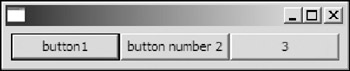
Figure 6-3
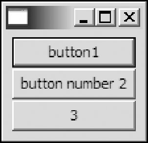
Figure 6-4
Using RowLayout
RowLayout offers several more features over FillLayouts. A RowLayout is capable of wrapping controls, and it can also lay out controls into different sizes. You can customize a RowLayout by modifying the values of its properties (i.e., the fields of the RowLayout class).
Properties of RowLayouts
The properties of Rowlayout are as follows:
- fill: Specifies whether all the controls in a row should share the same height if the type of this layout is HORIZONTAL; otherwise, it indicates whether all the controls in a column should share the same width. The default value is false.
- justify: Specifies whether the controls in a row should be justified. The default value is false.
- marginLeft, marginRight, marginTop, marginBottom: Specify the size of the left margin, the right margin, the top margin, and the bottom margin in pixels. The default value for each of the margins is 3.
- pack: Specifies whether all controls should take their preferred size. If pack is set to true, all controls have the same size, which is the size required to accommodate the largest preferred height and the largest preferred width of all the controls. The default value is true.
- spacing: Specifies the space between controls in pixels.
- type: Specifies whether the layout places controls in rows or columns. The default value is
HORIZONTAL. The other possible value is VERTICAL.
- wrap: Specifies whether controls will be wrapped to the next row or column if there is not enough space left on the current row or column. The default value is true.
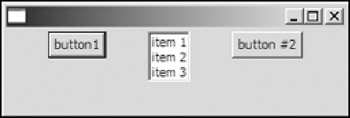
The following table shows how the layout properties affect the display of controls.
|
Layout Properties |
With Default Value |
With the Other Value |
|---|---|---|
|
Fill |
|
|
|
Justify |
|
|
|
Pack |
|
|
|
Type |
|
|
|
Wrap |
|
|
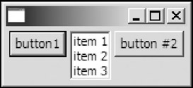
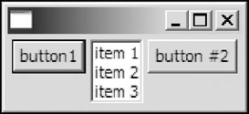

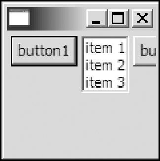
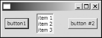
The corresponding code to generate the preceding GUIs is as follows:
 ...
 Shell shell = new Shell(display);

 RowLayout rowLayout = new RowLayout();
 //rowLayout.fill = true; // Overriding default values.
 //rowLayout.justify = true;
 //rowLayout.pack = false;
 //rowLayout.type = SWT.VERTICAL;
 //rowLayout.wrap = false;

 shell.setLayout(rowLayout);

 Button button1 = new Button(shell, SWT.PUSH);
 button1.setText("button1");

 List list = new List(shell, SWT.BORDER);
 list.add("item 1");
 list.add("item 2");
 list.add("item 3");

 Button button2 = new Button(shell, SWT.PUSH);
 button2.setText("button #2");

 //shell.setSize(120, 120);
 shell.pack();
 shell.open();
 ...
Using RowData Objects
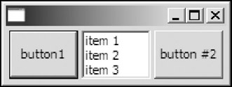
The corresponding layout data type for the RowLayout class is the RowData class. You can use a RowData object to specify the initial width and height of a control. The following code modifies the preceding code by associating a RowData object to change the initial size of the first button in the shell, as shown in Figure 6-5.
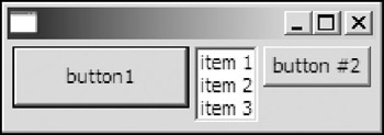
Figure 6-5
 ...
 Button button1 = new Button(shell, SWT.PUSH);
 button1.setText("button1");
 button1.setLayoutData(new RowData(100, 35));
 ...
Layout data objects should not be reused in SWT/JFace, unlike the usage in Swing. The implementations of layout data objects in SWT/JFace and Swing are simply different.
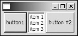
Using GridLayouts
A GridLayout lays out the children of a composite in a grid. GridLayout is the most powerful standard layout and it is also the most complicated, but don't worry. It's actually quite intuitive once you understand the fundamentals of how it works. SWT GridLayouts give you lots of layout power without the same pain as a Swing GridBagLayout.
Properties of GridLayouts
The properties of GridLayout are as follows:
- horizontalSpacing, verticalSpacing: Specify the horizontal spacing and vertical spacing between controls in a layout. The default value for each of them is 5.
- marginHeight, marginWidth: Specify the horizontal margin and vertical margin of the layout.
The default value for each of them is 5.
- numColumns: Specifies the number of cell columns in the layout. The default value is 1.
- makeColumnsEqualWidth: Specifies whether all columns should be forced to have the same width as the widest cell. The default value is false.
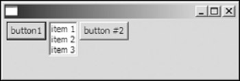
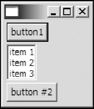
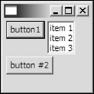
The following table shows how the property configurations of a GridLayout affect the final layout of controls.
|
Property Configuration |
Display |
|---|---|
[Defaults] numColumns = 1 makeColumnsEqualWidth = false |
|
numColumns = 3 makeColumnsEqualWidth = true |
|
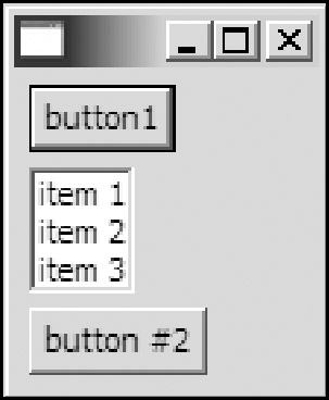
The code to generate a GUI is listed here:
 ...
 Shell shell = new Shell(display);

 GridLayout gridLayout = new GridLayout();
 // gridLayout.numColumns = 3;
 // gridLayout.makeColumnsEqualWidth = true;

 shell.setLayout(gridLayout);

 Button button1 = new Button(shell, SWT.PUSH);
 button1.setText("button1");

 List list = new List(shell, SWT.BORDER);
 list.add("item 1");
 list.add("item 2");
 list.add("item 3");

 Button button2 = new Button(shell, SWT.PUSH);
 button2.setText("button #2");

 ...
The properties of the GridLayout offer very limited customization. The power of the GridLayout lies in the flexible configurations of GridData objects.
Using GridData Objects
The GridData class is the layout data type associated with the GridLayout class. As you have seen in previous sections, you can call a control's setLayoutData method to set a control's GridData object.
The GridData class enables you to configure its properties through the constructors or its fields. For example, the following code creates a GridData object:
 GridData gridData = new GridData();
 gridData.horizontalAlignment = GridData. END;
 gridData.verticalAlignment = GridData.BEGINNING;
However, this code has a problem. All of the constants containing the text HORIZONTAL or VERTICAL are intended to be used in constructors only. If you assign such constants directly to the fields of GridData objects, you may get unexpected layout data configurations. So the only acceptable way to create a GridData instance with horizontal and vertical alignment characteristics is as follows:
 GridData gridData = new GridData(
 GridData.HORIZONTAL_ALIGN_END
 | GridData.VERTICAL_ALIGN_BEGINNING
 );
Horizontal Alignment and Vertical Alignment
The horizontalAlignment and verticalAlignment fields of GridData specify how a control is positioned horizontally and vertically in a cell.
Several possible values for horizontalAlignment are as follows:
- BEGINNING: Left-aligned (the default value)
- CENTER: Center-aligned
- END: Right-aligned
- FILL: Filling all the available horizontal space
Figure 6-6 shows layout data objects of controls using different horizontal alignment configurations. The first button is left-aligned; the list is center-aligned; the second button is right-aligned; and the third button is stretched to fill the horizontal space.
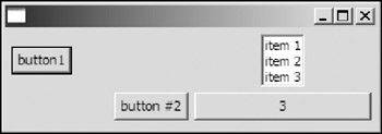
Figure 6-6
The code to generate a GUI is as follows:
 GridLayout gridLayout = new GridLayout();
 gridLayout.numColumns = 2;
 gridLayout.makeColumnsEqualWidth = true;

 shell.setLayout(gridLayout);

 Button button1 = new Button(shell, SWT.PUSH);
 button1.setText("button1"); // Default alignment

 List list = new List(shell, SWT.BORDER);
 list.add("item 1");
 list.add("item 2");
 list.add("item 3");
 list.setLayoutData(new GridData(GridData.HORIZONTAL_ALIGN_CENTER));

 Button button2 = new Button(shell, SWT.PUSH);
 button2.setText("button #2");
 button2.setLayoutData(new GridData(GridData.HORIZONTAL_ALIGN_END));

 Button button3 = new Button(shell, SWT.PUSH);
 button3.setText("3");
 button3.setLayoutData(new GridData(GridData.HORIZONTAL_ALIGN_FILL));
 ...
The verticalAlignment functions in exactly the same way as the horizontalAlignment does, except it is used to specify the vertical positioning.
Possible values for verticalAlignment include the following:
- BEGINNING: Top-aligned
- CENTER: Center-aligned (the default value)
- END: Bottom-aligned
- FILL: Filling all the available vertical space
Figure 6-7 shows the four controls (from left to right) with the following vertical alignment configurations: BEGINNING, CENTER, END, and FILL.
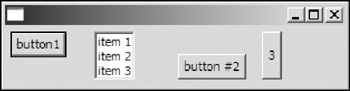
Figure 6-7
Horizontal Indentation
The horizontalIndent field specifies the number of pixels of indentation that is placed along the left side of the cell. The default value is 0.
In Figure 6-8, the second button has a 5-pixel horizontal indentation.
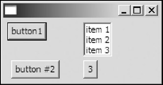
Figure 6-8
The corresponding code is:
 GridData gridData = new GridData(GridData.VERTICAL_ALIGN_END);
 gridData.horizontalIndent = 5;
 button2.setLayoutData(gridData);
Horizontal Span and Vertical Span
The horizontalSpan and verticalSpan fields can be used to specify the number of column cells and the number of row cells that a control takes up. The default value for each of them is 1.
For example, in Figure 6-9, the second button spans two columns horizontally.
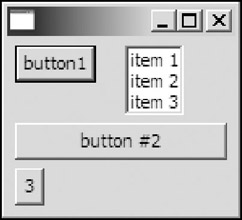
Figure 6-9
The corresponding code is:
 Button button2 = new Button(shell, SWT.PUSH);
 button2.setText("button #2");
 GridData gridData = new GridData(GridData.VERTICAL_ALIGN_END);
 gridData.horizontalSpan = 2;
 gridData.horizontalAlignment = GridData.FILL;
 button2.setLayoutData(gridData);
Grabbing Excess Space
The grabExcessHorizontalSpace and grabExcessVerticalSpace properties allow controls to grow if their parent composite grows. Of course, when the parent composite gets smaller, the controls with grab space properties set shrinks. Because cells in the same column share the same width and cells in the same row share the same height, when a control grabs excess space, the entire column or row grows, too. Usually, you enable these properties with controls such as Text, List, Tree, Table, or Canvas.
The default value of each of the two properties is false.
For example, the following code causes the text field to grab excess horizontal space, as shown in Figure 6-10.
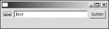
Figure 6-10
 Display display = new Display();
 Shell shell = new Shell(display);

 GridLayout gridLayout = new GridLayout();
 gridLayout.numColumns = 3;
 shell.setLayout(gridLayout);

 Label label = new Label(shell, SWT.BORDER);
 label.setText("label");

 Text text = new Text(shell, SWT.SINGLE | SWT.BORDER);
 text.setText("text");

 GridData gridData = new GridData();
 gridData.grabExcessHorizontalSpace = true;
 gridData.horizontalAlignment = GridData.FILL;
 text.setLayoutData(gridData);

 Button button = new Button(shell, SWT.PUSH);
 button.setText("button");

 shell.setSize(300, 80);
 shell.open();
Here's the preceding code modified to enable both the text field and the button to grab excess vertical space, as shown in Figure 6-11:
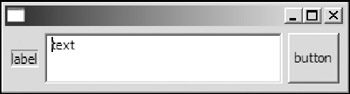
Figure 6-11
 ...
 Text text = new Text(shell, SWT.SINGLE | SWT.BORDER);
 text.setText("text");

 GridData gridData = new GridData();
 gridData.grabExcessHorizontalSpace = true;
 gridData.grabExcessVerticalSpace = true;
 gridData.horizontalAlignment = GridData.FILL;
 gridData.verticalAlignment = GridData.FILL;
 text.setLayoutData(gridData);

 Button button = new Button(shell, SWT.PUSH);
 button.setText("button");

 GridData gridData2 = new GridData();
 gridData2.grabExcessVerticalSpace = true;
 gridData2.verticalAlignment = GridData.FILL;
 button.setLayoutData(gridData2);
 ...
If more than one control are grabbing excess space, the excess space is distributed to them evenly. For example, the following code makes both the text and the button grab excess horizontal space, as shown in Figure 6-12.
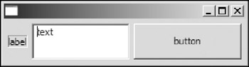
Figure 6-12
 Text text = new Text(shell, SWT.SINGLE | SWT.BORDER);
 text.setText("text");

 GridData gridData = new GridData();
 gridData.grabExcessHorizontalSpace = true;
 gridData.grabExcessVerticalSpace = true;
 gridData.horizontalAlignment = GridData.FILL;
 gridData.verticalAlignment = GridData.FILL;

 text.setLayoutData(gridData);

 Button button = new Button(shell, SWT.PUSH);
 button.setText("button");

 GridData gridData2 = new GridData();
 gridData2.grabExcessVerticalSpace = true;
 gridData2.grabExcessHorizontalSpace = true;
 gridData2.verticalAlignment = GridData.FILL;
 gridData2.horizontalAlignment = GridData.FILL;

 button.setLayoutData(gridData2);
 ...
Size Hints
You can use widthHint and heightHint to specify the minimum width and height of a control. The default value for them is SWT.DEFAULT, indicating that no minimum width or height is specified.
Now modify the code used previously to set the size hints for the label:
 Label label = new Label(shell, SWT.BORDER);
 label.setText("label");

 GridData gridData3 = new GridData();
 gridData3.widthHint = 60;
 gridData3.heightHint = 20;

 label.setLayoutData(gridData3);
 ...
The display is shown in Figure 6-13.
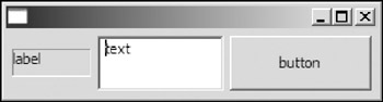
Figure 6-13
A Sample GUI Using GridLayouts
To get you familiar with GridLayout and GridData objects, you can build a book entry program. Figure 6-14 shows a sketch of the GUI. First, determine the total number of columns for the grid and the position of each of the controls.
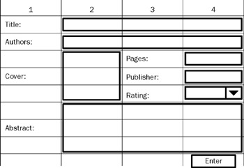
Figure 6-14
Now, you can start coding the program:
 Display display = new Display();
 Shell shell = new Shell(display);

 shell.setText("Book Entry Demo");

 GridLayout gridLayout = new GridLayout(4, false);
 gridLayout.verticalSpacing = 8;

 shell.setLayout(gridLayout);

 // Title
 Label label = new Label(shell, SWT.NULL);
 label.setText("Title: ");

 Text title = new Text(shell, SWT.SINGLE | SWT.BORDER);
 GridData gridData =
 new GridData(GridData.HORIZONTAL_ALIGN_FILL);
 gridData.horizontalSpan = 3;
 title.setLayoutData(gridData);

 // Author(s)
 label = new Label(shell, SWT.NULL);
 label.setText("Author(s): ");

 Text authors = new Text(shell, SWT.SINGLE | SWT.BORDER);
 gridData =
 new GridData(GridData.HORIZONTAL_ALIGN_FILL);
 gridData.horizontalSpan = 3;
 authors.setLayoutData(gridData);

 // Cover
 label = new Label(shell, SWT.NULL);
 label.setText("Cover: ");

 gridData = new GridData();
 gridData.verticalSpan = 3;
 label.setLayoutData(gridData);

 CLabel cover = new CLabel(shell, SWT.NULL);

 gridData =
 new GridData(GridData.FILL_HORIZONTAL);
 gridData.horizontalSpan = 1;
 gridData.verticalSpan = 3;
 gridData.heightHint = 100;
 gridData.widthHint = 100;

 cover.setLayoutData(gridData);

 // Details.
 label = new Label(shell, SWT.NULL);
 label.setText("Pages");

 Text pages = new Text(shell, SWT.SINGLE | SWT.BORDER);
 pages.setLayoutData(new GridData(GridData.HORIZONTAL_ALIGN_FILL));

 label = new Label(shell, SWT.NULL);
 label.setText("Publisher");

 Text publisher = new Text(shell, SWT.SINGLE | SWT.BORDER);
 publisher.setLayoutData(new GridData(GridData.HORIZONTAL_ALIGN_FILL));

 label = new Label(shell, SWT.NULL);
 label.setText("Rating");

 Combo rating = new Combo(shell, SWT.READ_ONLY);
 rating.setLayoutData(new GridData(GridData.HORIZONTAL_ALIGN_FILL));
 rating.add("5");
 rating.add("4");
 rating.add("3");
 rating.add("2");
 rating.add("1");

 // Abstract.

 label = new Label(shell, SWT.NULL);
 label.setText("Abstract:");

 Text bookAbstract =
 new Text(
 shell,
 SWT.WRAP
 | SWT.MULTI
 | SWT.BORDER
 | SWT.H_SCROLL
 | SWT.V_SCROLL);
 gridData =
 new GridData(
 GridData.HORIZONTAL_ALIGN_FILL | GridData.VERTICAL_ALIGN_FILL);
 gridData.horizontalSpan = 3;
 gridData.grabExcessVerticalSpace = true;

 bookAbstract.setLayoutData(gridData);

 // Button.
 Button enter = new Button(shell, SWT.PUSH);
 enter.setText("Enter");

 gridData = new GridData();
 gridData.horizontalSpan = 4;
 gridData.horizontalAlignment = GridData.END;
 enter.setLayoutData(gridData);

 // Fill up information.
 title.setText("Professional Java Interfaces with SWT/JFace");
 authors.setText("Jack Li Guojie");
 pages.setText("500pp");
 publisher.setText("John Wiley & Sons");
 cover.setBackground(new Image(display, "X:\web\img\photo.jpg"));
 bookAbstract.setText("This book provides a comprehensive guide for
" +
 "you to create Java user interfaces with SWT/JFace. ");
 shell.pack();
 shell.open();
The initial display and the display after resizing are shown in Figure 6-15 and Figure 6-16, respectively.
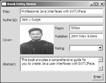
Figure 6-15
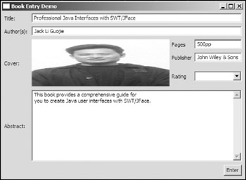
Figure 6-16
You should be very careful when you use grabExcessHorizontalSpace and grabExcessVertical Space options. In the demo program, only two controls have such properties set:
- The CLabel used to display the book cover: grabExcessHorizontalSpace = true
- The Text control used to display the abstract: grabExcessVerticalSpace = true
Obviously, the text fields used to display the title and authors should grab excess horizontal space. However, you should not explicitly set these properties for them. Because the title text spans three columns, including the column in which the CLabel belongs, if that column grabs excess horizontal space, the title text grabs excess horizontal space as a result. If you explicitly set the grabExcessHorizontalSpace of the title text's layout object to true, you will find that the CLabel as well as the text fields and the combo resize when the shell is resized.
A final note: You should fully understand the meaning and impact of a constant before using it in the constructors:
- HORIZONTAL_ALIGN_BEGINNING, HORIZONTAL_ALIGN_CENTER, HORIZONTAL_ALIGN_END, HORIZONTAL_ALIGN_FILL: Set the horizontalAlignment field to value BEGINNING, CENTER, END, and FILL, respectively.
- VERTICAL _ALIGN_BEGINNING, VERTICAL _ALIGN_CENTER, VERTICAL _ALIGN_END, VERTICAL
_ALIGN_FILL: Set the verticalAlignment field to value BEGINNING, CENTER, END, and FILL, respectively.
- GRAB_HORIZONTAL: Sets the grabExcessHorizontalSpace field to true.
- GRAB_VERTICAL: Sets the grabExcessVerticalSpace field to true.
- FILL_HORIZONTAL: Sets the horizontalAlignment field to FILL and grabExcessHorizontalSpace to true.
- FILL_VERTICAL: Sets the verticalAlignment field to FILL and grabExcessVerticalSpace to true.
- FILL_BOTH: Sets the horizontalAlignment field and the verticalAlignment field to FILL and the grabExcessHorizontalSpace field and the grabExcessVerticalSpace field to true.
Using FormLayouts
The FormLayout is another sophisticated layout. A FormLayout controls the position and size of the children of a composite by using FormAttachment objects to configure the left, right, top, and bottom edge of each child. A FormAttachment attaches a side of the control either to a position in the parent composite or to one of its sibling controls within the layout. Without FormAttachment objects, FormLayouts are useless.
The FormLayout allows you to configure the following properties:
- marginHeight: Specifies the size of the vertical margin in pixels. The default value is 0.
- marginWidth: Specifies the size of the horizontal margin in pixels. The default value is 0.
- spacing: Specifies the number of pixels between the edge of one control and the edge of its neighboring control. The default value is 0.
FormData Objects and FormAttachment Objects
FormData objects specify how controls should be laid out. A FormData object can be used to define the preferred size and the attachments for four sides of the control. The FormAttachment objects are used to control the position and size of the control.
You can set the preferred width and height of the control by setting the following properties of the FormData object:
- width
- height
To configure the attachment of each side, you need to set the following properties with proper FormAttachment objects:
- top: Specifies the attachment of the top of the control.
- bottom: Specifies the attachment of the bottom of the control.
- left: Specifies the attachment of the left of the control.
- right: Specifies the attachment of the right of the control.
A FormAttachment object specifies the attachment of a specific side of a control. You can attach a side to a position in the parent composite, to the adjacent side of another control, to the opposite side of another control, or centered on another control. I discuss these approaches in detail in the material that follows.
Attaching a Control to a Position in the Parent Composite
To attach the control to a position in the parent composite, you need to define the position of a side of the control using a percentage value.
For example, the following code creates a FormAttachment object with the percentage value of 50 (with the default dominator 100):
 FormData formData = new FormData();
 formData.left = new FormAttachment(50);
Now you can set the FormData to a control:
 Button button1 = new Button(shell, SWT.PUSH);
 button1.setText("button1");
 button1.setLayoutData(formData);
The left side of the button is centered horizontally on the shell, as shown in Figure 6-17.
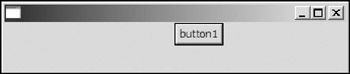
Figure 6-17
You can also specify the offset of the control side from the attachment position. If the value of the offset is positive, the control side is offset to the right of or below the attachment position. If the value is negative, then the control side is offset to the left of or above the attachment position.
Now center the button on the shell (i.e., the left side of the button needs to be shifted left by half of the width of the button).
 Button button1 = new Button(shell, SWT.PUSH);
 button1.setText("button1");

 Point size = button1.computeSize(SWT.DEFAULT, SWT.DEFAULT);
 int offset = size.x / 2;

 FormData formData = new FormData();
 formData.left = new FormAttachment(50, -1 * offset);

 button1.setLayoutData(formData);
The preceding code centers the button on the shell, as shown in Figure 6-18.
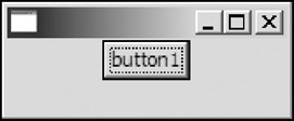
Figure 6-18
If you do not define FormAttachment objects for a control, the control will be attached to the top-left edges of the parent composite by default.
For example, place two buttons in a shell without specifying their FormData and FormAttachment objects:
 shell.setLayout(new FormLayout());
 Button button1 = new Button(shell, SWT.PUSH);
 button1.setText("button1");

 Button button2 = new Button(shell, SWT.PUSH);
 button2.setText("button number 2");
Because both of the buttons will be attached to the top-left corner of the shell, one button will stack on top of the other, as shown in Figure 6-19.
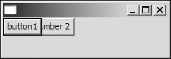
Figure 6-19
You can specify attachments for all four sides of a control. For example, the following code attaches a button to the bottom quarter of a shell, as shown in Figure 6-20.
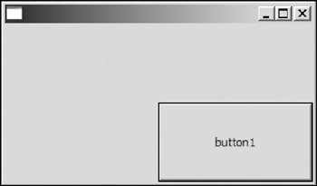
Figure 6-20
 shell.setLayout(new FormLayout());
 Button button1 = new Button(shell, SWT.PUSH);
 button1.setText("button1");

 FormData formData = new FormData();
 formData.left = new FormAttachment(50);
 formData.right = new FormAttachment(100);
 formData.top = new FormAttachment(50);
 formData.bottom = new FormAttachment(100);

 button1.setLayoutData(formData);
If you need more accurate layout control, you can specify the value of the denominator for a FormAttachment object. For example, the code that follows creates a FormAttachment object with the percentage value of 499/1000 (equivalent to 49.9 percent):
FormAttachment formAttachment = new FormAttachment(499, 1000, 0);
Attaching a Control to Another Control
In addition to attaching a control to a position in the parent composite, you can attach the side of the control to another control within the layout. The side of the control can be attached to the adjacent side of the other control (default alignment), to the opposite side of the other control, or centered on the other control. Additionally, you can specify offsets.
Attaching to the Adjacent Side of Another Control
By default, the control is attached to the adjacent side of the other control.
In the following code, the left side of button2 is attached to the right side of button1, and the top side of button3 is attached to the bottom side of button2 with an offset value of 10:
 shell.setLayout(new FormLayout());
 Button button1 = new Button(shell, SWT.PUSH);
 button1.setText("button1");

 Button button2 = new Button(shell, SWT.PUSH);
 button2.setText("button number 2");

 FormData formData = new FormData();
 formData.left = new FormAttachment(button1);
 button2.setLayoutData(formData);

 Button button3 = new Button(shell, SWT.PUSH);
 button3.setText("3");

 formData = new FormData();
 formData.top = new FormAttachment(button2, 10);
 button3.setLayoutData(formData);
The GUI is shown in figure 6-21
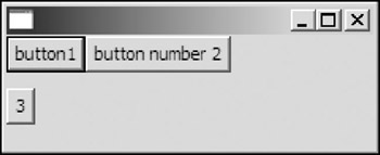
Figure 6-21
Attaching to the Specified Side of Another Control
The default behavior of attachments is attaching the side a control to the adjacent side of another control. You can change this behavior by setting the alignment property of a FormAttachment object. The following constants are possible values for the alignment property:
- TOP: Attaches the side of the control (the control to which the FormData object will be associated) to the top side of the specified control, "another control" (for top and bottom alignments only).
- BOTTOM: Attaches the side of the control to the bottom side of the specified control (for top and bottom alignments only).
- LEFT: Attaches the side of the control to the left side of the specified control (for left and right alignments only).
- RIGHT: Attaches the side of the control to the right side of the specified control (for left and right alignments only).
- CENTER: Attaches the side of the control at a position that will center the control on the specified control. This style is covered in the following subsection.
- DEFAULT: Attaches the side of the control to the adjacent side of the specified control.
All the constants are defined in the org.eclipse.swt.SWT class.
For example, to horizontally align button2 and button3 of the GUI in the preceding subsection, you can use the following code:
 ...
 Button button3 = new Button(shell, SWT.PUSH);
 button3.setText("3");

 formData = new FormData();
 formData.top = new FormAttachment(button2, 10);
 formData.left = new FormAttachment(button2, 0, SWT.LEFT);
 button3.setLayoutData(formData);
The line of code in boldface is the only line inserted. The new layout is shown in Figure 6-22.
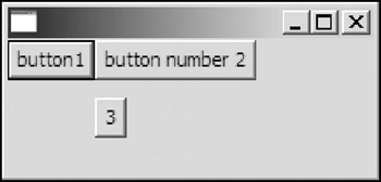
Figure 6-22
Centering a Control on Another Control
If you need to center a control on another control, you can use the CENTER alignment. For example, the following code
 formData.top = new FormAttachment(button1, 0, SWT.CENTER);
 button2.setLayoutData(formData);
centers button2 on button1 — the top of button2 is put in a position allowing the control to be centered on button1.
Next, the following code centers button2 on button1 both horizontally and vertically, as shown in Figure 6-23.
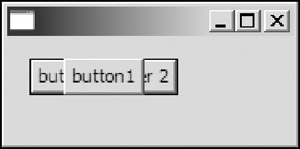
Figure 6-23
 Button button1 = new Button(shell, SWT.PUSH);
 button1.setText("button1");

 FormData formData = new FormData();
 formData.left = new FormAttachment(20);
 formData.top = new FormAttachment(20);
 button1.setLayoutData(formData);

 Button button2 = new Button(shell, SWT.PUSH);
 button2.setText("button number 2");

 formData = new FormData();
 formData.left = new FormAttachment(button1, 0, SWT.CENTER);
 formData.top = new FormAttachment(button1, 0, SWT.CENTER);
 button2.setLayoutData(formData);
If you need to center a control horizontally on another one, you need to set its FormAttachment object for the left side or the right side with CENTER alignment. Similarly, to center a control vertically on another one, you can set its FormAttachment object for the top side or the bottom side. FormLayout is a very powerful layout. As an exercise, try to rewrite the book entry program using FormLayout.
Using StackLayouts
The StackLayout class is in the package org.eclipse.swt.custom. A StackLayout stacks all the controls one on top of the other and resizes all controls to share the same size and location.
To set a particular control on the top, you should first set the topControl field of the StackLayout with that control and then call the layout method of the parent composite.
For example, the following code creates a stack of buttons on a shell, as shown in Figure 6-24.
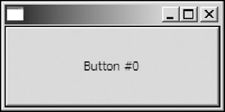
Figure 6-24
 ...
 final StackLayout stackLayout = new StackLayout();
 shell.setLayout(stackLayout);

 final Button[] buttons = new Button[3];

 for(int i=0; i
When a button is clicked, the next button will be flipped as the top control.
Additionally, you can configure the marginHeight and marginWidth fields of the StackLayout to control margins.
Creating Your Own Layouts
Sometimes, none of the layouts discussed can satisfy your requirements; in such a case, you can create your own layouts.
A layout must extend the org.eclipse.swt.widgets.Layout class, which has only two abstract methods:
 protected abstract Point computeSize(
 Composite composite,
 int wHint,
 int hHint,
 boolean flushCache)
The computeSize method computes and returns the minimum size of the specified composite's client area according to this layout.
The other method is:
protected abstract void layout(Composite composite, boolean flushCache)
which lays out the children of the composite.
The following code implements a layout that is very similar to the BorderLayout in Swing.
 /**
 * Lays out a composite, arranging and resizing its components to fit in five
 * regions: north, south, east, west, and center.
 */
 public class BorderLayout extends Layout {
 // Region constants.
 public static final int NORTH = 0;
 public static final int SOUTH = 1;
 public static final int CENTER = 2;
 public static final int EAST = 3;
 public static final int WEST = 4;

 /**
 * Indicates the region that a control belongs to.
 *
 */
 public static class BorderData {
 public int region = CENTER; // default.

 public BorderData() {
 }

 public BorderData(int region) {
 this.region = region;
 }
 }

 // Controls in all the regions.
 public Control[] controls = new Control[5];

 // Cached sizes.
 Point[] sizes;

 // Preferred width and height
 int width;
 int height;

 /*
 * (non-Javadoc)
 *
 * @see Layout#computeSize(org.eclipse.swt.widgets.Composite, int, int,
 boolean)
 */
 protected Point computeSize(
 Composite composite,
 int wHint,
 int hHint,
 boolean flushCache) {

 if (sizes == null || flushCache == true)
 refreshSizes(composite.getChildren());
 int w = wHint;
 int h = hHint;
 if (w == SWT.DEFAULT)
 w = width;
 if (h == SWT.DEFAULT)
 h = height;

 return new Point(w, h);
 }

 /*
 * (non-Javadoc)
 *
 * @see
 org.eclipse.swt.widgets.Layout#layout(org.eclipse.swt.widgets.Composite,
 * boolean)
 */
 protected void layout(Composite composite, boolean flushCache) {
 if (flushCache || sizes == null)
 refreshSizes(composite.getChildren());

 Rectangle clientArea = composite.getClientArea();

 // Enough space for all.
 if (controls[NORTH] != null) {
 controls[NORTH].setBounds(
 clientArea.x,
 clientArea.y,
 clientArea.width,
 sizes[NORTH].y);
 }
 if (controls[SOUTH] != null) {
 controls[SOUTH].setBounds(
 clientArea.x,
 clientArea.y + clientArea.height - sizes[SOUTH].y,
 clientArea.width,
 sizes[SOUTH].y);
 }
 if (controls[WEST] != null) {
 controls[WEST].setBounds(
 clientArea.x,
 clientArea.y + sizes[NORTH].y,
 sizes[WEST].x,
 clientArea.height - sizes[NORTH].y - sizes[SOUTH].y);
 }
 if (controls[EAST] != null) {
 controls[EAST].setBounds(
 clientArea.x + clientArea.width - sizes[EAST].x,
 clientArea.y + sizes[NORTH].y,
 sizes[EAST].x,
 clientArea.height - sizes[NORTH].y - sizes[SOUTH].y);
 }
 if (controls[CENTER] != null) {
 controls[CENTER].setBounds(
 clientArea.x + sizes[WEST].x,
 clientArea.y + sizes[NORTH].y,
 clientArea.width - sizes[WEST].x - sizes[EAST].x,
 clientArea.height - sizes[NORTH].y - sizes[SOUTH].y);
 }

 }

 private void refreshSizes(Control[] children) {
 for (int i = 0; i < children.length; i++) {
 Object layoutData = children[i].getLayoutData();
 if (layoutData == null || (!(layoutData instanceof BorderData)))
 continue;
 BorderData borderData = (BorderData) layoutData;
 if (borderData.region < 0 || borderData.region > 4) // Invalid.
 continue;
 controls[borderData.region] = children[i];
 }
 width = 0;
 height = 0;

 if (sizes == null)
 sizes = new Point[5];

 for (int i = 0; i < controls.length; i++) {
 Control control = controls[i];
 if (control == null) {
 sizes[i] = new Point(0, 0);
 } else {
 sizes[i] = control.computeSize(SWT.DEFAULT, SWT.DEFAULT, true);
 }
 }

 width = Math.max(width, sizes[NORTH].x);
 width =
 Math.max(width, sizes[WEST].x + sizes[CENTER].x + sizes[EAST].x);
 width = Math.max(width, sizes[SOUTH].x);

 height =
 Math.max(Math.max(sizes[WEST].y, sizes[EAST].y), sizes[CENTER].y)
 + sizes[NORTH].y
 + sizes[SOUTH].y;

 }
 }
Let's use the BorderLayout in a sample application:
 public class BorderLayoutSample {
 Display display = new Display();
 Shell shell = new Shell(display);

 public BorderLayoutSample() {
 shell.setLayout(new BorderLayout());

 Button buttonWest = new Button(shell, SWT.PUSH);
 buttonWest.setText("West");
 buttonWest.setLayoutData(new BorderLayout.BorderData(BorderLayout.WEST));

 Button buttonEast = new Button(shell, SWT.PUSH);
 buttonEast.setText("East");
 buttonEast.setLayoutData(new BorderLayout.BorderData(BorderLayout.EAST));

 Button buttonNorth = new Button(shell, SWT.PUSH);
 buttonNorth.setText("North");
 buttonNorth.setLayoutData(new BorderLayout.BorderData(BorderLayout.NORTH));

 Button buttonSouth = new Button(shell, SWT.PUSH);
 buttonSouth.setText("West");
 buttonSouth.setLayoutData(new BorderLayout.BorderData(BorderLayout.SOUTH));
 Text text = new Text(shell,
 SWT.MULTI | SWT.BORDER | SWT.V_SCROLL | SWT.H_SCROLL);
 text.setText("Center");
 text.setLayoutData(new BorderLayout.BorderData(BorderLayout.CENTER));

 shell.pack();
 shell.open();

 // Set up the event loop.
 while (!shell.isDisposed()) {
 if (!display.readAndDispatch()) {
 // If no more entries in event queue
 display.sleep();
 }
 }

 display.dispose();
 }

 public static void main(String[] args) {
 new BorderLayoutSample();
 }
 }
The initial display and the display after resizing are shown in Figure 6-25 and Figure 6-26, respectively.
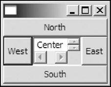
Figure 6-25
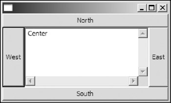
Figure 6-26
The BorderLayout class offers only the basic functions. You may add more features to the BorderLayout, such as margins, spacing, and so on.
Summary
This chapter introduced SWT layout support. Layouts can be used to position and size child controls on composites. Five typical layouts were discussed. A FillLayout lays out controls into a single row or column and forces all the children to be the same size. A RowLayout offers more flexibility than a FillLayout. You use a RowLayout to lay out controls into rows; it is capable of wrapping controls. A GridLayout is one of the most sophisticated layouts. It lays out controls in a grid. You can use a GridData object to customize the position and size of a particular control. A sample application showed you how to apply GridLayout in practical applications. A FormLayout positions and sizes controls using their associated FormAttachment objects. A FormAttachment object attaches a side of the control either to a position in the composite or to one of its sibling controls. Last, a StackLayout stacks all the controls one on top of the other and resizes all controls to share the same size and location. Finally, you learned how to create your own controls to satisfy your own needs.
Part I - Fundamentals
- Overview of Java UI Toolkits and SWT/JFace
- SWT/JFace Mechanisms
- Jump Start with SWT/JFace
- SWT Event Handling, Threading, and Displays
- Basic SWT Widgets
- Layouts
Part II - Design Basics
Part III - Dynamic Controls
- Scales, Sliders, and Progress Bars
- Other Important SWT Components
- SWT Graphics and Image Handling
- Drag and Drop and the Clipboard
- Printing
- JFace Windows and Dialogs
Part IV - Application Development
EAN: 2147483647
Pages: 147
