Basic SWT Widgets
Highlights
The beginning of this chapter guides you through the hierarchy of SWT widgets. Several typical widget types are discussed. After that, you learn about three kinds of basic SWT widgets:
- Shells
- Buttons
- Labels
You learn how to use these widgets, register proper listeners, and complete many other operations such as setting text labels and image labels. In addition, this chapter covers focus traversal.
By the end of the chapter, you should have a good understanding of how widgets in SWT are structured, how to set styles for widgets, and how to perform event handling on them. In particular, you should be able to use shells, buttons, and labels in SWT-based applications.
Overview of SWT JFace Widgets
This section first gives an overview of the SWT UI component hierarchy. Then it covers three important classes: Widget, Control, and Composite.
SWT JFace UI Component Hierarchy
Many UI components are available in SWT/JFace. Main SWT components are organized in the following hierarchy:
 Widget
 +-- Caret
 +-- Menu
 +-- ScrollBar
 +-- Tracker
 +-- Control
 | +-- Button
 | +-- Label
 | +-- ProgressBar
 | +-- Sash
 | +-- Scale
 | +-- Slider
 | +-- Scrollable
 | | +-- Composite
 | | | +-- Canvas
 | | | | +-- Decorations
 | | | | +-- Shell
 | | | +-- Combo
 | | | +-- CollBar
 | | | +-- Group
 | | | +-- TabFolder
 | | | +-- Table
 | | | +-- ToolBar
 | | | +-- Tree
 | | +-- List
 | | +-- Text
 +-- Item
 +-- CoolItem
 +-- MenuItem
 +-- TabItem
 +-- TableColumn
 +-- TableItem
 +-- ToolItem
 +-- TreeItem
All classes in italic are abstract classes. All of the components in the preceding tree are in the org.eclipse.swt.widgets package. Package org.eclipse.swt.custom provides extra custom widgets. Few other components are in JFace packages. You learn most of the other components in later chapters. Now, let's focus on SWT main components.
The Widget Class
The org.eclipse.widgets.Widget class is the top-level class of all the UI components in SWT/JFace. A Widget can be created and disposed of, and it is capable of issuing notifications to listeners when events occur.
You can create a Widget instance by calling the constructor with optional widget styles. After you finish using the widget, you must invoke the dispose method to release the system resources. Additionally, you can register event listeners to listen and react to widget-specific events.
The Constructor: public Widget(Widget parent, int style)
This is the only constructor of the Widget class. Because the Widget class is declared abstract, you can't use it to create new instances directly. Almost all kinds of UI components in SWT/JFace have similar constructors as this one, so it is worth looking at it in detail.
The first argument is a Widget that will be the parent of the object. The parent argument passed must not be null; otherwise, an IllegalArgumentException will be thrown.
The second argument specifies the style of the component. The style value is either one of the constants defined in the org.eclipse.swt.SWT class that is applicable to this kind of widget, or must be built by bitwise OR'ing together (using the "|" operator) two or more of those style constants. The Widget class does not have any styles; however, most of its child classes do. For example,
Button button = new Button(shell, SWT.PUSH | SWT.LEFT);
creates a push Button with text left-aligned.
In this book, when the UI components are introduced, their associated styles are discussed. Alternatively, you may find the UI components' possible styles from the SWT/JFace Javadoc. Styles are inherited from superclasses. They are marked as HINT if they are available either only on some window systems, or for a differing set of widgets on each window system. If a window system does not support a style, that style is ignored. The good news is that there are very few such styles.
The following method can be used to check the styles of a widget:
public int getStyle()
Here's an example:
 if( (button.getStyle() & SWT.PUSH) == 1) {
 System.out.println("The button is push button.");
 }else{
 System.out.println("The button is push button.");
 }
The value returned by getStyle may differ from the value that is provided to the constructor if:
- The underlying operating system does not support a particular combination of requested styles
or
- One or more of the styles specified is not applicable to this widget
public Display getDisplay()
This method returns the Display that is associated with this Widget. A widget's display is either provided when created, for example:
Shell shell = new Shell(display);
or is the same as its parent's display. For example:
 Button button = new Button(shell, SWT.PUSH);
 // This button's display is the same as the display of its parent (the shell).
This method throws an SWTException (SWT.ERROR_WIDGET_DISPOSED) if the Widget has already been disposed of. To check whether a Widget has been disposed of or not, use the method:
public boolean isDisposed()
which returns true when the widget is disposed of and false if not.
Dispose of the Widget: public void dispose()
As shown in Chapter 2, operating system resources associated with a widget and all of its descendants will be disposed of when this method is called. After this widget is disposed of, the method isDisposed returns true.
Event Handling
The following lists important methods of the Widget class in terms of event handling.
public void addListener(int eventType, Listener listener)
This method adds the given listener to the collection of listeners that will be notified when an event of the given type occurs. When an event of the specified type occurs in the widget, the listener is notified and the listener handleEvent method is called.
For example, the following code adds a listener to listen to the dispose event:
 widget.addListener(SWT.Dispose, new Listener() {
 public void handleEvent(Event event) {
 System.out.println(event.widget + " disposed");
 }
 });
public void addDisposeListener(DisposeListener listener)
Because every widget has a dispose method generating dispose events, the Widget class provides a typed listener registration method:
public void addDisposeListener(DisposeListener listener)
The previous dispose listening code can be rewritten as:
 shell.addDisposeListener(new DisposeListener() {
 public void widgetDisposed(DisposeEvent e) {
 System.out.println(e.widget + " disposed");
 }
 });
For details about untyped listener and typed listeners, please refer to Chapter 4.
public void removeListener(int eventType, Listener listener)
This method removes the given listener from the collection of listeners registered for events of the specified event type.
There is another removeListener method in the class:
 protected void removeListener(int eventType,
 org.eclipse.swt.internal.SWTEventListener listener)
This method is declared as protected and is not part of the SWT public API. To keep your code portable, you should never use such non-public API elements in your application code.
public void removeDisposeListener(DisposeListener listener)
When this method is called, the given listener is removed from the collection of listeners registered for the dispose event.
Getting and Setting Application Data
The Widget class provides four methods that allow you to associate application data to widgets and retrieve data later.
public void setData(Object data)
This method associates the application data object to the widget. If you need to "store" more than one data object to the widget, you can use the following method:
public void setData(String key, Object value)
To get the application data associated with the widget, you can use the following methods:
 public Object getData()
 public Object getData(String key)
If the data objects associated with the widget need to be notified when the widget is disposed of, you should handle this yourself in your application code by creating and registering listeners to hook the Dispose event on the widget.
The Control Class
The Control class is the superclass of all windowed user interface components. As one of the child classes of the Widget class, it provides many more features than the Widget class.
Styles
Styles supported by the Control class include:
- BORDER: This style bit causes a control to have bordered behavior.
- LEFT_TO_RIGHT, RIGHT_TO_LEFT: This style bit specifies the orientation of textual information. Only one may be specified. When the orientation of a control is not specified, orientation is inherited from its parent.
All widget styles are defined as constants in the org.eclipse.swt.SWT class.
Size and Location
There are several methods to get and set the size and location of a control. Figure 5-1 illustrates how the size and location of a control are measured in SWT.
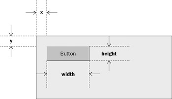
Figure 5-1
Based on the preceding information, you can easily calculate the following properties for the button in Figure 5-1:
- Size = new Point(width, height)
- Location = new Point(x, y)
- Bounds = new Rectangle(x, y, width, height)
The getting and setting methods for these properties are:
 public Point getSize()
 public void setSize(int width, int height)
 public void setSize(Point size)

 public Point getLocation()
 public void setLocation(int x, int y)
 public void setLocation(Point location)

 public Rectangle getBounds()
 public void setBounds(int x, int y, int width, int height)
 public void setBounds(Rectangle rect)
Sometimes you may find that these setting methods do not work properly — when you resize the ancestral shell of a control, the control sticks back to its original bounds. The cause of this problem is the layout of the parent composite. When the composite is resized, its associated layout rearranges all of its children. During this process, the layout queries its children and changes the bounds of them; as a result, your bounds setting of the control is lost. Controls such as Button exhibit this kind of behavior. If this behavior is undesired, you may consider using one of the following methods:
- Not using any layout
- Using custom layout data
- Creating your own layouts
For more details about layouts, refer to Chapter 6.
Before displaying a control, you need to know the best size for displaying it. This size is normally referred to as preferred size. The following methods return the preferred size of a control:
 public Point computeSize(int wHint, int hHint)
 public Point computeSize(int wHint, int hHint, boolean changed)
The preceding methods compute the best size with the width hint and the height hint in mind. If you do not want to constrain a particular dimension, you can pass SWT.DEFAULT for the hint. For the second method, if the changed flag is set to true, it indicates that the control's contents have changed. The two computeSize methods are frequently used by layouts to query for preferred sizes.
Fonts and Colors
To get and set the font that a control uses to paint textual information, call the following methods:
 public Font getFont()
 public void setFont(Font font)
If a null argument is passed to the setFont method, the default font for that kind of control will be used.
Fonts utilize operating system resources; thus, they need to be disposed of after use. The best way to manage fonts is to use one or more FontRegistrys. See Chapter 2 for details on FontRegistry.
A control can have foreground color and background color. To query these colors, you can use:
 public Color getBackground()
 public Color getForeground()
To change background color or foreground color of a control, use the following methods:
 public void setBackground(Color color)
 public void setForeground(Color color)
If a null argument is passed to any of the preceding methods, the default system color will be used.
UI Updating
This method marks the entire bounds of a control that needs to be redrawn:
public void redraw()
The control will be completely painted the next time a paint request is processed.
If only part of the control needs to be redrawn, you can use this method:
public void redraw(int x, int y, int width, int height, boolean all)
The preceding method causes the marked rectangular area of the control as needing to be redrawn. If the all flag is set to true, all children of this control that intersect with the specified area will also paint their intersecting areas.
If the contents of a control have changed and redrawn areas have been marked, you can use the following method to force all outstanding paint requests for the control to be processed:
public void update()
If you need to resize a control to its preferred size, you can use the following:
 public void pack()
 public void pack(boolean changed)
If the control is a composite that can contain other controls as its children, the pack methods compute the preferred size from its layout if there is one. For the second pack method, if the changed flag is set to true, it indicates that the contents of the control have been changed.
To set a control's visibility, you can use the following:
public void setVisible(boolean visible)
If one of the control's ancestors is not visible, marking the control visible may not actually cause it to be displayed. The following method can be used to query the control's visibility:
public boolean isVisible()
Similarly, the following method can be used to enable and disable a control:
public void setEnabled(boolean enabled)
To query the status, call this method:
public boolean isEnabled()
If you want a control to gain focus, try this method:
public boolean setFocus()
This method causes the control to gain the keyboard focus, so that all keyboard events will be delivered to it. The method may fail if platform constraints disallow such focus reassignment under some situations. The return boolean value indicates whether the operation is successful or not.
Event Handling
The Widget class handles only the dispose event. The Control class handles many more events than the Widget class, as listed in the following table.
 Open table as spreadsheet
|
Event Type |
Description |
Methods in the Control Class |
|---|---|---|
|
Control |
Generated when a control is moved or resized |
public void addControl Listener(ControlListener listener) public void removeControl Listener(ControlListener listener) |
|
Focus |
Generated when a control gains or loses focus |
public void addFocusListener (FocusListener listener) public void removeFocusListener (FocusListener listener) |
|
Help |
Generated when the user requests help for a control |
public void addHelpListener(Help Listener listener) public void removeHelpListener (HelpListener listener) |
|
Key |
Generated when the user presses or releases a key |
public void addKeyListener (KeyListener listener) public void removeKeyListener (KeyListener listener) |
|
Mouse |
Generated when the user presses, releases, or double clicks the mouse |
public void addMouseListener (MouseListener listener) public void removeMouseListener (MouseListener listener) |
|
MouseMove |
Generated when the user moves the mouse |
public void addMouseMoveListener (MouseMoveListener listener) public void removeMouseMoveListener (MouseMoveListener listener) |
|
MouseTrack |
Generated when the mouse enters, exits, or hovers over the control |
public void addMouseTrackListener (MouseTrackListener listener) public void removeMouseTrackListener (MouseTrackListener listener) |
|
Paint |
Generated when the control needs to be repainted |
public void addPaintListener (PaintListener listener) public void removePaintListener (PaintListener listener) |
|
Traverse |
Generated when a control is traversed by the user's using keystrokes |
public void addTraverseListener (TraverseListener listener) public void removeTraverseListener (TraverseListener listener) |
Miscellaneous Methods
The following methods can be used to get and set a control's pop-up menu:
 public Menu getMenu()
 public void setMenu(Menu menu)
To set a control's cursor, use the setCursor method:
public void setCursor(Cursor cursor)
If the argument passed is null, the system default cursor is set. When the mouse pointer moves over the control, its shape is changed to match the control's cursor.
Use the following to query the parent of a control:
public Composite getParent()
and its nearest ancestor shell:
public Shell getShell()
If the control is of the type Shell, the shell will return itself.
To get and set the tooltip text for a control, use the following methods:
 public String getToolTipText()
 public void setToolTipText(String string)
To perform focus traversal programmatically, you can call this method:
public boolean traverse(int traversalType)
The argument specifies the type of traversal that the system performs. For example, to initiate a TAB forward traversal, you should pass SWT.TRAVERSE_TAB_NEXT as the traversal type. If the traversal succeeds, true is returned; otherwise, false is returned. The next section discusses focus traversal in detail.
The Composite Class
A composite is a control that is capable of containing other controls.
Styles
Styles supported by the Composite class in addition to those inherited include:
The first four styles listed here are intended to be used with the Composite's subclass Canvas only.
- NO_BACKGROUND: Before a widget paints, the client area is filled with the current background color by default. If this style bit is set, the background is not filled and you need to take care of filling every pixel of the client area. Typically, setting this style helps to reduce canvas flickering.
- NO_FOCUS: This style bit indicates that the composite does not take focus behavior.
- NO_MERGE_PAINTS: This style bit prevents Paint event-merging behavior.
- NO_REDRAW_RESIZE: This style stops a canvas's entire client area from being invalidated when the size of the canvas changes:
- If the size of the canvas decreases, no Paint event is sent.
- If the size of the canvas increases, a Paint event is sent along with a GC clipped to the new areas to be painted.
This style also helps to stop canvases from flickering.
- NO_RADIO_GROUP: This style bit disables child radio group behavior.
- H_SCROLL, V_SCROLL: Inherited from the Composite's superclass Scrollable, these two style bits control horizontal scrollbar behavior and vertical scrollbar behavior, respectively.
Layout
Layouts are often used by composites to help arrange their children. The following method can be used to set the layout of a composite:
public void setLayout(Layout layout)
To query a composite for its layout, call this method:
public Layout getLayout()
If no layout is associated with the composite, null is returned.
The following methods can be used to request a composite to lay out all of its children:
 public void layout()
 public void layout(boolean changed)
If there is no layout associated with the composite, the preceding methods do nothing. For the second method, if the changed flag is set to true, the layout is requested to refresh cached information about the children. If it is set to false, the layout may simply use the cached information.
Focus Traversal
Focus traversal support enables the user to change focus owner (current control receiving keyboard input) without moving the mouse cursor. Focus traversal can be either forward to the next control or backward to the previous component. Usually, the user can press the Tab key to forward the focus to the next control or press Shift+Tab to move the focus to the previous control. Additionally, applications can initiate traversal programmatically.
The following method of Composite defines the tabbing order for the specified children controls:
public void setTabList(Control[] tabList)
Every control in the tab list passed as the argument must be a direct child of the composite. Otherwise, IllegalArgumentException is thrown.
Suppose you are required to build a GUI, as shown in Figure 5-2. The canvas in the middle of the right composite is used to display the character corresponding to a keystroke when the canvas has the focus. All other controls are for illustration only.
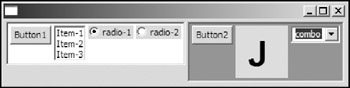
Figure 5-2
The order of each control in a focus traversal cycle is specified in Figure 5-3.
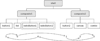
Figure 5-3
First, you need to build up the component tree:
 Display display = new Display();
 Shell shell = new Shell(display);

 shell.setLayout(new RowLayout());

 Composite composite1 = new Composite(shell, SWT.BORDER);
 composite1.setLayout(new RowLayout());
 composite1.setBackground(display.getSystemColor(SWT.COLOR_WHITE));

 Button button1 = new Button(composite1, SWT.PUSH);
 button1.setText("Button1");
 List list = new List(composite1, SWT.MULTI | SWT.BORDER);
 list.setItems(new String[]{"Item-1", "Item-2", "Item-3"});

 Button radioButton1 = new Button(composite1, SWT.RADIO);
 radioButton1.setText("radio-1");
 Button radioButton2 = new Button(composite1, SWT.RADIO);
 radioButton2.setText("radio-2");

 Composite composite2 = new Composite(shell, SWT.BORDER);
 composite2.setLayout(new RowLayout());
 composite2.setBackground(display.getSystemColor(SWT.COLOR_GREEN));

 Button button2 = new Button(composite2, SWT.PUSH);
 button2.setText("Button2");

 final Canvas canvas = new Canvas(composite2, SWT.NULL);
 canvas.setSize(50, 50);
 canvas.setBackground(display.getSystemColor(SWT.COLOR_YELLOW));

 Combo combo = new Combo(composite2, SWT.DROP_DOWN);
 combo.add("combo");
 combo.select(0);
Now, you need to add a KeyListener to listen to the keystroke and display the corresponding character:
 canvas.addKeyListener(new KeyListener() {
 public void keyPressed(KeyEvent e) {
 GC gc = new GC(canvas);
 // Erase background first.
 Rectangle rect = canvas.getClientArea();
 gc.fillRectangle(rect.x, rect.y, rect.width, rect.height);

 Font font = new Font(display, "Arial", 32, SWT.BOLD );
 gc.setFont(font);

 gc.drawString("" + e.character, 15, 10);
 gc.dispose();
 font.dispose();
 }

 public void keyReleased(KeyEvent e) {
 }
 });
Finally, set the traversal policy:
 composite1.setTabList(new Control[]{button1, list});
 composite2.setTabList(new Control[]{button2, canvas, combo});

 shell.setTabList(new Control[]{composite2, composite1});
First, the tab lists for composite1 and composite2 are set. Then the tab list for the top-level shell is set. You may notice that neither of the radios buttons appears in the tab list passed to composite1. This is because when a composite gains focus, it sets focus on its first radio control. If no radio control is contained in the composite, the first control (the first one added to the composite) will be set focus. Thus in the preceding code, radio buttons are omitted in the tab list.
When you run the preceding code, you encounter this problem: When the canvas has the focus, pressing the Tab key does not forward the focus to the next control because, by default, when the Tab key is pressed while a canvas is the focus, the system will not traverse and the Tab key will be delivered to key listeners of the canvas. To change this default behavior, you can add a TraverseListener to the canvas:
 canvas.addTraverseListener(new TraverseListener() {
 public void keyTraversed(TraverseEvent e) {
 if(e.detail == SWT.TRAVERSE_TAB_NEXT ||
 e.detail == SWT.TRAVERSE_TAB_PREVIOUS)
 e.doit = true;
 }
 });
When the canvas is traversed, the keyTraversed method in the TraverseListener will be called with a TraverseEvent object. There are two fields in TraverseEvent:
- detail: Indicates the type of traversal. You can modify the traversal type by changing this field.
For example, you can set the details to SWT.TRAVERSE_NONE to disable traversal actions.
- doit: Indicates whether the traversal operation should be allowed. If this field is set to false, the traversal operation will be cancelled and the traversal keystroke will be delivered to the control. If it is set to true, the traversal operation will be performed.
In the keyTraversed method, if the traversal type is SWT.TRAVERSE_TAB_NEXT or SWT.TRAVERSE_TAB_PREVIOUS the doit field in the event object is set to true to have the traversal operation performed. Similarly, the following code prevents escape from closing a dialog:
 ...

 Shell dialog = new Shell(shell, SWT.DIALOG_TRIM);
 dialog.addListener(SWT.Traverse, new Listener() {
 public void handleEvent(Event e) {
 if (e.detail == SWT.TRAVERSE_ESCAPE) {
 e.doit = false;
 }
 }
 });
 ...
As you have seen in the preceding sample application, you can use the setTabList method to set the focus traversal order of controls. Additionally, the traversal event provides fine control over focus traversal in a widget.
Shells
Shells are the most fundamental controls in SWT. A shell is a window that the desktop or window manager (part of the underlying window system) is managing. The class org.eclipse.swt.widgets.Shell shares a significant amount of code with its parent class org.eclipse.swt.widgets.Decorations.
Styles
You can apply the following styles to a shell:
- CLOSE, TITLE, MIN, MAX, RESIZE | NO_TRIM (inherited from the Decorations class): The CLOSE, MIN, MAX, and RESIZE style bits specify Close box trim, Title area trim, Minimize box trim, Maximize box trim, and Resize box trim, respectively. The NO_TRIM style causes no trimmings associated with the shell. (These styles are hints. The window manager has the ultimate control over the appearance and behavior of trimming and modality.) Two shells with different trimming styles are shown in Figure 5-4.
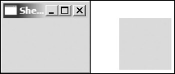
Figure 5-4SWT provides two convenient constants for the frequently used trimming style combinations:
- SHELL_TRIM = (CLOSE | TITLE | MIN | MAX | RESIZE): This style constant can be used to produce top-level shells.
- DIALOG_TRIM = (CLOSE | TITLE | BORDER): The style constant can be used to produce dialog shells.
- APPLICATION_MODAL, MODELESS, PRIMARY_MODAL, SYSTEM_MODAL: These style bits can be used to specify the modal state of shells. (They are hints, too.) Only one of them may be specified.
- ON_TOP: This style bit causes the shell to always float on the top of the desktop.
- TOOL: This style bit indicates that the shell is a tool window. It is a hint. Shells with this style can be used as floating toolbars. Figure 5-5 shows a shell with (SHELL_TRIM | TOOL) styles.
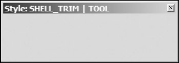
Figure 5-5
Shell States
A shell is always displayed in one of the following states:
- Normal: In the normal state, the shell's appearance is controlled by the style bits specified in the constructor and the restrictions of the window manager.
- Maximized: To set the shell to the maximized state, the window manager typically resizes it to fill the entire area of the display.
- Minimized: If the shell is in the minimized state, its contents are usually invisible. The window manager may "iconify" the shell by replacing it with a small representation of it or hide it.
To minimize a shell, you can use the following method:
public void setMinimized(boolean minimized)
If the minimized flag is set to true, this method causes the shell to switch to the minimized state. If the minimized flag is set to false and the shell is currently in the minimized state, the shell will be switched back to either the maximized state or the normal state.
To check whether a shell is minimized or not, use:
public boolean getMinimized()
The counterparts methods for the maximized state are as follows:
 public void setMaximized(boolean maximized)
 public boolean getMaximized()
All of the preceding four methods are inherited from the Decorations class.
Creating Shells
Shells can be separated into two categories: top-level shells and secondary/dialog shells. Shells that do not have a parent are top-level shells. All dialog shells have a parent. The Shell class provides many constructors for you to create both top-level shells and dialog shells.
Use the following constructors to create top-level shells:
 Shell()
 Shell(int style)
 Shell(Display display)
 Shell(Display display, int style)
For the first two constructors, no display object is required. In this case, if the current display exists, it will be set to the display of the shell. If there is no current display object, a default display object will be created and set to the display of the shell. You can specify the style constants in the style arguments.
Dialog shells can be created using the following constructors:
 Shell(Shell parent)
 Shell(Shell parent, int style)
Chapters 3 and 4 showed many example of creating top-level shells. Now, let's create a simple book rating application, as shown in Figure 5-6, to see how you can create dialog shells.
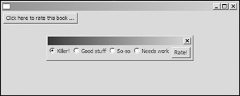
Figure 5-6
When the user clicks the button in the top-level shell, a dialog shell pops up. The user rates this book by selecting one of the radio buttons. After this, the user can press the "Rate!" button to save the rating status and close the dialog.
The following code creates the top-level dialog and the dialog invocation button:
 Display display = new Display();
 final Shell shell = new Shell(display);

 shell.setLayout(new RowLayout());
 shell.setSize(500, 200);

 final Button openDialog = new Button(shell, SWT.PUSH);
 openDialog.setText("Click here to rate this book ...");
You need to add a selection listener to the openDialog button to listen for button selection events:
 openDialog.addSelectionListener(new SelectionListener() {
 public void widgetSelected (SelectionEvent e) {
 final Shell dialog =
 new Shell(shell, SWT.DIALOG_TRIM | SWT.APPLICATION_MODAL);
 dialog.setLayout(new RowLayout());

 final String[] ratings = new String[] { "Killer!", "Good stuff",
 "So-so", "Needs work" };
 final Button[] radios = new Button[ratings.length];
 for (int i = 0; i < ratings.length; i++) {
 radios[i] = new Button(dialog, SWT.RADIO);
 radios[i].setText(ratings[i]);
 }
 Button rateButton = new Button(dialog, SWT.PUSH);
 rateButton.setText("Rate!");
 rateButton.addSelectionListener(new SelectionListener() {
 public void widgetSelected(SelectionEvent e) {
 for (int i = 0; i < radios.length; i++)
 if (radios[i].getSelection())
 openDialog.setText("Rating: " + ratings[i]);
 dialog.close();
 }

 public void widgetDefaultSelected(SelectionEvent e) {
 }
 });

 dialog.pack();
 dialog.open();

 }

 public void widgetDefaultSelected(SelectionEvent e) {
 }
 });
In the widgetSelected method of the openDialog button's selection listener, first the dialog shell and its contents are created. Then another selection listener is added to the rateButton button in the dialog. Finally, the dialog is opened and centered. When the user clicks the rateButton, the only selection listener of rateButton puts the rating information and closes the dialog. The following method:
public void close()
sends a close request to the window manager in the same way as if the user clicks the Close box. As a result, the dialog is closed.
Finally, open the top-level shell and set up the event loop:
 shell.open();

 // Set up the event loop.
 while (!shell.isDisposed()) {
 if (!display.readAndDispatch()) {
 // If no more entries in event queue
 display.sleep();
 }
 }

 display.dispose();
After a shell has been created, you need to call its open method to display it:
public void open()
This method makes the shell visible, sets the focus, and requests that the window manager make the shell active.
Shell Events
Besides types of events shared by all kinds of controls, shells can generate a unique type of event: shell events (ShellEvent). A shell event is generated when a shell is minimized, maximized, activated, deactivated, or closed. You can register ShellListeners to shells to listen to shell events and react accordingly.
To add a shell listener to a shell, use this method:
public void addShellListener(ShellListener listener)
To remove a shell listener from a shell, use this method:
public void removeShellListener(ShellListener listener)
The preceding section showed you how to modify the default focus traversal using the doit field of passed TraverseEvent objects. You can apply the same technique to change the default behavior of shells. For example, a document editor usually needs to warn the user about losing unsaved data when the user tries to exit the application. You can register a ShellListener to warn the user before closing the top-level shell:
 Display display = new Display ();
 final Shell shell = new Shell (display);
 shell.setSize(500, 300);
 shell.addListener (SWT.Close, new Listener () {
 public void handleEvent (Event event) {
 MessageBox messageBox = new MessageBox (shell,
 SWT.APPLICATION_MODAL | SWT.YES | SWT.NO);
 messageBox.setText ("Warning");
 messageBox.setMessage ("You have unsaved data. Close the shell anyway?");
 if(messageBox.open() == SWT.YES)
 event.doit = true;
 else
 event.doit = false;
 }
 });

 shell.open();
 while (!shell.isDisposed ()) {
 if (!display.readAndDispatch ()) display.sleep ();
 }
 display.dispose ();
When the user clicks the Close box, a message box pops up, as shown in Figure 5-7.
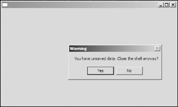
Figure 5-7
If the user clicks Yes, the shell is closed; otherwise, the shell remains open.
Miscellaneous
In this section, you learn how to create irregular-shaped shells, set title and icon image for shells, and set the default button for shells.
Creating Irregular-Shaped Shells
You can create an irregular-shaped shell with the setRegion method:
public void setRegion(Region region)
This shell must be created with the style NO_TRIM in order to specify a region. For example, the following code creates a ring shell, as shown in Figure 5-8.
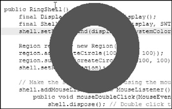
Figure 5-8
 Point originalPosition = null;

 public RingShell() {
 final Display display = new Display();
 final Shell shell = new Shell(display, SWT.NO_TRIM | SWT.ON_TOP);
 shell.setBackground(display.getSystemColor(SWT.COLOR_DARK_MAGENTA));

 Region region = new Region();
 region.add(createCircle(100, 100, 100));
 region.subtract(createCircle(50, 100, 100));
 shell.setRegion(region);

 // Make the shell movable by using the mouse pointer.
 shell.addMouseListener(new MouseListener() {
 public void mouseDoubleClick(MouseEvent e) {
 shell.dispose(); // Double click to dispose the shell.
 }

 public void mouseDown(MouseEvent e) {
 originalPosition = new Point(e.x, e.y);
 }

 public void mouseUp(MouseEvent e) {
 originalPosition = null;
 }
 });

 shell.addMouseMoveListener(new MouseMoveListener() {
 public void mouseMove(MouseEvent e) {
 if(originalPosition == null)
 return;
 Point point = display.map(shell, null, e.x, e.y);
 shell.setLocation(point.x - originalPosition.x,
 point.y - originalPosition.y);
 }
 });

 Rectangle regionBounds = region.getBounds();
 shell.setSize(regionBounds.width, regionBounds.height);
 shell.open();

 // Set up the event loop.
 while (!shell.isDisposed()) {
 if (!display.readAndDispatch()) {
 // If no more entries in event queue
 display.sleep();
 }
 }
 display.dispose();
 region.dispose();
 }
Note that regions use operating system resources; thus they must be explicitly disposed of. The following is the function that creates an array of points representing a circle:
 int[] createCircle(int radius, int centerX, int centerY) {
 int[] points = new int[360 * 2];
 for(int i=0; i<360; i++) {
 points[i*2] = centerX +
 (int)(radius * Math.cos(Math.toRadians(i)));
 points[i*2+1] = centerY +
 (int)(radius * Math.sin(Math.toRadians(i)));
 }
 return points;
 }
Setting Images
The setImage method, inherited from the Decorations class, can be used to set a shell's image.
public void setImage(Image image)
The image of a shell is typically displayed when the shell is iconified, and may also appear in the trim of the shell.
A shell's image is used as an icon in many places — for example, the trim of the shell, the Alt+Tab window (Windows). The trim icon usually is very small; however, the icon shown in the Alt+Tab window is much larger. The window system will scale up a small image if it needs a large one. In this case, it is desirable to specify an array of images and let the window manager choose the image with the "best" size. The setImages method is implemented for this purpose:
public void setImages(Image[] images)
You can use the following methods to get the image (images) of a shell:
 public Image getImage()
 public Image[] getImages()
Setting the Title
The setText method can be used to set a shell's title:
public void setText(String text)
The Default Button
The default button of a shell is the button that gains the focus and is pressed automatically when a SWT.TRAVERSE_RETURN type traversal happens. You can get and set the default button of a shell by using the following methods:
 public Button getDefaultButton()
 public void setDefaultButton(Button defaultButton)
The following sample code illustrates the use of default buttons.
 ...
 shell.setLayout(new RowLayout());

 final String[] ratings = new String[] {
 "Killer!", "Good stuff", "So-so", "Needs work" };
 final Button[] radios = new Button[ratings.length];
 for (int i = 0; i < ratings.length; i++) {
 radios[i] = new Button(shell, SWT.RADIO);
 radios[i].setText(ratings[i]);
 }

 Button cancelButton = new Button(shell, SWT.PUSH);
 cancelButton.setText("Cancel");

 Button rateButton = new Button(shell, SWT.PUSH);
 rateButton.setText("Rate!");
 rateButton.addSelectionListener(new SelectionListener() {
 public void widgetSelected(SelectionEvent e) {
 for (int i = 0; i < radios.length; i++)
 if (radios[i].getSelection())
 System.out.println("Rating: " + ratings[i]);
 }

 public void widgetDefaultSelected(SelectionEvent e) {
 }
 });

 shell.setDefaultButton(rateButton);
 ...
When the user selects one of the radio buttons using the mouse pointer, he or she can then simply press the Enter key to click the rateButton (as shown in Figure 5-9).
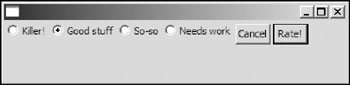
Figure 5-9
Buttons and Labels
This section introduces two kinds of basic controls in SWT: buttons and labels. You learn how to create them, set their styles, capture events, and more.
Buttons
A button is a selectable user interface component that issues notifications when pressed and released.
Styles
Styles supported by the Button class include the following:
- ARROW, CHECK, PUSH, RADIO, TOGGLE: These five styles specify five different kinds of buttons: arrow buttons, checkbox buttons, push buttons, radio buttons, and toggle buttons. Only one of the five styles may be specified when constructing a button. Figure 5-10 shows buttons with various styles.
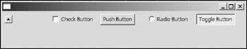
Figure 5-10 - FLAT: This is a hint. It makes the button look flat.
- UP, DOWN, LEFT, RIGHT: Each specifies a direction that the arrow on an arrow button points to.
Only one of them may be specified. UP and DOWN styles are available for arrow buttons only. For buttons except arrow buttons, LEFT and RIGHT styles specify the alignments. (See the next bullet.) In Figure 5-10, the arrow is pointing UP.
- LEFT, RIGHT, CENTER: These three styles specify the text/image alignment in buttons.
Button Basics
To get and set a button's text label, use the following method:
 public String getText()
 public void setText(String text)
If a button is an arrow button, the getText method returns an empty string and setText does not have any effect.
You can include the mnemonic character in the text label. Inserting an ampersand (&) before a character makes the character the mnemonic. When the user presses a key matching the mnemonic, the corresponding button is selected and a selection event is generated as a result. To escape the mnemonic character &, you can double it and a single "&" will be displayed.
To get and set a button's image label, use the following method:
 public Image getImage()
 public void setImage(Image image)
The setImage method causes a button's text label to be hidden; on the other hand, the setText method hides the button's image if it exists. To make a button's image visible, you must not call its setText method after executing the setImage method, and vice versa.
You can set the alignment of the text/image label of a button in the constructor of the Button class, or you can use the setAlignment method after it has been created:
public void setAlignment(int alignment)
To query a button for its label alignment, call the getAlignment method:
public int getAlignment()
Selection Events
Selection events are generated when buttons get selected and pressed. You can register selection listeners to buttons. There are two methods defined in the SelectionListener interface you must implement in your selection listener:
 public void widgetSelection(SelectionEvent e)
 public void widgetDefaultSelection(SelectionEvent e)
The first method is called when a button is selected. Because default selection is not applicable to buttons, you can simply leave it blank.
If you need to select a button programmatically, use the following method:
public void setSelection(boolean selected)
This method is applicable for checkbox buttons, radio buttons, and toggle buttons only. It has no effect on push buttons and arrow buttons.
To check the selection status of a button, use the following method:
public boolean getSelection()
Similarly, the above method is only applicable for check buttons, radio buttons, and toggle buttons. It always returns false if the button is a push button or an arrow button.
Radio Buttons
Radio buttons are normally used as a group to let the user select one option from all the available options.
By default all the radio buttons sharing the same parent belong to the same group. This may cause problems sometimes. For example, the following code creates a GUI to enable a user to select the gender and the title as shown in Figure 5-11.
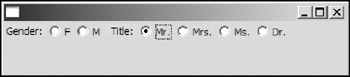
Figure 5-11
 ...
 Display display = new Display();
 Shell shell = new Shell(display);

 shell.setLayout(new RowLayout());

 Label label = new Label(shell, SWT.NULL);
 label.setText("Gender: ");
 label.setBackground(display.getSystemColor(SWT.COLOR_YELLOW));

 Button femaleButton = new Button(shell, SWT.RADIO);
 femaleButton.setText("F");

 Button maleButton = new Button(shell, SWT.RADIO);
 maleButton.setText("M");

 label = new Label(shell, SWT.NULL);
 label.setText(" Title: ");
 label.setBackground(display.getSystemColor(SWT.COLOR_YELLOW));

 Button mrButton = new Button(shell, SWT.RADIO);
 mrButton.setText("Mr.");
 Button mrsButton = new Button(shell, SWT.RADIO);
 mrsButton.setText("Mrs.");
 Button msButton = new Button(shell, SWT.RADIO);
 msButton.setText("Ms.");
 Button drButton = new Button(shell, SWT.RADIO);
 drButton.setText("Dr.");

 ...
Suppose the user is male. He selects the M option by clicking the radio button marked M. Then he tries to select "Mr." as his title. After the Mr. radio button is selected, the selection of the M radio button is gone! The cause of this problem is that all the radio buttons belong to the same group.
To fix this problem, you have to break the radio buttons into two groups. One viable approach is to put the four radio buttons about the title into a separate composite and leave anything else unchanged:
 ...
 Composite composite = new Composite(shell, SWT.NULL);
 composite.setLayout(new RowLayout());

 Button mrButton = new Button(composite, SWT.RADIO);
 mrButton.setText("Mr.");
 Button mrsButton = new Button(composite, SWT.RADIO);
 mrsButton.setText("Mrs.");
 Button msButton = new Button(composite, SWT.RADIO);
 msButton.setText("Ms.");
 Button drButton = new Button(composite, SWT.RADIO);
 drButton.setText("Dr.");
 ...
Labels
Labels are non-selectable user interface components that display strings or images. The org.eclipse. swt.widgets.Label class provides basic label functions. If you need labels with advanced features, use the org.eclipse.swt.custom.CLabel class.
Styles
Styles supported by the Label class are as follows:
- SEPARATOR, HORIZONTAL, VERTICAL: The SEPARATOR style causes a label to appear as a single line whose orientation can be either HORIZONTAL (default) or VERTICAL.
- SHADOW_IN, SHADOW_OUT, SHADOW_NONE: These three styles specify the shadow behavior of labels with the SEPARATOR style.
- LEFT, RIGHT, CENTER: These styles specify the text/image alignment in labels.
- WRAP: Labels with this style can automatically wrap long lines. The following code compares labels with and without WRAP styles as shown in Figure 5-12.
The code that follows creates two labels with different styles. The second label has the WRAP style set:
 Display display = new Display();
 Shell shell = new Shell(display);

 String text = "Professional Java Interfaces With SWT/JFace, by Jack Li Guojie";

 Label labelNoWrap = new Label(shell, SWT.BORDER);
 labelNoWrap.setText(text);
 labelNoWrap.setBounds(10, 10, 100, 100);

 Label labelWrap = new Label(shell, SWT.WRAP | SWT.BORDER);
 labelWrap.setText(text);
 labelWrap.setBounds(120, 10, 100, 100);
 ...
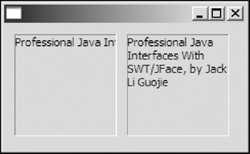
Figure 5-12
Label Basics
The Label class is very similar to the Button class in terms of API functions.
The following methods can be used to get and set the text label for a label:
 public String getText()
 public void setText(String text)
To get and set the image label for a label, you can use the following:
 public Image getImage()
 public void setImage(Image image)
The same constraint on text and image as the Button class applies here.
The CLabel Class
The CLabel class provides some advanced features over the Label class.
An instance of the CLabel class is capable of displaying its text label and image label at the same time. If there is enough space for both the text label and the image label, both of them will be displayed; otherwise, only the text label is displayed.
For the Label class, the style constants SHADOW_IN, SHADOW_OUT, SHADOW_NONE are applicable to label separators only. These three style constants can be used to specify the border behaviors for generic instances of CLabels, as shown in Figure 5-13.
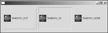
Figure 5-13
Use the following method to set the background image of a CLabel object:
public void setBackground(Image image)
If the image and the bounds of the CLabel instance are of differing sizes, the image will be stretched or shrunk to fit the bounds of the CLabel instance.
The CLabel class enables you to create labels with gradient colors as background using this method:
public void setBackground(Color[] colors, int[] percents)
You specify the colors to appear in the gradient to display from left to right in the first argument. The percentages of the width of the label at which color should change are specified as an array in the second argument. For example, the following code creates a label with a background gradient that varies from green to white and then to red (see Figure 5-14):
 CLabel labelGradientBg = new CLabel(shell, SWT.SHADOW_IN);
 labelGradientBg.setText("CLabel with gradient colored background");
 labelGradientBg.setImage(image);
 labelGradientBg.setBounds(10, 10, 300, 100);
 labelGradientBg.setBackground(
 new Color[] {
 display.getSystemColor(SWT.COLOR_GREEN),
 display.getSystemColor(SWT.COLOR_WHITE),
 display.getSystemColor(SWT.COLOR_RED)},
 new int[] { 50, 100 });
It's okay.
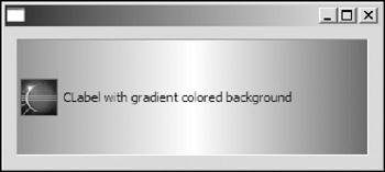
Figure 5-14
Summary
You have learned about the hierarchy of the SWT widgets and several basic controls. The Widget class is the top class in the hierarchy. A widget can be created and disposed of and it is capable of issuing notifications to listeners when events occur. The Control class is the superclass of all windowed UI components. You learned how to set the font and colors for a control, update its UI, and throw the redraw and update methods. A composite is capable of containing other controls, and you learned how to configure the focus traversal over child controls on a composite. The Shell class represents a window in SWT. Buttons and labels are two fundamental controls. You learned how to create buttons and labels with different styles.
The next chapter shows you how to position and size the children of a composite using a layout manager.
Part I - Fundamentals
- Overview of Java UI Toolkits and SWT/JFace
- SWT/JFace Mechanisms
- Jump Start with SWT/JFace
- SWT Event Handling, Threading, and Displays
- Basic SWT Widgets
- Layouts
Part II - Design Basics
Part III - Dynamic Controls
- Scales, Sliders, and Progress Bars
- Other Important SWT Components
- SWT Graphics and Image Handling
- Drag and Drop and the Clipboard
- Printing
- JFace Windows and Dialogs
Part IV - Application Development
EAN: 2147483647
Pages: 147
