Menus, Toolbars, Cool, Bars, and Actions
This chapter teaches you how to use menus, toolbars, and cool bars in SWT. Additionally, you learn how to use the JFace action framework to simplify the task of creating menus and toolbars.
Using Menus and Menu Items
In SWT, a menu is represented by the org.eclipse.swt.widgets.Menu class. A menu may contain many menu items (org.eclipse.swt.widgets.MenuItem). Menu items are selectable user interface objects that issue notifications when pressed and released.
Using Menus
There are different kinds of menus, and the Menu class provides different constructors to create them.
Bar Menus
A menu with the SWT.BAR style stays at the top of a shell. Bar menus are used as top-level menus for shells. Figure 9-1 shows a menu with two menu items.
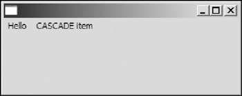
Figure 9-1
To create a bar menu, you can use the following constructor:
public Menu(Decorations parent, int style)
You need to put the SWT.BAR style bit in the style argument. To set a menu bar to a shell, you need to call the setMenuBar method of the Shell class:
public void setMenuBar(Menu menu)
The corresponding method to get the menu bar is the getMenuBar method.
The following section provides examples of creating menus.
Drop-Down Menus
A menu with the SWT.DROP_DOWN style is usually used as a submenu, which is used in conjunction with a menu item with the SWT.CASCADE style. A drop-down menu appears when the user clicks its corresponding parent menu item, as shown in Figure 9-2.
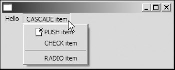
Figure 9-2
To create a drop-down menu, you can use either of the following constructors:
 public Menu(Menu parentMenu)
 public Menu(MenuItem parentItem)
The first one constructs a new instance of the menu with the given parent menu and sets the newly created menu style to SWT.DROP_DOWN. The second constructor sets the parent of the new instance to a menu item. The only difference between the two constructors is that they create menu widgets with different types of widgets as their parents. In the former case, the menu is disposed of when the parent menu is disposed of; in the latter case, the menu is disposed of when the parent menu item is disposed of.
After the drop-down menu has been created, you can associate it with a SWT.CASCADE menu item using the setMenu method of the MenuItem class:
public void setMenu(Menu menu)
Pop-Up Menus
A pop-up menu, with the SWT.POP_UP style, usually appears when the user right-clicks the corresponding widget, as shown in Figure 9-3.
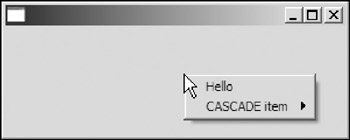
Figure 9-3
To create a pop-up menu for a control, you can use the following constructor of the Menu class:
public Menu(Control parent)
This method creates a menu with the SWT.POP_UP style. After the pop-up menu has been created, you can associate it to a control using the setMenu method of the control class:
public void setMenu(Menu menu)
The corresponding method to get the pop-up menu of a control is the getMenu method.
Menu Item Management
Typically, a menu has several menu items as its children. A few methods in the Menu class handle menu item management.
To retrieve all the menu items in a menu, you can use the getItems method:
public MenuItem[] getItems()
The total number of items can be obtained through the getItemCount method:
public int getItemCount()
To get a menu item at the specified index, you can use the getItem method:
public MenuItem getItem(int index)
If the specified index is out of range, an IllegalArgumentException is thrown.
There are two methods to get and set the default menu item. A default menu item is usually highlighted using boldface:
 public MenuItem getDefaultItem()
 public void setDefaultItem(MenuItem item)
Handling Events
Menus can generate two types of events: SWT.HELP and SWT.MENU.
When the user presses F1 on a menu, a help event is generated. The following method can be used to register a HelpListener to a menu:
public void addHelpListener(HelpListener listener)
Alternatively, you can also use the following code (see Chapter 4):
addListener(SWT.HELP, new Listener(...));
When a menu appears or disappears, menu events are generated. The following method can be used to add a MenuListener:
public void addMenuListener(MenuListener listener)
There are two methods in the MenuListener interface that you need to implement:
 public void menuHidden(MenuEvent e)
 public void menuShown(MenuEvent e)
Using MenuItems
A menu item is a selectable user interface object that issues notification when pressed and released.
A menu item may have one and only one style of the following:
- SWT.CHECK: A menu item with this style behaves like a checkbox.
- SWT.CASCADE: A cascade menu item may have a menu as the submenu. When the user clicks a menu item with the SWT.CASCADE style, instead of issuing notifications, the system opens the menu attached to the menu item.
- SWT.PUSH: Menu items with this style behave like push buttons.
- SWT.RADIO: A menu item with this style behaves like a radio button.
- SWT.SEPARATOR: A menu item with the SWT.SEPARATOR style is a line separator.
The MenuItem class provides two constructors:
 public MenuItem(Menu parent, int style)
 public MenuItem(Menu parent, int style, int index)
The first constructor creates a new instance with the given menu as its parent. You specify one and only one of the styles SWT.CHECK, SWT.CASCADE, SWT.PUSH, SWT.RADIO, and SWT.SEPARATOR in the style argument. The second constructor allows you to specify the index at which to place the menu item in the item list maintained by the parent menu.
The following code creates a menu bar, as shown in Figure 9-4.
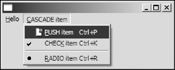
Figure 9-4
 Menu menuBar = new Menu(shell, SWT.BAR);

 MenuItem itemHello = new MenuItem(menuBar, SWT.PUSH);
 itemHello.setText("&Hello");
 itemHello.addListener(SWT.Selection, new Listener() {
 public void handleEvent(Event event) {
 System.out.println("HELLO");
 }
 });

 MenuItem itemCascade = new MenuItem(menuBar, SWT.CASCADE);
 itemCascade.setText("&CASCADE item");

 Menu menu = new Menu(itemCascade);

 MenuItem itemPush = new MenuItem(menu, SWT.PUSH);
 itemPush.setText("&PUSH item	Ctrl+P");
 itemPush.setAccelerator(SWT.CTRL + 'P');
 Image icon = new Image(shell.getDisplay(), "icons/new.gif");
 itemPush.setImage(icon);
 itemPush.addListener(SWT.Selection, new Listener() {
 public void handleEvent(Event event) {
 System.out.println("item selected: PUSH item");
 }
 });

 final MenuItem itemCheck = new MenuItem(menu, SWT.CHECK);
 itemCheck.setText("CHEC&K item	Ctrl+K");
 itemCheck.setAccelerator(SWT.CTRL + 'K');
 itemCheck.addListener(SWT.Selection, new Listener() {
 public void handleEvent(Event event) {
 System.out.println("item selected: CHECK item");
 System.out.println("Selection: " + itemCheck.getSelection());
 }
 });

 new MenuItem(menu, SWT.SEPARATOR);

 final MenuItem itemRadio = new MenuItem(menu, SWT.RADIO);
 itemRadio.setText("&RADIO item	Ctrl+R");
 itemRadio.setAccelerator(SWT.CTRL + 'R');
 itemRadio.addListener(SWT.Selection, new Listener() {
 public void handleEvent(Event event) {
 System.out.println("item selected: RADIO item");
 System.out.println("Selection: " + itemRadio.getSelection());
 }
 });

 itemCascade.setMenu(menu);

 shell.setMenuBar(menuBar);
The first line of the code creates the menu bar for the shell. A menu item with SWT.PUSH style is added to the menu bar. The setText method of the MenuItem is used to set the text label for the menu item.
We then add an untyped listener to listen for selection events. When the push menu item is pressed, the listener is invoked.
A menu item with the SWT.CASCADE style is then added to the menu bar. A menu with the SWT.DROP_DOWN style is created with the cascade menu item as its parent. We then add a push menu item, a check menu item, a line separator, and a radio menu item to the menu. Finally, we attach the menu to the cascade menu item and set the menu bar to the shell.
Notice that when you specify the text label for a menu item using the setText method, you may include the mnemonic character and accelerator text. Insertion of an ampersand (&) immediately before a character causes the character to be the mnemonic. When the user presses a key sequence matching the mnemonic, the corresponding menu item is selected. To escape the mnemonic character "&", you can double it in the string. Accelerator text is indicated by the characters. The text following is displayed on platforms that support accelerator text. The accelerator text displays only the acceleration key sequence. To install the acceleration key sequence, you need to call the setAccelerator method:
public void setAccelerator(int accelerator)
In the preceding code, Ctrl+K is assigned to the check menu item in the submenu. When Ctrl+K is pressed, even if the submenu is not displayed, a selection event is generated for the check menu item.
In addition to text labels, you can also specify an image label for a menu item using the setImage method:
public void setImage(Image image)
If a menu item is of the style SWT.CHECK or SWT.RADIO, you can check its selection status through the getSelection method:
public boolean getSelection()
To modify the selection status for a menu item programmatically, you can use the setSelection method:
public void setSelection(boolean selected)
Besides selection events, a menu can also generate help events and arm events. An arm event occurs when a menu item is armed (i.e., the user clicks the menu item and the mouse button has not been released yet). The methods to register help listeners and arm listeners are as follows:
 public void addHelpListener(HelpListener listener)
 public void addArmListener(ArmListener listener)
At the end of the preceding code, we use setMenu to attach the menu to the cascade menu item:
public void setMenu(Menu menu)
This method is available only for menu items with the SWT.CASCADE style, and the menu passed must be of the SWT.DROP_DOWN style. Otherwise, exceptions will be thrown.
To enable or disable a menu item, you can use the setEnabled method of the MenuItem class.
Creating a Text Editor
In this chapter, you are going to create a text editor with basic functions, as shown in Figure 9-5.
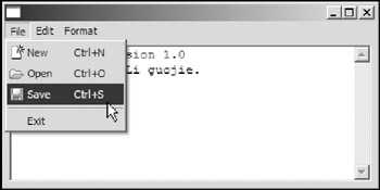
Figure 9-5
First, you set up the shell and create a styled text control:
 public class BasicEditor {
 Display display = new Display();
 Shell shell = new Shell(display);

 // The control used for text displaying and editing.
 StyledText text;

 // Is there any changes since last saving action? boolean hasUnsavedChanges;

 // The file associated with current text content. File file;

 // The recent directory
 private String lastOpenDirectory;

 // The name of this program.
 public static final String APP_NAME = "BasicEditor v1.0";

 public BasicEditor() {
 shell.setLayout(new GridLayout());

 text =
 new StyledText(
 shell,
 SWT.MULTI
 | SWT.WRAP
 | SWT.BORDER
 | SWT.H_SCROLL
 | SWT.V_SCROLL);
 text.setLayoutData(new GridData(GridData.FILL_BOTH));

 Font font = new Font(shell.getDisplay(), "Courier New", 10, SWT.NORMAL);
 text.setFont(font);

 text.setText("BasicEditor version 1.0
Written by Jack Li Guojie. ");
 text.addModifyListener(new ModifyListener() {
 public void modifyText(ModifyEvent e) {
 hasUnsavedChanges = true;
 }
 });
Then you create the menu bar and menu items as shown here:
 // Add menus.
 Menu menuBar = new Menu(shell, SWT.BAR);

 // --- sub menu: File
 MenuItem fileMenuItem = new MenuItem(menuBar, SWT.CASCADE);
 fileMenuItem.setText("&File");
 Menu fileMenu = new Menu(shell, SWT.DROP_DOWN);

 MenuItem miNew = new MenuItem(fileMenu, SWT.PUSH);
 miNew.setText("&New	Ctrl+N");
 miNew.setImage(getImage("new.gif"));
 miNew.setAccelerator (SWT.CTRL + 'N');
 miNew.addListener(SWT.Selection, new Listener() {
 public void handleEvent(Event event) {
 if(handleChangesBeforeDiscard()) {
 file = null;
 text.setText("");
 }
 }
 });

 MenuItem miOpen = new MenuItem(fileMenu, SWT.PUSH);
 miOpen.setText("&Open	Ctrl+O");
 miOpen.setAccelerator(SWT.CTRL + 'O');
 miOpen.setImage(getImage("open.gif"));
 miOpen.addListener(SWT.Selection, new Listener() {
 public void handleEvent(Event event) {
 if(handleChangesBeforeDiscard())
 loadTextFromFile();
 }
 });

 MenuItem miSave = new MenuItem(fileMenu, SWT.PUSH);
 miSave.setText("&Save	Ctrl+S");
 miSave.setImage(getImage("save.gif"));
 miSave.setAccelerator (SWT.CTRL + 'S');
 miSave.addListener(SWT.Selection, new Listener() {
 public void handleEvent(Event event) {
 saveTextToFile();
 }
 });

 new MenuItem(fileMenu, SWT.SEPARATOR);

 MenuItem miExit = new MenuItem(fileMenu, SWT.PUSH);


 miExit.setText("&Exit");
 miExit.addListener(SWT.Selection, new Listener() {
 public void handleEvent(Event event) {
 if(handleChangesBeforeDiscard())
 shell.dispose();
 }
 });

 fileMenuItem.setMenu(fileMenu);

 // --- sub menu: Edit.
 MenuItem editMenuItem = new MenuItem(menuBar, SWT.CASCADE);
 editMenuItem.setText("&Edit");

 Menu editMenu = new Menu(shell, SWT.DROP_DOWN);

 MenuItem miCopy = new MenuItem(editMenu, SWT.PUSH);
 miCopy.setText("&Copy	Ctrl+C");
 miCopy.setImage(getImage("copy.gif"));
 miCopy.setAccelerator(SWT.CTRL + 'C');
 miCopy.addListener(SWT.Selection, new Listener() {
 public void handleEvent(Event event) {
 text.copy();
 }
 });

 MenuItem miCut = new MenuItem(editMenu, SWT.PUSH);
 miCut.setText("Cu&t	Ctrl+X");
 miCut.setImage(getImage("cut.gif"));
 miCut.setAccelerator(SWT.CTRL + 'X');
 miCut.addListener(SWT.Selection, new Listener() {
 public void handleEvent(Event event) {
 text.cut();
 }
 });

 MenuItem miPaste = new MenuItem(editMenu, SWT.PUSH);
 miPaste.setText("&Paste	Ctrl+P");
 miPaste.setImage(getImage("paste.gif"));
 miPaste.setAccelerator(SWT.CTRL + 'P');
 miPaste.addListener(SWT.Selection, new Listener() {
 public void handleEvent(Event event) {
 text.paste();
 }
 });

 editMenuItem.setMenu(editMenu);

 // --- sub menu: Format.
 MenuItem formatMenuItem = new MenuItem(menuBar, SWT.CASCADE);
 formatMenuItem.setText("&Format");

 Menu formatMenu = new Menu(shell, SWT.DROP_DOWN);

 final MenuItem miWrap = new MenuItem(formatMenu, SWT.CHECK);

 miWrap.setText("&Wrap	Ctrl+W");
 miWrap.setAccelerator(SWT.CTRL + 'W');
 miWrap.addListener(SWT.Selection, new Listener() {
 public void handleEvent(Event event) {
 text.setWordWrap(miWrap.getSelection());
 }
 });

 formatMenuItem.setMenu(formatMenu);

 // Add the menu bar to the shell.
 shell.setMenuBar(menuBar);
Auxiliary functions are omitted for the sake of simplicity. For the complete source file, please refer to BasicEditor.java.
Finally, you open the shell and set up the event loop:
 // Set up the event loop.
 while (!shell.isDisposed()) {
 if (!display.readAndDispatch()) {
 // If no more entries in event queue
 display.sleep();
 }
 }
 display.dispose();
 }
Using ToolBars and ToolItems
A toolbar is able to lay out selectable tool bar items. A menu bar accepts menu items as its children only. Similarly, you can add tool items only to a toolbar.
Using ToolBars
You can add a menu bar only to a shell; however, you can assign a toolbar to any widget of the type org.eclipse.swt.widgets.Composite.
To assign a toolbar for a composite, you simply pass the composite to the constructor of the ToolBar class.
public ToolBar(Composite parent, int style)
ToolBar Styles
You can specify the style information in the constructor of the ToolBar class. Possible styles are as follows:
- SWT.WRAP: If the style is set, a toolbar may wrap the tool items into different rows when the horizontal dimension is not enough for all the items displayed in one row.
- SWT.RIGHT: By default, the image of a tool item is display above its text label. Setting this style puts the text label to the right of the image. If the vertical client area is limited, you should consider setting this style.
- SWT.HORIZONTAL, SWT.VERTICAL: These two styles specify the orientation of a toolbar. By default, a toolbar is laid out horizontally. To lay out the toolbar vertically, you can specify the SWT.VERTICAL style.
- SWT.FLAT, SWT.SHADOW_OUT: These two styles are used to specify the appearance of a toolbar.
Accessing ToolItems
The ToolBar class provides several methods to enable you to access the tool items of a toolbar easily.
You can use the getItem method to get a tool item at the specified index:
public ToolItem getItem(int index)
There is another getItem method with signature public ToolItem getItem(Point point), which returns the tool item at the given point in the toolbar or null if no such item exists.
To get all the items in a toolbar, you can call the getItems method:
public ToolItem[] getItems()
If you need to know the index of a particular tool item in the item list, you can use the indexOf method:
public int indexOf(ToolItem item)
The total number of items in a toolbar can be obtained through the getItemCount method:
public int getItemCount()
Finally, if a toolbar has the SWT.WRAP style set, you can get the number of rows in the toolbar by using the getRowCount method:
public int getRowCount()
Of course, if the toolbar does not have SWT.WRAP style set, the preceding method always returns 1.
Using ToolItems
A tool item is a selectable user interface object representing a button in a toolbar.
You can create a tool item on a toolbar using the following constructor of the ToolItem class:
public ToolItem(ToolBar parent, int style)
The first argument specifies the toolbar that this tool item resides on. Style information is stored in the second argument. The complete list of styles is introduced shortly.
Another constructor in the ToolItem class enables you to specify the index at which to place the tool item in the item list maintained by the parent toolbar:
public ToolItem(ToolBar parent, int style, int index)
Styles of ToolItems
Different kinds of menu items were introduced in the preceding section. Similarly, there are different kinds (styles) of tool items.
A tool item can have one and only one style of the following styles:
- SWT.PUSH: Tool items with this style behave like push buttons.
- SWT.CHECK: A tool item with this style behaves like a checkbox.
- SWT.RADIO: A tool item with this style behaves like a radio button.
- SWT.SEPARATOR: A tool item with SWT.SEPARATOR style is an item separator. Additionally, you can set a control for an item separator.
- SWT.DROP_DOWN: With this style set, a tool item is displayed as a button with an arrow. Usually, you add a selection listener to a tool item with the DROP_DOWN style and display a UI component(e.g., a menu) when the tool item is selected.
Creating ToolItems
In the preceding section, I introduced five different styles of tool items. In this section, you create tool items with different styles.
You are going to create a toolbar, as shown in Figure 9-6.
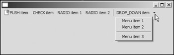
Figure 9-6
First, you create the toolbar and its tool items except the last one:
 ToolBar toolBar = new ToolBar(shell, SWT.FLAT | SWT.WRAP | SWT.RIGHT);

 ToolItem itemPush = new ToolItem(toolBar, SWT.PUSH);
 itemPush.setText("PUSH item");
 Image icon = new Image(shell.getDisplay(), "icons/new.gif");
 itemPush.setImage(icon);

 ToolItem itemCheck = new ToolItem(toolBar, SWT.CHECK);

 itemCheck.setText("CHECK item");

 ToolItem itemRadio1 = new ToolItem(toolBar, SWT.RADIO);
 itemRadio1.setText("RADIO item 1");

 ToolItem itemRadio2 = new ToolItem(toolBar, SWT.RADIO);
 itemRadio2.setText("RADIO item 2");

 ToolItem itemSeparator = new ToolItem(toolBar, SWT.SEPARATOR);

 ToolItem itemDropDown = new ToolItem(toolBar, SWT.DROP_DOWN);
 itemDropDown.setText("DROP_DOWN item");
You can use the setText method of the ToolItem class to set a text label for a tool item.
You can do several things when configuring a ToolItem:
- You can set its text label:
public void setText(String string)
- You can set its image label:
public void setImage(Image image)
- You can set its hot image (i.e., the one that shows up when the mouse is over the item):
public void setHotImage(Image image)
- You can set its disabled image:
public void setDisabledImage(Image image)
- You can set the mnemonic for the item by using the ampersand (&) character in the text of the tool.
- You can set the tooltip text:
public void setToolTipText(String string)
- You can enable and disable the tooltip text:
public void setEnabled(boolean enabled)
Now let's make the last ToolItem, the drop-down one, more functional. Remember the skeleton structure you gave it before:
 ToolItem itemDropDown = new ToolItem(toolBar, SWT.DROP_DOWN);
 itemDropDown.setText("DROP_DOWN item");
Now let's flesh that out by giving the drop-down tool some menu items to display when a user clicks the drop-down arrow at the right edge of the tool:
 final ToolItem itemDropDown = new ToolItem(toolBar, SWT.DROP_DOWN);
 itemDropDown.setText("DROP_DOWN item");
 itemDropDown.setToolTipText("Click here to see a drop down menu ...");

 final Menu menu = new Menu(shell, SWT.POP_UP);
 new MenuItem(menu, SWT.PUSH).setText("Menu item 1");
 new MenuItem(menu, SWT.PUSH).setText("Menu item 2");
 new MenuItem(menu, SWT.SEPARATOR);
 new MenuItem(menu, SWT.PUSH).setText("Menu item 3");

 itemDropDown.addListener(SWT.Selection, new Listener() {
 public void handleEvent(Event event) {
 if(event.detail == SWT.ARROW) {
 Rectangle bounds = itemDropDown.getBounds();
 Point point = toolBar.toDisplay(
 bounds.x, bounds.y + bounds.height);
 menu.setLocation(point);
 menu.setVisible(true);
 }
 }
 });
This tool item is created with the SWT.DROP_DOWN style. Then you create a pop-up menu to display the menu of options for the drop-down tool. You plan to display this menu when the small arrow of the tool item is pressed. A selection listener is added and the menu is set to visible only when the arrow is pressed.
Then you register selection listeners for the tool items:
 Listener selectionListener = new Listener() {
 public void handleEvent(Event event) {
 ToolItem item = (ToolItem)event.widget;
 System.out.println(item.getText() + " is selected");
 if( (item.getStyle() & SWT.RADIO) != 0 ||
 (item.getStyle() & SWT.CHECK) != 0 )
 System.out.println("Selection status: " + item.getSelection());
 }
 };
 itemPush.addListener(SWT.Selection, selectionListener);
 itemCheck.addListener(SWT.Selection, selectionListener);
 itemRadio1.addListener(SWT.Selection, selectionListener);
 itemRadio2.addListener(SWT.Selection, selectionListener);
 itemDropDown.addListener(SWT.Selection, selectionListener);
Because the second-to-last tool item is a plain separator, you do not register the listener to it. For tool items with SWT.RADIO style or SWT.CHECK style, you use the getSelection method to check their selection status:
public boolean getSelection()
To set selection status programmatically, you can use the setSelection method of the ToolItem class.
Finally, you pack the toolbar and enable it to resize automatically when the shell resizes:
 toolBar.pack();

 shell.addListener(SWT.Resize, new Listener() {
 public void handleEvent(Event event) {
 Rectangle clientArea = shell.getClientArea();
 toolBar.setSize(toolBar.computeSize(clientArea.width, SWT.DEFAULT));
 }
 });
Adding Controls to a ToolBar
You can add controls to a toolbar by using menu items with the SWT.SEPARATOR style. In fact, only tool items with the SWT.SEPARATOR style are capable of holding controls.
You are going to modify the code in the last section to add a text control to the toolbar (see Figure 9-7).
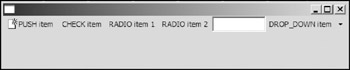
Figure 9-7
 ToolItem itemSeparator = new ToolItem(toolBar, SWT.SEPARATOR);
 Text text = new Text(toolBar, SWT.BORDER | SWT.SINGLE);
 text.pack();
 itemSeparator.setWidth(text.getBounds().width);
 itemSeparator.setControl(text);
The code highlighted in bold is the newly added part. First, a text control is created. You then set the width of the separator to the preferred width of the text control. The setControl method of the ToolItem class is used to associate a control with a tool item with the SWT.SEPARATOR style.
public void setControl(Control control)
The corresponding method to get the control from a separator is the getControl method:
public Control getControl()
Adding a Toolbar for the Text Editor
Now, you can add a toolbar to our sample application (see Figure 9-8).
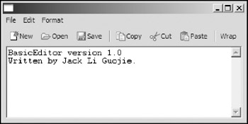
Figure 9-8
 MenuItem miWrap = null;

 public BasicEditor() {
 shell.setLayout(new GridLayout());

 // Add a tool bar.
 ToolBar toolBar = new ToolBar(shell, SWT.FLAT | SWT.RIGHT );
 ToolItem tiNew = new ToolItem(toolBar, SWT.PUSH);
 tiNew.setText("&New");
 tiNew.setImage(getImage("new.gif"));
 tiNew.addListener(SWT.Selection, new Listener() {
 public void handleEvent(Event event) {
 if(handleChangesBeforeDiscard()) {
 file = null;
 text.setText("");
 }
 }
 });

 ToolItem tiOpen = new ToolItem(toolBar, SWT.PUSH);
 tiOpen.setText("&Open");
 tiOpen.setImage(getImage("open.gif"));
 tiOpen.addListener(SWT.Selection, new Listener() {
 public void handleEvent(Event event) {
 if(handleChangesBeforeDiscard())
 loadTextFromFile();
 }
 });

 ToolItem tiSave = new ToolItem(toolBar, SWT.PUSH);
 tiSave.setText("&Save");
 tiSave.setImage(getImage("save.gif"));
 tiSave.addListener(SWT.Selection, new Listener() {
 public void handleEvent(Event event) {
 saveTextToFile();
 }
 });

 new ToolItem(toolBar, SWT.SEPARATOR);

 ToolItem tiCopy = new ToolItem(toolBar, SWT.PUSH);

 tiCopy.setText("&Copy");
 tiCopy.setImage(getImage("copy.gif"));
 tiCopy.addListener(SWT.Selection, new Listener() {
 public void handleEvent(Event event) {
 text.copy();
 }
 });

 ToolItem tiCut = new ToolItem(toolBar, SWT.PUSH);
 tiCut.setText("Cu&t");
 tiCut.setImage(getImage("cut.gif"));
 tiCut.addListener(SWT.Selection, new Listener() {
 public void handleEvent(Event event) {
 text.cut();
 }
 });

 ToolItem tiPaste = new ToolItem(toolBar, SWT.PUSH);
 tiPaste.setText("&Paste");
 tiPaste.setImage(getImage("paste.gif"));
 tiPaste.addListener(SWT.Selection, new Listener() {
 public void handleEvent(Event event) {
 text.paste();
 }
 });

 new ToolItem(toolBar, SWT.SEPARATOR);

 final ToolItem tiWrap = new ToolItem(toolBar, SWT.CHECK);
 tiWrap.setText("&Wrap");
 tiWrap.addListener(SWT.Selection, new Listener() {
 public void handleEvent(Event event) {
 text.setWordWrap(tiWrap.getSelection());
 miWrap.setSelection(tiWrap.getSelection());
 }
 });

 toolBar.pack();

 text =
 new StyledText(
 shell,
 SWT.MULTI
 | SWT.WRAP
 | SWT.BORDER
 | SWT.H_SCROLL
 | SWT.V_SCROLL);
 text.setLayoutData(new GridData(GridData.FILL_BOTH));
 ...
A toolbar must be added before you add any child control to the composite. Otherwise, the toolbar and child controls may overlap. If that happens, you have to insert this code before you set up the menus for the application. Otherwise, your menu will overlap the toolbar and you'll never have access to your tools.
The toolbar provides the exact same functions as the menu bar. Because both the menu item miWrap and the tool item tiWrap control the wrap property of the text widget, you need to synchronize both items.
Using CoolBars and CoolItems
A cool bar provides an area for dynamically positioning the items that it contains. The resizable and repositionable nature of a cool bar is useful if you need to have a lot of items available to the user. Because a cool bar enables the user to customize its cool items, you could find it in almost any SWT/JFace GUI. In SWT, the class org.eclipse.swt.widgets.CoolBar is used to represent cool bars. You can add only an instance of the org.eclipse.swt.widgets.CoolItem class to cool bars.
Creating a CoolBar with CoolItems
You can use the following constructor of the CoolBar class to create cool bars:
public CoolBar(Composite parent, int style)
The CoolBar class itself does not support any special style; however, you can use the styles inherited from its ancestor classes, such as SWT.BORDER and SWT.H_SCROLL.
After a cool bar is created, you can add cool items to it by directly creating cool items with the cool bar as their parent. There are two constructors of the CoolItem class:
 public CoolItem(CoolBar parent, int style)
 public CoolItem(CoolBar parent, int style, int index)
SWT.DROP_DOWN is the only style that can be specified while creating cool items. If this style is set, an arrow indicator is shown on the cool item when there is not enough space for the cool item to display the control embedded. When the user clicks the arrow indicator, a selection event with SWT.ARROW as the detail is generated. You can register a selection listener and react accordingly, such as by displaying a menu.
A cool item wraps a control. You can use the following method to set and get the control for a cool item:
public Control getControl() public void setControl(Control control)
The following code creates a cool bar, as shown in Figure 9-9:
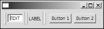
Figure 9-9
 Display display = new Display();
 Shell shell = new Shell(display);

 shell.setLayout(new GridLayout());

 CoolBar coolBar = new CoolBar(shell, SWT.NONE);

 coolBar.setLayoutData(new GridData(GridData.FILL_HORIZONTAL));

 // cool item with a text field.
 CoolItem textItem = new CoolItem(coolBar, SWT.NONE);

 Text text = new Text(coolBar, SWT.BORDER | SWT.DROP_DOWN);
 text.setText("TEXT");
 text.pack();

 Point size = text.getSize();
 textItem.setControl(text);
 textItem.setSize(textItem.computeSize(size.x, size.y));

 // cool item with a label.
 CoolItem labelItem = new CoolItem(coolBar, SWT.NONE);

 Label label = new Label(coolBar, SWT.NONE);
 label.setText("LABEL");
 label.pack();

 size = label.getSize();
 labelItem.setControl(label);
 labelItem.setSize(textItem.computeSize(size.x, size.y));

 // cool item with a button.
 CoolItem buttonItem = new CoolItem(coolBar, SWT.NONE | SWT.DROP_DOWN);

 Composite composite = new Composite(coolBar, SWT.NONE);
 composite.setLayout(new GridLayout(2, true));

 Button button1 = new Button(composite, SWT.PUSH);
 button1.setText("Button 1");
 button1.pack();

 Button button2 = new Button(composite, SWT.PUSH);
 button2.setText("Button 2");
 button2.pack();

 composite.pack();

 size = composite.getSize();
 buttonItem.setControl(composite);
 buttonItem.setSize(buttonItem.computeSize(size.x, size.y));
 ...
For each of the three cool items, you first create the cool item. Then the control to be wrapped by the cool item is created with the cool bar as the control's parent. After that, you resize the cool item according to the preferred size of the control.
The following is a utility method that helps you to create a cool item with the given control on a cool bar. The size of the cool item is adjusted according to the size of the control.
 /**
 * Creates a cool item with the given control and adds the cool item to the
 * specified cool bar.
 *
 * @param control
 * @param coolItemStyle -
 * should be SWT.NONE or SWT.DROP_DOWN.
 * @param coolBar
 * @return the cool item created.
 */
 public static CoolItem addControlToCoolBar(
 Control control,
 int coolItemStyle ,
 CoolBar coolBar) {
 CoolItem coolItem = new CoolItem(coolBar, coolItemStyle);
 Point size = control.getSize();
 if (size.x == 0 && size.y == 0) {
 // The control size has not been set yet.
 // Pack the control and recalculate its size.
 control.pack();
 size = control.getSize();
 }

 coolItem.setControl(control);
 coolItem.setSize(coolItem.computeSize(size.x, size.y));

 return coolItem;
 }
Saving and Loading the Display State of a CoolBar
A cool bar allows the user to reposition the cool items on it. An appealing GUI application should be able to restore the customization made by the user when the application is restarted.
The CoolBar class provides several methods that you can use to save and load the display state of a cool bar.
The getItemOrder method returns an array of zero-relative integers that map the creation order of the cool items to the order in which they are currently being displayed.
public int[] getItemOrder()
The getWrapIndices method returns an array of integers describing the indices of items in the cool bar that begin on a new row.
public int[] getWrapIndices()
The indices are given in the order in which they are currently being displayed. Because the first item always has the index value 0, it does not count as a wrap index. If there are two rows in the cool bar, this method returns a one-element array.
Figure 9-10 is the initial shell displayed by the code in the preceding section.
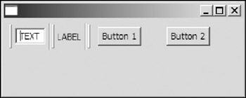
Figure 9-10
The initial item order and wrap indices are as follows:
 Item order: {0, 1, 2}
 Wrap indices: {}
If the user drops the cool item in the middle (i.e, the label), as shown in Figure 9-11, the new item order and wrap indices are as follows:
Item order: {0, 2, 1} Wrap indices: {2}
Figure 9-11
The getItemSizes method returns the sizes of all items in a cool bar as an array of Points:
public Point[] getItemSizes()
Now you can implement the saving and loading mechanism.
You can simply insert the following code in the code list in the preceding section to support cool bar state saving and loading:
 // Code to create the cool bar.
 ...
 try {
 setState(coolBar, new File("coolbar.state"));
 } catch (IOException e1) {
 e1.printStackTrace();
 }

 shell.addListener(SWT.Close, new Listener() {
 public void handleEvent(Event event) {
 try {
 saveState(coolBar, new File("coolbar.state") );
 } catch (IOException e) {
 e.printStackTrace();
 }
 }
 });

 // shell.pack();
 shell.open();
 ...
Just before the shell is opened, you load the state and set it to the cool bar using our custom method setState. When the shell is about to close, you save the state information using the saveState method.
The following is the implementation of the two custom methods you used in the preceding code:
 // Save the display state of the given cool bar in the specified file.
 private void saveState(CoolBar coolBar, File file) throws IOException {
 DataOutputStream out = new DataOutputStream(new FileOutputStream(file));

 try {
 // Orders of items.
 int[] order = coolBar.getItemOrder();
 out.writeInt(order.length);
 for(int i=0; iint[] wrapIndices = coolBar.getWrapIndices();
 out.writeInt(wrapIndices.length);
 for(int i=0; iPoint[] sizes = coolBar.getItemSizes();

 out.writeInt(sizes.length);
 for(int i=0; iprivate void setState(CoolBar coolBar, File file) throws IOException {
 if(! file.exists())
 throw new IOException("File does not exist: " + file);

 DataInputStream in = new DataInputStream(new FileInputStream(file));

 try {
 // Order
 int size = in.readInt();
 int[] order = new int[size];
 for(int i=0; icoolBar.setItemLayout(order, wrapIndices, sizes);
 } finally {
 in.close();
 }
 }
In our setState method, the setItemLayout method of the CoolBar class is used to set the display state for the cool bar:
public void setItemLayout(int[] itemOrder, int[] wrapIndices, Point[] sizes)
Using Actions and ContributionManagers
The following is the code to create a menu item and a tool item for text wrapping in the text editor:
 MenuItem miWrap = null;
 ...

 final ToolItem tiWrap = new ToolItem(toolBar, SWT.CHECK);
 tiWrap.setText("&Wrap");
 tiWrap.addListener(SWT.Selection, new Listener() {
 public void handleEvent(Event event) {
 text.setWordWrap(tiWrap.getSelection());
 miWrap.setSelection(tiWrap.getSelection());
 }
 });
 ...

 miWrap = new MenuItem(formatMenu, SWT.CHECK);
 miWrap.setText("&Wrap	Ctrl+W");
 miWrap.setAccelerator(SWT.CTRL + 'W');
 miWrap.addListener(SWT.Selection, new Listener() {
 public void handleEvent(Event event) {
 text.setWordWrap(miWrap.getSelection());
 tiWrap.setSelection(miWrap.getSelection());
 }
 });
Both the menu item and the tool item perform the exact same operation — when the menu item or the tool item is hit by the user, the wrap property of the text control is set. However, in the preceding code, we have created redundant code to set the operation for both of the items. This is error prone. Furthermore, we also added code to perform synchronization. When the operation is more complex and there are more items to be associated with the same operations, problems occur frequently due to redundant code and extra synchronization code.
JFace provides the actions framework to solve this problem elegantly.
Instead of creating tool items or menu items, you create actions that represent non-UI commands that can be triggered by the user. You then add those actions to contribution managers, which are capable of rendering proper UI objects to represent such actions. In this way, UI creation is greatly simplified and you need to focus only on business logic. Two common managers are MenuManagers and ToolBarManagers. As you'll see, using these managers removes duplication from your text editor application.
Creating Actions
First, let's create our first action object:
 // Action: set text wrapping property.
 Action actionWrap =
 new Action(
 "&Wrap", IAction.AS_CHECK_BOX) {
 public void run() {
 text.setWordWrap(isChecked());
 }
 };
 actionWrap.setAccelerator(SWT.CTRL + 'W');
In the preceding code, the action object is created with this constructor of the Action class:
protected Action(String text, int style)
You specify the text label for this action in the first argument. The style of the UI objects that will be created based on this action is specified in the second argument. Possible styles of an action are as follows:
- AS_CHECK_BOX: This style indicates the UI objects representing the action should be checkboxes or toggle buttons.
- AS_DROP_DOWN_MENU: The UI objects representing this action should be drop-down menus.
- AS_PUSH_BUTTON: The UI objects representing this action should be push buttons or push items.
- AS_RADIO_BUTTON: Radio buttons or radio items should be used to represent this action.
- AS_UNSPECIFIED: This style indicates the action style is unset. The SWT UI toolkit determines the proper types of UI objects to be created at runtime. By default, the UI objects representing this action should be push buttons or push items. If the setChecked method of the Action class is called, the action style will be AS_CHECK_BOX. Similarly, if setMenuCreator is called, the action style will be AS_DROP_DOWN_MENU.
You then override the run method of the Action class. The run method is called when the action is triggered by the user.
The action is mapped to the specified accelerator keycode by using the setAccelerator method.
public void setAccelerator(int keycode)
You can set the accelerator keycode in the text label. For example, if the text label &Wrap in the preceding code is replaced by &Wrap Ctrl+W, you do not have to make the call to the method setAccelerator. The accelerator keycode is extracted from the text set automatically.
The following code creates the rest of the actions:
 // Action: create new text.
 Action actionNew =
 new Action(
 "&New",
 ImageDescriptor.createFromFile(null, "icons/new.gif")) {
 public void run() {
 if (handleChangesBeforeDiscard()) {
 file = null;
 text.setText("");
 }
 }
 };
 actionNew.setAccelerator(SWT.CTRL + 'N');

 // Action: open a text file.
 Action actionOpen =
 new Action(
 "&Open",
 ImageDescriptor.createFromFile(null, "icons/open.gif")) {
 public void run() {
 if (handleChangesBeforeDiscard())
 loadTextFromFile();
 }
 };
 actionOpen.setAccelerator(SWT.CTRL + 'O');

 // Action: save the text to a file.
 Action actionSave =
 new Action(
 "&Save	Ctrl+S",
 ImageDescriptor.createFromFile(null, "icons/save.gif")) {
 public void run() {
 saveTextToFile();
 }
 };


 // Action: copy selected text.
 Action actionCopy =
 new Action(
 "&Copy",
 ImageDescriptor.createFromFile(null, "icons/copy.gif")) {
 public void run() {
 text.copy();
 }
 };
 actionCopy.setAccelerator(SWT.CTRL + 'C');

 // Action: cut the selected text.
 Action actionCut =
 new Action(
 "Cu&t",
 ImageDescriptor.createFromFile(null, "icons/cut.gif")) {
 public void run() {
 text.cut();
 }
 };
 actionCut.setAccelerator(SWT.CTRL + 'X');

 // Action: paste the text on clipboard.
 Action actionPaste =
 new Action(
 "&Paste",
 ImageDescriptor.createFromFile(null, "icons/paste.gif")) {
 public void run() {
 text.paste();
 }
 };
 actionPaste.setAccelerator(SWT.CTRL + 'P');

 // Action: exit.
 Action actionExit = new Action("&Exit	Ctrl+X") {
 public void run() {
 if (handleChangesBeforeDiscard())
 shell.dispose();
 }
 };
This constructor of the Action class allows you to specify an image label for the action:
protected Action(String text, ImageDescriptor image)
You can also use the setImageDescriptor method to set the image:
public void setImageDescriptor(ImageDescriptor newImage)
Additionally, two methods enable you to set the hover image and the disabled image for the action:
 public void setHoverImageDescriptor(ImageDescriptor newImage)
 public void setDisabledImageDescriptor(ImageDescriptor newImage)
Finally, you can use the setToolTipText method to set the tooltip text for the action:
public void setToolTipText(String toolTipText)
Creating Menus with MenuManagers
A MenuManager is a special type of ContributionManager. A contribution manager maintains a list of contribution items and manages them. A menu manager renders itself and its contribution items in a menu control.
The following is the complete code to create the bar menu and to set it to the shell for the text editor application:
 // Add menus.
 MenuManager barMenuManager = new MenuManager();

 MenuManager fileMenuManager = new MenuManager("&File");
 MenuManager editMenuManager = new MenuManager("&Edit");
 MenuManager formatMenuManager = new MenuManager("&Format");

 barMenuManager.add(fileMenuManager);
 barMenuManager.add(editMenuManager);
 barMenuManager.add(formatMenuManager);

 fileMenuManager.add(actionNew);
 fileMenuManager.add(actionOpen);
 fileMenuManager.add(actionSave);
 fileMenuManager.add(new Separator());

 fileMenuManager.add(actionExit);

 editMenuManager.add(actionCopy);

 editMenuManager.add(actionCut);
 editMenuManager.add(actionPaste);

 formatMenuManager.add(actionWrap);

 // Add the menu bar to the shell.
 barMenuManager.updateAll(true);
 shell.setMenuBar(barMenuManager.createMenuBar((Decorations)shell));
The guiding principle here is that you need to create a MenuManager for the menu bar and for each menu on the menu bar. Remember that you created an Action for each menu item. When you have the MenuManager created for each menu, you simply call add() on the manager to add each action to it. The updateAll method builds the menu control from the contribution items and does so recursively for all submenus.
public void updateAll(boolean force)
The force flag indicates whether the update should be performed even if the menu manager is not dirty(i.e., needs to be updated).
The createMenuBar method creates and returns a menu bar with the given decorations:
public Menu createMenuBar(Decorations parent)
Note that the Decorations class is the direct superclass of the Shell class, and it provides the appearance and behavior of shells.
To create a pop-up menu, you can use the createContextMenu method:
public Menu createContextMenu(Control parent)
Creating Toolbars with ToolBarManagers
A ToolBarManager renders itself into a toolbar control.
Here is the code to create the toolbar for the text editor using ToolBarManager:
 // Add a toolbar.
 ToolBar toolBar = new ToolBar(shell, SWT.FLAT | SWT.RIGHT);
 ToolBarManager toolBarManager = new ToolBarManager(toolBar);

 toolBarManager.add(actionNew);
 toolBarManager.add(actionOpen);
 toolBarManager.add(actionSave);

 toolBarManager.add(new Separator());

 toolBarManager.add(actionCopy);
 toolBarManager.add(actionCut);

 toolBarManager.add(actionPaste);

 toolBarManager.add(new Separator());

 toolBarManager.add(actionWrap);

 toolBarManager.update(true);
First, a toolbar control is created. You then associate this toolbar with a ToolBarManager. Action objects are then added to the toolbar manager. You can also add separators by using add(new Separator()). Finally, you need to update the control managed by the toolbar manager using the update method.
public void update(boolean force)
After the menu bar and the toolbar are created, you can then add other controls to the shell. The complete code is in the file BasicEditor2.java. When you run this version of the text editor, you will find that those menus and tool items work as usual. However, the code for this version is much more concise and manageable than the code used in the previous version.
Summary
In this chapter, you learned how to use menus, toolbars, and cool bars. To add a menu bar for a shell, you first create a menu with the SWT.BAR style and set the shell as its parent. Then you can add menu items and submenus to the menu bar. When a menu item is hit, a selection event occurs. You can register event listeners to listen to selection events. A sample application showed you how to create menu items with different styles. A toolbar is capable of laying out selectable toolbar items. Similar to a menu item, a tool item can be of a particular style, such as a push button style or a checkbox style. You can use a tool item with a separator style to add a control to a toolbar. If you want items to be positioned dynamically, you need a cool bar. The user can change the display order of cool items on a cool bar by dragging them to new places. Sometimes, managing menus, toolbars, and cool bars is tedious and error-prone. Fortunately, with JFace actions and contribution managers, you can manage menus, toolbars, and cool bars easily. The end of this chapter showed you how to use Actions and ContributionManagers to rewrite the sample application to make the code more maintainable.
Part I - Fundamentals
- Overview of Java UI Toolkits and SWT/JFace
- SWT/JFace Mechanisms
- Jump Start with SWT/JFace
- SWT Event Handling, Threading, and Displays
- Basic SWT Widgets
- Layouts
Part II - Design Basics
Part III - Dynamic Controls
- Scales, Sliders, and Progress Bars
- Other Important SWT Components
- SWT Graphics and Image Handling
- Drag and Drop and the Clipboard
- Printing
- JFace Windows and Dialogs
Part IV - Application Development
EAN: 2147483647
Pages: 147
