Performing Linear Curve Fitting Using Excel Charts
Problem
You'd like to generate a best-fit straight line for a set of data.
Solution
Use Excel's chart trendline feature to perform a linear curve fit of your data. Plot your data using an XY scatter chart (see Chapter 4). Once your chart has been created, right-click on the data series and select Add Trendline from the pop-up menu.
Discussion
Linear curve fits are easily generated using the trendline feature built into Excel's XY scatter chart. Once you've plotted your data using an XY scatter chart, you can generate a trendline that will be displayed on your chart, superimposed over your data. You can also include the resulting equation for the best-fit line on your chart.
Consider the data shown in Table 8-1. This data represents experimentally obtained angular deflections of an angular spring resulting from prescribed applied torques.
|
Applied torque |
Measured deflection |
|---|---|
|
(N-m) |
(degrees) |
|
-1.993 |
-1.547 |
|
-1.411 |
-1.178 |
|
-1.440 |
-1.167 |
|
-0.443 |
-0.318 |
|
-0.428 |
-0.416 |
|
-0.444 |
-0.327 |
|
0.016 |
-0.035 |
|
0.013 |
0.032 |
|
0.049 |
0.036 |
|
0.830 |
0.762 |
|
0.854 |
0.687 |
|
0.851 |
0.698 |
|
1.730 |
1.412 |
|
1.703 |
1.399 |
|
1.698 |
1.419 |
|
2.044 |
1.675 |
|
2.063 |
1.624 |
|
2.034 |
1.627 |
This data should exhibit a linear trend when plotted. (Assuming the spring obeys Hooke's law.) Indeed this is the case, as is revealed by plotting this data on an XY scatter chart. Once that chart has been created, right-click on the data series and select Add Trendline from the pop-up menu. This will open the Add Trendline dialog box shown in Figure 8-1.
|

Select the Linear Trend/Regression type as shown. Before pressing OK, click the Options tab (see Figure 8-2).
Select "Display equation on chart" and "Display R-squared value on chart." The former will display the resulting best-fit equation on your chart, while the latter will also include the R-squared value, allowing you to assess the goodness of the fit (see Recipe 8.7). Press OK to go back to your chart and see the resulting trendline.
Figure 8-1. Add Trendline dialog box
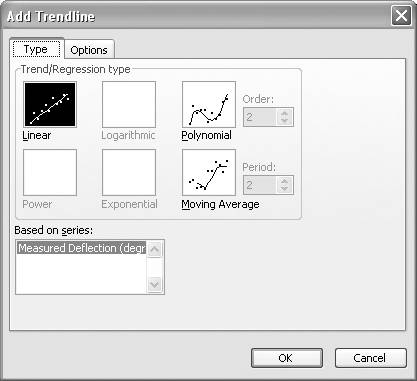
Figure 8-2. Add Trendline Options tab
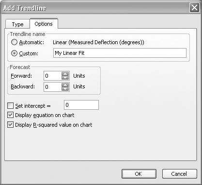
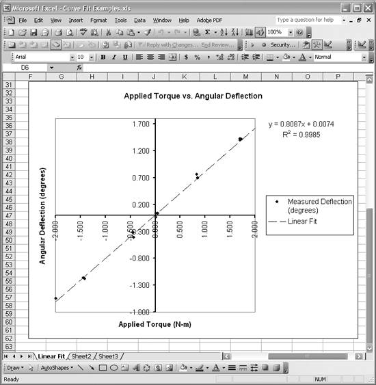
Figure 8-3 shows the resulting best-fit line for the example data contained in Table 8-1. The best-fit line is shown as the dashed line in Figure 8-3. The original data points are shown as dots. Clearly the data follows a straight line trend very well.
Figure 8-3. Linear fit
|
The equation for the best-fit line is displayed in the upper-right of the chart. The R-squared value for the trendline is very close to 1, indicating a good fit.
|
In practice, you could use the slope from this best-fit line to estimate the spring constant for the spring being tested. You have to be careful with units here, because we've plotted deflection versus torque, resulting in units for the slope of degrees per N-m.
In reality, you'd probably want the reciprocal of this value, to yield a slope with units of N-m per degree, following the standard units for spring constants. You can force your best-fit line to go through the origin by specifying the intercept on the Options tab of the Add Trendline dialog box (see Figure 8-2). Perhaps a better approach would be to plot the angular deflections on the horizontal axis with the torque data on the vertical axis, and then fit a line through the points.
|
See Also
See Chapter 4 for recipes covering creating and manipulating charts in Excel. Take a look at Recipe 8.7 to learn more about the R-squared value of trendlines. Also, check out the other recipes in this chapter to learn about alternative methods of performing linear curve fitting.
Using Excel
- Introduction
- Navigating the Interface
- Entering Data
- Setting Cell Data Types
- Selecting More Than a Single Cell
- Entering Formulas
- Exploring the R1C1 Cell Reference Style
- Referring to More Than a Single Cell
- Understanding Operator Precedence
- Using Exponents in Formulas
- Exploring Functions
- Formatting Your Spreadsheets
- Defining Custom Format Styles
- Leveraging Copy, Cut, Paste, and Paste Special
- Using Cell Names (Like Programming Variables)
- Validating Data
- Taking Advantage of Macros
- Adding Comments and Equation Notes
- Getting Help
Getting Acquainted with Visual Basic for Applications
- Introduction
- Navigating the VBA Editor
- Writing Functions and Subroutines
- Working with Data Types
- Defining Variables
- Defining Constants
- Using Arrays
- Commenting Code
- Spanning Long Statements over Multiple Lines
- Using Conditional Statements
- Using Loops
- Debugging VBA Code
- Exploring VBAs Built-in Functions
- Exploring Excel Objects
- Creating Your Own Objects in VBA
- VBA Help
Collecting and Cleaning Up Data
- Introduction
- Importing Data from Text Files
- Importing Data from Delimited Text Files
- Importing Data Using Drag-and-Drop
- Importing Data from Access Databases
- Importing Data from Web Pages
- Parsing Data
- Removing Weird Characters from Imported Text
- Converting Units
- Sorting Data
- Filtering Data
- Looking Up Values in Tables
- Retrieving Data from XML Files
Charting
- Introduction
- Creating Simple Charts
- Exploring Chart Styles
- Formatting Charts
- Customizing Chart Axes
- Setting Log or Semilog Scales
- Using Multiple Axes
- Changing the Type of an Existing Chart
- Combining Chart Types
- Building 3D Surface Plots
- Preparing Contour Plots
- Annotating Charts
- Saving Custom Chart Types
- Copying Charts to Word
- Recipe 4-14. Displaying Error Bars
Statistical Analysis
- Introduction
- Computing Summary Statistics
- Plotting Frequency Distributions
- Calculating Confidence Intervals
- Correlating Data
- Ranking and Percentiles
- Performing Statistical Tests
- Conducting ANOVA
- Generating Random Numbers
- Sampling Data
Time Series Analysis
- Introduction
- Plotting Time Series Data
- Adding Trendlines
- Computing Moving Averages
- Smoothing Data Using Weighted Averages
- Centering Data
- Detrending a Time Series
- Estimating Seasonal Indices
- Deseasonalization of a Time Series
- Forecasting
- Applying Discrete Fourier Transforms
Mathematical Functions
- Introduction
- Using Summation Functions
- Delving into Division
- Mastering Multiplication
- Exploring Exponential and Logarithmic Functions
- Using Trigonometry Functions
- Seeing Signs
- Getting to the Root of Things
- Rounding and Truncating Numbers
- Converting Between Number Systems
- Manipulating Matrices
- Building Support for Vectors
- Using Spreadsheet Functions in VBA Code
- Dealing with Complex Numbers
Curve Fitting and Regression
- Introduction
- Performing Linear Curve Fitting Using Excel Charts
- Constructing Your Own Linear Fit Using Spreadsheet Functions
- Using a Single Spreadsheet Function for Linear Curve Fitting
- Performing Multiple Linear Regression
- Generating Nonlinear Curve Fits Using Excel Charts
- Fitting Nonlinear Curves Using Solver
- Assessing Goodness of Fit
- Computing Confidence Intervals
Solving Equations
- Introduction
- Finding Roots Graphically
- Solving Nonlinear Equations Iteratively
- Automating Tedious Problems with VBA
- Solving Linear Systems
- Tackling Nonlinear Systems of Equations
- Using Classical Methods for Solving Equations
Numerical Integration and Differentiation
- Introduction
- Integrating a Definite Integral
- Implementing the Trapezoidal Rule in VBA
- Computing the Center of an Area Using Numerical Integration
- Calculating the Second Moment of an Area
- Dealing with Double Integrals
- Numerical Differentiation
Solving Ordinary Differential Equations
- Introduction
- Solving First-Order Initial Value Problems
- Applying the Runge-Kutta Method to Second-Order Initial Value Problems
- Tackling Coupled Equations
- Shooting Boundary Value Problems
Solving Partial Differential Equations
- Introduction
- Leveraging Excel to Directly Solve Finite Difference Equations
- Recruiting Solver to Iteratively Solve Finite Difference Equations
- Solving Initial Value Problems
- Using Excel to Help Solve Problems Formulated Using the Finite Element Method
Performing Optimization Analyses in Excel
- Introduction
- Using Excel for Traditional Linear Programming
- Exploring Resource Allocation Optimization Problems
- Getting More Realistic Results with Integer Constraints
- Tackling Troublesome Problems
- Optimizing Engineering Design Problems
- Understanding Solver Reports
- Programming a Genetic Algorithm for Optimization
Introduction to Financial Calculations
- Introduction
- Computing Present Value
- Calculating Future Value
- Figuring Out Required Rate of Return
- Doubling Your Money
- Determining Monthly Payments
- Considering Cash Flow Alternatives
- Achieving a Certain Future Value
- Assessing Net Present Worth
- Estimating Rate of Return
- Solving Inverse Problems
- Figuring a Break-Even Point
Index
EAN: 2147483647
Pages: 206
