Using Components with Custom Interfaces
|
|
Here's your chance to get some hands-on experience working with components that utilize custom interfaces for their component parameters.
| Component | Open the Chapter3_A_Start.fla. Save the file to your local hard drive as Chapter3_A_Modified.fla (see Figure 3.8). Zoom in on the gray rectangle labeled Spikes Background (as shown in Figure 3.9). |
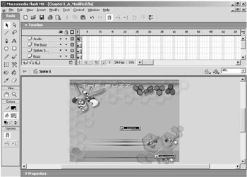
The gray rectangle is an instance of a component that generates a background pattern on a series of movie clips pulled from the library. In Chapter 2, we looked at the Zoom component. When that component was on the stage, it was represented by a big red circle. There was nothing about the Zoom component that distinguished it on the stage from another Flash symbol, such as a movie clip symbol or graphic symbol.
Notice that the gray rectangle has the same icon as a component in the library. We, at Eyeland Studio, use this same visual treatment for component instances to help users visually distinguish between components and other Flash resources (such as movie clips, graphic symbols, buttons, etc.). When the movie is published, the gray rectangle disappears and the component generates whatever effect it is programmed to create.
 |
Many of the components featured throughout the rest of the book are represented by the same visual treatment. However, this is not a very common practice with component developers in general.
|
Now let's try to edit the parameters for the Spikes Background component (let's just call it Spikes). Select the instance of the component on the stage and open the Component Parameters panel by pressing Option/Alt+F7.
When you attempt to open the Component Parameters panel for Spikes, you should see the panel, but it will be grayed out except for the message, "There was an error opening the Custom UI for this Component," as shown in Figure 3.10. This problem occurs because the Spikes component was set up to look for an .swf file named spikes_sc_UI.swf, which is the Flash file that is the custom UI for the Spikes component.
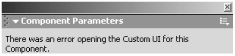
Figure 3.10: The Component Parameters panel displays an error message because it cannot access a necessary.swf file.
The Spikes component in the Chapter3_A_Modified.fla file that you are working with expects the spikes_sc_UI.swf file to be in the same directory on your hard drive where the .fla file is saved. However, when you saved the modified file to your hard drive, spikes_sc_UI.swf was not saved along with it. So, when you tried to open the Component Parameters panel, Flash couldn't oblige because the file was not where it was expected to be.
We will look at how to create a custom UI for a component's parameters in Chapter 11. For now, it's useful to know that custom UIs for component parameters are actually just Flash .swf files. If you see the "error opening" message in the Component Parameters panel, you know that the .swf the component needs is not in the right place.
Macromedia actually introduced a very valuable new capability in Flash MX to deal with this problem. Components developed in Flash MX can have their custom UIs embedded into them. If the custom UI is embedded into the file, then you don't have to worry about keeping track of any external .swf files.
Copy the spikes_sc_UI.swf and 3D_menu_UI.swf files to the same directory on your local hard drive where you saved Chapter3_A_Modified.fla.
Select the instance of Spikes on the stage and open the Component Parameters panel (see Figure 3.11) by pressing Option/Alt+F7.
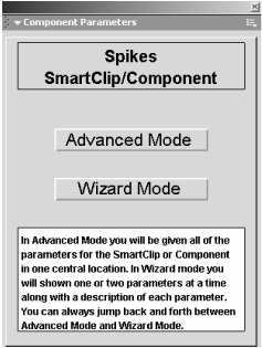
Figure 3.11: The Component Parameters panel displays the custom user interface.
The first screen of the custom UI for the Spikes component presents two buttons that navigate to either advanced mode or wizard mode. The wizard mode allows you to enter parameters one or two at a time. Each screen in wizard mode provides a description of the parameter or parameters. Because we are discussing what each parameter does here, let's go right to advanced mode. Click the Advanced Mode button in the Component Parameters panel to see the window shown in Figure 3.12.
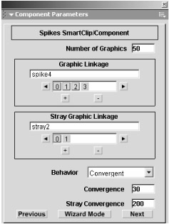
Figure 3.12: The first screen of the custom UI for the Spikes component in advanced mode
Parameters of the Spikes Component
There are two screenfuls of parameters in the advanced mode section of the Spikes custom UI. You can view and/or edit the second screen by clicking the Next button. Here are explanations of the parameters:
Number of Graphics The number specified in this field determines the number of graphics from Graphic Array that will be dynamically positioned on the stage.
Graphic Linkage Each entry in this array handler is the linkage name for a movie clip that the component will dynamically position on the stage. You can use any movie clips you want by setting their Linkage names and then entering the value in this array. Hit the plus button to add Linkage name references to the array and the minus button to remove items from the array. The yellow button designates the item in the array that is currently selected.
Stray Graphic Linkage This is the array of graphic names. Stray graphics are also contained in movie clips. Strays add variance to the overall effect. Generally, you would use shapes that are slightly different, but complementary, to the main graphics.
Behavior This parameter specifies how the graphics will be positioned on the stage. Convergent means that the items in the Graphic and Stray Graphic Linkage arrays will be dynamically positioned around one spot. Divergent means that all of the graphics will be randomly positioned on the stage. The next two parameters, Convergence and Stray Convergence, are only utilized if you choose the Convergent option for the Behavior parameter.
Convergence This parameter specifies the distance in pixels that the graphics will be positioned around the Converge X and Converge Y positions (specified in later parameters).
Stray Convergence This does the same thing as the Converge parameters except for the stray graphics (also based on the Converge X and Converge Y values).
Stray Probability This parameter determines how many strays are likely to appear. Values closer to 1 increase the probability; values closer to 0 decrease the probability.
Stray Angle This specifies an angle that the strays will be positioned at. Enter values from 0 to 360.
Converge X and Converge Y These parameters specify where the graphics and strays will be positioned around if you select the Convergent option in the Behavior parameter.
Low Alpha and High Alpha These specify a range of variable transparency for the graphic objects (both graphics and strays). Enter values from 0 to 100.
Screen Width and Screen Height Enter the width and height of the stage, respectively.
The Graphic Linkage Parameters
Most of the parameters in the custom UI for the Spikes component require little additional explanation beyond the information already provided. However, the Graphic Linkage and Stray Graphic Linkage parameters need a little explanation.
Both the Graphic Linkage and Stray Graphic Linkage parameters are array handlers. They operate differently than the array value fields in the default UI. In addition, the values for the Graphic Linkage and Stray Graphic Linkage parameters are Identifiers for movie clips that the components pull from directly from the Flash Library.
We will be seeing array handlers similar to these in custom UIs featured in later chapters. In addition, many of the components featured in later chapters use resources from the library by referencing their "linkage" names or identifiers. So let's look at how array handlers in the Spikes custom UI work and then at how the component utilizes the linkage names or identifiers to pull resources from the library.
Click the small box labeled 0 in the Graphic Linkage parameter, as shown in Figure 3.13.
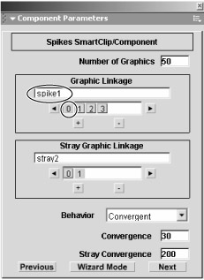
Figure 3.13: Adjusting the Graphic Linkage parameter
Notice that the box turns yellow when you click it, and the text field has the value spike 1 in it. The yellow box indicates which box is currently selected, and the text field reflects what text is associated with the selected box. If you click the box labeled 1, the box will turn yellow and the value will change to spike2. In fact, each box has a value assigned to it. Therefore, to edit the values for the Graphic Linkage array handler, you simply need to click the boxes and edit their associated values. Adding or removing values to the array is very easy.
Click the box labeled 3 and then click the small button with the + symbol on it. Enter the text spike5 in the field, as shown in Figure 3.14.
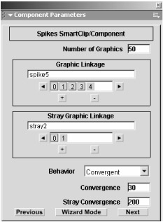
Figure 3.14: Click the add button (the plus sign) to add another item in the Graphic Linkage parameter array.
When you add an item to the array, the item is added after the currently selected item. So, for example, if you select the 2 box and click the plus button, the new item in the array will be inserted after the 2 box. If you click the minus button, the item that is currently selected will be removed. You will be using the item you just added to the array, so do not delete it.
Close the Component Parameters panel (Command/Alt+F4) and open the library (Command/Ctrl+L). Double-click the folder named Spikes SM Assets. Click the first movie clip named Spike 1, as shown in Figure 3.15.
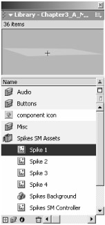
Figure 3.15: Open the Spikes SM Assets folder and select the Spikes 1 movie clip.
Notice the shape that appears in the library preview. This is one of the shapes that the Spikes component utilizes. If you click the movie clips named Spike 2, Spike 3, and Spike 4, you will see the other shapes that the component uses. The component also uses the shapes in the Stray 1 and Stray 2 movie clips.
|
You might have noticed that the boxes in the Graphic Linkage array parameter start with the number 0 and the values start with the number 1. That is, the box labeled 0 has the value spike1, the box labeled 1 has the value spike2, and so on. This is due to how arrays work in Flash's ActionScript. As far as the ActionScript is concerned, the first item in the array is numbered zero, the second item is numbered one, and so forth. This is known as zero-based counting. Arrays in Flash's ActionScript employ zero-based counting.
|
If you zoom out and inspect the stage, you will see that none of these shapes are on the stage. They are not hidden off the stage, and they are not on another scene. These movie clips are only in the library. However, when the movie plays, they appear on the stage because they are pulled from the library when the movie is exported. Let's see how this is accomplished.
Right-click or Option+click the Spike 1 movie clip. Select Linkage from the pop-up menu (see Figure 3.16) to open the Linkage Properties dialog box (shown in Figure 3.17).
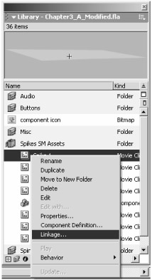
Figure 3.16: Selecting Linkage from the pop-up menu
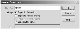
Figure 3.17: The Linkage Properties dialog box for the Spike 1 movie clip
Notice the contents of the Identifier field; the text in it is spike1. This is the same name as the first item in the Graphic Linkage parameter array. In fact, the Identifier is what the component uses to access the Spike 1 movie clip. Each entry in the Graphic Linkage parameter array is an Identifier for a movie clip. The value for the Identifier for any given movie clip must be entered exactly the same in the Graphic Linkage parameter array; otherwise, the component will not be able to access the movie clip.
Earlier we added an item to the Graphic Linkage array. Now let's create another movie clip and assign the Identifier name to it that we entered in the Graphic Linkage parameter array (spike5).
Click the Cancel button in the Linkage Properties dialog box. Right- click or Option+click the Spike 4 movie clip and choose Duplicate from the pop-up menu (see Figure 3.18). Enter the text Spike 5 in the Name box in the Duplicate Symbol dialog box (see Figure 3.19).
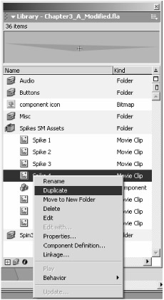
Figure 3.18: Creating another movie clip
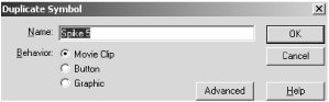
Figure 3.19: Changing the name to Spike 5
Now click the Advanced button. Click the Export For ActionScript option. Then enter spike5 in the Identifier field (see Figure 3.20). Click OK when you are done.
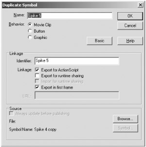
Figure 3.20: The Advanced button in the Duplicate Symbol dialog box provides access to Linkage property settings.
The Advanced button in the Duplicate Symbol dialog box is a nice little shortcut. We could have hit the OK button in the Duplicate Symbol dialog box without using the Advanced button. Then we could have opened the Linkage Properties dialog box as we did before to set the Identifier for the Spike 5 movie clip. Flash saves us an extra step by letting us set the Identifier within the Duplicate Symbol dialog box.
Notice that you must select the Export For ActionScript option before the Identifier field will become available. When you select this option, the Export In First Frame option is also selected automatically. The Export In First Frame option has to do with how the movie clip is loaded. It can substantially affect how the component loads over the Internet—particularly if preload code is built into the movie. We will look at this issue in detail in Chapter 5.
When you click the Export For ActionScript option, the Identifier field is automatically filled with the movie clip's name, Spike 5. If you leave the Identifier field with that name, the component will not be able to access the Spike 5 movie clip because there is an added space in the name. Earlier you entered spike5 in the Graphic Linkage parameter array, not Spike 5. Linkage names are not case-sensitive, so you can enter spike5 or Spike5 or even SPIKE5 and it will work, but the added space in Spike 5 will not work.
Editing Component Assets
Now edit the Spike 5 movie clip. Delete the polygonal shape within it and use the Line tool to draw a simple lightning-bolt line. To help the line blend in better with the other shapes, color the line burgundy and use the Color Mixer panel to set the opacity to 50%, as in Figure 3.21.
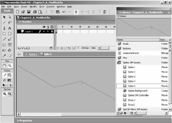
Figure 3.21: Editing the Spike 5 movie clip
Right now the Spikes Background is on a layer that's above most of the elements in the movie so that you could see it when you began working with the movie. Drag the Spike Smart Clip layer down below the Bottom Elements layer and above the Back layer. When you are finished, return to the main scene and press Command/Ctrl+Enter to test the movie (see Figure 3.22).
Figure 3.22: Notice that the component has used the movie clip with the lightning bolt line you added.
Look at the upper-left corner region of the movie and notice the texture created by a random array of spike graphics. You should also see several instances of the line you created in the previous step. The effect is random, so if you do not see the lines, close the test movie and retest. If you do not see any lines, then your spelling for the Identifier for the Spike 5 movie clip probably does not match what you entered in the Graphic Linkage parameter array.
In Chapter 2, we looked at the default UI for an array. The array handler in Spikes' custom UI is an improvement over the default UI because it does not require that you open a separate dialog box to add or remove items to the array. Also, in the custom UI, it is much more readily apparent that the Graphic Linkage parameter is an array handler. While you do need to learn how the custom UI handles arrays, once you know how it works, it is very easy to see at a glance which parameters in the custom UI are array parameters and which are not.
This example demonstrates how easy it is to add graphics to the array of graphics used by the Spikes Background component. In spite of the name of the component, however, you can actually use it to generate backgrounds with any shapes simply by editing all of the movie clips that the component uses. Of course, you can also get more out of the Spikes Background component by leveraging some of the other options in the parameters.
Other Custom UI Improvements
Of course, the fact that there is additional information about each parameter (in the wizard mode) is also an advantage over the default UI. Now let's edit a few more parameters.
Close the test movie and close the library. Make all the layers above the Spikes Smart Clip layer invisible. Select the instance of the Spikes Background component on the stage again and open the Component Parameters panel. Click the Advanced Mode button. Change the value for the Number Of Graphics parameter to 75. Now click the down-arrow next to the Behavior parameter and select Divergent, as shown in Figure 3.23.
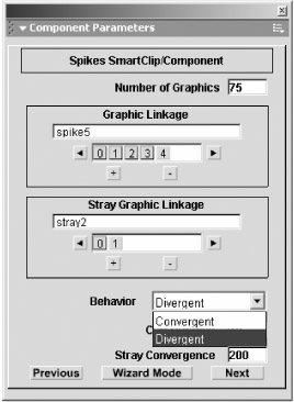
Figure 3.23: Editing the Number Of Graphics and Behavior parameters
Notice that the drop-down menu option for the Behavior parameter is a slight improvement over the default UI. The default UI requires that you first click the value field before you can see that it is a List value type. The custom UI for the Spikes component reveals the fact that the Behavior parameter is a List value type at a glance.
Click the Next button and change the parameter values as indicated in the following list and shown in Figure 3.24. When you are finished, close the Component Parameters panel.
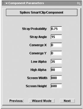
Figure 3.24: The second screen in Advanced mode
| PARAMETER | VALUE |
|---|---|
| | |
| High Alpha | 80 |
| Low Alpha | 35 |
| Screen Width | 800 |
| Screen Height | 600 |
Now test the movie. Notice that all of the polygon shapes and the line you created earlier are distributed all over the stage, as in Figure 3.25. Some of the shapes are also more transparent, and none of the shapes are fully opaque. If you don't quite like the effect, you can close the Test Movie window, reedit the parameters, and test again. Although opening and closing the Component Parameters panel might seem a little tedious, it's not nearly as tedious as having to sift through ActionScript to adjust all of the relevant variables. The custom UI also makes things a little easier and more intuitive by providing a more user-friendly environment to adjust the parameters.
Figure 3.25: The Spikes Component now distributes the shapes all over the stage.
|
It is especially important to close the Component Parameters panel before you test a movie when you are working with a component that utilizes a custom UI. Critical communication between a custom UI and the Flash file that contains the component occurs when you close the panel: Flash collects the values for the respective variables from the parameters in the custom UI. If you test the movie before closing the panel, the variables may not have values. The result is that Flash will very often crash or the movie may not work properly. Therefore, it's a good idea to get in the practice of always closing the Component Parameters panel when you are finished editing the parameters. It may get a little tedious to always have to open the panel, edit the parameters, close the panel, test the movie, close the Test Movie window, and then start the process all over again if you see something that needs to be adjusted. However, it is much better than crashing Flash and potentially losing all your hard work.
|
Resizing the Component Parameters Panel
Before I move on to another example component, let's look at a characteristic or a byproduct of working with custom UIs that is useful to be aware of. Select the Spikes Background component and open the Component Parameters panel. Drag the bottom-right corner of the panel and resize it so that it is much smaller. The exact size is not important; the panel should look something like Figure 3.26.
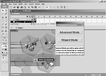
Figure 3.26: Resize the Component Parameters panel so that it is much smaller.
Custom component UIs can be created so that they resize when you resize the Component Parameters panel. Actually, it is more accurate to say that custom UIs can be programmed so that they won't resize when the panel is resized. That is the case with the custom UI for Spikes. When the panel is resized, the custom UI does not scale down or scale up. If a custom UI does scale, you might want to scale the Component Parameters panel up a little so that it is easier to see the parameters or built-in instructions.
The fact that you can resize the Component Parameters panel can lead to some problems. If, for example, the panel has been resized so that it is very small, a component with a custom UI may open up so that the parameters are too small to read or manipulate. If you encounter this problem, you can resize the Component Parameters panel so that the custom UI within the panel is easier to read.
We'll emulate the problem in this example. We have just sized the Component Parameters panel down as if we had been working with a custom UI that was much smaller. Close the panel. Then select the 3D Spin Menu component instance and open the panel again (see Figure 3.27).
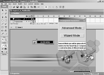
Figure 3.27: The Component Parameters panel opens to the size that it was when it was last closed.
It might look as if you accidentally had selected the Spikes Background component instead of the 3D Spin Menu component; the two custom UIs look very similar.
Notice that the size of the Component Parameters panel is the same as when we left it in the previous step. When you open the panel, it will always open up at the same size that it was when you closed it. This is true even when you're working with components in different Flash files. If the custom UI is not coded so that it won't scale with the size of the Component Parameters panel, then the custom UI might appear to be very small.
Of course, the solution is to simply resize the Component Parameters panel. However, if you ever see a custom UI in the panel that's really small, don't assume that the designers intended it to be very small and illegible. It is far more likely that the panel is just not sized properly.
Parameters of the 3D Spin Menu Component
| Component | The 3D Spin Menu component instance is in the middle of the stage. You have probably already noticed the results of the 3D Spin Menu when you tested the movie: it generates the rotating menu. Let's take a look at this component. |
Drag the bottom-right corner of the Component Parameters panel and resize it so that it displays the entire custom UI. The exact size is not important. Click the Advanced button when you have finished resizing; the panel should look something like Figure 3.28.
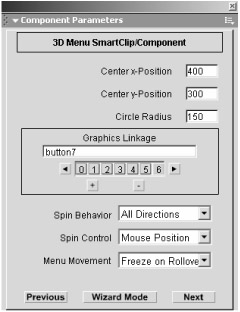
Figure 3.28: Resize the Component Parameters panel to view the entire custom UI.
Here is a list of the parameters and their descriptions for the 3D Spin Menu component:
Center x-Position and Center y-Position These parameters specify the point that the menu rotates about. Each parameter takes stage coordinates.
Circle Radius This parameter specifies the radius for the items to animate around. The radius is the maximum distance any item will be from the center point.
Graphics Linkage Each entry in this array handler is the linkage name for a movie clip that the component will dynamically position on the stage for the 3D menu. You can add as many movie clips as you want, and they will all be placed at an equidistance around a circle. The movie clips can also contain buttons for rollover effects and additional actions.
Spin Behavior This list parameter specifies how the menu spins. Selecting Horizontal makes the items spin as if they were on a carousel, Vertical makes the items spin as if they were on a Ferris wheel, and All Directions makes the menu spin on all axes.
Spin Control This list parameter specifies what the user must do to spin the menu. The Mouse Position option spins the menu depending on how far the mouse is from the center, the Click And Drag option spins the menu according to how fast the user moves the mouse while it is being clicked, and the Click, Drag And Throw option does the same as Click And Drag except the menu will keep spinning after the user has let go of the mouse.
Menu Movement This list parameter specifies how the menu behaves when the mouse is over an item. The Freeze On Rollover option stops the menu when the mouse is over an item, and the Move On Rollover option allows the menu to continue in motion even when the mouse is over an item.
Actions On Press, Actions On Rollover, Actions On Rollout These are array handlers. They allow you to specify an action for each of the menu items that will be executed when the user clicks, rolls over, or rolls out of the item, respectively. You can provide a URL to another web page, the path to an SWF file that will be loaded, or a simple ActionScript command. You can use any of the following actions: gotoAndPlay, gotoAndStop, nextFrame, play, prevFrame, and stop. Use dot-syntax to define the Timeline that the action should be called in, for example, _root.mc.gotoAndPlay(3). Each of these parameters can be left blank if you do not want any actions to occur for that particular event.
Load Movie Level This parameter allows you to specify a numeric value that defines what level to load any SWFs. This value is important only if you linked any of the menu items to load a movie. This parameter can be left blank.
URL Window If any of the menu items are linked to web pages, this parameters defines whether the page should be opened in a new browser window or the same.
Perspective Depth This parameter specifies a numeric value that controls the perspective appearance of the 3D menu. This value must be greater than the value for the menu's radius. If the menu items appear too big when you publish your file, increase this value.
Mouse Factor This determines how fast the menu spins with the user's input. The larger the value, the slower the menu spins.
Notice that the custom UI for the 3D Spin Menu component's parameters is very similar to the custom UI for Spikes. The nice thing about this is that now that you have learned how to use the Spikes component, you should have a good idea how to use many of the parameters for 3D Spin Menu.
For example, notice that there is a Graphics Linkage array parameter in the custom UI for 3D Spin Menu. The Graphics Linkage parameter in the 3D Spin Menu custom UI works exactly the same as the Graphic Linkage parameter in the Spikes custom UI. If you open the library and look in the Buttons folder, you will see a series of buttons. If you open the Linkage Properties for the movie clip named Button 1, you will see that its Identifier name matches the value for the first item in the Graphics Linkage array in the 3D Spin Menu custom UI (see Figure 3.29).
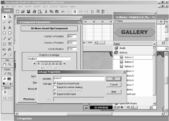
Figure 3.29: The Graphics Linkage parameter in the 3D Spin Menu works the same as the Graphic Linkage parameter in the Spikes custom UI.
If you click the Next button, you'll notice several more array parameters (see Figure 3.30). All of these parameters are for actions that occur either on press, rollover, or rollout. These array parameters differ from the Graphics Linkage parameters in that they can have several different types of values. For instance, you can enter a URL, or you can enter a simple ActionScript command such as:
_root.instance_name.gotoAndStop(5);
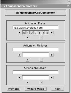
Figure 3.30: The arrays on the next page in advanced mode work the same as the Graphics Linkage parameter.
The additional information in the wizard mode lets the user know the difference between acceptable values for the Graphics Linkage parameter and acceptable values for, say, the Actions On Press parameter. This is a good example of a case where the ability to include additional information in the custom UI is a strong advantage over the default UI.
We will be working with these Actions On Press and similar parameters in the next chapter. For now, let's look at one more example of a custom UI feature that is an improvement over the default UI.
Click the Next button again and notice the last parameter: the Mouse Factor parameter, shown in Figure 3.31. The Mouse Factor parameter controls how fast the menu items will rotate. If you click and slide the slider to the far right and far left, you will see that the range of values is from 250 to 3000. Many of the parameters we've looked at already had values that were far below 3000. In fact, many parameters have acceptable values that range from 0 to only 100.
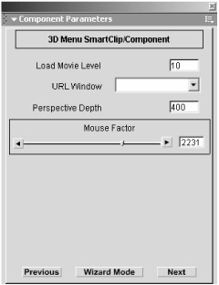
Figure 3.31: The Mouse Factor parameter utilizes a slider that keeps the user from entering a value that won't work with the component.
If this parameter had only a simple field for the user to enter a number into, the user could mistakenly enter a value that wouldn't work very well. If the user looked at the other parameters and decided to try a value from 0 to 100, the component might not work properly. The custom UI, however, lets you use interfaces like the slider element. By incorporating the slider into the 3D Spin Menu, the component designer allows the user to edit the parameter with no opportunity to inadvertently enter a value that won't work properly. Also, without an interface like the slider, the user might never discover that a value as high as 3000 could work.
|
|
EAN: 2147483647
Pages: 111