The Feel of a Custom UI
|
|
A custom user interface for a component's parameters is essentially a separate Flash file that has been constructed to make it easier to adjust the component's parameters. While there are some fairly stringent requirements for setting up a custom interface to work with a component, the actual appearance of a component can look like just about anything.
Presumably, the key goal for creating a custom user interface for a component's parameters is to make it easier and more intuitive for the user to edit those parameters. However, it's up to the designer of the custom interface to actually accomplish this goal. In reality, designers can easily create custom interfaces that are even more confusing or difficult to use than the default user interface for component parameters.
If you are familiar with plug-ins for programs such as Adobe Photoshop, this may not be as problematic or intimidating as you might think. Like plug-ins, components are essentially custom-built features. Since anyone can create these features, the interfaces used to control them can have wildly different looks and feels.
Figures 3.1 and 3.2 show the interfaces for two popular plug-ins for Photoshop (and Photoshop-compatible applications): Xaos Tools' Terrazzo and Procreate's KPT Effects. These plug-in interfaces have very little in common. Photoshop users, however, are used to adapting to or figuring out such plug-ins. Part of their appeal, in fact, is that they are fun to look at and play with.
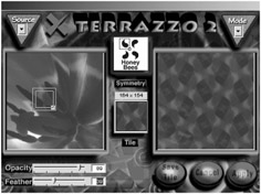
Figure 3.1: The plug-in interface for Xaos Tools' Terrazzo
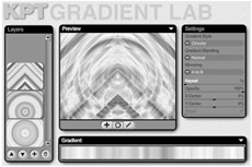
Figure 3.2: The plug-in interface for Procreate's KPT Effects
Even wild Photoshop plug-in interfaces, however, take advantage of interface elements that most people are familiar with. For example, look carefully at Figures 3.1 and 3.2. Notice that each plug-in interface features an Opacity setting that is controlled with a slider. This is because host applications like Photoshop also use sliders for their opacity settings (see Figure 3.3). Although there are slight stylistic differences between the plug-in sliders and the slider in Photoshop, the fundamental functionality is the same.
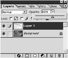
Figure 3.3: The opacity sliders in the third-party plug-in interfaces are similar to the opacity slider in Photoshop.
 |
It's worth noting that a custom user interface isn't necessarily any better than the default user interface. Whether or not the custom interface is an improvement over the default one is up to the custom interface's designer. The default interface is small, which can make it hard to read. The size makes it difficult for the designer to provide information about each parameter. Also, in the default interface it is easy to inadvertently place a value that is unusable. If a custom interface does not improve on shortcomings like these, then it might be more of a hindrance than a help.
|
Most of the components featured in this book use a custom interface for the component parameters. In this chapter, you'll get hands-on experience working with custom user interfaces for component parameters. We'll also discuss the advantages and disadvantages of using custom interfaces. First, let's look at some custom interfaces for the parameters of several Flash components.
Good and Bad Custom UIs
Figures 3.4 through 3.7 show several examples of custom interfaces for the component parameters of various components. All of these custom interfaces are by Eyeland Studio and show somewhat of a progression. Each new UI reflects improvements we added to our custom UIs based on lessons learned.
For example, notice that all of the fields in the custom UI shown in Figure 3.4 are standard text fields. These fields are similar to the default value fields in the default user interface for the Component Parameters panel. Several of the parameters in Figure 3.4 allow for only true or false as the available values. Because this was one of our first custom UIs, we didn't utilize the List value type. Consequently, this custom UI has little value over the default UI.
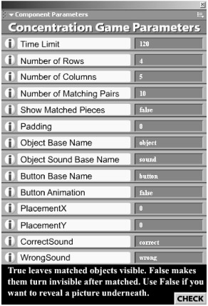
Figure 3.4: A custom UI that creates a concentration game
A few additional features are provided by the custom UI shown in Figure 3.4. Notice the circular icons to the left of each parameter. When the user rolls over these icons, a short description of the parameter is shown at the bottom. This provides the user with information that the default UI could not provide. Also notice the Check button at the bottom right; it allows the user to check if the values they set for the parameters will work with the component. The Check button is a small, added benefit that frees users from the trouble of testing the movies to determine if their chosen parameters will work properly.
Another problem with the custom UI shown in Figure 3.4 is that it's a little crowded. There are so many parameters that the UI's dimensions are too tall. When we created this custom UI, we kept adding features, and at some point we started to run out of room to add more parameters. The custom UI shown in Figure 3.5 solves this problem by placing parameters on different tabs.
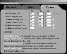
Figure 3.5: A word-search game
Although the custom UI shown in Figure 3.5 provides the freedom to add more parameters, it still does not offer many advantages over the default UI. Once again, we built in help information, placing it below the RGB color entry fields, but the RGB value entry fields don't even provide as many options as the default user interface.
The custom UIs shown in Figures 3.6 and 3.7 provide a much better solution. In Figure 3.7, you can enter RGB values or use standard HSB sliders and view the results in real time. Both of these custom UIs also provide standard sliders for specifying the values of some parameters. The sliders provide a benefit over the default UI because they show the user clear limits for the values of a parameter.
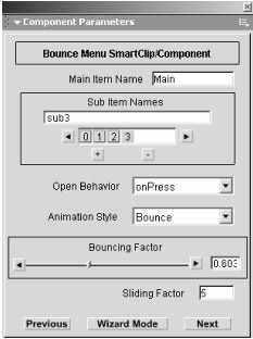
Figure 3.6: A dynamic drop-down menu
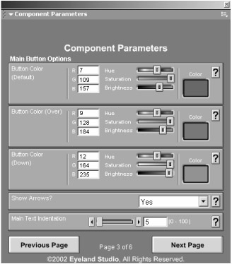
Figure 3.7: A collapsible menu
For example, let's say you have a parameter for which users need to specify a value between 0 and 255. If you use the default UI, you would probably use either the Default or Number value type fields. Either of these value types allows users to enter any value. If users aren't clear on what the parameter is for, they could easily enter a value of 500, which could potentially cause problems.
If you use a slider in a custom UI, then you can establish a range for that parameter. One end of the slider (usually the left end) would be the low value, and the other end would be the high value. Therefore, users could not specify values that won't work with the component.
The custom UI in Figure 3.6 shows the advanced mode, in which the parameters are grouped together with no explanations. This custom UI also features a wizard mode, which allows users to enter values for one or two parameters at a time. In wizard mode, each parameter is accompanied with a description of the parameter. Users can jump back and forth between advanced mode and wizard mode.
The custom UI shown in Figure 3.7 features pop-up help fields. At any time, users can roll over the buttons with question marks to receive information about the associated parameter. Therefore, users don't have to bother with going back and forth between advanced and wizard modes as they do in Figure 3.6.
Both Figures 3.6 and 3.7 are examples of custom UIs that offer users clear improvements over the default UI. Each of these custom UIs provides information on each component parameter. They also offer improved methods for entering values for the parameters.
In addition, both custom UI examples look and operate similarly to dialog boxes and panels found in Flash (for the most part). Notice that Figure 3.7 displays the name of the parameter in a very consistent place. Each parameter is also clearly sectioned off from the other, which helps to minimize confusion. These subtle, stylistic features help to make the custom UI less intimidating and more intuitive to use. Most of the examples featured in this book use custom user interfaces similar to those shown in Figures 3.6 and 3.7.
|
|
EAN: 2147483647
Pages: 111