Chapter 34: Notifying and Confirming
We dealt with error dialogs in the previous chapter. In this chapter, we discuss alert dialogs (also known as notifiers) and confirmation dialogs, as well as the structure of these interactions, the underlying assumptions about them, and how they, too, can be eliminated in most cases.
Alerts and Confirmations
Like error dialogs, alerts and confirmations stop the proceedings with idiocy, but they do not report malfunctions. An alert notifies the user of the program's action, whereas a confirmation also gives the user the authority to override that action. These dialogs pop up like weeds in most programs and should, much like error dialogs, be eliminated in favor of more useful idioms.
Alerts: Announcing the obvious
When a program exercises authority that it feels uncomfortable with, it takes steps to inform the user of its actions. This is called an alert. Alerts violate the axiom: A dialog box is another room; you should have a good reason to go there (see Chapter 25). Even if an alert is justified (it seldom is), why go into another room to do it? If the program took some indefensible action, it should confess to it in the same place where the action occurred and not in a separate dialog box.
Conceptually, a program should either have the courage of its convictions or it should not take action without the user's direct guidance. If the program, for example, saves the user's file to disk automatically, it should have the confidence to know that it is doing the right thing. It should provide a means for the user to find out what the program did, but it doesn't have to stop the proceedings with idiocy to do so. If the program really isn't sure that it should save the file, it shouldn't save the file, but should leave that operation up to the user.
Conversely, if the user directs the program to do something—dragging a file to the trash can, for example—it doesn't need to stop the proceedings with idiocy to announce that the user just dragged a file to the trashcan. The program should ensure that there is adequate visual feedback regarding the action; and if the user has actually made the gesture in error, the program should silently offer him a robust Undo facility so he can backtrack.
The rationale for alerts is that they inform the user. This is a desirable objective, but not at the expense of smooth interaction flow.
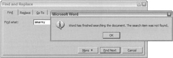
The alert shown in Figure 34-1 is an example of how alerts are more trouble than help. The Find dialog (the one underneath) already forces the user to click Cancel when the search is completed, but the superimposed alert box makes it a brace of flow-breaking buttons: First the OK to the alert, then the Cancel to the Find. If the information aspect of the alert were built into the main Find dialog, the user's burden would be reduced to half. That is good economy for user interface designers.

Figure 34-1: Here is a typical alert dialog box. It is unnecessary, inappropriate, and stops the proceedings with idiocy. The Find dialog in Word has finished searching the document. Is reporting that fact a different facility of Word? If not, why does it use a different dialog? It's like having to go into the dining room to use a fork and the kitchen to use a spoon. The "information" icon is a sure tip-off to clumsy interface design. Yes, software must constantly and effusively report its status to the user. But proceedings-stopping alert dialogs are an inappropriate mechanism.
Alerts are so numerous because they are so easy to create. Most languages offer some form of message box facility in a single line of code. Conversely, building an animated status display into the face of a program might require a thousand or more lines of code. Programmers cannot be expected to make the right choice in this situation. They have a conflict of interest, so designers must be sure to specify precisely where information is reported on the surface of an application. The designers must then follow up to be sure that the design wasn't compromised for the sake of rapid coding. Imagine if the contractor on a building site decided unilaterally not to add a bathroom because it was just too much trouble to deal with the plumbing. There would be consequences.
Software needs to keep the user informed of its actions. It should have visual indicators built into its main screen to make such status information available to the user, should he desire it. Launching an alert to announce an unrequested action is bad enough. Putting up an alert to announce a requested action is pathological.
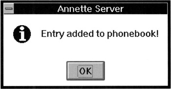
Software needs to be flexible and forgiving, but it doesn't need to be fawning and obsequious. The dialog box shown in Figure 34-2 is a classic example of an alert that should be put out of our misery. It announces that it added the entry to our phone book. This occurs immediately after we told it to add the entry to our phone book, which happened milliseconds after we physically added the entry to what appears to be our phone book. It stops the proceedings to announce the obvious.

Figure 34-2: This dialog, from Delrina WinFax Lite, is unnecessarily obsequious. We add an entry to our phone book, and are promptly stopped in our tracks by this important message. Do we really need the program to waste our time elaborating the obvious?
It's as though the program wants approval for how hard it worked: "See, dear, I've cleaned your room for you. Don't you love me?" If a person interacted with us like this, we'd suggest that they seek counseling.
Confirmations
When a program does not feel confident about its actions, it often asks the user for approval with a dialog box. This is called a confirmation, like the one shown in Figure 34-3. Sometimes the confirmation is offered because the program second-guesses one of the user's actions. Sometimes the program feels that is not competent to make a decision it faces and uses a confirmation to give the user the choice instead. Confirmations always come from the program and never from the user. This means that they are a reflection of the implementation model and are not representative of the user's goals.

Figure 34-3: Every time we delete a file in Windows, we get this confirmation dialog box asking if we're sure. Yes, we're sure. We're always sure. And if we're wrong, we expect Windows to be able to recover the file for us. Windows lives up to that expectation with its Recycle Bin. So why does it still issue the confirmation message? When a confirmation box is issued routinely, users get used to approving it routinely. So when it eventually reports an impending disaster to the user, he goes ahead and approves it anyway, because it is routine. Do your users a favor and never create another confirmation dialog box.
As discussed in Chapter 2, revealing the implementation model to users is a sure-fire way to create an inferior user interface. This means that confirmation messages are inappropriate. Confirmations get written into software when the programmer arrives at an impasse in her coding. Typically, she realizes that she is about to direct the program to take some bold action and feels unsure about taking responsibility for it. Sometimes the bold action is based on some condition the program detects, but more often it is based on a command the user issues. Typically, the confirmation will be launched after the user issues a command that is either irrecoverable or whose results might cause undue alarm.
Confirmations pass the buck to the user. The user trusts the program to do its job, and the program should both do it and ensure that it does it right. The proper solution is to make the action easily reversible and provide enough modeless feedback so that the user is not taken off-guard.
As a program's code grows during development, programmers detect numerous situations where they don't feel that they can resolve issues adequately. Programmers will unilaterally insert buck-passing code in these places, almost without noticing it. This tendency needs to be closely watched, because programmers have been known to insert dialog boxes into the code even after the user interface specification has been agreed upon. Programmers often don't consider confirmation dialogs to be part of the user interface, but they are.
THE DIALOG THAT CRIED, "WOLF!"
Confirmations illustrate an interesting quirk of human behavior: They only work when they are unexpected. That doesn't sound remarkable until you examine it in context. If confirmations are offered in routine places, the user quickly becomes inured to them and routinely dismisses them without a glance. The dismissing of confirmations thus becomes as routine as the issuing of them. If, at some point, a truly unexpected and dangerous situation arises—one that should be brought to the user's attention—he will, by rote, dismiss the confirmation, exactly because it has become routine. Like the fable of the boy who cried, "Wolf," when there is finally real danger, the confirmation box won't work because it cried too many times when there was no danger.
For confirmation dialog boxes to work, they must only appear when the user will almost definitely click the No or Cancel button, and they should never appear when the user is likely to click the Yes or OK button. Seen from this perspective, they look rather pointless, don't they?
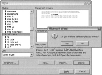
The confirmation dialog box shown in Figure 34-4 is a classic. The irony of the confirmation dialog box in the figure is that it is hard to determine which styles to delete and which to keep. If the confirmation box appeared whenever we attempted to delete a style that was currently in use, it would at least then be helpful because the confirmation would be less routine. But why not instead put an icon next to the names of styles that are in use and dispense with the confirmation? The interface then provides more pertinent status information, so one can make a more informed decision about what to delete.

Figure 34-4: If you click the Delete button in the Style dialog box in Word, you get this confirmation box. Most people will click Yes, by rote, regardless of whether that's what they really mean to do. In the Style dialog, you might occasionally inadvertently delete a style you really want to keep. This confirmation, however, doesn't do much to prevent that, nor does it allow recovery. If its appearance were based on some criteria other than simply asking for a deletion, there is some faint chance that it would be useful. Promise that you won't ever create one of these, please?
ELIMINATING CONFIRMATIONS
Three axioms tell us how to eliminate confirmation dialog boxes. The best way is to obey the simple dictum: Do, don't ask. When you design your software, go ahead and give it the force of its convictions (backed up by user research, as discussed in Chapter 4). Users will respect its brevity and its confidence.
| AXIOM | Do, don't ask. |
Of course, if the program confidently does something that the user doesn't like, it must have the capability to reverse the operation. Every aspect of the program's action must be undoable. Instead of asking in advance with a confirmation dialog box, on those rare occasions when the program's actions were out of turn, let the user issue the Stop-and-Undo command.
Most situations that we currently consider unprotectable by Undo can actually be protected fairly well. Deleting or overwriting a file is a good example. The file can be moved to a suspense directory where it is kept for a month or so before it is physically deleted. The Recycle Bin in Windows uses this strategy, except for the part about automatically erasing files after a month: Users still have to manually take out the garbage.
| AXIOM | Make all actions reversible. |
Even better than acting in haste and forcing the user to rescue the program with Undo, you can make sure that the program offers the user adequate information so that the he never purposely issues a command that leads to an inappropriate action (or never omits a necessary command). The program should use sufficiently rich visual feedback so that the user is constantly kept informed, the same way the instruments on dashboards keep us informed of the state of our cars.
| AXIOM | Provide modeless feedback to help users avoid mistakes. |
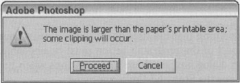
Occasionally, a situation arises that really can't be protected by Undo. Is this a legitimate case for a confirmation dialog box? Not necessarily. A better approach is to provide users with protection the way we give them protection on the freeway: with consistent and clear markings. You can often build excellent, modeless warnings right into the interface. For instance, look at the dialog from Adobe Photoshop in Figure 34-5, telling us that our document is larger than the available print area. Why has the program waited until now to inform us of this fact? What if guides were visible on the page at all times (unless the user hid them) showing the actual printable region? What if those parts of the picture outside the printable area were highlighted when the user moused over the Print butcon in the toolbar? Clear, modeless feedback (see the next section) is the best way to address these problems.

Figure 34-5: This dialog provides too little help too late. What if the program could display the printable region right in the main interface as dotted guides? There's no reason for users to be subjected to dialogs like these.
Much more common than honestly irreversible actions are those actions that are easily reversible but still uselessly protected by routine confirmation boxes. The confirmation in Figure 34-3 is an excellent specimen of this species. There is no reason whatsoever to ask for confirmation of a move to the Recycle Bin. The sole reason that the Recycle Bin exists is to implement an undo facility for deleted files.
|
|
EAN: N/A
Pages: 263