Viewing the Transparency Grid
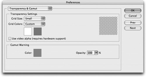
| How do you indicate nothing? Specifically, how do you indicate which areas of an image are actually transparent and will appear invisible when placed in a page layout? A long time ago Adobe came up with the image of a checkerboard grid to indicate transparency. Wherever you see this transparency grid, you know you are looking at nothing. Transparency Grid PreferencesPhotoshop, Illustrator, and Acrobat all have a transparency grid, which you can use to help see the effects of transparency. To change the appearance of the grid, in Photoshop, choose Photoshop > Preferences > Transparency & Gamut (Macintosh) or Edit > Preferences > Transparency & Gamut (Windows). This opens the dialog box where you can adjust the colors of the checker-board pattern that makes up the grid (Figure 11-16). You can also change those colors so that they are easier to see for certain images. The None setting in the Grid Size menu turns off the display. Figure 11-16. Transparency grid controls in Photoshop. Illustrator and Acrobat allow you to change the status of the transparency grid, but not its colors or size. In Illustrator, choose View > Show Transparency Grid. In Acrobat, choose Acrobat > Preferences > Page Display (Macintosh) or Edit > Preferences > Page Display (Windows). Check the option for Display Transparency Grid to see the transparent areas in the Acrobat file. InDesign doesn't have a transparency grid on the document pages, but when you apply an effect or place an image that requires flattening, a checkerboard pattern appears on the spread for those pages. What Requires Flattening?Both Illustrator and InDesign provide a Flattener Preview that helps you determine if flattening will be necessary in a file. (This is discussed in "Previewing Flattening in Illustrator" and "Previewing Flattening in InDesign" in Chapter 16, "Preflighting and Printing.") However, rather than relying totally on the software to tell you where flattening will occur, it's a good idea if you also understand some of the principles.
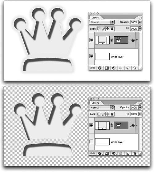
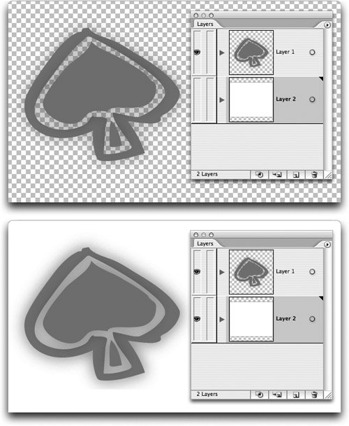
When Does Photoshop Flatten?Many people think that it is the presence of layers in a Photoshop file that initiates the flattening process. That's not the case; it's the status of the transparency grid that triggers flattening. If the transparency grid in Photoshop is visible, then the file requires flattening when placed into InDesign (Figure 11-17). If the grid is not visible, the file may contain layers, but the flattener is not applied to the page. This status can change if you change the layer visibility in InDesign. Figure 11-17. When the layers in the Photoshop file completely hide the transparency grid (top), flattening is not necessary when the image is placed into the InDesign file. When the transparency grid is visible in the Photoshop file (bottom), then flattening is necessary. Illustrator and InDesign Transparency CommandsUnlike Photoshop, Illustrator and InDesign require flattening whenever you apply any transparency commands to your document. As shown in Figure 11-18, it doesn't matter if you can see the transparency grid (available in Illustrator) under the artwork or not. Any time you apply one of the effects, flattening automatically comes next. Figure 11-18. Both these examples of a transparency effect in Illustrator require flattening when output from Illustrator or InDesign.
|
EAN: 2147483647
Pages: 192