| One of the responsibilities of a graphical operating system such as Windows Vista is to provide a common set of interface controls not only for itself, but also for all the applications that run on it. This chapter provides an alphabetical reference to the elements of the Windows Vista user interface, how to use them, and what tricks you can perform with them. Also included are the building blocks of the Windows Vista shell (commonly known as Explorer), such as the Desktop and the various toolbars. In addition to imposing a certain level of user interface consistency, these common elements allow programmers to quickly piece together the interfaces for their applications with a "toolbox" of parts. Although these interface elements are available to all applications, some application designers choose instead to implement their own custom controls and interface paradigms. Sometimes this can lead to an innovative and clever design, but more often than not, it just results in a mess. A poor result typically comes not so much from the choice not to use Windows common controls, but from a failure to follow the rules of good user interface design. The following are a few guidelines that apply to all elements of the Windows interface, which should provide some understanding of why certain elements are designed the way they are in Windows Vista. Even if you're familiar with previous versions of Windows, you'd do well to review these elements, because Windows Vista's richer visual experience alters some basic ways that Windows previously ran.
Visual clues One of the most basic advantages of a graphical operating system is that the elements of the interface contain visual clues on how they're used. For example, buttons have a 3D look, implying that you're supposed to click them. Folder icons look like actual yellow folders you'd see in a file cabinet, reinforcing the notion that they are containers that hold your documents. Folder icons in Windows Vista let you actually look inside those folders by showing a preview of the contents withinfor example, so you can see that one folder holds photographs and another contains Word documents, as shown in Figure 3-1. Figure 3-1. Windows Vista folders displaying previews of their contents so that you know the kinds of files inside without having to open the folders 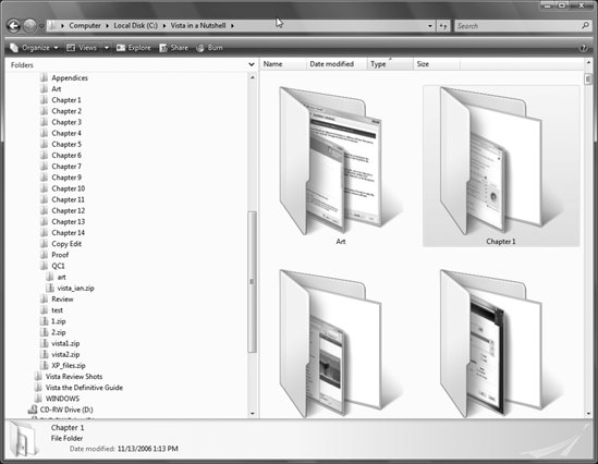 Folders also light up when you're dragging items over them, signaling that they can accept dropped objects. Even the mouse pointer provides visual feedback, changing to a resize arrow when it's over the edge of the window, or changing to a circle with a line through it when you're dragging over an object that can't accept the object you're holding. (Don Norman, author of The Design of Everyday Things [Doubleday], calls these visual clues and says they are intended to recall the way the physical world affords opportunities to interact with objects, or "perceived affordances.") These clues are present in nearly every aspect of the Windows interface; learn to recognize them, and you will quickly find even the most unfamiliar interface more intuitive and easier to use.
Constraints Many controls have limits, or constraints, that permit you to enter only certain values. Scroll bars have a maximum and a minimum limit, for instance, so you can't scroll past the end of a document.
Grayed-out (inactive) controls Any control that appears "grayed out" is disabled because the underlying operation is not currently available. For example, in the dialog box shown in Figure 3-2, you need to select "Single-click to open an item" before you can choose the Underline button. Figure 3-2. Disabled (grayed out) options, indicating that they're unavailable or not applicable 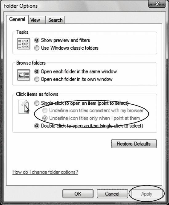 Gray items typically don't respond at all when clicked, and sometimes it's not obvious what action must be taken in order to "un-gray" a menu item. If you're stuck, try to imagine the context in which the menu item is used, and then try to put the application in the correct state for that menu item to be appropriate. For example, some menu items in your word processor will be grayed out when graphics are selected, or if the spellchecker is open.
Ellipses ( . . . ) You'll commonly see ellipses on menu items and command buttons, and occasionally on other interface elements. This notation implies that a new window will appear when the control is activated.
Focus The focus (explained in greater detail in Chapter 2) is the visual highlighting of a single control, identifying which element will receive input from the keyboard. Because there's only one keyboard, only one control can have focus at a time, and because only one window can be active at a time, you should always be able to determine what will happen when you press keys on the keyboard by simply looking for the focus. For example, if a button has the focus, it will glow blue; if an input field has the focus, a blinking cursor will appear where text is to be typed (this is known as the insertion point). You can usually click an item to give it focus, use the Tab key to move the focus from one control to another, or hover your mouse over the item (such as a button).
Different visual experiences Unlike with earlier versions of Windows, with Windows Vista the fine points of your interface may change according to the hardware you use, because not all hardware supports Vista's most advanced interface features. Windows Vista has four levels of interface: Basic, Classic, Standard, and Windows Aero. Entry-level computers will be able to run only the Basic interface. Basic does not include sophisticated visual elements such as transparent windows, or live Taskbar thumbnails that show previews of windows on the Taskbar. It does, however, use the same basic overall organization and interface as all versions of Windows Vista, such as new folder views, and so on. The Classic interface is exactly the same as the Basic interface except that it uses the old square windows and overall look of Windows 2000. The Standard interface includes the features of the Basic interface but also uses the new Windows Display Driver Model (WDDM), which makes for faster and smoother screen and window redraws, no time lags when displaying content, and an end to the "tearing" effect you sometimes had in Windows XP, when a dragged window would leave traces of itself all across your screen. Windows Aero, the most advanced interface, features transparent windows (and also lets you alter the transparency to your taste), live Taskbar thumbnails, and Windows Flip 3D for switching among open applications, as well as other features. When most people think of Windows Vista, they think of Windows Aero; it's what gives the operating system its distinctive look and feel, and it's the interface that the vast majority of Windows Vista users run.
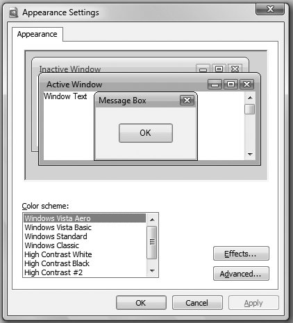
Styles In Windows Vista, the style of all your windows and interface elements is determined by the actual Windows Vista interface you're running (Basic, Classic, Standard, or Windows Aero). However, there is a way to change the style of all your windows and interface elements, no matter which interface you're running. You can choose another style by going to Control Panel  Appearance and Personalization Appearance and Personalization  Personalization Personalization  Window Color and Appearance. (If you are running the Windows Aero user interface, youll need to also click "Open Classic appearance properties.") Click on Advanced, and you'll be able to choose the look and feel of all of Windows Vista's controls, including title bars, buttons, scroll bars, and much more (see Figure 3-3). Window Color and Appearance. (If you are running the Windows Aero user interface, youll need to also click "Open Classic appearance properties.") Click on Advanced, and you'll be able to choose the look and feel of all of Windows Vista's controls, including title bars, buttons, scroll bars, and much more (see Figure 3-3).  | The Appearance Settings dialog box lets you choose to run a different Windows Vista interface than the one you're currently running. So, for example, if you're running Windows Aero and you want to switch to Windows Basic, you can do that. However, it will not let you run an interface your hardware won't support. So if your hardware won't support Windows Aero, you won't be able to switch to it from this dialog box. |
|
Figure 3-3. The Appearance Settings dialog, which allows you to choose among the visual styles available in Windows Vista  |


 Appearance and Personalization
  Personalization
