Blending Modes in Action


Now that you've got a little practice with blending modes, it's time to explore their creative and production side in greater depth. Blending modes are part of a professional's workflow. The next four sections showcase a few different ways to better integrate blending modes for professional results.

Instant Spice

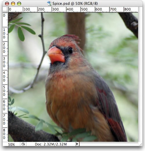
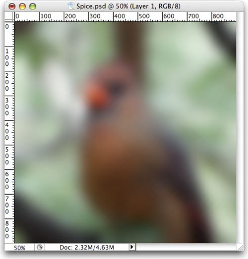
One way to improve a washed out or flat image is through blending modes. By blending a blurred copy of an image on top of itself, you can quickly create visual pop. Let's give it a try:

1.

Open the file Spice.psd from the Chapter 9 folder.

2.

Select the Background layer in the Layers palette.

3.

Duplicate the Background layer by pressing Cmd+J (Ctrl+J).

4.

Significantly blur the new layer by choosing Filter > Blur > Gaussian Blur. A value of 25 pixels should do the trick.

5.

Select the Move tool by pressing V.

6.

Cycle blending modes by pressing Shift++. Look for modes (such as Overlay or Soft Light) that increase Saturation and add visual "pop" to the image.

7.

If needed, adjust the opacity of the layer to taste. You can quickly change opacity by typing in the first number of an opacity setting, such as 4 for 40% opacity. You can type 25 to quickly switch to 25% opacity, for example, if a more specific adjustment is required.

Here's a quick look at how different blending modes can be used to add instant spice to an image.

Original

Blurred to be Blended Image

Dissolve

Darken

Multiply

Color Burn

Linear Burn

Lighten

Screen

Color Dodge

Linear Dodge

Overlay

Soft Light

Hard Light

Vivid Light

Linear Light

Pin Light

Hard Mix

Difference

Exclusion

Hue

Saturation

Color

Luminosity

Fixing a Shadowed Image

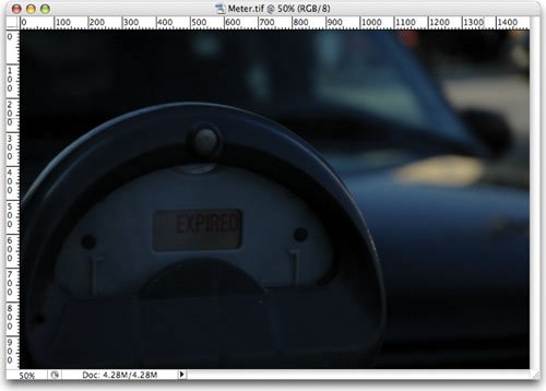
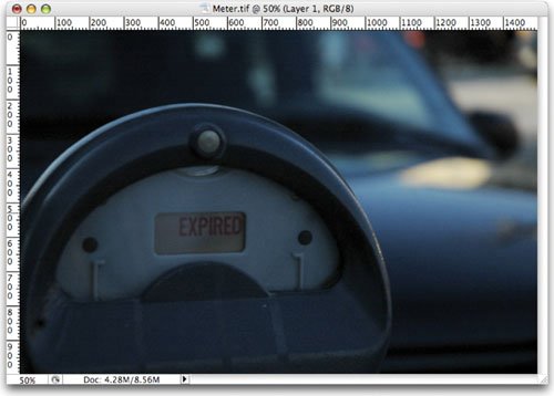
If an image is completely thrown into the shadows, you can turn to blending modes to shed a little light. In fact, this is a technique that is often used by law enforcement agencies to enhance security photos or footage.

1.

Open the file Meter.tif from the Chapter 9 folder.

2.

Duplicate the Background layer by pressing Cmd+J (Ctrl+J).

3.

Set the top layer to Screen mode. You can choose it from the pop-up list in the Layers palette or press the keyboard shortcut Shift+Opt+S (Shift+Alt+S). The image should appear significantly lighter.

4.

You can further lighten the image by placing another duplicate copy on top. Press Cmd+J (Ctrl+J) as many times as needed. Each will lighten the image further.

Fixing a Bad Sky

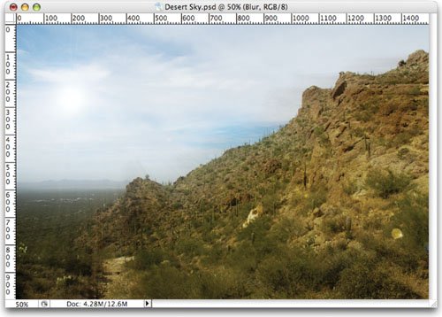
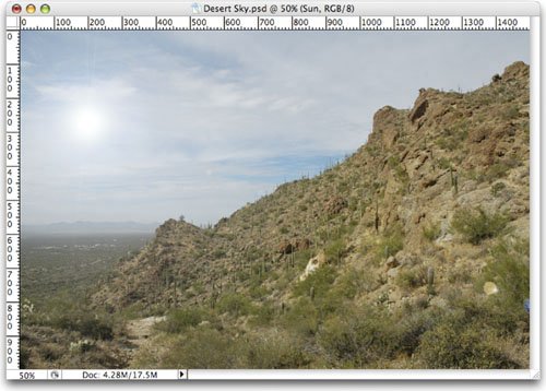
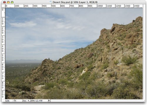
You can use blending modes to enhance a flat or boring sky. In fact, through a little bit of layering, we can greatly improve the average landscape shot. Let's give it a try:
1.

Open the file Desert Sky.psd from the Chapter 9 folder.

2.

Create a new, empty layer. Fill it with black by choosing Edit > Fill and choose black. Name the layer Sun.

3.

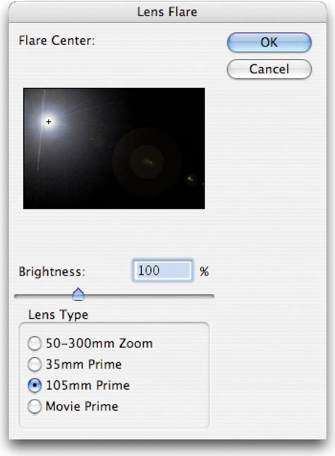
We are going to add a "sun" to the sky. Choose Filter > Render > Lens Flare. The Lens Flare filter normally simulates flares caused from the sun or a light source hitting the lens. Experiment with the different options and adjust the Brightness. Drag the crosshair to position the light source near the upper-left corner. Click OK.

4.

Change the Sun layer's blending mode to Screen. This will drop out the darkest areas and leave on the areas that are brighter than the background behind.

5.

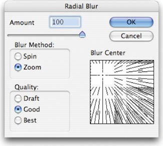
Let's further enhance the image by adding some more "rays" to the sky. Duplicate the Background layer and place it on the top of the layer stack. Name the copy Blur.

6.

It's time to blur the layer using a Radial Blur. Choose Filter > Blur > Radial Blur. Set the blur method to Zoom and the amount to 100. Move the crosshair in the filter window so the Blur is directed from the upper-left corner of the image. Click OK.

7.

Change the Blur layers blending mode to Overlay. Adjust the opacity to taste.

Applying a Rubber Stamp

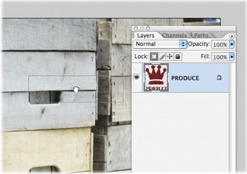
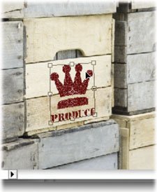
You can also use blending modes to make one image appear as if it were applied to another. If we add the Free Transform command, we can make that stamp match the perspective of the photo. Let's give it a try:

1.

Open the files Boxes.tif and Logo.psd from the Chapter 9 folder.

2.

Select the Logo.psd file so it is active.

3.

Activate the Layers palette. Click the thumbnail for the Logo layer and drag it into the Boxes.tif document.

4.

Press Cmd+T (Ctrl+T) to invoke the Free Transform command. To harness additional transformations, right-click (Ctrl-click). Choose Distort; this will allow you to corner-pin the logo and match its angle to that of the box.

5.

We now need to scale the logo smaller. Right-click (Ctrl-click) and choose Scale. Shrink the logo so it fits better on the side of the box.

6.

Set the Logo layer to the Multiply blending mode and lower its opacity to 85%. This will make the Logo layer appear to be stamped on the crate.

Table 9.1 provides the keyboard shortcuts to make it easier for you to use blending modes.

Table 9.1. Blending Shortcuts

Result Windows

Windows

Mac OS

Normal

Shift+Option+N

Shift+Alt+N

Dissolve

Shift+Option+I

Shift+Alt+I

Darken

Shift+Option+K

Shift+Alt+K

Multiply

Shift+Option+M

Shift+Alt+M

Color Burn

Shift+Option+B

Shift+Alt+B

Linear Burn

Shift+Option+A

Shift+Alt+A

Lighten

Shift+Option+G

Shift+Alt+G

Screen

Shift+Option+S

Shift+Alt+S

Color Dodge

Shift+Option+D

Shift+Alt+D

Linear Dodge

Shift+Option+W

Shift+Alt+W

Overlay

Shift+Option+O

Shift+Alt+O

Soft Light

Shift+Option+F

Shift+Alt+F

Hard Light

Shift+Option+H

Shift+Alt+H

Vivid Light

Shift+Option+V

Shift + Alt+V

Linear Light

Shift+Option+J

Shift + Alt+J

Pin Light

Shift+Option+Z

Shift + Alt+Z

Hard Mix

Shift+Option+L

Shift + Alt+L

Difference

Shift+Option+E

Shift + Alt+E

Exclusion

Shift+Option+X

Shift + Alt+X

Hue

Shift+Option+U

Shift+Alt+U

Saturation

Shift+Option+T

Shift+Alt+T

Color

Shift+Option+C

Shift+Alt+C

Luminosity

Shift+Option+Y

Shift+Alt+Y


Profile: Scott Billups, Director of Photography/Director/VFX Supervisor/Author

Scott Billups is a pioneer in the digital visual effects world. He has worked on major Hollywood films and television shows in various capacitiesas a cinematographer, a director, and a supervisor for the special effects in the project. Despite these varied roles and need for motion, Scott relies heavily on Photoshop.

"Photoshop is probably the single most commonly used graphics application in television and motion picture production," said Billups. "There are probably as many ways to use it as there are people who use it."

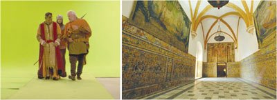
Billups has created several television specials for the Discovery and History Channels. He frequently needs to take actors and insert them into historical locations. His process often involves shooting photos on location, and then inserting actors using greenscreen technology back in his California studio.

"One of my favorite budget-stretching, time-saving uses is a process I call Super-Frames," said Billups. "The trick is to shoot the plates cinematically. Unlike your basic holiday snapshot, a Super-Frame series needs to adhere to an established narrative structure. Since the Super-Frame is much larger than even the most advanced High Definition frame, you have plenty of room to pan and move the framing of your shot."

While he takes photos of historical locations for these shows, the photos need to be touched up. Modern buildings and power lines must be removed, often along with such items as roads and sidewalks. Billups also takes note of lighting conditions so he can match them later. Having a reference point allows for multiple shots to be color matched.

"It is very important to make a note of the lighting for each of these Super-Frames that you are creating. I've found that a simple white balloon, positioned in the area of the actors, has basically all of the information that I need to re-create a matching lighting scenario back in the studio."

Billups stressed that Photoshop is both an essential tool and a stepping-stone to other filmmaking tools.

"The Matte and Alpha Channel tools in Photoshop are used at some point on nearly every production, large or small," said Billups. "If you don't have the patience to cut a matte, you're ill suited to a career of pushing pixels."

If you are looking to get into visual effects and the motion picture industry, Billups stressed that it takes a deep sense of commitment and a respect for quality.

"It takes less effort to stay busy than it does to look busy," said Billups. "There's always a way to make something look better, so if you finish ahead of time, tweak till they pry it away from you."

For more information on Scott Billups, see his Web site at www.pixelmonger.com.


Understanding. AdobeR PhotoshopR. Digital Imaging Concepts and Techniques
Understanding Adobe Photoshop: Digital Imaging Concepts and Techniques
ISBN: 0321368983
EAN: 2147483647
Year: 2004
Pages: 129
flylib.com © 2008-2017.
If you may any questions please contact us: flylib@qtcs.net