Section 24.6. CSS Rollovers
24.6. CSS RolloversA rollover is a visual effect in which an item on the page changes when the pointer is placed over it. It has proven to be an effective interface device for indicating that a button or link is interactive and is ready to be clicked. Previously, it was necessary to use JavaScript to create rollover effects, but the same thing can be accomplished with CSS alone using the :hover pseudoclass selector. It should be noted that Internet Explorer 6 (and earlier) does not support :hover on elements other than links (a), so this section focuses on text and image link rollovers . The good news is that IE 7 expands the use of :hover to apply to all elements. 24.6.1. Text RolloversA rollover can be used to change any aspect of an element's appearance. You can change the size or color of the text, its background color, its decoration, or virtually any property that can be used to style text. Figure 24-12 shows just a few examples. Styles are applied to the a element, and an alternate style is specified with the a:hover selector for the rollover state. Remember, to work correctly, the pseudoclass selectors must appear in the style sheet in the following order: :link, :visited, :hover, :active (think LVHA, or "Love, Ha!"). In all three examples, the default link is set in gray text with its underline turned off using this rule. Figure 24-12. Examples of text rollover effects on links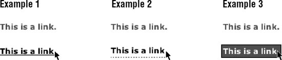 a:link { text-decoration: none; color: #666; } In Example 1, the rollover changes the link to black and makes the underline appear. a:hover { text-decoration: underline; color: #000; } Example 2 demonstrates a popular technique of using a fancy bottom border instead of the generic underline. A little padding is added to give the link enough space. a:hover { text-decoration: none; color: #000; padding-bottom: 2px; border-bottom: dotted 2px #999; } In Example 3, both the foreground and background colors change on rollover. A border is thrown in for good measure. a:hover { text-decoration: none; color: #FFF; padding: 2px; background-color: #666; border: solid 1px black; } 24.6.2. Image RolloversImage rollovers work on the same principle as described in the previous examples, only the value of background-image is changed for the hover state. Again, because Internet Explorer 6 and earlier support :hover on the a element only, a link is used in this example. This example style sheet applies a background image (button.gif) to all links in a document. The a element is set to display as a block so that width and height values (matching the image dimensions) can be applied to it. The a:hover rule specifies a different background image (button_over.gif) to display when the mouse is over the link (Figure 24-13).
a { display: block; /* allows width and height to be specified */ width: 150px; height: 30px; background: url(button.gif) no-repeat #666; color: #FFF; /* the next properties center the text horizontally and vertically*/ text-align: center; text-decoration: none; line-height: 30px; vertical-align: middle; } a:hover { background: url(button_over.gif) no-repeat #eee; color: #333; } Figure 24-13. Simple image rollover In some instances, such as graphical navigation bars, it is desirable for each link to have its own background and rollover images. In this case, it is necessary to give the containing elements unique identifiers. <li ><a href="#">more info</a></li> <li ><a href="#">contact us</a></li> a {display: block; width: 150px; height: 30px; } #info a {background url(info.gif) no-repeat #666; } #info a:hover {background url(info_over.gif) no-repeat #666; } #contact a {background url(contact.gif) no-repeat #eee; } #contact a:hover {background url(contact_over.gif) no-repeat #eee; } 24.6.2.1. Rollovers without preloadingAnother popular method for handling image rollovers is known as the "Pixy No-Preload Rollover" technique introduced by Petr Staníek (aka "Pixy") in his article "Fast Rollovers without Preload" (wellstyled.com/css-nopreload-rollovers.html). In this method, all the rollover states are placed in one image, and only the background-position is changed for each link state. This avoids the need to load or preload multiple images for each rollover and can speed up display. Figure 24-14 shows the image that contains both the default background image and the hover state. The style rule shifts the position of the initial background image down by the height of the element, revealing the appropriate portion of the image. a { display: block; width: 150px; height: 30px; background: url(allbuttons.gif) top left no-repeat #666; } a:hover { background url(allbuttons.gif) 30px left no-repeat #eee; } Figure 24-14. Containing all rollover states in one image
|
EAN: 2147483647
Pages: 325