Section 24.7. List-Based Navigation Bars
24.7. List-Based Navigation BarsHorizontal navigation toolbars are a staple of web interface design. Traditionally, they were created with some number of adjacent text links or a line-up of images. Either way, there wasn't much meaning to their markup in the document source. When you think about it, it makes sense for a list of navigational options to be marked up as a list in the source. With CSS, it is possible to give it the appropriate semantic markup while visually presenting the options as a familiar horizontal bar. There are two methods for changing a bulleted list into a horizontal navigation bar. The first makes the list items display inline instead of stacked (the default display mode for block elements). The second uses floats to line up the list items and links. Both examples below use this markup for an ordinary unordered (bulleted) list with five list items. Figure 24-15 shows how it looks using the default browser styles. <ul > <li><a href="/">Water</a></li> <li><a href="/">Fire</a></li> <li><a href="/">Air</a></li> <li><a href="/">Earth</a></li> <li><a href="/">Beyond</a></li> </ul> Figure 24-15. The unstyled list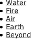 24.7.1. Inline List ItemsWe'll start with the minimum style rules for removing the bullets (list-style-type: none) and making the list items appear next to each other instead of in a list (display: inline). The margins and padding are set to 0 to prepare for anchor (a) element styling. The results of the styles thus far are shown in Figure 24-16. ul#nav { list-style-type: none; margin: 0px; padding: 0px; } ul#nav li { display: inline; } Figure 24-16. Making a list display horizontally With the pieces in place, you can then apply any style to the anchor (a) elements. In this example, the link underlines have been removed and a border, a background color, and padding have been added. An alternate style has been specified for the rollover state as demonstrated in the previous section. The resulting navigation list in Figure 24-17 is just one simple example of what can be done. ul#nav li a { padding: 5px 20px; margin: 0px 2px; border: 1px solid #666; background-color: #CCC; text-decoration: none; text-align: center; } ul#nav li a:hover { background-color: #333; color: #FFF; Figure 24-17. Adding styles to the inline list 24.7.2. Floated List ItemsThe other method for creating horizontal lists uses the float property to cause the list items to line up next to one another. When using float, it is important to set the following element in the source to clear: both to ensure that no page content wraps around the list. This is just one of many variations on formatting navigation with floated list items. The primary steps are turning off the bullets (list-style: none), floating each list item (float: left), and then applying styles to the links (a) as block elements. ul#nav { list-style: none; margin: 0; padding: 0; } ul#nav li { float: left; margin: 0 2px ; padding: 0 ; } ul#nav li a { display: block; /* allows width and height settings on a element */ float: left; /* provided only to fix display in IE-Mac */ width: 100px ; height: 28px ; line-height: 28px ; background: url(tab.gif ) #CCC no-repeat; text-decoration: none ; text-align: center ; } /* Commented backslash hack hides rule from IE5-Mac \*/ ul#nav li a { float: none; } /* End IE5-Mac hack */ ul#nav li a:hover { background: url(tab_over.gif ) #333 no-repeat; color: #FFF ; } This time instead of a solid background color, each link is styled with a background image that changes for rollovers, as shown in Figure 24-18. Figure 24-18. Tabbed navigation created with floated list items 24.7.3. More List and Tabbed Navigation TutorialsThe example in this section is only the most elementary introduction to how CSS can be used to create tabbed navigation from semantically logical list markup. For more sophisticated techniques and in-depth tutorials , these are just a few of the numerous resources online.
|
EAN: 2147483647
Pages: 325