Springtime: Using color to evoke emotion
|
| Boér Attila, Designer www.csszengarden.com/083  AFTER A COLD WINTER filled with monotones, Boér Attila woke to the first clear, sunny day of spring and found the colors to be uplifting, energetic, and joyous. This shift from winter to spring inspired aspects of Attila's visual design, especially the color choices. That color induces a variety of human emotions has long been established. This is why we do things like define red as being a hot color. We relate red to a flame, or red-hot peppers. We then allow those ideas to influence the way we use color in designfor example, using earth tones like browns and tans in package design for natural products. In Springtime the monotonous colors of winter meet the emerging colors of spring, resulting in a color palette that is neither cold nor hot, but rather expresses warmth and harmony, creating a soothing, positive feeling for the viewer. The Influence of ColorAs a designer seeking to offer a message to your audience, you'll find that an understanding of the psychological effects, cultural influence, and gender bias of color is as important as the more technical concerns. Sending a Clear MessageWhile the way your content is written, laid out, and enhanced with imagery will undoubtedly provide an overt means of how the goals of a site is expressed, the use of color is a significant piece of visual communication. The experienced designer knows to use colors that are appropriate for the message and the audience. Color can be as persuasive to the human eye as imagery and text, and perhaps even more so at times. Note Certainly, using the reverse of expected colors can create conflict, making for an interesting approach to design, which can lead to excellent results. However, being daring in that way requires even more planning and testing to ensure that the chosen colors are doing their job. The point here is to show the natural correlation between colors and human response. If your assignment is to create a site for a death metal rock band, the use of bright colors such as yellow and pink on a white background would be counterproductive to the message. Death metal is synonymous with darkness, and while bright colors can certainly be used within the design, the clearest message about the band is communicated through use of dark, heavy colors typically associated with that genre of music. Conversely, if you're creating a site for a classical quartet, a very dark site won't convey the sense of sophistication and the lighter sound of that genre. Choosing colors that are in accordance with the subject matter and message of your site is crucial for a design to be effective. Color and the Human PsycheThe influence of color on human emotion is an area of great fascination. It is a complex relationship involving numerous factors. If someone cannot see, the point is obviously moot. For those with partial color perception, the experience simply cannot be the same as for a person with full color perception. Approximately 1 in 12 North Americans suffers from the most widespread form of color blindness (dichromacy, the inability to distinguish two colors from one another, most commonly red and green). For that reason, it's important to keep your audience demographic in mind when choosing your colors. The hue of a color can change its significance, too. A bright green evokes a certain emotion, whereas khaki green produces different results. Similarly, adding texture to color can alter its perception. TABLE 1 lists common colors and their general psychological associations.
As you might have noticed, there are some contradictions within associations of individual colors, and dichotomies between different colors like black and white. Red, for example, both inspires passion and expresses danger (perhaps the two really aren't so different?). Again, there are numerous factors connected to these apparent contradictions, and cultural as well as gender differences are responsible for a great deal of the discrepancies. In the case of Springtime, the hue and intensity of the greens chosen are soft and pleasing, evocative of grass and leaves. The touch of blue in the design also helps extend the expression of nature, (FIGURE 1). Figure 1. The palette for Springtime, including a range of green, a hint of blue, and white. Color, Culture, and GenderAttila is Hungarian. Do an artist's cultural roots and the environment in which he or she lives and works influence their design choices and perception of color? Experts would agree that this is so. Similarly, the gender and culture of a viewer of Springtime may well affect that visitor's experience of the design. Note To learn more about color and find numerous research articles, books, and other color resources, visit Professor J. L. Morton's Web site, Colorcom (www.colorcom.com). Another great site for information about color is Causes of Color (http://webexhibits.org/causesofcolor). Culture and gender extend and complicate the basic responses to and associations with color discussed in the preceding section. TABLE 2 provides some insight into color responses and associations based on culture and gender. As you can quickly surmise, the use of colorespecially in a worldwide forum such as the Webhas to be considered very carefully.
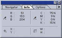
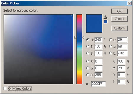
Color Palettes for Web SitesAs you build color palettes for your own projects, you'll want to keep these color issues in mind. Along with knowing your message, you'll need a sense of your audience's expectations in order to come up with a range of palettes that suit your needs. Study the AudienceIt's the golden rule of communication: Know your audience. Because the human psyche, one's cultural perceptions, and one's gender all play a role in how color is perceived, it's necessary to understand your audience prior to determining a color scheme. In some cases, color associations are so broad as to be appropriate for all groups. This would include designs with a lot of blue, brown, oras is true for Springtimegreen. Note Before launching a design, it's a good idea to create a number of test palettes. You can do this quite easily in Adobe Photoshop (FIGURE 2). Create an empty document and, using the Color Picker, add colors to a strip, seeing how they mix and match. You can then set up a test document to apply your colors using CSS. Figure 2. Building a color palette in Photoshop. CSS is helpful in the prototyping phase of the design process: You can create several style sheets relating to each of your test palettes and apply the color to the test document. You can even set this up as part of a usability study, in which you deliver different color schemes to your subjects and then gauge their responses. Color expert J. L. Morton, whose site is mentioned earlier in this chapter, suggests that designers stick as close to expected relationships as possible. If the site is for children, the use of colors that express joy can be very handy. If you are expressing elegance, black and silver can be an excellent combination in the United States. If you are appealing to men, generally speaking, lots of blue is always good. If you are appealing to women, reds and pinks are likely to be more appropriate than blue. If you're designing a nature site or one celebrating nature, the use of greens, blues, and browns make sense. Color Options in CSSFortunately, CSS offers many options in terms of color values. We can use any of the following:
Note For more information on system color keywords, see www.w3.org/TR/CSS21/ui.html#system-colors. Note that these colors will not be part of the CSS 3.0 color module. Colorful ConclusionsWhether you are designing for personal or professional reasons, it's best to start by understanding your message and the audience to whom it is directed. With that information in hand, you are far more likely to make color choices that serve to enhance your message. Springtime is an excellent example of color design that is completely appropriate for the goals it is meant to achieve: express the transition from winter to spring, bring a touch of calm optimism to the visitor, and ensure that those emotions are expressed to a global audience, which the CSS Zen Garden most assuredly has. Note Many people continue to design using the "Web-safe" palette. However, since the majority of computers available today support millions of colors out of the box, following that convention is no longer necessary unless you are designing for a specific demographic. Readers familiar with the Web-safe palette will notice that the colors used in Springtime are well outside the 256 colors it specifies. |
|
EAN: N/A
Pages: 117