Zunflower: Playing with light and shadow, shape and space
|
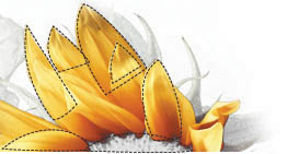
| Radu Darvas, Designer www.csszengarden.com/026  WHEN SUNFLOWERS ON THE BALCONY caught his eye, Radu Darvas began taking photos, from which his design ideas for Zunflower emerged. Playing around with the sunflowers in Adobe Photoshop helped him formulate ideas for a CSS Zen Garden submission. One concern was that he didn't want to "think in boxes." However, progressing deeper into the design, he saw that he could adjust the placement of his columns and create a visual overlap. This led to additional interplay of light and shadow, shape and space, resulting in the bright and energetic Zunflower. Finding the LightWherever you're sitting right now while reading these pages, there's at least one source of light you're using to read. Take a moment to lift your eyes from the page. Where's the primary light source coming from? How is it highlighting the objects around you? Where are the shadows? Light and shadow are used by visual artists to make their representations realistic, to add mood to a work, and to enhance the work by allowing for interesting aspects to be brought to the foreground of the piece. If we look back over the past decade of Web design, we find many uses of light. Whether to add gradients to graphics (FIGURE 1), to bevel edges of buttons (FIGURE 2), or to create drop shadows (FIGURE 3), light has been used in many ways on the Web. Figure 1. Gradient fills, circa 1995. Dithering and banding occur at high compression rates, resulting in a less-than-professional look. Figure 2. A sample of beveled text on a beveled button. This sort of visual effect dominated mid-'90s Web pages. Figure 3. A classic drop shadow effect applied to a photo. Unfortunately, light is sometimes mismanaged by Web designers who don't have formal schooling in the visual arts. What we've been able to do within the limitations of our medium has also proved to be a challenge. Finally, trends influence techniqueeven if the light in use is unrealistic and has conflicting light sources (FIGURE 4). Figure 4. Incorrect use of a light sourcenote the different directions of the shadows for each object. Preserving the ShadowZunflower demonstrates the proper use of light to create drop shadows. While strong gradients and gratuitous bevels have largely gone out of style in contemporary Web design, the use of drop shadows persists for a number of reasons:
To avoid the problems that using shadows might introduce, such as conflicting light sources, the following points offer some general guidelines:
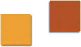
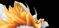
For example, the first two overlapping boxes that make up the central column within Zunflower share shadows that fall naturally from a left light source (FIGURE 5). Figure 5. Correct use of light source to achieve appropriate shadows. Also, the fade effect used on the right box adds to the sense of light within the design. The light appears to be waning, which fades the remaining image from our sight (FIGURE 6). Figure 6. Following through with the light source to achieve a realistic feel. Tip If you're using Photoshop layer effects, be sure the Use Global Angle check box is checked. This will keep the light angle you choose consistent while working on images. Getting into ShapeAs with color, shapes influence us psychologically. There are specific qualities associated with them that designers are able to tap into to evoke a specific emotion in our visitors. The impact of shape isn't limited to computer or print design. Humans have used shape as long as we've been able to scratch symbols into the dust or tell tales using pictograms on cavern walls. We find them everywherethey're inherent in our world and, by extension, in just about everything people do. Whether used to describe a complex mathematical equation, to add an architectural accent to a building, or even to describe religious and tribal affiliations (the Holy Cross, the Star of David, tattoo art), shapes are part of our nature and our self-expression. In Zunflower, the flower is an especially compelling image, one that we are drawn to because of its color and because of the presence that its shapes express. Primary ShapesCircles are most frequently associated with the feminine: warmth, comfort, sensuality, and love, and the extension of those associations. Circles (or arcs) are often used to represent community, wholeness, endurance, movement, and safety. Many Web sites related to women, community, holistic living, and romance use circles to strengthen the message. Triangles are thought to be masculine, expressing qualities such as strength, aggression, and dynamic motion. The direction of a triangle also influences meaning. The eye tends to follow any dominant angle. If the triangle faces upward, it suggests upward motion and aggression. If the triangle faces downward, the association can be negative, and represent passivity and impotence. Of course, rectangles (including the square) have associations as well. Rectangles suggest power and foundation, quite possibly because of their rigidity and suggestion of mass. Rectangular imagery can suggest to viewers order, logic, containment, and a sense of security. Combining Shapes for Maximum ImpactIf we study the "zunflower" image itself, we find a combination of triangles and circles. Of course, these occurred naturally, but Darvas enhanced the image in Photoshop, bringing out the flower's color and shape. The result is a very sensual image, one that is both masculine and feminine, and that creates a very memorable emotion (FIGURE 7). Figure 7. A close look at the "zunflower," with its combination of triangular and circular shapes. In Zunflower, strong rectangles balance the more sensual nature of the flower, providing a ground for the design (FIGURE 8). Figure 8. Rectangles help balance the design. Shapes can be combined for greatest impact. Add color and light, and things really get interesting. Top it off with an appreciation for space, and the impact can be very strong indeed. Give Me My Space!As with its cousins light, shadow, and shape, space also has interesting psychological and archetypal relevance that artists throughout the ages have tapped into to elicit responses from their audiences. The proper use of space in a visual design serves a number of purposes: Space can assist with guiding the eye to a point on the page of interest; it cushions text and images; and provides a resting place for the eyes. This improves readability and gives us extra mental room to process the information being presented. Psychological and Social RelevanceSpace has distinct psychological and social meaning. In terms of psychosocial relevance, consider these issues:
If we apply these issues to design, we see that space isn't just a by-product of what we don't put on a page, but rather it's an integrated aspect of a design. Positive and Negative SpaceHow space is integrated with design is more clearly understood when the differences between positive and negative space are explained. Positive space is the space occupied by the objects that make up your design. Negative space is the space that is not your objects (the background). However, it's not possible to detach positive space from negative space; this is an interdependent and always-present relationship. Negative space assists in defining the border of the positive space, and the border of an object defines the beginning of negative space, which is in and of itself a shape (FIGURE 9). Figure 9. When the space is made black, you can more clearly see how space defines the object edge and how it is itself made up of a combination of shapes. Adding Professional PolishUnderstanding light sources and how to work with them can assist you in making drop shadows and related techniques more consistent. The role that shape plays in design is something worth examining in more detail, both for overall visual design, and specific needs such as logos and icons. Finally, a sense of space, and how to manipulate it, with a fuller understanding of its purpose will help you send a clearer message to your visitors. Ultimately, gaining control over light, space, and shape will add a professional polish to your design work as confidently as in Zunflower. |
|
EAN: N/A
Pages: 117