Atlantis: Minimal design, unity, and symbolism
|
| Kevin Davis, Designer www.csszengarden.com/028 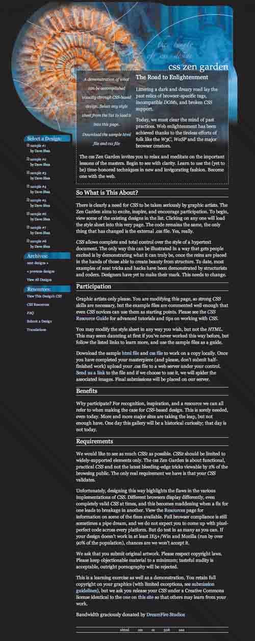 GRAPHIC DESIGN IS ABOUT communication; a successful design delivers a message to the viewer that words alone can't. Design is capable of evoking atmosphere and emotion, creating a tone, and soliciting a response from the viewer. Kevin Davis's goal when creating Atlantis was to combine design elements like typography and imagery the same way an interior designer might combine tables, counters, and paint while creating a moody café interior. Starting with photographs and a color palette, Davis blended elements until he achieved the desired result. He then applied this graphical framework to the layout he had formulated. MinimalismWhat's immediately striking about Atlantis is its relative simplicity, with the exception of the detailed header collage. In combining photographic elements with a deceptively simple layout, Davis has achieved a rare intermingling of the complex and the minimal. The CSS Zen Garden itself was created in a climate where most CSS designs were largely disregarded as being "boxy" and often "minimal" (FIGURES 1A, 1B, and 1C). There's nothing inherently wrong with either, provided each is used in the correct context. Figure 1A-1C. Examples of earlier, minimal CSS layouts.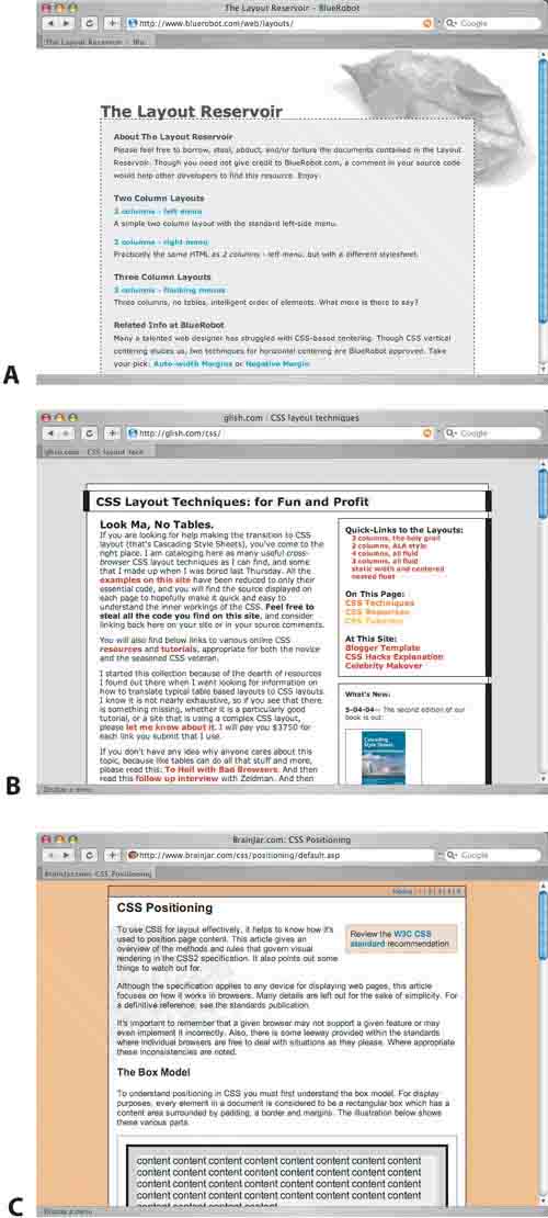 The disdain for these "typical" CSS designs stemmed from a simple misunderstanding: Those producing the work often were not graphic designers in the traditional sense, so the technology suffered for it. Of course, this was precisely one of the problems the Zen Garden was created to remedy. But Atlantis brings the argument full circle as a poignant visual example of the fact that minimalism does not naturally equal bad design; when you see countless examples of the same thing over and over again, though, you simply get tired of it. Serving mashed potatoes, roasted potatoes, and french fries for dinner is too much of a good thing. A nice dollop of mashed potatoes on the side of your turkey (or tofu, as the case may be) makes precisely the right combination for a simple but tasteful dinner. So in settings where low-profile visuals make sense, a light, minimal design may be just the thing. Content dictates design, after all, and if the content is visually complex or requires more attention, there's no point in overpowering it with excessive decoration. Creating a really good minimal layout, on the other hand ... well, even the pros have difficulty doing that. When design elements are simple, they capture more of a viewer's focus on a page than they normally might. Every element used is more important, and so attention to detail is what will set apart the spectacular from the mediocre. In learning how to apply these elements well, you can greatly benefit from studying a strong minimal layout like Atlantis. If we remove the header image, the nature of the layout is more evident (FIGURE 2): A main content area in the middle is flanked by a smaller menu just to the left. Figure 2. Atlantis, minus the header image.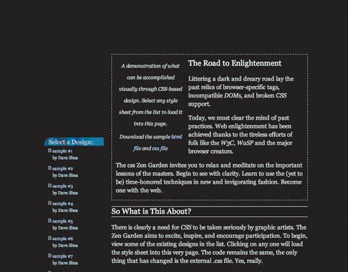 TypographyThe body text in Atlantis is proportionally quite a bit larger than the menu text; to further differentiate the two areas, Davis has adjusted the typography to hint that what is on the left isn't quite as significant as what is on the right (FIGURE 3). As well, larger header type clearly separates the headers from the body text. These visual differences communicate extra information about the importance of each piece of text relative to each other. Figure 3. The body type is almost twice the size of the menu type. Type is a framework for communicating the written word, which has its own built-in hierarchy, patterns, and rhythm. Adjusting these patterns for effect through text sizing, spacing, and color is a powerful method of communicating more than what's written. IconographyIn the menu on the left, Davis has inserted small icons next to each design name. Because the icons are close in size to the links, they blend in with the link text and function as low-profile bullets without distracting the eye. This simple detail adds a context that sets the design links apart from those underneath, and makes an otherwise straightforward menu a bit more unique and interesting. Icons are simplified symbols that either represent objects and ideas, or abstract a concept by providing a visual replacement for a longer text description. Objects often have obvious visual representations, while ideas like processes and actions are much harder to portray. A great icon doesn't need to be explained, but icons are often visually abstract out of necessity. The key is to strongly and consistently associate the icon with the idea in question, so that indentification becomes more intuitive after repeated exposure. LineDavis has chosen two line styles to distinguish various areas within the design: A dashed line surrounds the top paragraphs, which overlap the header image, and solid white lines further set apart the headers and footer within the page (FIGURE 4). These simple lines add extra visual context to the page without confusing the eye. Figure 4. Solid white lines distinguish the headers from body text. Simple use of line can define areas within a page and establish boundaries, create movement throughout a page, and add extra dimension. The danger is in using too many linesunclosed boxes and too many parallel lines will suggest grids and structures that may not be present. The eye will attempt to find patterns where they may not exist, so it's prudent to use lines judiciously and only where it makes sense to do so. MarginsBy constraining the design within a central column area, Davis has exerted maximum control over the spacing of the elements within the page. A variable-width margin on either side positions the content centrally within the browser window. Sometimes it's beneficial to fill the whole window with a design; at other times a constrained layout is preferable. In either case, generous margins on the left and right edges of major text areas prevent a design from becoming too cramped. By default, most browsers will apply the slimmest of margins around the outer edge of a page, which unfortunately allows text to run from the left to the right edges of the window almost completely unfettered. This is a visual problem. Text needs room to breathe, and a lack of margins will cause it to visually blend with whatever rests behind the browser. The technology defaults in this case aren't appropriate for the situation, so extra responsibility is placed on the designer to fix the situation. In the case of a minimal layout where a margin is one of the few design elements used, getting it right makes all the difference. A bold margin sets a stage for the text within the browser window and places the viewer's focus on the content. Note Most designers won't take issue with poor default margins, since they intend to override defaults regardless, but a good starting point is more important for the sake of non-designers and amateurs. Nobody loses if the technology does a better job of setting the stagea standard office printer adds generous margins around the edge of the page to prevent this sort of busy clutter, for example. Unity and SymbolismAtlantis is a strong example of using design elements to create a mood, as Davis intended. According to the Greek philosopher Plato, Atlantis is a lost island that sank into the sea ages ago. The rust-flecked spiral shell and classical stone statues and columns in the header certainly evoke the ancient and worn feeling surrounding the legend, and the deep blues and black bring to mind the lower light levels of deep water. By choosing imagery and color ahead of time, Davis ensured that his design remained true to its inspiration. ConsistencyThe shell was color-adjusted to merge with the collage behind it, and its edges were softened in Adobe Photoshop to further blend into the overall header image. But without tonally shifting the entire shell to a blue color range, Davis has left behind sufficient rust tones to provide some welcome color contrast (FIGURE 5). A consistent blue across the entire design would have reinforced the mood with far too heavy a hand (FIGURE 6). Figure 5. The orange tones in the shell provide color contrast. Figure 6. A more consistently blue header might adhere to the theme, but the design suffers for the lack of contrast.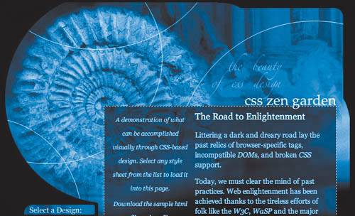 Design elements may be varied, but an overall tone of unity is an important goal. In lieu of an overtly monotone color scheme, there are other, more subtle ways of creating consistency within a design: echoing dominant shapes in line art and photography, for example, or matching proportions and sizing between type and surrounding lines. In Atlantis we see solid white circles in the header, overlapping shell and collage alike. Without context, simple white lines like these don't appear to resemble anything. But between their shape and the blue background, they're highly reminiscent of ripples on water. Their shape and size also closely match those of the shell, forming a close connection between the two elements. RepresentationThis method of representationof using simple design elements to stand in for more complex imagery or ideasis a strong way of adding subtlety and extra depth to design work; you may not even have noticed the white lines until we pointed them out, but now that they're apparent, it's difficult to see them as anything but ripples on the surface of a body of water. The symbolism of Atlantis doesn't end with simple lines; more obvious is the placement of the imagery within the header. The Atlantis of long agoa virile and rich empire of stone columns and ornate statuesis faded and positioned in the background behind the central and more distinct Atlantis of today: rusted, ancient, and under the sea. A faded empire, long past its glory days, is implied by a spatial relationship between the two halves of the collage. This seemingly simple placement creates a narrative and adds an extra level of depth for the viewer to decipher. And for the CSS-savvy viewer, the use of a shell for header imagery holds an extra meaning; Davis's choice of a seashell is an homage to a classic CSS demonstration page, Eric Meyer's Complexspiral, which is found at www.meyerweb.com/eric/css/edge/complexspiral/demo.html (FIGURE 7). Figure 7. The Complexspiral demonstration referenced by the shell within the header of Atlantis.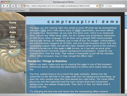 Design PrerogativeDesign is powerful for the purposes of communication; a clear and unified message across a site sets the stage for a user's experience. Not all sites require the same level of design attention, and in cases where content and functionality take center stage, it might be the responsibility of the designer to simply stay out of the way with simple imagery and an effective, minimal layout. In other cases design must communicate a stronger messageoften more than one. It's possible that a first analysis of a design will miss some of the subtlety of the designer's vision. Interpretation is tempered by personal experience and knowledge, so grasping the full meaning of a work like Atlantis inevitably involves meeting the designer halfway and sharing common understanding. The designer's responsibility is to provide a clear message that will be understood by as wide an audience as possible, in a unique and compelling manner. There are many opportunities for layering additional information underneath the main message, though, as proved by Kevin Davis's Atlantis. |
|
 Visual Enlightenment for the Web")
EAN: N/A
Pages: 117