Viridity: Balancing pattern, texture, and contrast
|
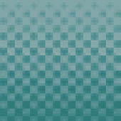
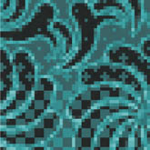
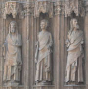
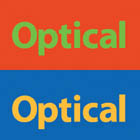
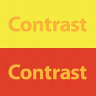
| Laura MacArthur, Designer www.csszengarden.com/022  WITH ITS MONOTONE GREEN color scheme and attention to detail, viridity has a lush texture that brings to mind mossy forest floors and rich, velvety fabric. Laura MacArthur attempted to capture a sense of balance and serenity with this design. Through the use of repeating patterns and simulated texture, MacArthur sought to balance the richer detail with simple choices in other areas. The muted, monotone color scheme prevents the design from becoming too busy, and the flat green areas provide resting places for the eye among the dominant patterns. PatternThe imagery of viridity consists mainly of visually similar patterns. Analyzed in detail, they are consistent across the entire design and fall into two distinct types: one made up of halftone dots, and another containing a floral paisley (FIGURES 1 and 2). Each pattern was created by combining illustrational clip art elements with Adobe Photoshop filters. Slight variations were developed to add some extra visual interest, and the net effect is a consistent look that isn't repetitive or dull. Figure 1. Close-up of the halftone pattern type. Figure 2. Close-up of the paisley pattern type. A pattern is generally a repeating visual element (or more than one element) that fills a given area. Patterns can be found in many facets of visual design, like fashion and interior decorating, as well as in nature, like the pores of an orange peel or the repeating veins in a leaf. A good pattern can be a Web designer's best friend. Expansive areas with little to no content must be dealt with somehow: In some designs a solid color fill may make sense, in others leaving the space blank for the sake of extra white space may work, and in yet others there's a need for visual detail beyond what simple coloring can provide. The limitations of modern Web design encourage the use of patterns. A single small image that has been designed to repeat across a larger area is easily applied to a page, and the small file size means that the extra detail comes at a relatively low cost, bandwidth-wise; a repeating 500 byte image can easily fill a 900-pixel-wide area, for example. Controlling repetition is simple with the background-repeat property built into CSS. Potential values are repeat, no-repeat, repeat-x, and repeat-y. These allow you to respectively choose between a repeating image, an image that is applied but doesn't repeat, and an image that only repeats in a single direction. h3 { background-repeat: no-repeat; } body { background: #669999 url(z_bgrnd.gif) repeat-x 0px 1px; } The previous examples show that the background-repeat value may be applied on its own, independent of any other background properties, or as a shorthand value within a longer background rule. TextureOn the Web there isn't much consideration for tactile response, something that is true of the computer industry in general. Simple force feedback is popular in the controllers of game consoles, but there aren't many consumer-level products available that go beyond that. In the earlier part of the decade, Logitech experimented with a line of mice called iFeel that had some finer feedback controls allowing elements of your operating system, and Web pages, to take on simple "textures." Moving the pointer over a hyperlink might feel like pushing the mouse over a rubber surface, for example. We haven't heard much about the technology recently, and Logitech doesn't make the mice anymore; while the technology was cool, no one really figured out what to do with it and it never caught on. So in the traditional sense, texture isn't well represented on the Web; clicking a button is about the most tactile response you'll receive. But texture doesn't end at what you feel; from a visual standpoint, texture is possible through representation. A statue might have detailed flowing garments carved into the stone; we inherently know that if we touch the statue's clothes, we'll only feel a smooth, hard surface (FIGURE 3). But we understand them to be a representation of actual cloth because both share some of the same visual characteristics. Figure 3. Simulated cloth texture is carved into these statues. Pattern and texture are related. Often a pattern will create a simulated texture, whether deliberately or not. And many textural elements naturally form patterns, through their repetition of similar elements. The simulated patterns of viridity may not be derived from photographic elements, but they certainly suggest real-world textures. The dot-screen patterns evoke a bumpy surface, and their fuzzy squares suggest a fabric like gingham. The paisley patterns might have come straight off of a retro cushion or some ornate drapery. The overall cloth look of the texture in viridity suggests an inviting, comfortable lounge chair. ContrastA strongly monotone color scheme like the one used in viridity is dangerous in the wrong hands. An abundance of color and detail will lead to contrast issues that must be kept in mind. Contrast is important for the sake of distinguishing between various elements: Too little, and they blend into each other and text becomes unreadable; too much, and your viewers will feel overwhelmed and uncomfortable. High ContrastToo much contrast in a design leads to busy-ness and a cacophony of overdone visuals. The narrow color range in viridity works because contrast is achieved elsewhere through texture and type. A variation with a wider color range would be visually noisy and excessive (FIGURE 4). Figure 4. Greater color contrast conflicts with the already busy patterns of viridity. For centuries, the printed word has traditionally been rendered in black ink on a white page. While colored inks have existed for ages, black on white is the greatest achievable contrast combination, and the most conducive to comfortable reading. Generally, the same principle holds true for onscreen viewing: The best possible contrast comes from applying black text to a white background. However, there are exceptions. Because a computer screen projects light and a printed page doesn't, the screen has its own set of limitations. A bright LCD screen viewed in a dark room, for example, can be too bright for comfort. Attempting to read anything off of an all-white screen under those conditions is an exercise in optical endurance. Color presents additional challenges when considering contrast. Certain color combinations will optically shimmer when placed adjacent to each other, due to an effect called simultaneous contrast. When two complementary colors, like orange and blue or red and green, are placed next to each other, the contrast is strongest and boundaries are particularly intense (FIGURE 5). When these elements of complementary colors intermingle, the contrast creates an unpleasant visual tension. Figure 5. Simultaneous contrast causes shimmering at the boundaries of these primary colors. But in its subtler forms, simultaneous contrast may prove itself a valuable tool for extra richness and subtlety. An orange yellow color may appear more orange when placed on a yellow background, but it may appear yellow when placed on an orange or red background (FIGURE 6). Surrounding dim colors with even duller shades may brighten them; a desaturated red can take on a brighter tone, for example, if placed on a gray background. Figure 6. The same yellow color appears more orange when placed on a yellow background and more yellow when placed on a red background. Low ContrastToo little contrast in a design leads to a uniformly dull overall impression. Some contrast is needed for the sake of variation and distinction. The monotone greens in viridity are spread out across a tonal range from light to dark; a more consistent tone would ruin the interplay of visual elements, remove the highlights and resting points for the eye, and end up destroying the present visual balance (FIGURE 7). Figure 7. viridity without sufficient color contrast. Low contrast is often employed for subtlety. Pixels are relatively large, clunky base units for design purposes; a line can never be thinner than a single pixel, since pixels are indivisible. By decreasing the intensity of the line's shading, however, the visual lightening makes it appear thinner (FIGURE 8). Figure 8. Lightening the outlines of these buttons makes them appear thinner. Similarly, by lowering general contrast within design elements, a subdued, lessening effect is achieved. A piece of text of lower importance, for example, might be appropriately de-emphasized through the use of a lighter text color. And an inactive icon or link benefits from a low-contrast variant that looks "grayed out" as a visual cue to the user that it's not available. With the design empowerment that low contrast enables comes a responsibility to use it correctly and with discretion. Users with 20/20 vision may have no trouble reading your dark gray text sitting on a light gray background. However, users with less perfect vision may have to squint or increase the text size drastically to make out the words; black text might have meant better initial legibility. Legibility is also influenced by color contrast. Various hues have different tonal values associated with them. Pure yellow is inherently a lighter color than blue, for example, and yellow text on a white background can be unreadable even to viewers with 20/20 vision. Color BlindnessA further aspect of contrast deserving consideration is the impact that poor color contrast may have on someone who is color-blind (FIGURES 9A and 9B). There are different forms of color deficiency, and many variations. Two of the more common general forms are Figure 9A. The Zen Garden's main design, as seen through a filter simulating a form of protanopia. Figure 9B. The Zen Garden's main design, as seen through a filter simulating a form of deuteranopia.
Each type has subclassifications with partially or completely reduced sensitivity to combinations of reds, greens, and, rarely, blues. In general, color deficiency affects 1 in 12 people, and males are far more susceptible than females. What happens when users with color-deficient vision view a design that uses colors outside of their visual range? Their limited perception of color may mean that a carefully chosen palette distorts to the point of confusion, if the designer has relied on color to convey information. Directing a color-blind user to click a red button is futile, if the button is perceived as dark brown or black. In many cases, the color will simply blend into the surrounding area, and the contrast a normally sighted viewer would perceive isn't nearly as evident. There is no reliable method for a designer to simulate color-blindness. Converting a design to grayscale may seem like the obvious approach, but it doesn't actually portray what most color-blind viewers see. Various filters exist that are designed to simulate the different types of color-blindness, but they can only provide an approximation; color deficiency is personal and varies from viewer to viewer. What can be done, if color-blindness can't actually be tested? Guideline 2 of the Web Content Accessibility Guidelines (www.w3.org/TR/WCAG10/#gl-color) suggests that any information conveyed with color should also be conveyed in at least one other manner; a link could be blue and underlined, a button could be green and contain an icon or text, warning text could be red and have a solid border, and so on. UnityDesigning with an eye toward visual unity means taking into account all visual aspects equally. A design like viridity could have very well become overwhelming and too busy without considering the interplay of texture and color, type and pattern. Because Laura MacArthur has paid considerable attention to balancing the design elements, the final result is more formidable than the sum of its parts. Note One filter that can simulate color blindness is the Colorblind Web Page Filter (http://colorfilter.wickline.org). |

|
EAN: N/A
Pages: 117
- MPLS Operation
- Option 3: Multi-Hop MP-eBGP Between RR and eBGP Between ASBRs
- Command Reference
- Modular QoS CLI: Configuration of QoS on Cisco Routers
- Case Study 2: Implementing Multi-VRF CE, VRF Selection Using Source IP Address, VRF Selection Using Policy-Based Routing, NAT and HSRP Support in MPLS VPN, and Multicast VPN Support over Multi-VRF CE