| The Properties tab of the Property inspector has two slightly different modes for setting text attributes. When you choose the text tool in the Tools panel, the Properties tab is labeled Text Tool; this tab provides options for setting typeface, font size, style, spacing between letters, line spacing, and color; for controlling tracking (the amount of space between letters and words in a chunk of selected text); for defining text as superscript or subscript; and for creating live links between text and URLs. When you select an existing text box, the label for the Properties tab disappears, but the panel displays all the text-attribute options just listed and adds options for setting attributes of the text box itself, such as size and location on the Stage. When you need to distinguish one tab from the other, this book will refer to them as as the Text Tool Properties tab and the Text Properties tab; when referring to either or both tabs, this book will use the Text (Tool) Properties tab. You can set attributes in advance so that as you type, the text tool applies them automatically, or you can apply attributes to existing text. The text tool always uses whatever settings currently appear in the Text (Tool) Properties tab (Figure 3.6). Figure 3.6. When you have selected the text tool in the Tools panel (or you have selected a text block on the Stage), the Properties tab of the Property inspector displays the type attributes to be created by the text tool (or applied to the current text selection). 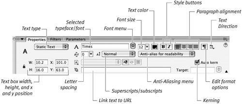
For the following tasks, keep the Properties tab of the Property inspector open (choose Window > Properties > Properties if it's not already open).  Tip Tip
In addition to setting text attributes in the Text (Tool) Properties tab, you can set the font, size, style, paragraph alignment, and tracking from the Text menu. You can use the Text menu to change the properties of selected text or to load text properties into the text tool.
To select text to apply character attributes Do either of the following: - With the text tool selected, drag over existing text to highlight just a portion of text.
- With the selection tool active, click a text box to select all the text within it.
Tips You can select multiple text boxes with the selection tool and modify them at the same time. (You'll learn more about selections in Chapter 4.) The contact-sensitivity settings in the General category of the Preferences dialog also apply to selecting text boxes with a selection outline. (You'll learn more about making such selections in Chapter 4.)
To choose an installed typeface 1. | Select the text you want to modify.
| 2. | In the Text Properties tab of the Property inspector, click the scroll arrow to the right of the Font field.
A scrolling list of your installed fonts appears, together with a font-preview window (Figure 3.7).
Figure 3.7. As you move the pointer through the font list in the Text (Tool) Properties tab of the Property inspector, you see a preview of each installed font. 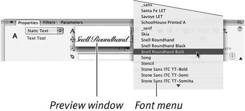
| 3. | Move the pointer over a font name.
Flash highlights the font name and displays its preview.
Vertical Text Using Flash's static text boxes, you can create a single vertical text column, or create text that flows from column to column. You can set the columns to read left to right (as in English) or vice versa (as in Japanese text). With the text tool active, you can set the text-flow direction in the Properties tab of the Property inspector by choosing one of the vertical modes from the Change Orientation of Text menu (Figure 3.8). You work with vertical text boxes just as you do with horizontal ones, resizing to set word wrapin vertical text, the "wrap" forces words to the next column not the next line. As you enter text, Flash places one character below another until the text reaches the bottom edge of the box. Then text jumps to the next column. You can force text to flow to the next column by adding a paragraph return. Figure 3.8. When you have selected the text tool or a text box, the Properties tab of the Property inspector displays a text-direction menu, with options for setting the direction in which your text flows. 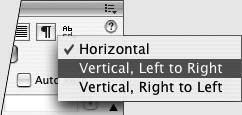
|
| 4. | Click to select the currently highlighted font and close the scrolling list.
The selected font name appears in the Font field. Flash changes the selected text to the new font.
|
Tips You can also enter a font by typing its name in the Font field in the Text (Tool) Properties tab. The field isn't case-sensitive, but you must type accurately. If you make a mistake in typing the name of an installed font, Flash assumes that it's dealing with a missing font and substitutes the system default font. Another way to select a font is to choose it from the Text > Font menu. You can allow end users to copy text from static text boxes. During authoring, select the text that you want users to be able to copy. In the Text Properties tab of the Property inspector, click the Selectable Text button (the button labeled with the letters Ab, just below the pop-up menu for creating superscripts and subscripts).
The Mystery of Device Fonts When you assign an installed font to a static text box, usually you want the text to look exactly the same during playback as it does during authoring. Yet you have no way of knowing if your end users will have the font that you assigned installed on their system. In order to re-create your static text box font accurately during playback, Flash saves information about the outlines of the letter forms with the published (SWF) file (you'll learn more about publishing files in Chapter 16). During playback, Flash Player uses those outlines to draw the letters correctly. Saving outline information increases the size of your SWF file. Device fonts allow you to eliminate that information. You can apply device fonts two ways: Select one from a font menu, or choose Use Device Fonts from the Anti-Aliasing menu in the Text (Tool) Properties tab of the Property inspector. By choosing a device font from one of the font menus, you retain control over the style of type Flash displays but give up the use of a specific typeface. Three device fonts appear in the font menu in the Text (Tool) Properties tab and the Text > Font menu: _sans, _serif, and _typewriter. During movie playback of static text for which you chose a specific device font, the end user's system supplies a font that has the same type style. For static text set as _serif, the end users' system supplies a font with serifs, those little hooks and tails you see at the ends of some letters' strokes in typefaces such as Times Roman. For _sans (short for sans serif, or without serifs), the end user's system supplies a plainer font, one without hooks and tails; Helvetica and Arial are good examples. For _typewriter, the end user's system supplies a monospaced font (one in which each letter form takes up the same amount of space, like the letters on a typewriter); Courier is one example. Choosing a specific font for your static text and then choosing Use Device Fonts from the Anti-Aliasing menu in the Text (Tool) Properties tab of the Property inspector gives the end user's system the greatest liberty in choosing a substitute font; the system looks for the closest match from its installed fonts, but there's no guarantee that it will substitute a font with the same style as the font you originally specified. Although the use of Device Fonts helps to keep your SWF files slim, the results are often unattractive. If you want to try this option, be sure to test your published movie on a variety of systems to get a feel for what your users might actually wind up seeing. The savings in file size may not be worth the loss of quality. |
To set the font size 1. | Select the text you want to modify.
| 2. | In the Text Properties tab of the Property inspector, double-click (or click and drag) in the Font Size field to highlight the current value.
| 3. | Enter the desired point size.
| 4. | Press Enter.
|
or 1. | Click the triangle to the right of the Font Size field.
A slider pops open (Figure 3.9).
Figure 3.9. Drag the font-size slider to change the point size of selected text interactively on the Stage. 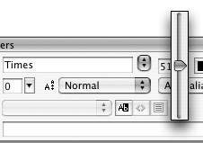
| 2. | Drag the slider's lever to choose a value between 8 and 96 points.
Flash previews the changes on the Stage as you drag the slider lever.
| 3. | Click outside the slider to confirm the new font size.
|
Tips For even quicker changes, click and drag the slider triangle. When you release the slider's lever, Flash confirms the new font size automatically. To enter font sizes outside the slider's range, you must type the value in the Font Size field.
The Mystery of Anti-aliasing Anti-aliasing is a method of rendering (drawing lines and curves) that softens edges. For text, this means making the letter forms appear slightly blurry. Anti-aliasing text at large point sizes makes it easier to read, but at smaller sizes, text may appear fuzzy and indistinct. In previous versions of Flash, applying anti-aliasing to text in small sizes made that text difficult to read. Flash Type (the new font-rendering engine found in Flash 8) allows you to apply anti-aliasing to small type sizes and still have readable text, provided that the text isn't animated. |
To set the font rendering method 1. | Select the text you want to modify.
| 2. | In the Text tab of the Property inspector, from the Anti-Aliasing menu (Figure 3.10), choose one of the following:
Use device fonts. Choose this setting when smaller file sizes are more important than being able to re-create the precise font outlines on the end user's system (see "The Mystery of Device Fonts").
Bitmap text (no anti-alias). Choose this setting when you want your text to have hard edges instead of softened (anti-aliased) edges. Fonts are embedded in your published movie, without anti-aliasing. (Bitmap text can greatly increase your SWF file size.)
Anti-alias for animation Choose this setting for animated text boxes or when you plan to publish your movie to Flash Player 7 or below. Flash embeds font outlines for these text boxes but ignores some information about aligning and kerning to help speed playback. Flash Type doesn't do the rendering.
Anti-alias for readability (the default setting for publishing to Flash Player 8; see Chapter 16). Choose this setting for text boxes that you don't plan to animate. The Flash Type font-rendering engine draws text with this setting on the Stage as you create your FLA file. When you publish, Flash embeds the fonts in the SWF file. The Flash Type engine renders this text for playback.
Custom anti-alias (found only in Flash Professional). Choosing this setting gives you access to the Custom Anti-Aliasing dialog, where you can determine how soft and blurry the anti-aliased letter forms are. The dialog's Sharpness and Thickness settings control the transitional blurred area between each letter and the background against which it appears.
Figure 3.10. To control the degree of anti-aliasing, in the Text (Tool) Properties tab of the Property inspector, select an option from the Anti-Aliasing menu (top). If you are working with Flash Professional, the Custom Anti-Aliasing option gives you access to a dialog for setting more precise anti-aliasing controls (bottom). 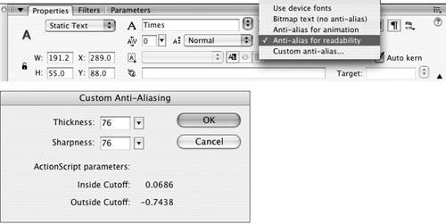
|
Tips Even when you choose an option that evokes Flash Type anti-aliasing, certain situations cause Flash to turn off anti-aliasing. When you skew, flip, or distort a text box, Flash Type doesn't anti-alias that text. Flash Type doesn't work on fonts larger than 255 points. (Note that when you zoom in on a text box during authoring, you may effectively be asking to see fonts at a size larger than 255 points, even though the text box is set to a smaller point size.) In the published Flash Player 8 movie (the SWF), anti-aliasing is applied; but when you view the magnified text on the Stage, you won't see anti-aliasing. You can also select a font size from the Text > Size menu.
To choose a text color 1. | Select the text you want to modify.
| 2. | In the Text Properties tab, click the Text (Fill) Color control (note that text in Flash is a type of fill).
The standard color-control swatch set appears (Figure 3.11).
Figure 3.11. You can choose a color for text created with the text tool from the color control in the Text (Tool) Properties tab of the Property inspector. 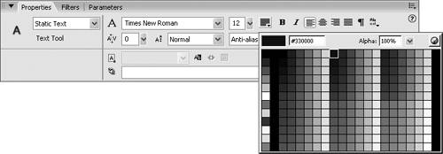
| 3. | Select a color.
Because Flash considers text to be a fill, you can change the text color by using any of the methods described for setting fill attributes in Chapter 2.
|
Tip Flash changes all the settings in the Text (Tool) Properties tab to match the attributes of selected text, which means that by selecting text, you load the text tool with that text's attributes. Keep blocks of text with formatting you use often on the Pasteboard, and click to re-create their settings for the text tool.
To choose a type style 1. | Select the text you want to modify.
| 2. | In the Text Properties tab of the Property inspector, do one of the following:
- To create boldface type, click the Bold button (Figure 3.12).
Figure 3.12. Access bold and italic styles by clicking the Bold (left) and Italic (right) buttons in the Text (Tool) Properties tab of the Property inspector. 
- To create italic type, click the Italic button.
- To create type that is both boldface and italic, click the Bold and Italic buttons.
|
Tip You can also toggle boldface type by pressing Shift- -B (Mac) or Ctrl-Shift-B (Windows). (Take special note of that Shift key if you're used to using another application for creating text: muscle memory is likely to make your fingers skip the Shift because it's not part of the usual command.) To toggle italic, press Shift--I (Mac) or Ctrl-Shift-I (Windows). -B (Mac) or Ctrl-Shift-B (Windows). (Take special note of that Shift key if you're used to using another application for creating text: muscle memory is likely to make your fingers skip the Shift because it's not part of the usual command.) To toggle italic, press Shift--I (Mac) or Ctrl-Shift-I (Windows).
To apply tracking (letter spacing) 1. | Within a text box in a Flash document, select the text to track.
| 2. | In the Text Properties tab's Letter Spacing field, enter the desired point size.
A negative value reduces the space between the letters; a positive value increases it (Figure 3.13).
Figure 3.13. Enter a negative letter-spacing value to bring characters closer together. Enter a positive value to space characters out. Enter 0 to use a font's built-in tracking value. 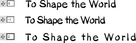
| 3. | Press Enter.
or
|
1. | In the Text Properties tab's Letter Spacing field, click the triangle to the right of the field.
A slider pops open.
| 2. | Drag the slider's lever to a value between -60 and 60.
Flash previews the changes interactively on the Stage as you drag.
| 3. | Release the slider to confirm the new spacing.
|
Tips To increase tracking of selected text in 0.5-point increments, choose Text > Letter Spacing > Increase or press Option--right arrow (Mac) or Ctrl-Alt-right arrow (Windows). To decrease tracking, choose Text > Letter Spacing > Decrease, or use the keyboard commands with the left arrow. Add the Shift key to the keyboard shortcuts for narrower and wider tracking; this method increases or decreases space in two-pixel increments. You can also track interactively by using the keyboard shortcuts. The space between letters continues to expand or contract as long as you hold down the key combination. To reset the font's original letter spacing, choose Text > Letter Spacing > Reset or press Option--up arrow (Mac) or Ctrl-Alt-up arrow (Windows).
What Is Kerning? Whereas tracking affects the space between characters and words in an entire line or paragraph of text, kerning affects the space between a pair of letters. Because of the way fonts are constructed, with each letter being a separate element, some pairs of letters look oddly spaced when you type them. The space between a capital T and a lowercase o, for example, may seem too large because of the white space below the crossbar of the T. To make the characters look better, you can reduce the space between them, or kern in the pair. Some letters may seem to be too close togethersay, a t and an i. You can kern out the pair so that it looks better. Font designers often build into their fonts special information about how to space troublesome pairs of letters. Flash takes advantage of that embedded kerning information when you select the Auto Kern check box in the Text (Tool) Properties tab of the Property inspector. It's a good idea to turn on kerning to make your type look its best. You can kern manually in Flash instead of using the embedded kerning or in addition to it. Select the character pair that you want to kern; then use Flash's Letter Spacing feature to bring the letters closer together or move them farther apart. |
|