In this task, you will use a rollover event to display a detailed state of the application. You will explore the use of different simple controls to display text and review how application states work.
1. | Be sure that you are still in Source mode in Flex Builder. Locate the <mx:Image> tag that displays the image you added in the last section. Add a mouseOver event to the tag that will change the currentState to expanded.
<mx:Image source="@Embed('assets/dairy_milk.jpg')" scaleContent="true" mouseOver="this.currentState='expanded'"/>
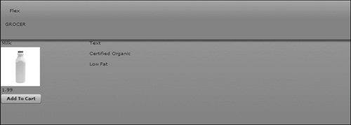
mouseOver simply means that when the user rolls the mouse anywhere over the <mx:Image> tag, the ActionScript will be executed. In this ActionScript, you are referring to the expanded state, which will be created later in this lesson. You will modify this state so it will display more information about the item the user is interested in purchasing.
|
2. | In the same <mx:Image> tag, add a mouseOut event that will change the currentState back to the default or original state. The beginning view state of the application is expressed as "" or '' inline.
<mx:Image source="@Embed('assets/dairy_milk.jpg')" scaleContent="true" mouseOver="this.currentState='expanded'" mouseOut="this.currentState=''" />
When the user moves the mouse away from this <mx:Image> tag, the detailed state will no longer be displayed, and the application will display only the images and labels for the control, which is the default and expressed with an empty String.
|
3. | Switch back to Design mode. Be sure to click the Refresh button to make sure all your changes in code have been applied.
|
| |
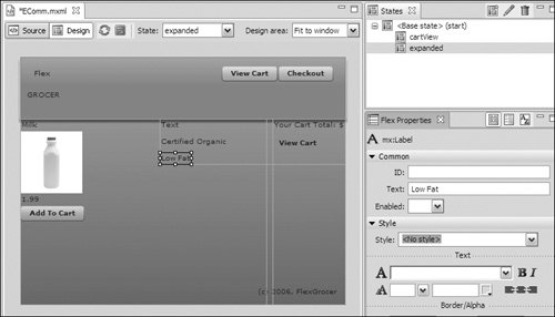
4. | Be sure that the States view is open. If not, choose Window > States. Click the New State button and create a new state with the name of expanded. Be sure that this state is based on the <Base state> state.
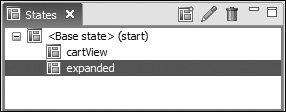
You want the product description to appear when the user rolls over the <mx:Image> tag that shows the image associated with each grocery item.
|
5. | Return to Source mode, and locate the expanded state. Add an <mx:AddChild> tag and inside of that tag add an <mx:VBox> tag. You will see that Flex automatically added the <mx:State name="expanded"/> tag, however, it used the single tag syntax described in Chapter 2, "Getting Started." You will need to change this to an open and close tag, as shown:
<mx:State name="expanded"> <mx:AddChild> <mx:VBox> </mx:VBox> </mx:AddChild> </mx:State>
You will place all of the controls to display the item detail inside of a VBox container so that you can position them all at once.
|
6. | Set the x property of the VBox container in the expanded state to 200. Also, set the width property to 100%, as follows.
<mx:VBox x="200" width="100%">
This will place the controls in the <mx:VBox> tag in a better positioneasier for users to view when they roll over the grocery product.
|
| |
7. | Switch back to Design mode. Ensure that the expanded state is selected in the States view and drag an instance of the Text control from the Controls folder in the Components view, to the VBox container you just modified in the last step.
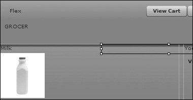
The Text control enables you to display multiple lines of text, which you will do when you display the product description, which will ultimately come from a database. You will use data binding in the next section to make this Text control work. For now, you are just setting up the layout. All the text must use the same styling unless you specify it as HTML text.
|
8. | Drag an instance of the Label control from the Components view to the bottom part of the VBox container you created. Populate the text property with the words Certified Organic .
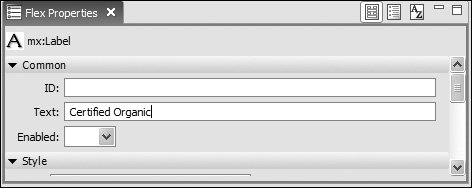
The Label control allows you to display a single line of text. Later on, you will modify the visible property of this component to display only when a grocery item is certified organic.
|
9. | Drag an instance of the Label control from the Components view to the bottom part of the VBox container you created. Populate the text property with the words Low Fat.
 Later, you will set the visible property of this label to true if the grocery item is low fat, or false if it is not. Later, you will set the visible property of this label to true if the grocery item is low fat, or false if it is not.
|
| |
10. | Switch back to Source mode. Notice that Flex Builder has added the Text and two Label controls you added in Design mode.
Note that all of the code created in Design mode is displayed in the code in Source mode.
|
11. | Locate the <mx:Text> tag in the expanded state and set the width property of the Text control to 50%.
<mx:Text text="Text" width="50%"/>
|
12. | Save and run the application.
When you roll over the milk bottle image, you see the Text and Label controls you created in the expanded state.
|