6.2 Vertical Alignment
| Now that we've covered horizontal alignment, let's move on to vertical alignment. Since the construction of lines is covered in much more detail in Chapter 7, I'll just stick to a quick overview here. 6.2.1 The Height of LinesThe property line-height refers to the distance between the baselines of lines of text rather than the size of the font, and it determines the amount by which the height of each element's box is increased or decreased. In the simplest cases, specifying line-height is a way to increase (or decrease) the vertical space between lines of text, but this is a misleadingly simple way of looking at how line-height works. line-height controls the leading, which is the extra space between lines of text above and beyond the font's size. In other words, the difference between the value of line-height and the size of the font is the leading.
When applied to a block-level element, line-height defines the minimum distance between text baselines within that element. Note that it defines a minimum, not an absolute value, and baselines of text can wind up being pushed further apart than the value of line-height. For replaced elements, line-height does not have an effect on layout, but it still applies to them. (This subtle mystery is explained in Chapter 7.) 6.2.1.1 Constructing a lineEvery element in a line of text generates a content area , which is determined by the size of the font. This content area in turn generates an inline box that is, in the absence of any other factors, exactly equal to the content area. The leading generated by line-height is one of the factors that increases or decreases the height of each inline box. To determine the leading for a given element, simply subtract the computed value of font-size from the computed value of line-height. That value is the total amount of leading. And remember, it can be a negative number. The leading is then divided in half, and each half-leading is applied to the top and bottom of the content area. The result is the inline box for that element. As an example, let's say the font-size (and therefore the content area) is 14 pixels tall, and the line-height is computed to 18 pixels. The difference (four pixels) is divided in half, and each half is applied to the top and bottom of the content area. This creates an inline box that is 18 pixels tall, with 2 extra pixels above and below the content area. This sounds like a roundabout way to describe how line-height works, but there are excellent reasons for the description. Once all of the inline boxes have been generated for a given line of content, they are then considered in the construction of the line box. A line box is exactly as tall as needed to enclose the top of the tallest inline box and the bottom of the lowest inline box. Figure 6-7 shows a diagram of this process. Figure 6-7. Line box diagram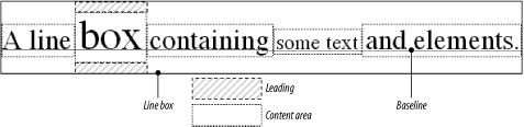 6.2.1.2 Assigning values to line-heightLet's now consider the possible values of line-height. If you use the default value of normal, the user agent must calculate the vertical space between lines. Values can vary by user agent, but they're generally 1.2 times the size of the font, which makes line boxes taller than the value of font-size for a given element. Most values are simple length measures (e.g., 18px or 2em). Be aware that even if you use a valid length measurement, such as 4cm, the browser (or the operating system) may be using an incorrect metric for real-world measurements, so the line height may not show up as exactly four centimeters on your monitor. For more details, see Chapter 4. em, ex, and percentage values are calculated with respect to the font-size of the element. The markup is relatively straightforward, and the results are shown in Figure 6-8: body {line-height: 14px; font-size: 13px;} p.cl1 {line-height: 1.5em;} p.cl2 {font-size: 10px; line-height: 150%;} p.cl3 {line-height: 0.33in;} <p>This paragraph inherits a 'line-height' of 14px from the body, as well as a 'font-size' of 13px.</p> <p >This paragraph has a 'line-height' of 21px(14 * 1.5), so it will have slightly more line-height than usual.</p> <p >This paragraph has a 'line-height' of 15px (10 * 150%), so it will have slightly more line-height than usual.</p> <p >This paragraph has a 'line-height' of 0.33in, so it will have slightly more line-height than usual.</p> Figure 6-8. Simple calculations with the line-height property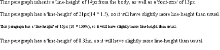 6.2.1.3 Line height and inheritanceWhen the line-height is inherited by one block-level element from another, things get a bit trickier. line-height values inherit from the parent element as computed from the parent, not the child. The results of the following markup are shown in Figure 6-9. It probably wasn't what the author had in mind: body {font-size: 10px;} div {line-height: 1em;} /* computes to '10px' */ p {font-size: 18px;} <div> <p>This paragraph's 'font-size' is 18px, but the inherited 'line-height' value is only 10px. This may cause the lines of text to overlap each other by a small amount.</p> </div> Figure 6-9. Small line-height, large font-size, slight problem Why are the lines so close together? Because the computed line-height value of 10px was inherited by the paragraph from its parent div. One solution to the small line-height problem we just saw is to set an explicit line-height for every element, but that's not very practical. A better alternative is to specify a number, which actually sets a scaling factor: body {font-size: 10px;} div {line-height: 1;} p {font-size: 18px;} When you specify a number, you cause the scaling factor to be an inherited value instead of a computed value. The number will be applied to the element and all of its child elements, so that each element has a line-height calculated with respect to its own font-size (see Figure 6-10): div {line-height: 1.5;} p {font-size: 18px;} <div> <p>This paragraph's 'font-size' is 18px, and since the 'line-height' set for the parent div is 1.5, the 'line-height' for this paragraph is 27px (18 * 1.5).</p> </div> Figure 6-10. Using line-height factors to overcome inheritance problems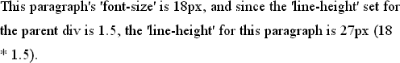 Though it seems like line-height distributes extra space both above and below each line of text, it actually adds (or subtracts) a certain amount from the top and bottom of an inline element's content area to create an inline box. Assume that the default font-size of a paragraph is 12pt and consider the following: p {line-height: 16pt;} Since the "inherent" line height of 12-point text is 12 points, the preceding rule will place an extra 4 points of space around each line of text in the paragraph. This extra amount is divided in two, with half going above each line and the other half below. You now have 16 points between the baselines, which is an indirect result of how the extra space is apportioned. If you specify the value inherit, then the element will use the computed value for its parent element. This isn't really any different than allowing the value to inherit naturally, except in terms of specificity and cascade resolution. See Chapter 3 for details on these topics. Now that you have a basic grasp of how lines are constructed, let's talk about vertically aligning elements relative to the line box. 6.2.2 Vertically Aligning TextIf you've ever used the elements sup and sub (the superscript and subscript elements), or used an image with markup such as <img src="/books/2/882/1/html/2/foo.gif" align="middle">, then you've done some rudimentary vertical alignment. In CSS, the property vertical-align applies only to inline elements and replaced elements such as images and form inputs. vertical-align is not an inherited property.
vertical-align accepts any one of eight keywords, a percentage value, or a length value. The keywords are a mix of the familiar and unfamiliar: baseline (the default value), sub, super, bottom, text-bottom, middle, top, and text-top. We'll examine how each keyword works in relation to inline elements.
6.2.2.1 Baseline alignmentvertical-align: baseline forces the baseline of an element to align with the baseline of its parent. Browsers, for the most part, do this anyway, since you'd obviously expect the bottoms of all text elements in a line to be aligned. If a vertically aligned element doesn't have a baseline that is, if it's an image, a form input, or another replaced element then the bottom of the element is aligned with the baseline of its parent, as Figure 6-11 shows: img {vertical-align: baseline;} <p>The image found in this paragraph <img src="/books/2/882/1/html/2/dot.gif" alt="A dot" /> has its bottom edge aligned with the baseline of the text in the paragraph.</p> Figure 6-11. Baseline alignment of an image This alignment rule is important because it causes some web browsers always to put a replaced element's bottom edge on the baseline, even if there is no other text in the line. For example, let's say you have an image in a table cell all by itself. The image may actually be on a baseline, but in some browsers, the space below the baseline causes a gap to appear beneath the image. Other browsers will "shrink-wrap" the image with the table cell and no gap will appear. The gap behavior is correct, according to the CSS Working Group, despite its lack of appeal to most authors.
6.2.2.2 Superscripting and subscriptingThe declaration vertical-align: sub causes an element to be subscripted, meaning that its baseline (or bottom, if it's a replaced element) is lowered with respect to its parent's baseline. The specification doesn't define the distance the element is lowered, so it may vary depending on the user agent. super is the opposite of sub; it raises the element's baseline (or bottom of a replaced element) with respect to the parent's baseline. Again, the distance the text is raised depends on the user agent. Note that the values sub and super do not change the element's font size, so subscripted or superscripted text will not become smaller (or larger). Instead, any text in the sub- or superscripted element should be, by default, the same size as text in the parent element, as illustrated by Figure 6-12: span.raise {vertical-align: super;} span.lower {vertical-align: sub;} <p>This paragraph contains <span >superscripted</span> and <span >subscripted</span> text.</P> Figure 6-12. Superscript and subscript alignment
6.2.2.3 Bottom feedingvertical-align: bottom aligns the bottom of the element's inline box with the bottom of the line box. For example, the following markup results in Figure 6-13: .feeder {vertical-align: bottom;} <p>This paragraph, as you can see quite clearly, contains a <img src="/books/2/882/1/html/2/tall.gif" alt="tall" /> image and a <img src="/books/2/882/1/html/2/short.gif" alt="short" /> image, and then some text that is not tall.</p> Figure 6-13. Bottom alignment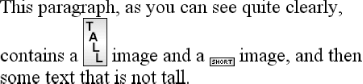 The second line of the paragraph in Figure 6-13 contains two inline elements, whose bottom edges are aligned with each other. They're also below the baseline of the text. vertical-align: text-bottom refers to the bottom of the text in the line. For the purposes of this value, replaced elements, or any other kinds of non-text elements, are ignored. Instead, a "default" text box is considered. This default box is derived from the font-size of the parent element. The bottom of the aligned element's inline box is then aligned with the bottom of the default text box. Thus, given the following markup, you get a situation such as that shown in Figure 6-14: img.tbot {vertical-align: text-bottom;} <p>Here: a <img src="/books/2/882/1/html/2/tall.gif" style="vertical-align: middle;" alt="tall" /> image, and then a <img src="/books/2/882/1/html/2/short.gif" alt="short" /> image.</p> Figure 6-14. Text-bottom alignment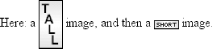 6.2.2.4 Getting on topEmploying vertical-align: top has the opposite effect of bottom. Likewise, vertical-align: text-top is the reverse of text-bottom. Figure 6-15 shows how the following markup would be rendered: .up {vertical-align: top;} .textup {vertical-align: text-top;} <p>Here: a <img src="/books/2/882/1/html/2/tall.gif" alt="tall image"> tall image, and then <span >some text</span> that's been vertically aligned.</p> <p>Here: a <img src="/books/2/882/1/html/2/tall.gif" alt="tall"> image that's been vertically aligned, and then a <img src="/books/2/882/1/html/2/short.gif" alt="short" /> image that's similarly aligned.</p> Figure 6-15. Aligning with the top and text-top of a line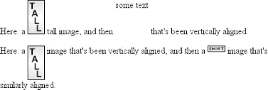 Of course, the exact position of this alignment will depend on which elements are in the line, how tall they are, and the size of the parent element's font. 6.2.2.5 In the middleThere's the value middle, which is usually (but not always) applied to images. It does not have the exact effect you might assume given its name. middle aligns the middle of an inline element's box with a point that is 0.5ex above the baseline of the parent element, where 1ex is defined relative to the font-size for the parent element. Figure 6-16 shows this in more detail. Figure 6-16. Precise detail of middle alignment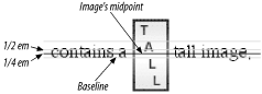 Since most user agents treat 1ex as one-half em, middle usually causes the vertical midpoint of an element to be aligned with a point one-quarter em above the parent's baseline. Don't rely on this happening, however, since some user agents actually calculate the exact x-height for each element. (See Chapter 5 for more details on x-height.) 6.2.2.6 PercentagesPercentages don't let you simulate align="middle" for images. Instead, setting a percentage value for vertical-align raises or lowers the baseline of the element (or the bottom edge of a replaced element) by the amount declared, with respect to the parent's baseline. (The percentage you specify is calculated as a percentage of line-height for the element, not its parent.) Positive percentage values raise the element, and negative values lower it. Depending on how the text is raised or lowered, it can appear to be placed in adjacent lines, as shown in Figure 6-17, so take care when using percentage values: sub {vertical-align: -100%;} sup {vertical-align: 100%;} <p>We can either <sup>soar to new heights</sup> or, instead, <sub>sink into despair...</sub></p> Figure 6-17. Percentages and fun effects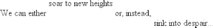 Let's consider percentage values in more detail. Assume the following: <div style="font-size: 14px; line-height: 18px;"> I felt that, if nothing else, I deserved a <span >raise</span> for my efforts. </div> The 50%-aligned span element has its baseline raised nine pixels, which is half of the element's inherited line-height value of 18px, not seven pixels. 6.2.2.7 Length alignmentFinally, let's consider vertical alignment with a specific length. vertical-align is very straightforward: it shifts an element up or down by the declared distance. Thus, vertical-align: 5px; will shift an element upwards five pixels from its unaligned placement. Negative length values shift the element downwards. This simple form of alignment did not exist in CSS1, but it was added in CSS2. It's important to realize that vertically aligned text does not become part of another line, nor does it overlap with text in other lines. Consider Figure 6-18, in which some vertically aligned text appears in the middle of a paragraph. Figure 6-18. Vertical alignments can cause lines to get taller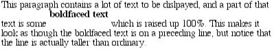 As you can see, any vertically aligned element can affect the height of the line. Recall the description of a line box, which is exactly as tall as necessary to enclose the top of the tallest inline box and the bottom of the lowest inline box. This includes inline boxes that have been shifted up or down by vertical alignment. |

EAN: 2147483647
Pages: 135