How a Program Draws Unwanted Attention
So just how does a program draw unwanted attention to itself? Any user interface problem effectively draws unwanted attention; however, some problems are much worse than others. Let's round up the usual suspects, in order of their heinousness.
Capital Crimes
Of all the ways to draw unwanted attention, these are by far the worst:
Beeping or blinking
Whatever you do, don't make your program beep or blink. Nothing is more annoying than a beeping, blinking program. Enough said. (A good exception is flashing a program's taskbar window button to notify the user of a pending message.)
Using unnecessary customization
Some programmers try to customize everything—custom windows, custom title bars, custom menus, custom toolbars and tooltips, and so on. These custom features typically do not have the standard Microsoft Windows appearance. Often they do not have the standard Windows behavior either. The interesting thing about such customizations is that they usually make the program worse, since they are confusing and do absolutely nothing to help users get their work done. I am constantly amazed at the extraordinary effort some developers put into creating truly awful user interfaces. (If you must create a highly customized user interface, try to change only the appearance and not the behavior.)
Using unnecessary audio effects
Avoid unnecessary audio effects. At the very least, make them optional. Ideally, they should be turned off by default and the user should have to ask for them explicitly. The user and his neighbors can close their eyes, but they can't close their ears.
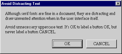
Using distracting text
Avoid distracting text colors, generally anything other than black. Use the system colors COLOR_BTNTEXT or COLOR_WINDOWTEXT for most text. Avoid distracting fonts, generally typefaces other than Arial, Tahoma, or MS Sans Serif. Verdana, Trebuchet MS, and Century Gothic are also good choices for a slightly different look. Any serif fonts in an interface should be considered distracting, although serif fonts are fine in a document. Don't use monospaced fonts except to indicate user input or to mimic a typewriter. Avoid unnecessary uppercase text. It's OK to label a button OK, but never label a button CANCEL.
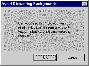
Using distracting backgrounds
Avoid distracting backgrounds, especially backgrounds with poor contrast. Few interface problems are sillier than making text illegible by displaying it on a distracting background. Users are never impressed by this, so what's the point? Remember that there is absolutely nothing wrong with black text (that is, COLOR_WINDOWTEXT) on a white background (COLOR_WINDOW).
Using harsh colors
Avoid harsh colors (that is, highly saturated colors), especially in windows that the user sees often. Harsh colors demand the user's attention. Don't make your program look like a cartoon, unless it is supposed to look like a cartoon. A limited number of muted, coordinated colors works well.
Using distracting graphics and animations
Avoid distracting bitmaps, icons, and animations. When used properly, graphics and animation can add a great amount of style to your program. When misused, they can make your program look ugly and amateurish. Make sure that prominent graphics are necessary and well designed. Don't think eye candy, and definitely don't think eye Velcro.
Of course, distraction is a subjective experience. I thought for sure that I would find the Microsoft Office Office Assistants to be way over the top. I forced myself to use the Clippit Office Assistant in Microsoft Word just so that I could understand exactly why I would find these animations to be irritating. I am fairly surprised to say that after using the Clippit assistant for an extended period of time, I don't mind it at all. (Still, I don't care for the Office Logo assistant since its colors are much too distracting, especially when they are flashing. The Clippit assistant uses a very limited and muted palette, which is almost certainly why I don't mind it much. It would be even better if it didn't wiggle around as often.) While I don't use the Office Assistant by default anymore, I no longer rush to get rid of it either.
Being unforgiving
Users make mistakes, but some programs really make the user pay for making a mistake. This is especially frustrating when the mistake is easy to make. Try to design your programs to prevent the user from making mistakes, and provide some degree of forgiveness, ideally by providing an undo/redo feature. Forgiveness is especially important for programs designed for beginners.
Using cumbersome metaphors
Good metaphors help users get their work done by modeling program tasks after real-world tasks. Bad metaphors do not help the user; they just get in the way and draw unwanted attention to the program. A good metaphor makes perfect sense and is so natural the user might not even be aware of it. A bad metaphor just seems dorky.
Metaphors are most successful when they have the following attributes:
- They are simple.
- They make sense. Choose a metaphor that uses real-world properties to help the user grasp the task at hand.
- They are not driven into the ground. Don't try to force similarities that don't really exist.
- They don't constrain the user to real-world limitations. The whole point of using computers is to make things easier, not to do things exactly as they are done without computers.
For example, suppose you are creating a program that lets users buy products. There is nothing wrong with using a shopping cart as a metaphor when referring to the collection of items the user selects for purchase. Using a shopping cart metaphor is much better than using technical terms such as a selection database or purchase subset. But don't drive it into the ground by extending the metaphor to shopping aisles, checkout lines, and squeaky wheels that wobble around. The world really doesn't need a wobbly wheel metaphor.
TIP
Use a metaphor only if it is simple and helps the user accomplish the task without constraining the user to the real-world limitations of the metaphor.
Note that the world's most successful software metaphor—the desktop—is very simple and barely reflects the real-world properties of an actual desktop. The desktop in Windows is just a place to put things you need while you are working. People don't really put recycling bins or wallpaper on their real-world desktops, but this doesn't harm the metaphor. Folders are another example of a good, simple metaphor. It is far easier for a beginning user to understand what a folder is than a subdirectory. Windows uses many other simple metaphors, such as files, menus, the Clipboard, the Recycle Bin, the Briefcase, mail, forms, lists, and push buttons. Of course, Windows itself is a metaphor for a way to view information on the screen.
The irony of most bad metaphors is that in their quest to leverage the user's assumed relevant knowledge of real-world tasks, designers are all too willing to abandon the standard controls that users in fact already know how to use. Does this really make sense?
Felonies
These problems draw unwanted attention but are not quite as serious (at least in small quantities):
Using unnecessary dialog boxes and message boxes
Unnecessary dialog boxes and message boxes are one of the worst ways that a program can draw attention to itself. While one or two unnecessary dialog boxes or message boxes aren't that big of a deal, the problem is that this is a fairly easy mistake to make, so it is quite common. For every distracting background or cumbersome metaphor, there are probably hundreds of unnecessary dialog boxes and message boxes out there.
Unnecessary dialog boxes and message boxes break the user's flow because the user is no longer in control of the program. Rather, the program is now controlling the user. Furthermore, even the most beginning user is fully aware of which dialog boxes and message boxes are really necessary and which ones aren't, so you shouldn't think that this problem will escape the user's notice. It's important to realize just how much these boxes break the user's train of thought: users often greet such boxes with a groan. I'll discuss unnecessary dialog boxes and message boxes in detail in Chapters 22 and 23.
TIP
Unnecessary dialog boxes and message boxes break the user's flow because the user is no longer in control of the program. Rather, the program is controlling the user.
Using commands that are hard to find or difficult to access
Make sure that it is easy for the user to find commands. The user shouldn't have to hunt for commands as if on some sort of bizarre command safari, because this will certainly break the user's concentration. Make sure all commands are easy to find in the menu bar and easy to access through context menus and keyboard shortcuts.
Not conforming to standards and not integrating well with Windows
A program that doesn't conform to standards definitely attracts unwanted attention, since this usually means that the program doesn't behave the way the user expects. The same is true if the program doesn't integrate well with Windows.
Being just plain stupid
Sometimes a program is just plain stupid, such as when it:
- Prevents the user from doing something that he clearly should be able to do.
- Asks the user for input and then promptly forgets it. Your program should save input and use it for future default values to eliminate unnecessary repetitive tasks.
- Asks the user a question when the program already knows the answer.
- Presents poorly worded, unhelpful error messages.
- Blames the user for problems.
- Uses offensive language, such as "execute," "kill," "terminate," and "abort."
- Doesn't present a wait cursor or progress dialog box to indicate a time-consuming operation, thus giving the appearance of being hung.
Misdemeanors
These problems also draw unwanted attention to a program, but they are much less serious than the others:
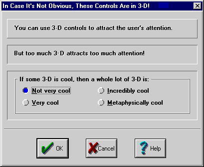
Using three-dimensional effects unnecessarily
A restrained use of 3-D effects can give your program style. Too much use of 3-D effects draws attention to the interface, but not in a flattering way, and makes your program look amateurish.
Using unnecessary nonstandard controls
Using unnecessary custom controls draws unwanted attention by making your program look strange. Programs that use nonstandard controls don't look or behave like most other Windows programs, and nonstandard controls often draw attention to interface elements that shouldn't really be receiving attention.
Using inconsistent terminology
Inconsistent terminology draws unwanted attention simply by confusing the user. For more on this subject, see Chapter 3, "Establish Consistent Terminology"
An interesting observation about these problems is that the worse the offense, the more likely the problem was caused by the developer trying to impress the user. Animation, sound effects, and wild backgrounds might seem cool while you are developing a program, but to the user they grow tiresome quickly. Also, none of these problems are necessary. They often reveal a lack of good judgment and restraint. While many of these problems are minor, each acts as an irritant, like a pebble in your shoe. And no matter how good the shoes are, all you want to do is get rid of that pebble.
When in doubt, ask yourself whether the user benefits from the feature you are considering. For example, animation that shows the progress of a lengthy task benefits the user by showing the user how much work needs to be done, how much work has already been done, and that progress is being made. The animation also helps the user pass the time. Such animations are used throughout Windows and are very easy to justify. However, if a feature doesn't help the user get his work done (or, as in the animation example just mentioned, doesn't help the user when he is not able to do any work) and is merely to show off, you shouldn't use it. If you look at the user interface from the user's point of view and become an advocate for helping the user get his work done, you'll understand that you are not doing the user a favor by creating a user interface that draws attention to itself.
TIP
Be an advocate for the user. Put the user's goals ahead of your goals.