Section 6.7. Style Properties
Cascading Style Sheets are a powerful and complex technology, providing many more formatting options than HTML alone. In fact, Dreamweaver lets you set 67 different CSS properties using the Rule Definition window. The following pages cover each of the eight Rule Definition categories and the properties available from each. (If you'd prefer an online reference, don't miss the built-in CSS reference available from the Window  Reference command; its described more completely on Section 9.6.)
Note: As noted earlier, not all Web browsers can display the many different formatting options available through Cascading Style Sheets. Dreamweaver, in its zeal to give you access to as many options as possible, actually lets you set properties that don't work in many browsers, or that work differently in different browsers.There's some hope, however. Here are two sites whose charts detail which CSS properties work on which browsers:www.westciv.com/style_master/academy/browser_support/and http://macedition.com/cb/resources/abridgedcsssupport.html.
6.7.1. Type Properties
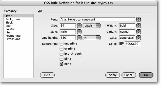
As the name implies, the Type category of the Rule Definition window lets you set formatting options that affect text (see Figure 6-17). Here are the settings you can adjust:
-
Font . You choose a font for the style from the Font menu. As when using the Property inspector to select a font (see Section 3.3.2), you choose from groups of fonts rather than the specific one you have your heart set on. Unfortunately, your array of choices is no better than in HTML. Dreamweaver also lets you create your own "first-choice, second-choice " font choices from this menu, exactly as described on Section 3.3.2.2.
-
Size . Unlike HTML, where font size is defined using a number from 1 to 7, CSS offers a dizzying array of size choices.
If you want to make sure your text appears at the same size regardless of browser or platform, type a number in the Size box and select "pixels" from the unit menu to its right. Twelve pixels is a good size for regular type.
There's one downside to this approach: pixel values prevent Windows visitors using Internet Explorer from adjusting the size of text on the screen using their Web browsers' text size up/down controls. (Other Windows browsers and most Mac browsers let users resize pixel- sized text.)
Note: This isn't entirely true. Internet Explorer can be tweaked to allow resizing of pixel-sized text, but you have to change some of the default settings of the browser. That's something most people would never do.
Another option is to use ems . An em is a relative measurement that, when applied to text, works just like a percentage. One em starts out equal to a Web browser's default font size. In Internet Explorer for Windows, for example, the default font size is 16 pixels, so 1 em (or 100 percent of the default) equals 16 pixels. However, since an em is a relative measurement, if some visitor changed his default font size to 20 pixels, any text sized to 1 em would appear 20 pixels tall in his browser.
And to make things more complicated, when you use ems to define the size of text that's inside some other element with a fixed text size, the em is then determined relative to that other element . For example, say you created a style for the <body> tag that set the text size to .8 ems (in other words, 80 percent of the default text size). If the browser's default font size is 16 pixels, then all text in the body is 13 pixels tall. However, if you then define a p tag style that also has a text size of .8 ems, text modified by that p tag won't be 13 pixels tall. It's .8 ems of the body's .8 emsin other words, 80 percent of 80 percent of 16 pixels, or roughly 10 pixels tall. If you find that your text is smaller than you think it should be, this cascading percentage effect may be the problem.
Figure 6-17. You'll visit the Type category frequently while creating CSS styles. You can set many different properties for formatting text; it's the most common use of CSS. Rest assured that, unlike a lot of other CSS properties, type settings work well in almost all browsers that understand Cascading Style Sheets.
Note: Setting sizes for fonts is a hotly debated topic in CSS circles. For more in-depth discussion, check out the resources on this page: http:// css-discuss .incutio.com/?page=FontSize.
-
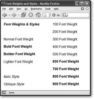
Weight . Weight refers to the thickness of the font. The Weight menu offers 13 different choices. Normal and bold are the most common, and they work in all browsers that understand CSS. See Figure 6-18 for details.
Figure 6-18. The numeric values 100900 are intended to work with fonts that have many different weights (ultrathin, thin, light, extra bold, and so on). 400 is normal; 700 is the same as bold. However, in today's browsers, you'll notice no difference between the values100500. Similarly, choosing any of the values from 600 to 900 just gets you bold text. You're better off keeping things simple and choosing either "normal" or "bold" when picking a font weight.
-
Style . In this peculiar instance, Style means italic, oblique , or normal. Technically, italic is a custom-designed , emphatic version of a type face, like this . Oblique, on the other hand, is just a computerized adaptation of a normal font, in which each letter is inclined a certain number of degrees to the right. In practical application, there's no visible difference between italic and oblique.
-
Variant . This pop-up menu simply lets you specify small-caps type, if you likea slightly formal, fancy-looking type style much favored by attorneys ' offices.
-
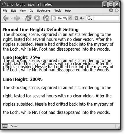
Line Height . Line height, otherwise known as leading (pronounced "LED-ing"), refers to the space between lines of text in a paragraph (see Figure 6-19). To allow more space between lines, set the line height greater than the font size. (If you type a number without a % sign, Dreamweaver assumes you're specifying a line height in pixels. You can change the units of measurement using the pop-up menu to the right of the Line Height field.)
Tip: A good approach for line height is to type in a percentage measurement, such as 120% , which is relative to the size of the text (see "Size," described earlier); if your text is 10 pixels tall, the space from the base of one line of text to the next is 12 pixels (120% of 10). Now, if you change the size of the text, the relative space between lines remains the same.
Normal, the default setting (top paragraph in Figure 6-19), uses a line height that's slightly larger than the height of the text. You don't get access to the pop-up menu of measurement units (pixels, points, %, and so on) unless you choose "value" from this menu.
Figure 6-19. Control the space between lines with the Line Height property (which you'll find in the CSS Rule Definition dialog box). In this example, each paragraph's text is set in 16-pixel Tahoma. With CSS, you can make lines bump into each other by setting a low line-height value (middle paragraph), or spread them far apart by using a larger value (bottom paragraph).
-
Case . From this menu, you can set up automatic capitalization of the text in this style. To capitalize the first letter of each word, choose "capitalize." The"uppercase" option gives you all-capitals typing, while "lowercase" makes all letters lowercase. The factory setting is "none," which has no effect on the text.
-
Decoration . This strange assortment of five checkboxes lets you dress up your text, mostly in unattractive ways. "Underline," "overline," and "line-through" add horizontal lines below, above, or directly through the affected text, respectively. Turning on "blink" makes affected text blink on and off (but only in some browsers); unless you want to appear on one of those "worst Web site of the week" lists, avoid it. You can apply any number of decorative types per style, except with "none," which, obviously, can't be chosen along with any of the other options.
Tip: On certain forward-thinking Web sites these days, text links don't appear underlined . Instead, they show up in a different color . You, too, can perform this trendy design stunt , just by redefining the <a> tag with Cascading Style Sheets, turning on the "none" option for the Decoration property, and voil No more underlines. Use this technique with care, however; most Web surfers have grown accustomed to associating underlines with clickable links. If you do remove an underline, use some other cuebold and colorful text, for exampleto indicate that the text is a link. In addition, using pseudo-classes (Section 6.6.1), you can add or remove the underline for certain states of a link. For example, you can hide the line on a normal <a> tag but make it appear on the hover state (when a visitor's mouse moves over the link), or vice versa.
-
Color . Set the color of the style's text using Dreamweaver's color box, which is described on Section 1.3.3.
| FREQUENTLY ASKED QUESTION Pixels, Points, Picas, Oh My |
| When it comes to font size units, I never know which one to pick; which one should I use? Specifying sizes, whether it's the size of a font on the page, or the width and height of a sidebar, is a common task when creating CSS styles. You'll notice that CSS lets you choose from a wide range of measuring systemseverything from the screen-dependent pixel to picas, points, and more. Most of these aren't relevant to designing pages that display on a computer screen. After all, a monitor doesn't really understand the concept of an incheven if your display is set to 72 dots per inch, 72 dots may occupy a half inch, an inch, or more depending on the screen's resolution (which you can change from 800 x 600 to 1600 x 1200 on the same monitor). The same goes for centimeters and millimeters. The bottom line? Skip 'em. In general, stick to pixels, ems, and percentages. Pixel values are useful for dictating exact sizes on the screen, whereas ems and percentages are relative measurements. An em is a relative measurement based on the default text size of the browser viewing the page. Percentages are also a relative measurement and come in handy when your design needs to accommodate different sized monitors ; for example, say you wanted a particular paragraph to always fill up half the screen, no matter how wide the Web browser window. Setting the width of that paragraph to 50 percent ensures that the paragraph resizes to fit exactly 50 percent of any browser window. This type of arrangement is useful for "liquid layouts," like those discussed in the next chapter on Section 7.3.6. Points and picas (two types of measurement used in typography and printed material) can also come in handy when you want your design to look just as good when it comes out of a laser printer. A point, in the computer world, is 1/72 of an inch; a pica is 12 points. You're probably used to "points" if you've used a word processor or a page-layout program; 12 points is a common size for type in these kinds of applications. Picas and points also are used by your inkjet or laser printer, which would be at a loss to understand what you meant by 12 pixels. Use this type of measurement when defining styles in an external style sheet that you attach using Dreamweaver's "printer media" option (see Section 6.3). By doing so, you can create "printer-friendly" font styles that produce elegant looking copies from your printer. 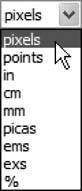 |
6.7.2. Background Properties
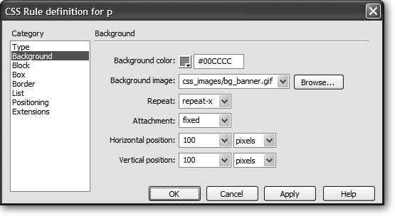
While you're probably familiar with changing the background colors of Web pages, tables, and table cells , Cascading Style Sheets provide even more options for adding colors and images to the backgrounds of your styles (see Figure 6-20).
Figure 6-20. The CSS Background category lets you specify a background color for a style; it also lets you control the placement of background images. Dreamweaver can't preview the "Fixed" option for the Attachment property (Section 6.7.2.3), so to get an accurate view of what this property does, you need to preview it in a Web browser.
6.7.2.1. Background color
Any object can have a background color: a single word, a paragraph, or the Web page itself. Using this color box, you can redefine the <td> (table cell) tag, for example, using a light-blue background color (every table cell on the page gets filled with that light-blue color), or create a " reversed -out" text effect for headlines, by setting a dark background color behind a light text color; the background color looks like a box out of which jumps the light-colored headline.
6.7.2.2. Background image
Add a background image to the style by clicking the Browse button and selecting an image from your site. You can also type an absolute URL, starting with http:// , to use an image off the Web.
To fill your entire page background with some repeating graphic, you could either redefine the <body> tag using this property, or create a class style with a Background Image property and apply it to the <body> tag as described on Section 6.3.2.
You can even control how the image tiles (repeats) and where it's placed on the page (see the following sections). Further more, you can add background images to any individual element on your page: paragraphs, tables, layers , and so on.
Background images appear above any background color, so you can (and often will) combine the two. For example you may want to position an interesting graphic on top of a colorful background.
Tip: One common byte-saving technique is to create an image that looks like a button and then use it for the background image of navigation links on a page. The links themselves include text"Home," "About Us," and so onbut the background of each link looks like a graphical button. The main benefit of this technique is that you don't need to create separate graphics for each button.
6.7.2.3. Background repeat
Background imagesas the background of either a page (Section 1.3.3) or of a table (Section 7.7.3)normally fill the available space by tiling (that is, repeating over and over again) across and down. A small image of a carrot added to the background of a page, for example, appears as a field of carrotsone next to another, row after row.
But with CSS, you can control how the background image repeats. You can select from the following options:
-
repeat tiles the image horizontally and vertically. This is the factory setting.
-
repeat-x and repeat-y display a horizontal and vertical band of images, respectively. So if you'd like to have a single row of images appear at the top of a page, use the repeat-x option; it's a good way to add a graphical background to a banner. repeat-y, on the other hand, is great for a graphical sidebar that appears down the left edge of a page.
-
no-repeat displays the image one time only.
6.7.2.4. Background attachment
By default, the background image on a page scrolls with the rest of the page, so that as you scroll to read a long Web page, the image scrolls along with the text.
But using CSS, you can lock the image in place by choosing "fixed" from the Attachment menu. For example, say you added your company's logo to the background of a page and set the Repeat property (described above) to "no-repeat." The logo now appears only once in the upper-left corner of the page. If you use the "fixed" option for this property, when a visitor scrolls the page, the logo remains fixed in the upper-left corner. (Choosing "scroll" from the Attachment menu means, of course, that the background image scrolls with the page.)
Note: Internet Explorer for Windows supports the "fixed" setting only when it's applied to the <body> tag.
6.7.2.5. Horizontal and vertical position
Using these controls, you can specify a position for the affected text or other Web page element. The Horizontal Position options are: "left," "center," and "right." You can also choose "(value)," type an exact number in the box, and then select a unit of measurement from the menu to the right. Similarly, the Vertical Position options include "top," "center," and "bottom," or you can enter a specific value.
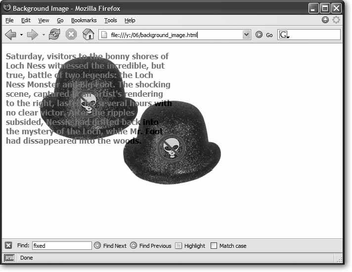
These positioning options refer to the position of the styled object. For example, suppose you created a class style that included a background image with Horizontal and Vertical Position both set to center . Then you applied that class style to a paragraph. The background image would appear in the center of that paragraph , not in the center of the Web page (see Figure 6-21).
Figure 6-21. Background images aren't just for the body of a Web page. You can apply styles that include background images to any selection, even a paragraph of text. Here, a class style with a background image is set to "no-repeat" (the image won't tile) and to center horizontally and vertically. The style was applied to the body of the page, resulting in the graphic appearing smack dab in the middle of the window. Meanwhile, the same style was applied to a paragraph; this time, the image floats right in the middle of the paragraph.
Likewise, if you set the horizontal position of the image to 10 pixels and the vertical position to 20 pixels, the image would start 10 pixels from the left edge of the paragraph and 20 pixels from the top edge.
And if you wanted to place an image in the exact middle of the page, you'd choose "center" from both the Horizontal and Vertical Position menus , set the Repeat property to "no-repeat," and apply the style to the page's <body> tag (see Figure 6-21).
6.7.3. Block Properties
The Block Properties panel is a hodgepodge of CSS settings that affect how letters and words are displayed (see Figure 6-22).
Despite this category's name, these properties don't just apply to block-level elements(paragraphs, headlines, and so on). You can apply a style with these properties to even a single word or two. (The one exceptionis the Text Align property, which can apply only to paragraphs and other block-level elements.)
-
Word spacing . This property helps you clean up text by adding or removing space between words. The default value, "normal," leaves a normal, single space between words. If you want words in a sentence to be spaced apart like this, then type a value of about 10 pixels. (Choose Value from the first pop-up menu, then the units you want from the second one.) The bigger the number, the larger the gap between words. You can also remove space between words by using a negative numbera great choice when you want to make your pages difficult to read.
-
Letter spacing . This property works just like word spacing, but governs the space between letters . To add space l i k e t h i s, type a value of about 5 pixels. The result can make long passages of text hard to read, but a little space between letters can add a dramatic flair to short headlines and movie titles.
-
Vertical alignment . With this property, you can control the alignment of an objectsuch as an image or movierelative to other items around it. This feature works a lot like the image-alignment options discussed onSection 5.2.4 (see Figure 5-7).
Two notable additions"sub" and "super"also let you create superscript and subscript styles when used on text. This property is a godsend when you want to properly format a trademark, copyright symbol, or footnote reference. For example, in the trademark symbol in National Exasperator , the letters TM were selected and the "super" alignment was applied.
Figure 6-22. The Block category is an eclectic mix consisting mostly of text styles. However, the Display property can be used on images, tables, and any other selection or HTML tag. Although the list is long, most of these options, alas, don't work in today's browsers.
Tip: The "sub" and "super" alignment options don't change the size of text. If you want to create true subscript or superscript (for chemical symbols, trademark or copyright symbols, and so on), you should also use a smaller font size in the style; 75 percent works great.
-
Text align . This property controls the alignment of a block-level element like a paragraph or table. You can choose from among the usual suspects "left," "center," "right," or even "justify." (Like the text in this paragraph, justified text has both the left and right edges of the text aligned.)
Avoid this option, however. Because Web browsers don't have the advanced controls that page-layout software does, they usually do an awful job of justifying text on a computer screen. The results are usually difficult to read and ugly.
-
Text indent . This useful option lets you indent the first line of a paragraph. If you enter 15 pixels, you give each paragraph an attractive first-line indent, exactly as in a real word processor.
You can also use a negative number, which makes the first line extend past the left margin of the paragraph, creating a hanging indent (or outdent )a nice effect for bulleted lists or glossary pages. (Beware: some browsers have trouble with negative values for this property.)
-
Whitespace . This property controls how the browser displays extra white space (spaces, tabs, returns, and so on). Web browsers normally ignore extra spaces in the HTML of a page, reducing them to a single space character between words and other elements (see Section 2.2.4). The "pre" option functions just like the HTML <pre> tag: extra white space (like tabs, multiple spaces, and carriage returns) in the HTML code appear in the document window (see Section 3.1.3 for more on this option). The"nowrap" option prevents lines from breaking (and wrapping to the next line) when they reach the end of the browser window.
-
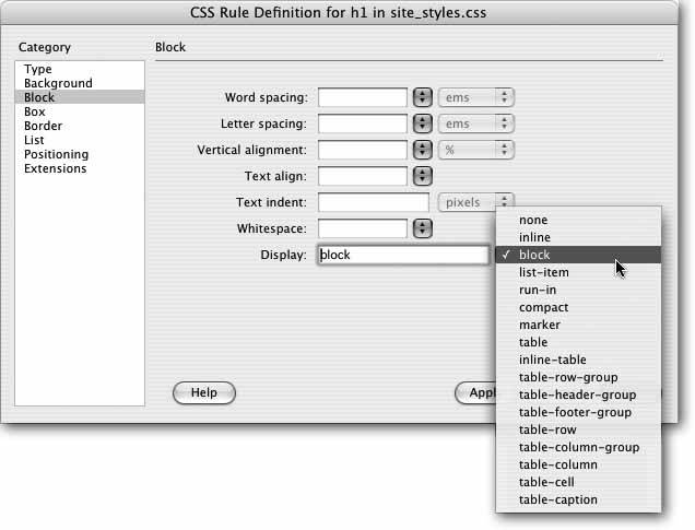
Display defines how a Web browser should display a particular element like a paragraph or a link. You may be overwhelmed by the range of choices for this propertyand you may be underwhelmed when you find out that most of these options aren't supported by most browsers.
Most CSS-capable browsers understand only three of the options: "none,""inline," and "block." The "block" option treats any item styled with this property as a blockseparated from other content by space above and below it. This is how paragraphs and headings normally appear. But you can apply this value to a link (which normally appears inside of a block-level element like a paragraph) to turn it into its own block. In this way, you can transform links that appear next to each other into a series of links stacked one on top of the next.
The "inline" option treats the item like part of the current block or paragraph, so that any item styled with this property (like a picture) flows together with other items around it, as if it were part of the same paragraph. This property is frequently used to take a bulleted list of links and turn it into a horizontal navigation bar. For a good tutorial on this topic, visithttp://css. maxdesign .com.au/listutorial/horizontal_introduction.htm.
The "none" option is the most fun: It turns off the display of an item. In other words, any text or item styled with this option doesn't appear on the page. You can use JavaScript programming to switch this property on and off, making items seem to appear and disappear. In fact, Dreamweaver's Change Property behavior provides one simple way to do this (see Section 11.4.6).
6.7.4. Box Properties
CSS lets you control the space that appears around any affected Web page element. You work with those properties in the Box category of the CSS Rule Definition window (see Figure6-23).
-
Width and Height . You can specify a width and height for any styled object using these properties. Web designers use these settings most often to control layers, using Dreamweaver's Layer tools (see Section 8.6), but they can also affect other Web elements. For example, if you want a paragraph to be 100 pixels wide, create a class style with the Width property set to 100 pixels and apply it to the paragraph. You'll often use the Width property in conjunction with the Float property (see the following paragraph) to do things like create a box with a set width that floats to either the left or right side of the pagea common format for pull-quotes, message boxes, and sidebars.
-
Float . If you want to move an object to the left or right side of the page and have other content wrap around it, use the Float property. For example, if you want an image to appear at the right side of the page and have text flow around its left and bottom edges, choose "right" from the Float menu. The option behaves just like the right and left alignment options for images (Section 5.2.4) and tables (Section 7.7).
Note: The Float property has many uses, from aligning images to the right or left side of the page to creating drop caps and thumbnail photo galleries. For an excellent introduction and set of tutorials on this subject, visit http://css.maxdesign.com.au/floatutorial/.
-
Clear . Clear prevents an element from wrapping around any object with a right or left Float property (see above). You may want, for example, all Heading 1 paragraphs to stand out on their own lines and not wrap around an image with a right float. In that case, you'd choose the "right" option from the Clear menu when you're styling the <h1> tag.
-
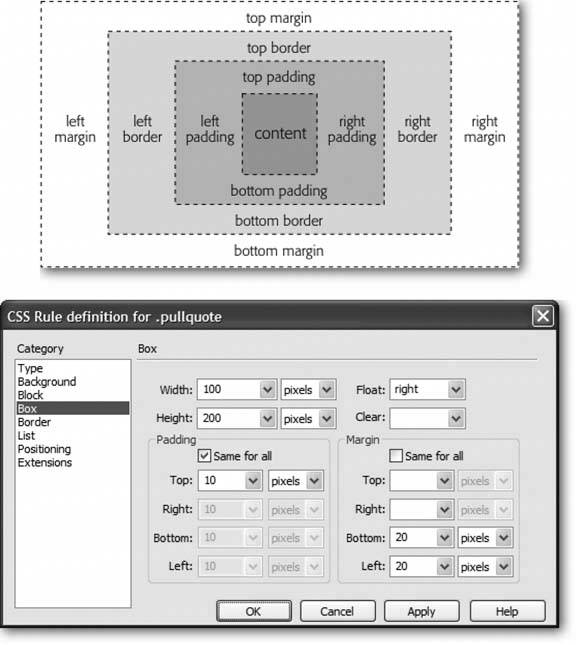
Padding . Padding is the gap that separates the content of the stylesuch as a paragraph of text or an imageand its border (see Section 6.7.5). For example, if you put a1-pixel border around an image and want to add 10 pixels of space between the image and the border, type 10 into the top padding box and choose "pixels" from the pop-up menu. Turn off the "Same for all" box if you wish to set the padding around each edge separately; then, type values into each of the four boxes.
Warning: Unfortunately, Internet Explorer 5 for Windows doesn't handle the Box model correctly. If you set the padding or borders of a style, Internet Explorer displays the element smaller than other browsers, ruining the layout of your Web page. For more information on this problem and a clever workaround, visit http://css-discuss.incutio.com/?page=BoxModelHack.
-
Margin . The margin is the outermost space surrounding an element (Figure 6-23). It surrounds the border and padding properties of the style and lets you add space between one element and another. Use any of the valuespixels, percentages, and so onthat CSS supports.
Figure 6-23. Top: In the CSS Box model, every style is composed of multiple boxes, one inside the other. Each box controls certain display properties of the style. For example, the outermost box of a style is called the margin. It controls the space between the border of the style and any other objects around the styled object, such as images, paragraphs, or tables.
Bottom: This dialog box controls the margins and padding around a styled object that uses the Box category. Its fields correspond to the measurements shown in the top diagram. For a discussion of the Box model from the World Wide Web Consortium, visit: www.w3.org/TR/CSS21/box.html.
Tip: You can also use the Margin properties to eliminate a margin entirely, if, for example, you don't like the space that browsers automatically insert between paragraphs. Type in the Top margin box and in the Bottom margin box to create a style with no top or bottom margins.
6.7.4.1. CSS Layout Box Model
Margins and padding are invisible. They also have similar effects: 5 pixels of left padding adds 5 pixels of space to the left edge of a style, just like with a 5-pixel left margin. Because you can't see padding or margins (just the empty space they make), it's often difficult to know if the gap between, say, the banner at the top of your page and the main area of content is caused by the style applied to the banner or the main area. You also can't always tell if any extra space is caused by a padding or margin setting. Dreamweaver 8 adds a helpful diagnostic tool that lets you see these invisible properties clearly.
When you select a <div> tag (see page303) that has margin or padding properties set, Dreamweaver draws a box around that div and adds slanting lines to indicate the space occupied by margins and padding (see Figure 6-24).
Figure 6-24. In addition to displaying the space occupied by margins and padding, the CSS Layout Box Model's visual aids indicate the vertical and horizontal center point of the <div> tag (circled in this figure).
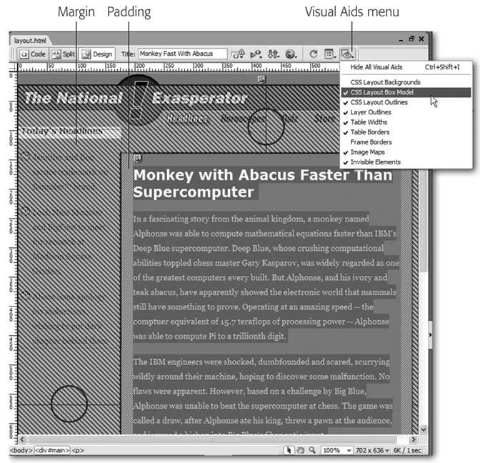
Margins appear outside of padding and are represented by lines that slant downward from left to right; padding appears inside of the margin and is represented by lines that go upward from left to right. For example, in Figure 6-24, the area that contains the main story is enclosed in a <div> tag with an ID style named main applied to it. When that div is selected (see the tag selector in the lower-left corner of the figure), Dreamweaver highlights the margins and padding values that are defined in that ID style. As you can see, there's a considerable amount of margin on both the top and left edges, and a smaller amount of padding (20 pixels) applied to both the left and right edges.
Note: Dreamweaver also displays visual aids for margins and padding values around any element with a style that has its display property set to "block" (see Section 6.7.3) or that uses either "absolute" or "relative" positioning (these properties are described in Chapter 8 on Section 8.3.1).
If you find these visual aids confusing, you can turn them off via the Visual Aids menu in the document window (see Figure 6-24) or by choosing View Visual Aids Layout Box Model. These same steps turn the margin and padding visual aids back on.
6.7.5. Border Properties
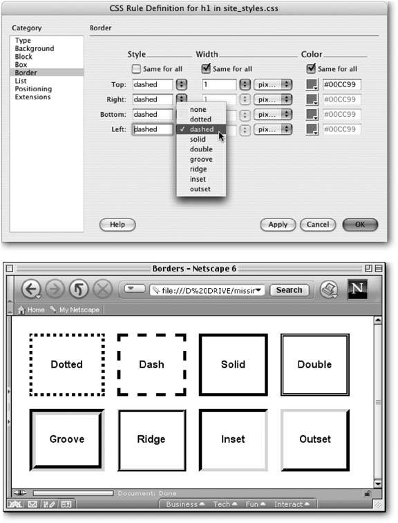
Only a few elements can have borders in HTML: tables, images, and cells. With CSS, however, you can add a border to any object, from an image to a paragraph to a single exclamation point (see Figure 6-25).
Figure 6-25. Top: Add colorful and stylish borders to paragraphs, images, tables, and links with the CSS Border properties. Turning on only the bottom border for a paragraph is a great way to add a horizontal rule between paragraphs. While HTML's Horizontal Rule object also does this, only CSS lets you control the color.
Bottom: The eight different border styles provide interesting visual diversity to the otherwise plain border.
Even better, you can control each side of the border independently with its own width and color settings, or even turn off some parts of the border:
-
Style . This menu lets you specify the type of line used for the border. Dreamweaver gives you more options than a frame shop: "none" (the default choice), " dotted ,""dashed," "solid," "double,""groove," "ridge," "inset," and "outset." You can use a different style for each edge, or select a style from the top menu and turn on the "Same for all" box to apply the same style to all four borders.
-
Border Widths . You can set the border around each side of a styled object separately. Choose one of the preset widths"thin," "medium," "thick," or "auto"or, if you choose "(value)" from the pop-up menu, you can type a value into the Width box and select a unit of measurement from the pop-up menu to the right. Again, you can choose from a wide range of types:"pixels," "percentage," "inches," and so on. If you want to eliminate the border on one side, type into the appropriate box.
-
Border Colors . You can color each of the four borders individually using the ubiquitous Dreamweaver color box (Section 1.3.3). If you don't assign any colors, but do assign border widths , Dreamweaver makes the borders black.
Note: You have to select a style from the pop-up menu to see the borders. If you leave this option blank or select "none," you won't see the borders even if you set the width and color.
6.7.6. List Properties
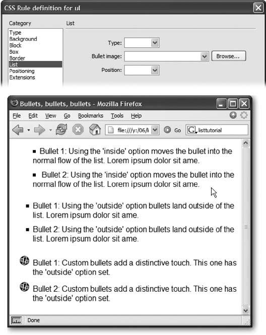
To exercise greater control over bulleted and numbered lists, use the CSS options on the List panel of the CSS Rule Definition window (see Figure 6-26).
-
Type . Select the type of bullet to be used in front of a list item. Options include: "disc," "circle," "square," "decimal" (1., 2., 3.), "lower-roman" (i, ii, iii), "upper-roman" (I, II, III), "lower-alpha" (a, b, c), "upper-alpha" (A, B, C), and "none" (no bullet at all).
-
Bullet image . For the ultimate control of your bullet icon, skip the boring options preprogrammed into a Web browser (like disc, circle, square, or decimal) and supply your own. Click the Browse button and select a graphics file from your site folder. Make sure the graphic is appropriate bullet materialin other words, small.
Tip: A more versatile solution to adding bullet images to a list is the Background Image property (seeSection 6.7.2.1). Since you can accurately position a background image, you can easily tweak the placement of your bullets. Here's how to do it: Create a style for the <li> tag (or a class style that you apply to each <li> tag), make sure you set the List property type to "none" (this hides the bullet), set the background image to your graphical bullet, and play with the background position values (Section 6.7.2.3). Playing with the padding values (Section 6.7.4) helps position the text relative to the image.
-
Position . This property controls how the bullet is placed relative to the list item's text. The "outside" option places the bullet outside of the margin of the text, exactly the way bulleted lists normally appear on a Web page. "Inside," on the other hand, displays the bullet within the text margin, so that the left edge of the bullet aligns with the left margin; Figure 6-26 should make the effect clearer.
Figure 6-26. Top: Take control of your bulleted and numbered lists using the CSS Rule Definition window's List panel. With Cascading Style Sheets, you can even supply your own graphic bullets.
Bottom: A bullet-crazed Web page, for illustration purposes. Parading down the screen, you can see "inside" bullets, "outside" bullets, and bullets made from graphics.
6.7.7. Positioning Properties
Cascading Style Sheets may be useful for formatting text and adding background colors and margins to objects, but this technology is also intended as a structural aid for laying out Web pages. You'll learn about these properties and how to set them on Section 8.3.1.
6.7.8. Extensions
The final category in the CSS Rule Definition window is listed last for a good reason: not all Web browsers support its properties properly:
-
Page Break . This property specifies, when your visitor makes a printout of your page, whether a page breaks before or after the styled object. You could apply this, for example, to the <h1> tag in order to make sure each printed page begins with a Heading 1 paragraph.
-
Cursor . Of all the Extension properties, this one holds the most promise. When a visitor moves the mouse over an object with this style applied, this property changes the cursor shape to one of 15 different designs (a hand, an hourglass, or a crosshair, for example). Internet Explorer 4 and above, Netscape Navigator 6 and above, Mozilla, Safari, and Opera 5 and above all recognize this professional-looking property.
-
Filter . The Filter property can apply many interesting visual effects to a page; for example, it can add a drop shadow to an image. Unfortunately, this Microsoft-only option works in the Windows version of Internet Explorer, and no other browsers.
![Dreamweaver 8[c] The Missing Manual](/icons/blank_book.jpg "Dreamweaver 8[c] The Missing Manual")