Control Class Basics
This chapter explores the Control class, which provides basic functionality for the family of Windows controls. You will learn about fundamental topics like mouse and keyboard handling, focus, and control relations. Along the way, I'll also introduce some important pieces of the System.Drawing namespace that allow you to create structures that represent colors, fonts, rectangles, and points.
The Windows Forms Package
.NET provides two toolkits for user interface design: one for web applications, and one for Windows development. This chapter introduces the Windows Forms package, which allows you to create the traditional rich graphical interfaces found in everything from office productivity software to arcade games. The one detail that all these applications have in common is the fact that they are built out of windows-tiny pieces of screen real estate that can present information and receive user input.
It's easy to imagine that "Windows Forms" refers to a special part of the .NET class library, where fundamental classes like Form and Control are stored. This is true, but it isn't the whole story. More accurately, Windows Forms is the technology that allows the Common Language Runtime to interact with control objects and translate them into the low-level reality of the Windows operating system. In other words, you create objects that represent controls and windows, and the Common Language Runtime handles the details like routing messages, keeping track of window handles, and calling functions from the Windows API.
This idea isn't new. In the past, developers have used the MFC framework in C++, WFC in J++, and Visual Basic's own "Ruby" forms engine to insulate themselves from some of the low-level details of Windows programming. These frameworks all provide an object-oriented wrapper around the Windows API (which, on its own, is a disorganized collection holding hundreds of miscellaneous C routines). These frameworks were well intentioned, but they have all suffered from a few problems.
- Lack of consistency. If you learn how to use MFC, you still won't know anything about creating Visual Basic user interfaces. Even though every framework ultimately interacts with the Windows API, they have dramatically different object models and philosophies.
- Thin layer/thick layer problems. Frameworks tend to be either easy to use, or powerful, but not both. MFC is really only a couple of steps away from Windows messages and low-level grunt work. On the other hand, Visual Basic developers have the benefit of a simple framework, but face the lingering dread that they will need to delve into the raw Windows API for complex or unusual tasks that are beyond Visual Basic's bounds.
- Subjugation to Windows API rules. The Windows API dictates certain harsh realities. For example, once you create a fixed-border window, you can't make its border resizable. These limitations make sense based on how the Windows API is organized, but they often lead to confusing inconsistencies in a framework's object model.
The result of these limitations is that there are essentially two types of frameworks: those that are complicated to use for simple tasks (like MFC), and those that are easy to use for simple tasks, but difficult or impossible to use for complex tasks (like VB). These object models provide a modern way to code user interfaces, but many programmers wonder why they should abstract the Windows API when its restrictions remain.
The NET Solution
.NET addresses these problems by becoming more ambitious. The result is a user interface framework that uses some innovative sleight-of-hand to perform tasks that are difficult or impossible with the Windows API. Here are some examples- tasks that .NET can perform but the Windows API cannot:
- Change fixed style properties like the selection type of a list box or the border type of a window.
- Change a form's owner.
- Move an MDI child window from one MDI parent window to another.
- Transform an MDI child window into an MDI parent and vice versa.
- Move controls from one window to another.
Clearly this list includes a couple of tricks that a self-respecting application will probably never need to use. Still, they illustrate an important fact: .NET doesn't just provide an easier object model to access the Windows API; it also provides capabilities that extend it. The result is a framework that works the way you would intuitively expect it to work based on its objects.
| Note |
The samples for this chapter include a project called ImpossibleAPI, which shows one of these "broken rules"-a child window that can jump between different MDI parents whenever the user clicks a button. |
All of this raises an interesting question. How can a programming model built on the Windows API actually perform feats that the Windows API can't? Truthfully, there's nothing in the preceding list that couldn't be simulated with the Windows API with a fair bit of effort. For example, you could appear to change the border style of a window by destroying and recreating an identical window. To do so you would have to rigorously track and restore all the information from the previous window.
In fact, this is more or less what takes place in .NET. If you examine the control or window handle (the numeric value that identifies the window to the operating system), you'll see that it changes when you perform these unusual operations. This signifies that, on an operating system level, .NET actually provides you with a new window or control. The difference is that .NET handles this destruction and re-creation automatically. The illusion is so perfect that it's hardly an illusion at all (any more than the illusion that .NET web controls can maintain state, or that television shows continuous movement, rather than just a series of still images).
The cost of this functionality is a runtime that requires a fair bit of intelligence. However, .NET programs already need an intelligent runtime to provide modern features like improved code access security and managed memory. The Windows Forms are just another part of the ambitious and sprawling .NET framework.
Some programmers may still feel they need to resort to the Windows API. You can still use API calls in your .NET applications without too much trouble. However, I encourage you to abandon those habits and start dealing with the new .NET abstractions. Not only is it easier, it also provides a short path to some remarkable features.
| Tip |
One of the best pieces of advice for beginning programmers in traditional development was to master the Windows API. However, in .NET the story changes. In .NET, you'll get the most benefit by studying the low-level details of the .NET object libraries, not the API. Believe it or not, the operating system details will not be as important in the next generation of software development. Instead, you'll need to know the full range of properties, methods, and types that are at your fingertips to unlock the secrets of becoming a .NET guru. |
 Companion Web Site
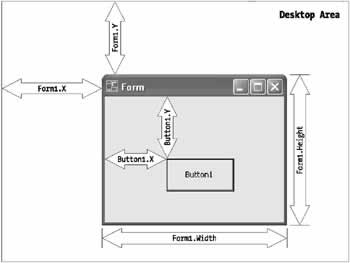
Position and SizeA control's position is defined by the distance between its top-left corner and the top-left corner of its container. Often, the container is a form, but it could also be a container control like a panel or group box. Similarly, the size is measured as the width and height of the control from the top-left point. By convention, the position measurement is positive in the downward and rightward directions.
All values are integers measured in pixels. They are provided through several properties (including Top, Left, Right, and Bottom for position, and Width and Height for size), as shown in Figure 3-3. Although you can manipulate any of these properties, the preferred way for setting position is by using the Location property with a Point structure. Similarly, the preferred way to define size is to use the Size property with a Size structure. These basic structures originate from the System.Drawing namespace.
The following code shows how you can set the location and size of a control using the Point and Size structures. System.Drawing.Point pt = new System.Drawing.Point(); pt.X = 300; // The control will be 300 pixels from the left pt.Y = 500; // The control will be 500 pixels from the top. ctrl.Location = pt; System.Drawing.Size sz = new System.Drawing.Size(); sz.Width = 500; sz.Height = 60; ctrl.Size = sz; // Just for fun, set another control to have the same size. ctrl2.Size = ctrl.Size; By importing the System.Drawing namespace and using some handy constructors, you can simplify this code considerably. ctrl.Location = new Point(300, 500); // Order is (X, Y) ctrl.Size = new Size(500, 60); // Order is (Width, Height) This latter approach is the one that Visual Studio .NET takes when it creates code for your controls at design-time. There are other size and position-related properties, such as those used for anchoring and docking when creating automatically resizable forms. These are described in detail in Chapter 5.
|
|||||||||||||||||||||
ColorEvery control defines a ForeColor and BackColor property. For different controls, these properties have slightly different meanings. In a simple control like a label or text box, the foreground color is the color of the text, while the background color is the area behind it. These values default to the Windows system-configured settings. Colors are specified as Color structures from the System.Drawing namespace. It's extremely easy to create a color object, because you have several different options. You can create a color using:
The code listing that follows shows several ways to specify a color using the Color, ColorTranslator, and SystemColors types. In order to use this code as written, you must import the System.Drawing namespace.
// Create a color from an ARGB value
int alpha = 255, red = 0;
int green = 255, blue = 0;
ctrl.ForeColor = Color.FromARGB(alpha, red, green, blue);

// Create a color from an environment setting
ctrl.ForeColor = SystemColors.HighlightText;

// Create a color using a .NET name
ctrl.ForeColor = Color.Crimson;

// Create a color from an HTML code
ctrl.ForeColor = ColorTranslator.FromHtml("Blue");

// Create a color from an OLE color code
ctrl.ForeColor = ColorTranslator.FromOle(OxFF00);

// Create a color from a Win32 color code;
ctrl.ForeColor = ColorTranslator.FromWin32(0xA000);
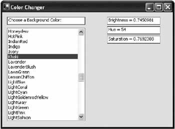
The next code snippet shows how you can transform the KnownColors enumeration into an array of strings that represent color names. This can be useful if you need to display a list of valid colors (by name) in an application. String[] colorNames; colorNames = System.Enum.GetNames(typeof(KnownColor)); Changing a color name string back to the appropriate enumerated value is just as easy using the special static Enum.Parse() method. This method compares the string against all the available values in an enumeration, and chooses the matching one. KnownColor myColor; myColor = (KnownColor)System.Enum.Parse(typeOf(KnownColor), colorName); // For example, if colorName is "Azure" then MyColor will be set // to the enumerated value KnownColor.Azure (which is also the integer value 32). Incidentally, you can use a few useful methods on any Color structure to retrieve color information. For example, you can use GetBrightness(), GetHue(), and GetSaturation(). Here's a complete program that puts all of these techniques to work. When it loads, it fills a list control with all the known colors. When the user selects an item, the background of the form is adjusted accordingly (see Figure 3-4).
public class ColorChange : System.Windows.Forms.Form
{
 // (Windows designer code omitted.)
 System.Windows.Forms.ListBox lstColors;

 private void ColorChange_Load(object sender, System.EventArgs e)
 {
 string[] colorNames;
 colorNames = System.Enum.GetNames(typeof(KnownColor));

 lstColors.Items.AddRange(colorNames);
 }

 private void lstColors_SelectedIndexChanged(object sender,
 System.EventArgs e)
 {
 KnownColor selectedColor;
 selectedColor = (KnownColor)System.Enum.Parse(
 typeof(KnownColor), lstColors.Text);
 this.BackColor = System.Drawing.Color.FromKnownColor(selectedColor);

 // Display color information.
 lblBrightness.Text = "Brightness = " +
 this.BackColor.GetBrightness().ToString();
 lblHue.Text = "Hue = " + this.BackColor.GetHue().ToString();
 lblSaturation.Text = "Saturation = " +
 this.BackColor.GetSaturation().ToString();
 }
}
|
|||||||||||||||
Fonts and TextThe Control object defines a Text property that is used by derived controls for a variety of purposes. For a text box, the Text property corresponds to the information displayed in the text box, which can be modified by the user. For controls like labels, command buttons, or forms, the Text property refers to static descriptive text displayed as a title or caption. The font of a control's text is defined by the Font property, which uses an instance of the System.Drawing.Font class. Note that a Font object does not just represent a typeface (like Tahoma). Instead, it encapsulates all details about the font family, point size, and styles (like bold and italic).
// You can create a font with one of the 13 constructors.
ctrl.Font = new Font("Tahoma", 8, FontStyle.Bold);
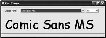
A Control.FontHeight property is also provided, which returns the height of your chosen font in pixels. This setting allows you to perform calculations when you are drawing special graphics or text on a control manually. For example, you could manually space lines the appropriate amount when drawing text directly onto a form background. Note that font families are set using a string, rather than a type-safe enumerated property. If you try to create an object using a name that does not correspond to an installed font, .NET automatically (and unhelpfully) defaults to the Microsoft Sans Serif font. An error does not occur. You may want to explicitly check the Font.Name property to check if this automatic substitution has been made. To determine what fonts are installed on the system, you can enumerate through them with the System.Drawing.Text.InstalledFontCollection class. The example below adds the name of every installed font to a list box.
InstalledFontCollection fonts = new InstalledFontCollection();
foreach (FontFamily family in fonts.Families)
{
 lstAvailableFonts.Add(family.Name);
}
The online samples for this chapter include a FontViewer utility that uses this technique to create a list of fonts. The user can choose a font from a drop-down list control, and a sample line of text will be painted directly on the window (see Figure 3-5). To perform the font painting, the application uses some of the GDI+ methods you'll see in Chapter 12.
Access KeysSome controls (namely buttons and menu items) allow a character in their caption to be highlighted and used as an access key. For example, button controls often underline one character in the caption. If the user presses the Ctrl key and that character, the button is "clicked" automatically. To configure these shortcuts keys just add an ampersand (&) before the special letter, as in "Sa&ve" to make "v" the access key. (If you actually want to use an ampersand, you'll need to include the text "&&".) |
|||||||||||||||||||||
Control RelationsTable 3-2).
|
|||||||||||||||||||||||||||||||||||||||||||||
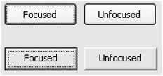
Focus and the Tab SequenceIn the Windows operating system, a user can only work with one control at a time. The control that is currently receiving the user's key presses is the control that has focus. Sometimes this control is drawn slightly differently. For example, the button control uses a dotted line around its caption to show that it has the focus. Figure 3-6 shows focused and unfocused buttons with both the classic Windows look and Windows XP visual styles.
To move the focus, the user can click the mouse or use the tab key. The developer has to take some care to make sure that the tab key moves focus in a logical manner (generally from left to right and then down the form). The developer also has to choose the control that should receive the focus when the window is first presented. All controls that support focusing provide a Boolean TabStop property. When set to true, the control can receive focus. When set to false, the control is left out of the tab sequence and can only be reached using a mouse click.
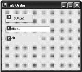
To set the tab order, you configure a control's TabIndex property. The control with a TabIndex of 0 gets the focus first. When the user presses the tab key, the focus moves to the next control in the tab order, as long as it can accept focus. Visual Studio .NET provides a special tool, shown in Figure 3-7, that allows you to quickly set tab order. Just select View → Tab Order for the menu. You can then assign TabIndex values by clicking controls in the desired order.
Label controls have a TabIndex setting even though they cannot receive focus. This allows you to use a label with an access key. When the user triggers the label's access key, the focus is automatically forwarded to the next control in the tab order. For that reason, you should give your labels an appropriate place in the tab order, especially if they use access keys. (You create an access key by placing an ampersand character before a letter in the label's text.) Controls that are invisible or disabled (commonly known as "greyed out") are generally skipped in the tab order, and are not activated regardless of the TabIndex and TabStop settings. To hide or disable a control, you set the Visible and Enabled properties, respectively. Note that if you hide or disable a control at design time, the appearance is not modified. This is a deliberate idiosyncrasy designed to make it easier to work with controls at design time, and it is recommended that custom controls also follow this pattern. Some other properties and methods for managing the focus programmatically are described in Table 3-3.
|
|||||||||||||||||||||||||||||||||||||||||||||||
Responding to the Mouse and KeyboardControls also provide some built-in intelligence for dealing with the keyboard and mouse. These include low-level events that react to key presses and mouse movement, and methods that return key and mouse button state information (Table 3-4).
Generally you will react to the KeyDown and KeyUp events when you need to react to special characters like the arrow keys, which do not trigger KeyPress events. The KeyPress event is used when you need to restrict input and perform character validation. If you want to update the display or react to a changed text value in an input control, you would probably not use any of these events. Instead, you should react to the higher-level Changed event, which fires when any modifications are made. The Changed event will fire if you modify the text programmatically or the user deletes the text with the right-click menu. Forms provide a Boolean KeyPreview property. If you set this to true, your form receives key press events when any of its controls have focus, and it receives these events before the control does (Table 3-5). This technique is useful if you are programming a customized interface or a game where you need to take complete control of the keyboard. You'll also see in Chapter 14 that this technique is useful when you are handling the F1 key to create your own context-sensitive help system.
The MouseMove, MouseDown, and MouseUp events provide additional information about the state of the mouse buttons. Separate MouseDown and MouseUp events are triggered for every mouse button. In this case, the MouseEventArgs.Button property indicates the button the caused the event.
private void lbl_MouseUp(Object sender, System.Windows.Forms.MouseEventArgs e)
{
 if (e.Button == MouseButtons.Right)
 {
 // This event was caused by a right-click.
 // Here is a good place to show a context menu.
 }
}
In the MouseMove event, however, the Button property indicates all the buttons that are currently depressed. That means that this property could take on more than one value from the MouseButtons enumeration. To test for a button, you need to use bitwise arithmetic.
private void lbl_MouseMove(Object sender, System.Windows.Forms.MouseEventArgs e)
{
 if ((e.Button & MouseButtons.Right) == MouseButtons.Right)
 {
 // The right mouse button is currently being held down.
 if ((e.Button & MouseButtons.Left) == MouseButtons.Left)
 {
 // You can only get here if both the left and the right mouse buttons
 // are currently held down.
 }
 }
}
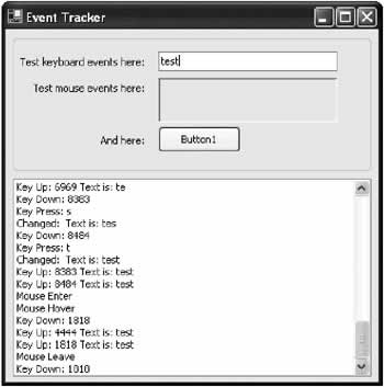
Every control also provides a MousePosition, MouseButtons, and ModifierKeys property for information about the mouse and keyboard. These properties are less useful than the event data. For example, if you use them in an event handler they retrieve information about the current location of the mouse pointer, not the position where it was when the event was triggered. Additionally, the MousePosition property uses screen coordinates, not control coordinates. However, this information can still be useful when you are reacting to an event that doesn't provide mouse information. In Chapter 11 you'll see how it can be used with a dynamic drawing application. A Mouse Keyboard ExampleThe mouse and keyboard events have some subtleties, and it's always best to get a solid and intuitive understanding by watching the events in action. The sample code for this chapter provides an ideal example that creates a list of common mouse and keyboard events as they take place. Each entry also includes some event information, giving you an accurate idea of the order these events occur, and the information they provide. MouseMove events are not included in the list (because they would quickly swamp it with entries), but a separate label control reports on the current position of the mouse (see Figure 3-8).
For example, here's the code that adds an entry in response to the pic.MouseLeave event:
private void pic_MouseLeave(object sender, System.EventArgs e)
{
 Log("Mouse Leave");
}
The private Log() method adds the string of information, and scrolls the list control to the bottom to ensure that it is visible.
private void Log(String data)
{
 lstLog.Items.Add(data);
 int itemsPerPage = (int)(lstLog.Height / lstLog.ItemHeight);
 lstLog.TopIndex = lstLog.Items.Count - itemsPerPage;
}
Mouse CursorsOne other useful mouse-related property is Cursor. It sets the type of mouse cursor that is displayed when the mouse is moved over a control, and it applies to all child controls. If your application is about to perform a potentially time-consuming operation, you might want to set the form's Cursor property to an hourglass. You can access standard system-defined cursors using the static properties of the Cursors class. myForm.Cursor = Cursors.WaitCursor; // (Perform long task.) myForm.Cursor = Cursors.Default; You can also create a custom cursor using the Cursor class, load a custom cursor graphic, and assign it to a control. Cursor myCursor = new Cursor(Application.StartupPath + "\mycursor.cur"); myCustomControl.Cursor = myCursor; Cursor files are similar to icons, but they are stored in a special .cur file format. Currently, animated cursors (.ani files) are not supported. |
|||||||||||||||||||||||||||||||||||||||||||||||||||||||||||||||||||||||
Graphics and PaintingControls provide a variety of events and properties related to painting (Table 3-6). You'll find information about how to take control of these details and draw your own custom controls in the GDI+ chapters later in this book.
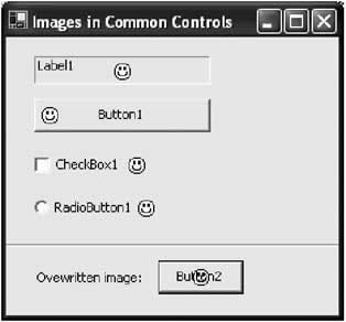
You can create an Image object using the static Image.FromFile() method, which reads a standard bitmap format (like a BMP, GIF, JPEG, or PNG file). button1.Image = Image.FromFile(Application.StartupPath + "\mypic.bmp"); The Image class provides its own set of properties and methods. Some of the most interesting include RotateFlip(), which changes the picture orientation by rotating or inverting it, and GetThumbnailImage(), which returns an image object of the specified size that condenses the information from the original Image. Image myImage, myThumbnail; myImage = Image.FromFile(Application.StartupPath + "\mypic.bmp"); // Rotate by 270 degrees and flip about the Y-axis. myImage.RotateFlip(RotateFlipType.Rotate270FlipY); // Create a 100 x 100 pixel thumbnail. myThumbnail = myImage.GetThumbnailImage(100, 100, null, null); Figure 3-9 shows common controls with embedded pictures. These can be added using the thoughtfully included Image and ImageAlign properties. However, if you place an image over a portion of the control text, the text will overwrite the image. No word wrapping is provided.
|
|||||||||||||||||||||||||||||||||||||||||||||||||
Low Level MembersThe .NET framework hides the low-level ugliness of the Windows API, but it doesn't render it inaccessible. This is a major advantage of .NET over other frameworks like traditional VB: it adds features without removing any capabilities. For example, if you want to use a DLL or Windows API function that requires a window handle, you can just retrieve the control's Handle property. The only special .NET consideration is that you should retrieve the handle immediately before you use it. Changing some properties can cause the control to be recreated, and receive a new handle. You've probably also realized by now that low-level Windows messages are abstracted away in .NET controls, and replaced with more useful events that bundle additional information. If, however, you need to react to a message that doesn't have a corresponding event, you can handle it directly by overriding the PreProcessMessage() method. (You can also attach global message filters for your entire application by using the Application.AddMessageFilter() method). This book focuses on pure .NET programming, and won't get into most of these tricks, which are really workarounds based on traditional Windows programming. If you do want to examine these features, try starting with the members described in Table 3-7.
|
|||||||||||||||||||||||||||||||||
The Last WordThis chapter provided a lightning tour through the basics of .NET controls, including how they interact, receive messages, process keystrokes and mouse movements, and handle focus. It also detailed the basic ingredients from the System.Drawing namespace for creating and managing colors, fonts, images, and more. The next chapter puts this high-level theory to a more practical purpose by teaching you to master the basic set of Windows controls. |
|||||||||||||||
Classic Controls |
|||||||||||||||
Introduction
 Windows Forms and Custom Controls")
EAN: 2147483647
Pages: 142
