Custom Controls
Overview
Custom controls are a key theme in .NET development. They can help your programming style by improving encapsulation, simplifying a programming model, and making user interface more "pluggable" (i.e., making it easier to swap out one control and replace it with a completely different one without rewriting your form code). Of course, custom controls can have other benefits, including the ability to transform a generic window into a state-of-the-art modern interface. Generally, developers tackle custom control development for one of three reasons:
- To create controls that abstract away unimportant details and are tailored for a specific type of data. You saw this model in Chapter 6 with custom ListView and TreeView examples.
- To create controls that provide entirely new functionality, or just combine existing UI elements in a unique way. An example of this is the directory browser control developed in this chapter.
- To create controls with a distinct original look, or ones that mimic popular controls in professional applications (like Microsoft's Outlook bar) that aren't available to the masses. This topic is considered briefly in this chapter, and returned to in Chapter 13, with GDI+.
Creating custom controls in .NET is far easier than it has been in languages like C++ or VB, where you typically need to embrace the ActiveX model to create a truly shareable component. As most developers have found, ActiveX controls can be difficult to distribute because every version needs to be registered. Creating ActiveX controls also requires a bit of wizardry, with special care taken to handle property pages, design-time versus runtime appearance, and state management.
In .NET, creating a custom control is as easy as creating an ordinary class. You simply inherit from the best possible ancestor and add the specific features you need. Best of all, you can create a custom control class as part of an existing project, and then decide later to place it in a separate assembly that can be shared with other programmers.
This chapter introduces the different types of custom controls, and the types of problems they can solve. You will look at several key examples, including a thumbnail image viewer and a masked text box, and consider advanced techniques like creating multithreaded controls. However, you won't learn how to make these controls behave happily in Visual Studio .NET. That topic, as well other issues like control distribution and licensing, are picked up in the next chapter.
 Companion Web Site
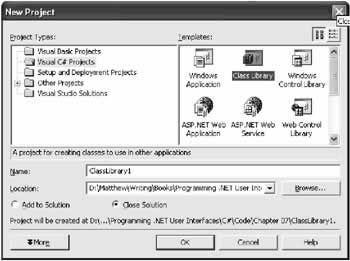
Control ProjectsWhen designing a custom control, you could create the control class directly in your application project. In this case, you'll need to manually create the control and add it to the Controls collection of a Form in code. However, to add flexibility, reuse your control, and add design-time support, you need to create a dedicated project for your custom controls. Every project that needs to use the control then needs to add a reference to the compiled DLL assembly that contains the control classes. The Class Library ProjectTypically, you'll create your control as either a Class Library Project (for most custom control projects) or a Windows Control Project (for user controls). The choice you make doesn't make much difference—essentially all the project type does is configure the default references and the namespaces that are initially imported into your project. The important fact is that you are creating a library project, which creates a DLL assembly, instead of a stand-alone executable. This DLL can then be shared with any other project that needs to use the control. Figure 7-1 shows the option you must select to create a Class Library project.
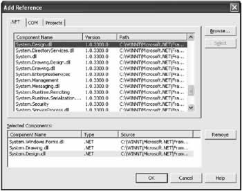
When you begin your control project, you will probably find that you need to add a few assembly references and import some namespaces. If you try to use a standard type and you receive an error, the problem is probably a missing reference. Typically, you need to add references to the System.Windows.Form.dll, System.Drawing.dll, and System.Design assemblies. Just right-click the project in the Solution Explorer and select Add Reference (see Figure 7-2).
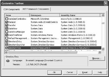
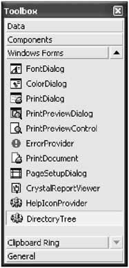
Having accomplished this step, you'll probably want to import some namespaces so you don't have to type fully qualified names (like System.Windows.Forms.Form instead of just Form). Useful namespaces include System.Windows.Forms, System.ComponentModel, and System.Drawing. Remember, importing namespaces isn't required—it's just a convenience that helps trim long lines of code. You can then create your custom control classes. Generally, you place each control in a separate file, although this approach isn't required. You can create a class library project that contains several files and multiple controls, or you can create a separate project and assembly for each custom control you make. To build your project at any time, right-click it in the Solution Explorer and choose Build. The DLL file will be placed in the bin subdirectory of your project directory. Referencing a Custom ControlFor other projects to use your control, they need a reference to the compiled assembly. When you add a reference, Visual Studio .NET stores the location of the file. Every time you rebuild your client project, Visual Studio copies the latest version of the dependent assembly from its source directory into the client project's bin directory, where the client executable resides. This ensures that you are always testing against the most recent build of a control. There are two ways to add a reference to a control project. First, you can use the familiar Add Reference command. In this case, the control won't appear in the toolbox, but you will be able to create it manually through code. Your other option is to customize the Toolbox (right-click the Toolbox, and choose Customize). Then, select the .NET Framework Components tab, and click the Browse button. Once you select the appropriate assembly, all controls are added to the list, and check marked automatically. Figure 7-3 shows the assembly for one of the custom controls developed in this chapter: the DirectoryTree.
When you click OK, your control is added to the bottom of the Toolbox alongside its .NET counterparts (see Figure 7-4). If you haven't configured a custom icon, it appears with the default gear icon. The next chapter describes how to modify this default icon.
You can create instances of this control by dragging it to the design surface. The first time you add a control to a project, Visual Studio .NET adds a reference to the assembly where the control is defined, and copies this assembly to your project directory. Note that the Toolbox is a Visual Studio .NET setting, not a project setting. This means that once you add a control to the Toolbox, it will remain there until you remove it, regardless of what project you are working with. You'll also notice that when you use the examples for this chapter, the control icons won't appear in your Toolbox (although the code will work perfectly well). To add the control icons, you'll need to follow the steps above. When you actually deploy an application that uses a custom control, all you need to do is ensure that the required control DLL is in the same directory as the application executable. When you copy these files to another computer, you do not need to worry about registering them or performing additional steps. This is the infamous zero-touch deployment that is heavily hyped with .NET.
The GACIf multiple applications need to use the same control, you can copy the appropriate assembly to each application directory. This gives you the freedom to update some applications with additional functionality without worrying about backward compatibility. It also only requires a minuscule amount of disk space, and is thus the favored approach. Another option is to install your component to the Global Assembly Cache (the same repository that contains the core .NET assemblies). The Global Assembly Cache (or GAC) allows multiple versions of a component to be installed side-by-side. The GAC also ensures that every application uses the version of a control that it was compiled with, which almost completely eliminates versioning headaches. The only disadvantage to using the GAC is that you need to sign your versioned assembly using a private key to ensure that it has a unique identifier (and can't conflict with other components), and to ensure that no other organization can release a new control that claims to be your own. This process is the same for any shared component, whether it is a control or a business object. Many factors that required a central repository for components in the old world of COM don't apply with .NET. If you just want to share a control between specific applications, you probably don't need the additional complexity of the GAC. On the other hand, if you are a tool vendor who creates, sells, and distributes custom controls, you will almost certainly want to use it. This process is well documented in the MSDN reference, but the essential steps are explained in the following three sections.
Creating a key The first step for installing a control into the GAC is to use the sn.exe commandline utility included with the .NET framework. To create a key, you use the −k parameter, and specify the name for your key: sn -k MyKey.snk Each .snk file contains a private and a public key. Private and public keys provide a special, time-honored form of encryption (called asymmetric encryption). Anything encrypted with a private key can be read only with the corresponding public key. Conversely, anything encrypted with a public key can only be read with the corresponding private key. The public key is typically made available to the world. The private key is carefully guarded. Public and private key encryption is sometimes used with email. If you want to create a message that is only decipherable by a specific user, you would use that individual's public key to encrypt the message. If you want to create a message that anyone can read, but no one can impersonate, you would use your own private key. Thus, asymmetric encryption can protect data and your identity. In .NET, the private key is used to compile the assembly, and the public key is embedded inside the assembly. When an application uses your control, the Common Language Runtime uses the public key to decode information from the manifest. Thus, no one else can create an update to your assembly because they need to have your original private key to encode it successfully. Applying a key to a control To add the key to a control project, you need to add an Assembly attribute to the AssemblyInfo.vb file that identifies the file.
[Assembly: AssemblyKeyFile("c:KeyFilesMyKey.snk")]
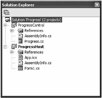
The next time you compile the project, the key information is added to the assembly. .NET also supports delayed assembly signing, which allows you to add the strong name just before shipping the control. This is useful in a large organization, because it allows you to debug the control without requiring the private key. The assembly can then be signed just before it is released by the individual who guards the private key. Delayed assembly assignment requires a little more gruntwork, and is described in the MSDN reference. Installing a control to the GAC Now that your control is signed, you can install it to the GAC using a dedicated setup program or the GACUtil.exe utility. You can event drag-and-drop the assembly to the C:[WindowsDir]Assembly directory in Windows Explorer, which installs it automatically. At this point, life couldn't be easier. If you install later versions of the same assembly in the GAC, the original version remains. Clients automatically use the latest assembly that shares the same major and minor and version number as the one they were compiled with. In other words, if you compile an application that uses version 1.2.0.0 of your control, the application automatically upgrades itself to version 1.2.1.0 if it exists in the GAC. However, it won't support version 1.3.0.0. When dealing with assemblies, you have many more options for configuring version policies. You should consult the MSDN reference or a book about .NET fundamentals for more information. Now that you've digested the basics of creating, compiling, and consuming a control, let's look at some practical examples. All of these custom controls are included with the code download for this chapter. The control projects have names that end with "Control" (as in DirectoryTreeControl), while the Windows Forms projects that test the controls have names that end with "Host" (as in DirectoryTreeHost). The test project directory also contains a solution file that will open both projects at once in the IDE. Figure 7-5 shows the arrangement for the Progress user control.
Typically, user controls are created as a group of ordinary controls that are related in some way. For example, you might include a simple record browser, or related customer input fields that provide their own validation. The .NET documentation assumes that user controls are the most common type of custom control project, although they suffer from some serious drawbacks:
That said, user controls are useful for quickly solving certain problems, or just creating composite controls. Creating User ControlsTo add a user control to a .NET custom control project, right-click the Solution Explorer window and select Add User Control. Figure 7-6 shows a user control in the Solution Explorer.
You'll notice from the designer that a user control is halfway between an ordinary control and a form. It helps to imagine that a user control is just a reusable portion of a form—more flexible than the visual inheritance you used in Figure 7-7.
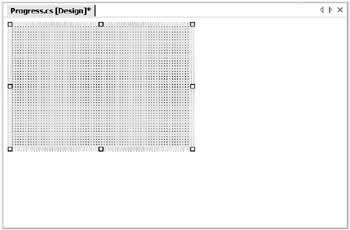
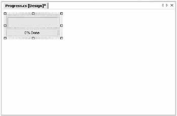
To add a control, just draw it onto the design surface in the same way as you would a form. You can (and should) use anchoring and docking with the controls in your user control. This ensures that they always resize to fit the bounds of their container. Remember, the size of the user control is dictated by the application programmer. If you add a form and a user control to the same project, Visual Studio .NET thoughtfully adds your user control to the toolbar so that you can drag-and-drop it onto your form. In many ways, user controls have the most convenient designtime support, and don't require any additional work from the programmer. However, you will still need to add a reference to the DLL assembly that contains the user control, or you will receive an error when you try to add the control to the project. Also, note that as with visual inheritance, if you change the user control you need to recompile before the change will appear in any form that hosts it. Just right-click the project in the Solution Explorer and choose Build. To understand the strengths and limitations of user controls, it helps to consider a couple of examples. The Progress User ControlThe first user control you'll consider is a simple coupling of a ProgressBar and Label control. This control solves a minor annoyance associated with the ProgressBar—there is no way to show the standard text description about the percent of work complete. You can easily get around this limitation by adding a label to every form that uses the ProgressBar, and manually synchronizing the two. Even better, the Progress user control implements a standard, reusable solution. To begin, the user control is created with a label and progress bar, as shown in Figure 7-8.
If you try to use the Progress control directly in a project, you'll discover that you can't access the label or the bar. Instead, the only properties and methods that are available are those of the user control itself, allowing you to modify the default font and background color (as you can with a form), but not much more. To actually make the Progress user control functional, you need to replicate all the important methods and properties. Then, in each method or property procedure for your user control, you simply call the corresponding method or property procedure in the label or progress bar. This delegation pattern can add up to a lot of extra code for an advanced control! Fortunately, when you create a user control you will usually restrict and simplify the interface so that it is more consistent and targeted for a specific use. In the Progress user control, for example, don't worry about allowing the user to set a font or background color for the label control.
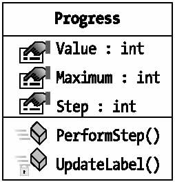
The Progress user control provides access to three properties from the ProgressBar control (Value, Maximum, and Step), and one method (PerformStep).
public class Progress : System.Windows.Forms.UserControl
{
 internal System.Windows.Forms.Label lblProgress;
 internal System.Windows.Forms.ProgressBar Bar;

 // (Designer code omitted.)

 public int Value
 {
 get
 {
 return Bar.Value;
 }
 set
 {
 Bar.Value = value;
 UpdateLabel();
 }
}

public int Maximum
 {
 get
 {
 return Bar.Maximum;
 }
 set
 {
 Bar.Maximum = value;
 }
 }

 public int Step
 {
 get
 {
 return Bar.Step;
 }
 set
 {
 Bar.Step = value;
 }
 }

 public void PerformStep()
 {
 Bar.PerformStep();
 UpdateLabel();
 }

 private void UpdateLabel()
 {
 lblProgress.Text = (Math.Round((decimal)(Bar.Value * 100) /
 Bar.Maximum)).ToString();
 lblProgress.Text += "% Done";
 }
}
Every time the progress bar changes (either by modifying the Value or invoking the PerformStep() method), the code calls a special private method, UpdateLabel. This ensures that the label always remains completely synchronized. Testing this control is easy. All you need is a simple form that hosts the Progress user control, and increments its value. In this case, a timer is used for this purpose. Each time the timer fires, the PerformStep() method increments the counter by its Step value.
private void tmrIncrementBar_Tick(object sender, System.EventArgs e)
{
 status.PerformStep();
 if (status.Maximum == status.Value)
 {
 tmrIncrementBar.Enabled = false;
 }
}
The timer itself is enabled in response to a button click, which also configures the user control's initial settings:
private void cmdStart_Click(object sender, System.EventArgs e)
{
 tmrIncrementBar.Enabled = false;

 status.Value = 0;
 status.Maximum = 20;
 status.Step = 1;

 tmrIncrementBar.Enabled = true;
}
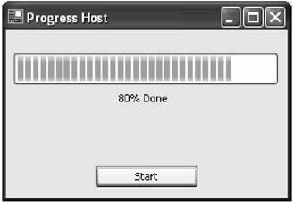
Figure 7-9 shows the Progress control in the test application. Remember, though the Progress control will appear in the Toolbox automatically, you still need to add a reference to the appropriate project. Follow these steps if you are experiencing any trouble:
Incidentally, the user can access one back door in the Progress user control: the Controls collection. If you search for the ProgressBar control by name, and modify it through the Controls collection, the label will not be refreshed. This technique relies on a string name, and is therefore not type-safe. It is strongly discouraged. When creating any custom control, it helps to remember that you are designing a genuine class. As with any class, you should decide how it will communicate with other code, and how it can encapsulate its private data before you begin writing the code. The best approach is to start by designing the control's interface. Figure 7-10 presents a UML (Unified Modeling Language) diagram that defines the interface for the Progress user control.
There are no clear rules for designing custom controls. Generally, you should follow the same guidelines that apply to any type of class in a program. Some of the basics include the following:
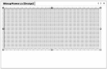
Finally, whenever possible analyze the user interface for an application as a whole. You can then decide based on that analysis what custom controls can be made to reduce the overall development effort. The Bitmap Thumbnail ViewerThe next example of user control development is a little more ambitious. It creates a series of thumbnails that show miniature versions of all the bitmap files found in a specific directory. This type of control could be created in a more flexible way, and with much more code, by using the GDI+ drawing features. Instead, this example uses control composition, and dynamically inserts a PictureBox control for every image. This makes it easier to handle image clicks and support image selection. It also previews the techniques you'll see in Chapter 11, where user interface is generated out of controls dynamically at runtime. Possibly the best aspect of the BitmapViewer user control is that it communicates with your program in both directions. You can tailor the appearance of the BitmapViewer by setting properties, and the BitmapViewer notifies your code when a picture is selected by raising an event. The design-time appearance of the BitmapViewer is unremarkable (see Figure 7-11). It contains a Panel where all the picture boxes will be added. Alternatively, the picture boxes could be added directly to the Controls collection of the user control, but the Panel allows for an attractive border around the control. It also allows automatic scrolling support—as long as AllowScroll is set to true, scrollbars are provided as soon as the image thumbnails won't fit in the Panel. As with our previous example, the Panel is anchored to all sides for automatic resizing.
Unlike the Progress control, the BitmapViewer cannot just hand off its property procedures and methods to members in one of the composite controls. Instead, it needs to retain a fair bit of its own information. The following code shows the key private variables: // The directory that will be scanned for image. private string directory = ""; // Each picture box will be a square of dimension X dimension pixels. private int dimension; // The space between the images and the top, left, and right sides. private int border = 5; // The space between each image. private int spacing; // The images that were found in the selected directory. private ArrayList images = new ArrayList(); Some of the values are user configurable, while some are not. For example, the collection of images is drawn from the referenced directory. The property procedures for the modifiable values are shown here:
public string Directory
{
 get
 {
 return directory;
 }
 set
 {
 directory = value;
 GetImages();
 UpdateDisplay();
 }
}

public int Dimension
{
 get
 {
 return dimension;
 }
 set
 {
 dimension = value;
 UpdateDisplay();
 }
}

public int Spacing
{
 get
 {
 return spacing;
 }
 set
 {
 spacing = value;
 UpdateDisplay();
 }
}
Notice that every time a value is modified, the display is automatically regenerated by calling the UpdateDisplay() method. A more sophisticated approach might make this logic depend on a property like AutoRefresh. That way, the user could temporarily turn off the refresh, make several changes at once, and then re-enable it. The set procedure for the Directory property also calls a special GetImages() method, which inspects the directory, and populates the Images collection. You might expect that the Images collection contains Image objects, but this is not the case. To provide useful event information, the BitmapViewer actually tracks the file name of every image it displays. To do this, a special NamedImage class is defined:
private class NamedImage
{
 public Image Image;
 public string FileName;

 public NamedImage(Image image, string fileName)
 {
 this.Image = image;
 this.FileName = fileName;
 }
}
The NamedImage class is a private class nested inside the BitmapViewer control class. This means that NamedImage is used exclusively by the BitmapViewer, and not made available to the application using the BitmapViewer control. The GetImages() method uses the standard .NET file and directory classes to retrieve a list of bitmaps. For each bitmap, a NamedImage object is created, and added to the Images collection.
private void GetImages()
{
 images.Clear();
 if (this.Directory != "")
 {
 DirectoryInfo dir = new DirectoryInfo(Directory);
 foreach (FileInfo file in dir.GetFiles("*.bmp"))
 {
 images.Add(new NamedImage(Bitmap.FromFile(file.FullName), file.Name));
 }
 }
}
This code stores the entire Image object in memory. To save memory, especially with large directories, it's more practical to store only the thumbnail-sized image. To do so, use the Bitmap.GetThumbnailImage() method, and then add the resulting Bitmap object to the collection. The online code samples demonstrate this technique. The bulk of the work for the BitmapViewer takes place in the UpdateDisplay() method, which generates the picture boxes, adds them to the panel, and sets their tag property with the name of the corresponding file for later reference. The BitmapViewer is filled from left to right, and then row-by-row.
private void UpdateDisplay()
{
 // Clear the current display.
 pnlPictures.Controls.Clear();

 // Row and Col will track the current position where pictures are
 // being inserted. They begin at the top-left corner.
 int row = border, col = border;

 // Iterate through the Images collection, and create PictureBox controls.
 foreach (NamedImage image in images)
 {
 PictureBox pic = new PictureBox();
 pic.Image = image.Image;
 pic.Tag = image.FileName;
 pic.Size = new Size(dimension, dimension);
 pic.Location = new Point(col, row);
 pic.BorderStyle = BorderStyle.FixedSingle;

 // StretchImage mode gives us the "thumbnail" ability.
 pic.SizeMode = PictureBoxSizeMode.StretchImage;

 // Display the picture.
 pnlPictures.Controls.Add(pic);

 // Move to the next column.
 col += dimension + spacing;

 // Move to next line if no more pictures will fit.
 if ((col + dimension + spacing + border) > this.Width)
 {
 col = border;
 row += dimension + spacing;
 }
 }

}
This code is also provided to the user through the public RefreshImages() method. This allows the user to trigger a refresh without needing to modify a property if the directory contents have changed.
public void RefreshImages()
{
 GetImages();
 UpdateDisplay();
}
The OnSizeChanged() method is also overriden to ensure that the pictures are redrawn when the user control size changes. This ensures that the pictures are automatically adjusted (in rows and columns) to best fit the new size.
protected override void OnSizeChanged(System.EventArgs e)
{
 UpdateDisplay();
 base.OnSizeChanged(e);
}
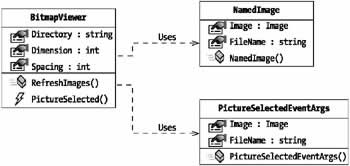
Figure 7-12 shows a stripped-down UML diagram for the BitmapViewer control, in keeping with my philosophy of clearly defining the interfaces for custom controls. This diagram omits private members and members that have been inherited. It also shows two other class dependencies: the private NamedImage class and the PictureSelectedEventArgs class, which is introduced shortly as a means of passing event data to the application that hosts the BitmapViewer.
Testing the BitmapViewerTo see the final BitmapViewer control, follow these steps:
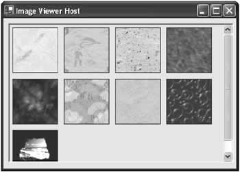
Figure 7-13 shows the BitmapViewer test project. In this example, the BitmapViewer is docked to the form so you can change the size and see the image thumbnails being reorganized. BitmapViewer EventsTo make the BitmapViewer more useful, you can add an event that fires every time a picture box is selected. Because the BitmapViewer is built entirely from PictureBox controls, which natively provide a Click event, no hit testing is required. All you need to do is register to handle the Click event when the picture box is first created in the UpdateDisplay() method. pic.Click += new EventHandler(this.pic_Click); To send an event to the application, the event must first be defined in the user control class. In this case, the event is named PictureSelected. In true .NET style, it passes a reference to the event sender and a custom EventArgs object that contains additional information. public delegate void PictureSelectedDelegate(object sender, PictureSelectedEventArgs e); public event PictureSelectedDelegate PictureSelected; The custom PictureSelectedEventArgs object follows. It provides the file name of the picture that was clicked, which allows the application to retrieve it directly for editing or some other task. Note that this class should not be private, as the client must use it to retrieve the event information.
public class PictureSelectedEventArgs : EventArgs
{
 public string FileName;
 public Image Image;

 public PictureSelectedEventArgs(String fileName, Image image)
 {
 this.FileName = fileName;
 this.Image = image;
 }
}
The PictureBox.Click event handler changes the border style of the clicked picture box to make it appear "selected." If you were using GDI+, you could draw a more flexible focus cue, like a brightly colored outline rectangle. The PictureBox.Click event handler then fires the event, with the required information.
private PictureBox picSelected;

private void pic_Click(object sender, System.EventArgs e)
{
 // Clear the border style from the last selected picture box.
 if (picSelected != null)
 {
 picSelected.BorderStyle = BorderStyle.FixedSingle;
 }

 // Get the new selection.
 picSelected = (PictureBox)sender;
 picSelected.BorderStyle = BorderStyle.Fixed3D;

 // Fire the selection event.
 PictureSelectedEventArgs args = new
 PictureSelectedEventArgs((string)picSelected.Tag, picSelected.Image);
 if (PictureSelected != nul)
 {
 PictureSelected(this, args);
 }
}
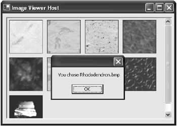
The application can now handle this event. In the example shown here (and pictured in Figure 7-14), a message box is displayed with the file name information.
private void bitmapViewer1_PictureSelected(object sender,
 BitmapThumbnailViewer.PictureSelectedEventArgs e)
{
 MessageBox.Show("You chose " + e.FileName);
}
BitmapViewer Enhancements and ThreadingIf you use the bitmap viewer with a directory that contains numerous large images, you start to notice a performance slowdown. One of the problems is that in its current form, the BitmapViewer stores the entire image in memory, even though it only displays a thumbnail. A better approach would be to scale the image immediately when it is retrieved. This is accomplished using the Image.GetThumbnail() method. In the code that follows, the GetImages() method has been rewritten to use this more memory-friendly alternative.
private void GetImages()
{
 if (Directory != "")
 {
 Image thumbnail;
 DirectoryInfo dir = new DirectoryInfo(Directory);
 foreach (FileInfo file in dir.GetFiles("*.bmp"))
 {
 thumbnail = Bitmap.FromFile(file.Name).GetThumbnailImage(
 Dimension, Dimension, null, null);
 Images.Add(new NamedImage(thumbnail, file.Name));
 }
 }

}
This technique also frees you up to use a simpler control than the PictureBox to contain the Image (or even draw it directly on the form surface), because the control no longer has to perform the scaling. However, it also means that you need to update the Dimension property procedure to call the GetImages() method— otherwise, the image objects won't be the correct size.
public int Dimension
{
 get
 {
 return dimension;
 }
 set
 {
 dimension = value;
 GetImages();
 UpdateDisplay();
 }
}
Assuming that the GetImages() method takes a significant amount of time, you might want to change the BitmapViewer to use multithreading. With this design, the GetImages() code runs on a separate thread, and then automatically calls the UpdateDisplay() method when it is completed. That way, the user interface wouldn't be tied up in the meantime. The remainder of this section walks you through the process. First, change every property procedure that calls GetImages() so that it doesn't call UpdateDisplay(). An example is shown here with the Dimension() property.
public int Dimension
{
 get
 {
 return dimension;
 }
 set
 {
 dimension = value;
 GetImages();
 UpdateDisplay();
 }
}
Next, modify the GetImages() method so it actually starts the real ReadImagesFromFile() method on a separate thread.
private void GetImages()
{
 Threading.Thread getThread = new Threading.Thread(new
 ThreadStart(this.ReadImagesFromFile));
 getThread.Start();
}
Finally, modify the file reading code and place it in the ReadImagesFromFile() method:
private void ReadImagesFromFile()
{
 lock (Images)
 {
 if (Directory != "")
 {
 Image thumbnail;
 DirectoryInfo dir = new DirectoryInfo(Directory);
 foreach (FileInfo file in dir.GetFiles("*.bmp"))
 {
 ThumbNail = Bitmap.FromFile(file.Name).GetThumbnailImage(
 Dimension, Dimension, null, null);
 Images.Add(new NamedImage(thumbnail, file.Name));
 }
 }
 }

 // Update the display on the UI thread.
 pnlpictures.Invoke(new MethodInvoker(this.UpdateDisplay));

}
Threading introduces numerous potential pitfalls and isn't recommended unless you really need it. When implementing the preceding example, you have to be careful that the UpdateDisplay() method happens on the user interface thread, not the ReadImagesFromFile() thread. Otherwise, a strange conflict could emerge in real-world use. Similarly, the lock statement is required to make sure that no other part of the control code attempts to modify the Images collection while the ReadImagesFromFile() method is in progress. |
|||||||||||||||||||||||||||||||||
Inherited ControlsInherited controls are an ideal way to take functionality from the .NET base classes, and extend it. An inherited control can be dramatically different than its predecessor, or it may just add a few refinements. The .NET class library is filled with examples of inherited controls. For example, LinkLabel derives from Label and CheckedListBox derives from ListBox. Unlike user controls, there is no design-time support for creating an inherited control. You simply create a class that derives from your selected control type and add the features you need. You'll also find that inherited controls are awkward to use in Visual Studio .NET. For example, it's difficult to add inherited controls to a form except through code. You overcome these difficulties in the next chapter by creating custom designers. Inherited controls are generally more powerful than user controls, and more likely to be used across applications (and even organizations, if you are a tool vendor), not just between different windows in the same program. Some of the reasons that programmers develop inherited controls are to set defaults (for example, a control that automatically configures its appearance in its constructor) or to add features. So far in this book, you've seen the following examples of inherited controls:
In this chapter, I'll present two more advanced inherited control examples. Inherited Controls or User Controls?So, how do you know when to create a user control, and when you need a fullfledged inherited control? It's not always an easy question to answer, because most problems can be solved with either approach. However, here are a few pointers that you should consider before embarking on a custom control project:
If you want to integrate more than one control, you have two choices: you can use composition with a user control, or you can develop two separate inherited controls. The latter approach gives you the freedom to link controls (like a TreeView and ListView), but make the links optional. The application programmer can then use them separately or together, and has complete freedom about how to integrate them into a user interface. With user controls, however, the application programmer can only control the size taken by the full user control. The DirectoryTree ControlThe DirectoryTree control inherits from the standard TreeView and adds the features needed to display a hierarchical view of directories. .NET does not include any type of native directory control, so this TreeView is genuinely useful. Perhaps most important, it fills itself by reading subdirectories "just in time." This means that the control operates very quickly, even if the drive has tens of thousands of subdirectories. Only the expanded directory levels are actually shown. The collapsed branches all have a dummy node inserted. Every time a directory branch is expanded, the inherited control checks if a dummy node is present, and, if it is, the dummy node is removed and the directories are read from the disk. (You see a variation of this technique to allow efficient data access in Chapter 9). The full code listing follows. Notice that the currently selected drive is stored as a single character string (technically, a Char). Another approach would be to use an instance of the System.IO.DirectoryInfo class to track or set the currently highlighted directory. That approach would provide better control for the application programmer, but it would complicate design-time support.
using System;
using System.IO;
using System.Windows.Forms;

public class DirectoryTree : TreeView
{
 public delegate void DirectorySelectedDelegate(object sender,
 DirectorySelectedEventArgs e);
 public event DirectorySelectedDelegate DirectorySelected;

 private Char drive;
 public Char Drive
 {
 get
 {
 return drive;
 }
 set
 {
 drive = value;
 RefreshDisplay();
 }
 }

 // This is public so a Refresh can be triggered manually.
 public void RefreshDisplay()
 {
 // Erase the existing tree.
 this.Nodes.Clear();

 // Set the first node.
 TreeNode rootNode = new TreeNode(drive + ":\");
 this.Nodes.Add(rootNode);

 // Fill the first level and expand it.
 Fill(rootNode);
 this.Nodes[0].Expand();
 }

 private void Fill(TreeNode dirNode)
 {
 DirectoryInfo dir = new DirectoryInfo(dirNode.FullPath);

 // An exception could be thrown in this code if you don't
 // have sufficient security permissions for a file or directory.
 // You can catch and then ignore this exception.

 foreach (DirectoryInfo dirItem in dir.GetDirectories())
 {
 // Add node for the directory.
 TreeNode newNode = new TreeNode(dirItem.Name);
 dirNode.Nodes.Add(newNode);
 newNode.Nodes.Add("*");
 }
 }

 protected override void OnBeforeExpand(TreeViewCancelEventArgs e)
 {
 base.OnBeforeExpand(e);

 // If a dummy node is found, remove it and read the real directory list.
 if (e.Node.Nodes[0].Text == "*")
 {
 e.Node.Nodes.Clear();
 Fill(e.Node);
 }
 }

 protected override void OnAfterSelect(TreeViewEventArgs e)
 {
 base.OnAfterSelect(e);

 // Raise the DirectorySelected event.
 if (DirectorySelected != null)
 {
 DirectorySelected(this,
 new DirectorySelectedEventArgs(e.Node.FullPath));
 }
 }
}
The base class events are handled by overriding the corresponding method (the recommended approach). The OnAfterSelect event is turned into a more useful DirectorySelected event, which provides a custom DirectorySelectedEventArgs class.
public class DirectorySelectedEventArgs : EventArgs
{
 public string DirectoryName;

 public DirectorySelectedEventArgs(string directoryName)
 {
 this.DirectoryName = directoryName;
 }
}
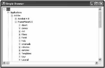
Testing the DirectoryTreeTo test the DirectoryTree, you can add it to the Toolbox, or you can add a project reference and programmatically add it to a form, which is the approach our simple test form will take. Make sure that you set the initial drive when using the control, or the display will be blank. The following code snippet creates, configures, and displays the DirectoryTree control on a form. Figure 7-15 shows the results.
private void Form1_Load(object sender, System.EventArgs e)
{
 DirectoryTreeControl.DirectoryTree dirTree = new
 DirectoryTreeControl.DirectoryTree();
 dirTree.Size = new Size(this.Width - 30, this.Height - 60);
 dirTree.Location = new Point(5, 5);
 dirTree.Drive = Char.Parse("C");
 this.Controls.Add(dirTree);
}
Another option is to follow the steps outlined at the beginning of this chapter, which allow you to add the DirectoryTree to the Toolbox and configure it at design-time. The DirectoryTree could have been created as a user control, but the inheritance approach provides far more flexibility. For example, all the original TreeView events, properties, and methods are still available to the client code. Images can be assigned, the Nodes collection can be traversed, and restricted directories could have their nodes removed. Best of all, you don't need to write any code to delegate the properties of your custom control class to an underlying control. Clearly, inherited controls provide a far greater level of flexibility. A Masked TextBox ControlThe final inherited control example is one for a custom masked text box. A masked text box is one that automatically formats the user's input into the correct format. For example, it may add dashes or brackets to make sure it looks like a phone number. This task is notoriously difficult. One useful tool is Microsoft's masked edit text box, which is provided as an ActiveX control with previous versions of Visual Studio. The example of a masked text box is important because it demonstrates how features (rather than data) might be added to an existing control by subclassing. The example I provide is still quite limited-notably, it restricts deletions and the use of the arrow keys. Tracking the cursor position, which is required to allow inline masked edits, results in a good deal of tedious code that only obscures the point. Here's the full class code for the masked text box:
using System;
using System.Windows.Forms;

public class MaskedTextBox : TextBox
{
 private string mask;
 public string Mask
 {
 get
 {
 return mask;
 }
 set
 {
 mask = value;
 this.Text = "";
 }
 }

 protected override void OnKeyPress(KeyPressEventArgs e)
 {
 if (Mask != "")
 {
 // Suppress the typed character.
 e.Handled = true;

 string newText = this.Text;

 // Loop through the mask, adding fixed characters as needed.
 // If the next allowed character matches what the user has
 // typed in (a number or letter), that is added to the end.
 bool finished = false;
 for (int i = this.SelectionStart; i < mask.Length; i++)
 {
 switch (mask[i].ToString())
 {
 case "#" :
 // Allow the keypress as long as it is a number.
 if (Char.IsDigit(e.KeyChar))
 {
 newText += e.KeyChar.ToString();
 finished = true;
 break;
 }
 else
 {
 // Invalid entry; exit and don't change the text.
 return;
 }
 case "." :
 // Allow the keypress as long as it is a letter.
 if (Char.IsLetter(e.KeyChar))
 {
 newText += e.KeyChar.ToString();
 finished = true;
 break;
 }
 else
 {
 // Invalid entry; exit and don't change the text.
 return;
 }
 default :
 // Insert the mask character.
 newText += mask[i];
 break;
 }
 if (finished)
 { break; }
 }

 // Update the text.
 this.Text = newText;
 this.SelectionStart = this.Text.Length;
 }
 }

 protected override void OnKeyDown(KeyEventArgs e)
 {
 // Stop special characters.
 e.Handled = true;
 }
}
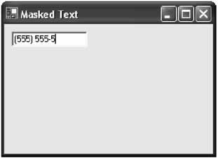
To use the masked control, the application programmer chooses a mask and applies it to the Mask property of the control. The number sign (#) represents any number, and the period (.) represents any letter. All other characters in the mask are treated as fixed characters, and are inserted automatically when needed. For example, in the phone number mask (###) ###-#### the first bracket is inserted automatically when the user types the first number. Figure 7-16 shows this mask in action.
private void Form1_Load(object sender, System.EventArgs e)
{
 MaskedTextBoxControl.MaskedTextBox txtMask = new
 MaskedTextBoxControl.MaskedTextBox();
 txtMask.Location = new Point(10, 10);
 txtMask.Mask = "(###) ###-####";
 this.Controls.Add(txtMask);
}
|
|||||||||||||||
Custom Extender ProvidersExtender providers were first introduced in Chapter 4 as interesting components that extend other controls. Examples are the ToolTipProvider, which displays a tooltip next to other controls; the ErrorProvider, which displays an error icon; and the HelpProvider, which invokes context-sensitive Help on a control's behalf when the F1 key is pressed. Providers tend to be specialized solutions, and you may design dozens of custom controls before even contemplating a custom provider. Nonetheless, custom providers can achieve some remarkable tricks. In this section, I demonstrate two extender providers, one that mimics the old-fashioned MFC behavior of menu Help text, and another that displays a clickable Help icon. Both of these classes are found in the ExtenderProviderControls project provided with the online samples. The test applications can be found in the ExtenderProviderHost project.
The Menu Text ProviderThe MenuTextProvider extends ordinary menus by associating each item with a unique Help string. When the user hovers over a menu item, the MenuTextProvider displays the appropriate Help string. This is a common user interface convention I've mentioned before, and while it's not very useful for the average user, it does provide a good introduction to extender providers. Choosing a base class The first step when creating an extender provider is to create a class that implements the IExtenderProvider interface and uses the ProvideProperty attribute (both of these types are found in the System.ComponentModel interface). This can be any type of class, including a user control, inherited control, or just a basic Component class that doesn't derive from any control. The type of class depends on the type of provider you are creating. A control-based provider, like the MenuTextProvider, uses a dedicated control to display information in a specific location on a form. In this example, the MenuTextProvider inherits from the StatusBar class. This means you can add the MenuTextProvider to any form, and it will act as an ordinary status bar and update its display to provide the appropriate text automatically. Another possible approach would be to derive the provider from the StatusBarPanel class. You could then add it to an existing status bar. Choosing the object to extend Once you've decided what type of provider you are creating, your next decision is to determine the type of object that you are extending. Many providers extend any type of Windows control, while some are limited to specific classes. To specify the appropriate type of object, you need to handle the IExtenderProvider.CanExtend() method. In this method, you look at the supplied type of object, and then make a decision about whether or not it can be extended by your provider. To make this decision you can evaluate any information about the target, including the type (the most common criteria), whether it is hosted in another control or on a form, and even its name. You return true if the object can be extended. The MenuTextProvider only extends the MenuItem object. Here's the code that enforces this restriction:
public class MenuTextProvider : StatusBar, IExtenderProvider
{
 public bool CanExtend(object extendee)
 {
 if (extendee.GetType() == typeof(MenuItem))
 {
 return true;
 }
 else
 {
 return false;
 }
 }
}
Providing an extended property The next step is to identify the property that will be assigned to all extended controls. You do this by adding a ProvideProperty attribute just before your class declaration. The ProvideProperty attribute identifies the property name and the data type.
[ProvideProperty("HelpText", typeof(string))]
public class MenuTextProvider : StatusBar, IExtenderProvider
Once you've specified a property in this fashion, you need to provide corresponding Get and Set methods that perform the actual work when the property is changed. These members are preceded with "Get" or "Set" and use the same name you identified in the ProvidePoperty attribute. These methods must be public.
public void SetHelpText(object extendee, string value)
{
 // (Code omitted.)
}

public string GetHelpText(object extendee) As String
{
 // (Code omitted.)
}
Note that the GetProperty() method accepts a reference to the target and the SetProperty() method accepts a reference to the target and a value for the property. Keep in mind that a single instance of your extender can be reused to extend dozens of controls (and, conversely, two similar providers can extend the same control). This means that you need to keep track of all the extended controls in a collection. Our examples use the Hashtable class for this purpose, because it allows the object reference to be used as a key. (Remember, MenuItem objects are not controls, and do not have a unique Name property that can be used as a key). The completed provider To complete the MenuTextProvider, create a collection to store the Help text values for every extended control, and add the implementation logic for the SetHelpText() and GetHelpText() methods. When the Help text is set, the provider registers to receive the Select event from the MenuItem and stores the Help text in the collection under the name of the control. When the Select event occurs, the Help text is retrieved and displayed in the status bar panel. We could just as easily monitor different events (like key presses, as the HelpProvider control does). Here's the complete code:
using System;
using System.Windows.Forms;
using System.ComponentModel;
using System.Collections;

[ProvideProperty("HelpText", typeof(string))]
public class MenuTextProvider : StatusBar, IExtenderProvider
{
 public bool CanExtend(object extendee)
 {
 if (extendee.GetType() == typeof(MenuItem))
 {
 return true;
 }
 else
 {
 return false;
 }
 }

 private Hashtable helpText = new Hashtable();

 public void SetHelpText(object extendee, string value)
 {
 // Specifying an empty value removes the extension.
 if (value == "")
 {
 helpText.Remove(extendee);
 MenuItem mnu = (MenuItem)extendee;
 mnu.Select -= new EventHandler(MenuSelect);
 }
 else
 {
 helpText[extendee] = value;
 MenuItem mnu = (MenuItem)extendee;
 mnu.Select += new EventHandler(MenuSelect);
 }
 }

 public string GetHelpText(object extendee)
 {
 if (helpText[extendee] != null)
 {
 return helpText[extendee].ToString();
 }
 else
 {
 return string.Empty;
 }
 }

 private void MenuSelect(object sender, System.EventArgs e)
 {
 this.Text = helpText[sender].ToString();
 }
}
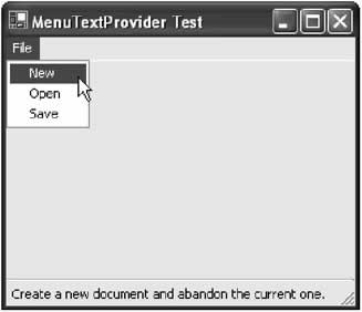
You can set the Help text for a menu item with the SetHelpText() method (see Figure 7-17): menuTextProvider1.SetHelpText(mnuNew, " Create a new document and abandon the current one.");
The Help Icon ProviderIn many ways, the next example is a more typical provider because it extends other controls without being a control itself. Instead, it derives from the System.ComponentModel.Component class. The HelpIconProvider retrieves a reference to the form that contains the control and adds a miniature PictureBox control with a question mark icon in it. It also registers for the DoubleClick event for the picture box. If this occurs, a Help file is launched, with the specified context identifier for the control. The name of the Help file is global to the provider, and specified through a standard HelpFile property. To further refine the control, you could handle more events from the dynamically generated picture box, perhaps tailoring the mouse cursor when it is positioned over it.
using System;
using System.Windows.Forms;
using System.ComponentModel;
using System.Collections;
using System.Drawing;

[ProvideProperty("HelpID", typeof(string))]
public class HelpIconProvider : Component, IExtenderProvider
{
 private Hashtable contextID = new Hashtable();
 private Hashtable pictures = new Hashtable();
 private string helpFile;

 public bool CanExtend(object extendee)
 {
 if (extendee.GetType() == typeof(Control))
 {
 // Ensure the control is attached to a form.
 if (((Control)extendee).FindForm() == null)
 {
 return false;
 }
 else
 {
 return true;
 }
 }
 else
 {
 return false;
 }
 }

 public string HelpFile
 {
 get
 {
 return helpFile;
 }
 set
 {
 helpFile = value;
 }
 }

 public void SetHelpID(object extendee, string value)
 {
 Control ctrl = (Control)extendee;
 // Specifying an empty value removes the extension.
 if (value == "")
 {
 contextID.Remove(extendee);

 // Remove the picture.
 PictureBox pic = (PictureBox)pictures[extendee];
 pic.DoubleClick -= new EventHandler(PicDoubleClick);

 pic.Parent.Controls.Remove(pic);
 pictures.Remove(extendee);
 }
 else
 {
 contextID[extendee] = value;

 // Create new icon.
 PictureBox pic = new PictureBox();
 pic.Image = Image.FromFile("Help.gif");

 // Store a reference to the related control in the PictureBox.
 pic.Tag = extendee;

 pic.Size = new Size(16, 16);
 pic.Location = new Point(ctrl.Right + 10, ctrl.Top);
 ctrl.Parent.Controls.Add(pic);

 // Register for DoubleClick event.
 pic.DoubleClick += new EventHandler(PicDoubleClick);

 // Store a reference to the help icon so we can remove it later.
 pictures[extendee] = pic;
 }
 }

 public string GetHelpID(object extendee)
 {
 if (contextID[extendee] != null)
 {
 return contextID[extendee].ToString();
 }
 else
 {
 return String.Empty;
 }
 }

 public void PicDoubleClick(object sender, EventArgs e)
 {
 // Invoke help for control.
 Control ctrlRelated = (Control)((Control)sender).Tag;
 Help.ShowHelp(ctrlRelated, helpFile, HelpNavigator.Topic,
 contextID[ctrlRelated].ToString());
 }

}
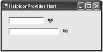
It's important to note that if you don't have a valid Help file and context identifier, nothing will happen when you click the Help icon. For this reason, the code download for this sample includes a message box that pops up to let you know the event has been detected. You will find out much more about the Help class this control uses to invoke the Help engine in Chapter 14. To invoke this control, just specify a global Help file for the provider and set a Help context ID for a specific control. Figure 7-18 shows the HelpIconProvider in action.
private void HelpIconHost_Load(object sender, System.EventArgs e)
{
 helpIconProvider1.HelpFile = "myhelp.hlp";
 helpIconProvider1.SetHelpID(TextBox1, "10001");
 helpIconProvider1.SetHelpID(TextBox2, "10002");
}
One limitation with this provider is that it reads the image it displays from a file. That means that every client who uses the provider control also requires the Help icon picture in the project directory directory. The next chapter demonstrates a better approach that embeds the picture as a resource, so it can't be lost. |
||||||||||||||||||||||||
The Last WordThis chapter considered one of the most important ingredients in advanced user interfaces: custom controls. You learned how to master user interface controls, and equip them with useful properties, methods, and events. You also learned about inherited controls and the different model they provide. One topic that hasn't been considered in great detail is Visual Studio .NET's sometimes quirky design-time support of custom controls. In order to improve on this, I take the same collection of controls to the next chapter, and develop the designers and type editors that allow them to behave properly in the IDE. |
|||||||||||||||
Design Time Support for Custom Controls |
|||||||||||||||
Introduction
 Windows Forms and Custom Controls")
EAN: 2147483647
Pages: 142
- Chapter I e-Search: A Conceptual Framework of Online Consumer Behavior
- Chapter III Two Models of Online Patronage: Why Do Consumers Shop on the Internet?
- Chapter X Converting Browsers to Buyers: Key Considerations in Designing Business-to-Consumer Web Sites
- Chapter XVI Turning Web Surfers into Loyal Customers: Cognitive Lock-In Through Interface Design and Web Site Usability
- Chapter XVII Internet Markets and E-Loyalty
