Analysis of the GDI+ Extensions Requirements
 |
The analysis of the requirements for this chapter also includes the F:photo_editor requirement key. The reason is that to access the functionality described in the two keys just described, the selection must be made from within the photo editor application. Therefore, the GUI must be adapted to reflect these additional buttons. |
As with all the requirements gathering and analysis, this update of the GUI should be done in close collaboration with the customer. Defining the GUI is probably the most important task because the GUI is what the customer and users will experience first. In addition, developing a solid GUI definition will eliminate a lot of possible ambiguity regarding the functionality of the business logic (or, in our case, the image-processing part). This is because the GUI defines the possible ways a user can access the business logic. For example, consider the rotation feature implemented in Chapter 5. The buttons allow the user to rotate the image only in 90 degree steps clockwise or counterclockwise. This in turn enables the developer to use the system-provided RotateFlipType instead of implementing a customized rotate feature that would allow for arbitrary rotation angles.
6.2.1 The photo_editor Requirement
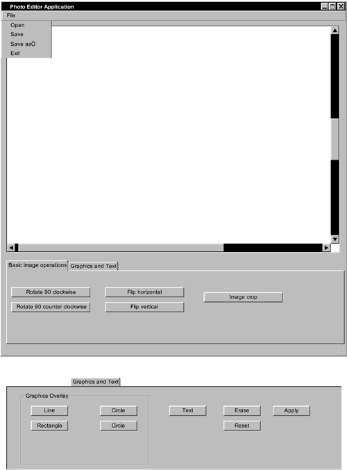
Figure 6.1 shows the changes to the GUI. To access the new functionality, we add a new tab to the existing tab control. The layout of the new tab is shown in the lower part of the figure.
Figure 6.1. The Photo Editor GUI
6.2.2 The image_graphics_annotations Requirement
Users can add a graphics overlay element to the image by selecting one of the buttons for the shapes. If a shape is selected, a left mouse click within the image will put the start point of the shape at the selected position. The start point for a line is simply the first point of the line, whereas the start point for a rectangle is the upper-left corner, and for a circle it is the upper-left point of the enclosing rectangle. By moving the mouse while pressing down on the left mouse button, users can resize the shape. The new mouse location relative to the start point will define the new size of the shape. When the mouse button is released, the shape is drawn on top of the image.
The shapes are drawn in black, with a default line thickness of 2. The application will be able to call one draw method to draw all the primitives without having to distinguish between them. Users can erase any drawn primitive by using the erase tool and clicking the mouse button within a ±5-pixel area of the start or end point. To make the changes to the bitmap permanent, users use the Apply button to "burn" the graphics onto the bitmap. In addition, a Reset button is provided to enable the user to revert to the originally loaded image.
6.2.3 The image_text_annotations Requirement
Users will add text overlays to the image by selecting the Text button. After selecting the text overlay, users add text to the image by clicking within the image to open a dialog box. The dialog box displays a field where the user can enter text, which is drawn after the OK button is applied. The position selected with the mouse corresponds to the upper-left corner of the first letter of the text to be inserted. The text uses the default font and size, and its color is black.
Introducing .NET
- Introducing .NET
- The Need for .NET
- The .NET Framework
- The C# Language
- Debugging and the IDE
- References for Further Reading
Introducing Software Engineering
- Introducing Software Engineering
- Introducing Software Engineering Practices
- Choosing a Software Development Model
- Commonly Used Software Development Models
- Conclusion
- References for Further Reading
A .NET Prototype
- Getting Started
- Evaluating .NET for Windows Client Applications
- Our First .NET Application
- Prototyping
- Implementing the SmartNotes Application
- Visual Studio.NET: Platform of Choice
- References for Further Reading
Project Planning
- Project Planning
- The Project Vision and Business Case
- The Initial Use Case Model
- Project Requirements
- Initial Project Planning
- Initial Risk Analysis
- Initial Requirements Analysis and Design
- Conclusion
- References for Further Reading
The Photo Editor Application
- The Photo Editor Application
- The Refined Project Vision and Business Case
- Refined Requirements for Online Photo Shop
- Analysis of the Photo Editor Requirements
- Design of the Photo Editor Application
- The Detailed Project Schedule
- Implementation of the Photo Editor Application
- Unit Tests
- Conclusion
- References for Further Reading
GDI+ Graphics Extensions
- GDI+ Graphics Extensions
- Requirements for the GDI+ Extensions
- Analysis of the GDI+ Extensions Requirements
- Design of the GDI+ Extensions
- Project Management Issues
- GDI+ Programming
- Drawing GDI+ Primitives
- Unit Tests
- Conclusion
- References for Further Reading
Advanced GDI+ Operations
- Advanced GDI+ Operations
- Advanced GDI+ Extensions
- Analysis of the Advanced GDI+ Extensions Requirements
- Design of the Advanced GDI+ Extensions
- Project Management Issues
- Using Pens and Brushes in GDI+
- Implementation of Regions, Pens, and Brushes
- Unit Tests
- Conclusion
Dynamic Loading of Components
- Dynamic Loading of Components
- Requirements for Image Postprocessing Components
- Analysis of the Image Postprocessing Requirements
- Design of the Image-Processing Components Using Late Binding
- Project Management Issues
- Implementing Dynamically Loadable Image Postprocessing Plugins
- Unit Tests
- Conclusion
- References for Further Reading
Accessing System Resources
- Accessing System Resources
- Refining Requirements for 3D Text Display
- Three-Dimensional Rendering Technologies
- Analyzing User Interface Needs
- Using OpenGL.NET
- Adding 3D Text to the Photo Editor Application
- Conclusion: Dont Reinvent the Wheel
- References for Further Reading
Performance Optimization, Multithreading, and Profiling
- Performance Optimization, Multithreading, and Profiling
- Requirements for Performance Optimization
- Analysis of the Editor Optimization Requirement
- Design of the Optimizations
- Project Management Issues
- Multithreading and Optimization Implementation
- Unit Tests
- Conclusion
- References for Further Reading
Building the Web Application with ASP.NET
- Building the Web Application with ASP.NET
- Online Store Requirements
- Analyzing Interfaces and Activities
- Breakdown of the Code Modules
- Implementation of Online Photo Shop
- Conclusion
Security and Database Access
- Security and Database Access
- Secure Checkout
- Integrating Externally Supplied Software
- E-mail, Password, Credit Card: Creating a Customer Profile
- Secure Web Applications
- Database Access with ADO.NET
- Putting It All Together
- No Longer under Construction
- References for Further Reading
Product Release
EAN: 2147483647
Pages: 123
