Centering Type
Center alignment is widely used in magazine design for crossheads and in book design for title pages. When chosen consciously centering can be extremely effective; when chosen as a "default" or fall-back option, it can make layouts appear stodgy or generic. At its best, it is formal and classical; at its worst, it is static and conventional, andif you are centering whole paragraphsit is less readable. The potential pitfall of centered type is that the even amount of white space on either side of the heading can create a symmetry that may be at odds with asymmetrical nature of the ragged right text. Centering is also commonly associated with birth announcements, wedding invitations, and…gravestones.
Guidelines for Centering Type
- When centering display type over left-aligned body text, you may need to tweak the alignment to compensate for the type looking off center if the display type is followed by a line of ragged type that does not fill the full measure.
Figure 8.4. Center alignment used for poetry.
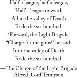
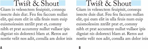
Figure 8.5. A static Center alignment (example A) and a more dynamic Left alignment (example B).

Figure 8.6. Optically centering a headline. In example A, the headline is mathematically centered. In example B, the headline has been optically centeredby adding a small amount of right indentover the first line of type.
- Avoid using an italic headline over roman type because the slant of the italic can make the headline appear off-center.
- Centered lines that begin or end with punctuation may look off-center and require optical centering.
- Avoid centering paragraphs with too many lines, especially on a wide measure, because it is harder to find the beginning of the next line.
- Break lines into phrases that make sense.
Part I: Character Formats
Getting Started
- Getting Started
- An InDesign Type Map: Where to Find Stuff
- Viewing Your Page
- Creating a Typography Workspace
- Up Next
Going with the Flow
- Going with the Flow
- A Blank Sheet: Typing on Your Page
- Text Flow
- Threading Text Frames
- Using Placeholder Text
- Pasting Text
- Importing Word Text
- Up Next
Character Reference
- Character Reference
- Less is More, Maybe
- Type Anatomy
- Type Classification
- Character Formatting Options
- Readability
- Up Next
Getting the Lead Out
- Getting the Lead Out
- How Much Is Enough?
- (Not) Using Auto Leading
- Keep It Consistent, Except. . .
- Leading Menu Options and Keyboard Shortcuts
- See Also
- Up Next
Kern, Baby, Kern
- Kern, Baby, Kern
- When to Kern
- Metrics Kerning
- Optical Kerning
- Manual Kerning
- How Much to Kern
- Tracking
- When to Track
- Controlling Widows and Orphans
- Up Next
Sweating the Small Stuff: Special Characters, White Space, and Glyphs
- Sweating the Small Stuff: Special Characters, White Space, and Glyphs
- Typographers Quotes
- Apostrophes
- Dashes
- Ellipses
- End Marks
- White Space Characters
- The Glyphs Palette
- Footnotes
- Footnote Options
- Up Next
OpenType: The New Frontier in Font Technology
- OpenType: The New Frontier in Font Technology
- Ligatures
- Discretionary Ligatures
- Ordinals/Raised and Lowered Characters
- Swash Characters
- Fractions
- Oldstyle Figures
- Contextual Alternates
- Opticals
- Glyph Positioning
- Stylistic Sets
- Up Next
Part II: Paragraph Formats
Aligning Your Type
- Aligning Your Type
- Centering Type
- Clean Shaven or Rugged: Justified vs. Ragged Type
- How InDesign Justifies Type
- Balancing Ragged Lines
- Right-Aligned Type
- Optical Margin Alignment
- Indent to Here
- Vertical Alignment
- Up Next
Paragraph Indents and Spacing
First Impressions: Creating Great Opening Paragraphs
- First Impressions: Creating Great Opening Paragraphs
- Creating a Simple Drop Cap
- Drop Cap Aesthetics
- Tricks with Drop Caps
- Up Next
Dont Fear the Hyphen
Mastering Tabs and Tables
- Mastering Tabs and Tables
- Setting Tabs
- Creating Decimal Tabs
- Using Tab Leaders
- Reply Forms
- Numbered Lists
- Right Indent Tab
- Working with Tables
- Creating a Table
- Working with Rows and Columns
- Working with Table Cells
- Up Next
Part III: Styles
Stylin with Paragraph and Character Styles
- Stylin with Paragraph and Character Styles
- Creating Styles
- Applying Styles
- Editing Styles
- Redefining Styles
- Creating Default Styles
- A Typical Style Sheet
- Up Next
Mo Style
Part IV: Page Layout
Setting Up Your Document
- Setting Up Your Document
- Choosing a Page Size
- Determining Margins
- Determining Column Width
- Changing Columns
- Break Characters
- Page Numbers
- Section Markers
- Up Next
Everything in Its Right Place: Using Grids
- Everything in Its Right Place: Using Grids
- Things to Consider
- Your Grid Tool Kit
- Calculating the Height of the Type Area
- Align to Grid
- First Baseline Options
- Snap to Guides
- Up Next
Text Wraps: The Good, the Bad, and the Ugly
- Text Wraps: The Good, the Bad, and the Ugly
- Applying Text Wraps
- Wrapping Type Around Irregularly Shaped Graphics
- Text Wrap Preferences
- Ignoring Text Wrap
- Anchored Objects
- Up Next
Type Effects
EAN: 2147483647
Pages: 186
