Cluttering the Display with Useless Decoration
Another common problem on the dashboards that I find on vendor web sites is the abundance of useless decoration. They either hope that we will be drawn in by the artistry or assume that the decorative flourishes are necessary to entertain us. I assure you, however, that even people who enjoy the decoration upon first sight will grow weary of it in a few days.
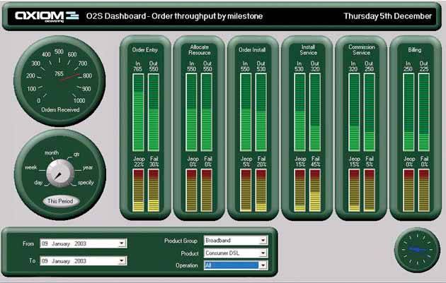
The makers of the dashboard in Figure 3-28 did an exceptional job of making it look like an electronic control panel. If the purpose were to train people in the use of some real equipment by means of a simulation, this would be great, but that isn't the purpose of a dashboard. The graphics dedicated to this end are pure decoration, visual content that the viewer must process to get to the data.
Figure 3-28. This dashboard is trying to look like something that it is not, resulting in useless and distracting decoration.
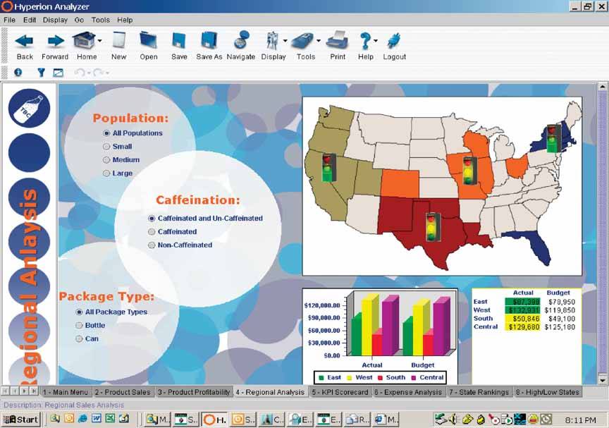
I suspect that the dashboard in Figure 3-29 looked too plain to its designer, so she decided to make it look like a page in a spiral-bound bookcute, but a distracting waste of space.
Figure 3-29. This dashboard is another example of useless decorationthe designer tried to make the dashboard look like a page in a spiral-bound notebook.
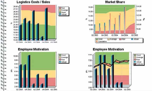
Likewise, I'd guess that the designer of the dashboard in Figure 3-30after creating a map, a bar graph, and a table that all display the same datadecided that he had to fill up the remaining space, so he went wild with an explosion of blue and gray circles. Blank space is better than meaningless decoration. Can you imagine yourself looking at this every day?
Figure 3-30. This dashboard is a vivid example of distracting ornamentation.
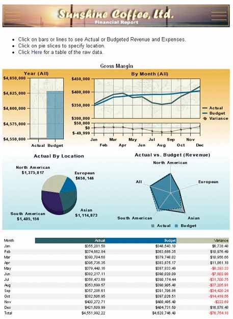
The last example, Figure 3-31, includes several elements of decoration that ought to be eliminated. To begin with, a visually ornate logo and title use up the most valuable real estate across the entire top of the dashboard. If a logo must be included for branding purposes, make it small and visually subtle, and place it somewhere out of the way. The background colors of gold and blue certainly draw our eyes to the data, but they do so in an unnecessarily heavy-handed manner. Also, the color gradients from dark to light provide visual interest that supports no real purpose and is therefore distracting. Lastly, the maps in the background of the three upper graphs, though visually muted, still distract from the data itself.
Figure 3-31. This dashboard exhibits several examples of dysfunctional decoration.
As data visualization expert Edward Tufte observes:
Inept graphics also flourish because many graphic artists believe that statistics are boring and tedious. It then follows that decorated graphics must pep up, animate, and all too often exaggerate what evidence there is in the data… If the statistics are boring, then you've got the wrong numbers.
Note: Edward R. Tufte, The Visual Display of Quantitative Information (Cheshire, CT: Graphics Press, 1983), 80.
Clarifying the Vision
- Clarifying the Vision
- All That Glitters Is Not Gold
- Even Dashboards Have a History
- Dispelling the Confusion
- A Timely Opportunity
Variations in Dashboard Uses and Data
Thirteen Common Mistakes in Dashboard Design
- Thirteen Common Mistakes in Dashboard Design
- Exceeding the Boundaries of a Single Screen
- Supplying Inadequate Context for the Data
- Displaying Excessive Detail or Precision
- Choosing a Deficient Measure
- Choosing Inappropriate Display Media
- Introducing Meaningless Variety
- Using Poorly Designed Display Media
- Encoding Quantitative Data Inaccurately
- Arranging the Data Poorly
- Highlighting Important Data Ineffectively or Not at All
- Cluttering the Display with Useless Decoration
- Misusing or Overusing Color
- Designing an Unattractive Visual Display
Tapping into the Power of Visual Perception
- Tapping into the Power of Visual Perception
- Understanding the Limits of Short-Term Memory
- Visually Encoding Data for Rapid Perception
- Gestalt Principles of Visual Perception
- Applying the Principles of Visual Perception to Dashboard Design
Eloquence Through Simplicity
- Eloquence Through Simplicity
- Characteristics of a Well-Designed Dashboard
- Key Goals in the Visual Design Process
Effective Dashboard Display Media
- Effective Dashboard Display Media
- Select the Best Display Medium
- An Ideal Library of Dashboard Display Media
- Summary
Designing Dashboards for Usability
- Designing Dashboards for Usability
- Organize the Information to Support Its Meaning and Use
- Maintain Consistency for Quick and Accurate Interpretation
- Make the Viewing Experience Aesthetically Pleasing
- Design for Use as a Launch Pad
- Test Your Design for Usability
Putting It All Together
EAN: 2147483647
Pages: 80
