Displaying Excessive Detail or Precision
Dashboards almost always require fairly high-level information to support the viewer's need for a quick overview. Too much detail, or measures that are expressed too precisely (for example, $3,848,305.93 rather than $3,848,305, or perhaps even $3.8M), just slow viewers down without providing them any benefit. In a way, this problem is the opposite extreme of the one we examined in the previous sectiontoo much information rather than too little.
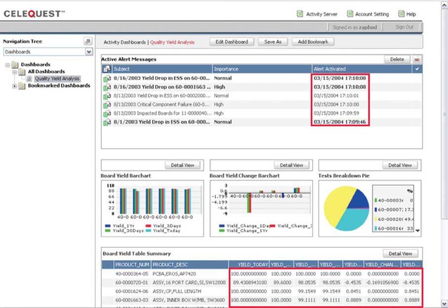
The dashboard in Figure 3-6 illustrates this type of excess. Examine the two sections that I've enclosed in red rectangles. The lower-right section displays from 4 to 10 decimal digits for each measure, which might be useful in some contexts, but doubtfully in a dashboard. The highlighted section above displays time down to the level of seconds, which also seems like overkill in this context. With a dashboard, every unnecessary piece of information results in time wasted trying to filter out what's important, which is intolerable when time is of the essence.
Figure 3-6. This dashboard shows unnecessary detail, such as times expressed to the second and measures expressed to 10 decimal places.
Clarifying the Vision
- Clarifying the Vision
- All That Glitters Is Not Gold
- Even Dashboards Have a History
- Dispelling the Confusion
- A Timely Opportunity
Variations in Dashboard Uses and Data
Thirteen Common Mistakes in Dashboard Design
- Thirteen Common Mistakes in Dashboard Design
- Exceeding the Boundaries of a Single Screen
- Supplying Inadequate Context for the Data
- Displaying Excessive Detail or Precision
- Choosing a Deficient Measure
- Choosing Inappropriate Display Media
- Introducing Meaningless Variety
- Using Poorly Designed Display Media
- Encoding Quantitative Data Inaccurately
- Arranging the Data Poorly
- Highlighting Important Data Ineffectively or Not at All
- Cluttering the Display with Useless Decoration
- Misusing or Overusing Color
- Designing an Unattractive Visual Display
Tapping into the Power of Visual Perception
- Tapping into the Power of Visual Perception
- Understanding the Limits of Short-Term Memory
- Visually Encoding Data for Rapid Perception
- Gestalt Principles of Visual Perception
- Applying the Principles of Visual Perception to Dashboard Design
Eloquence Through Simplicity
- Eloquence Through Simplicity
- Characteristics of a Well-Designed Dashboard
- Key Goals in the Visual Design Process
Effective Dashboard Display Media
- Effective Dashboard Display Media
- Select the Best Display Medium
- An Ideal Library of Dashboard Display Media
- Summary
Designing Dashboards for Usability
- Designing Dashboards for Usability
- Organize the Information to Support Its Meaning and Use
- Maintain Consistency for Quick and Accurate Interpretation
- Make the Viewing Experience Aesthetically Pleasing
- Design for Use as a Launch Pad
- Test Your Design for Usability
Putting It All Together
EAN: 2147483647
Pages: 80
- Chapter I e-Search: A Conceptual Framework of Online Consumer Behavior
- Chapter V Consumer Complaint Behavior in the Online Environment
- Chapter XIII Shopping Agent Web Sites: A Comparative Shopping Environment
- Chapter XIV Product Catalog and Shopping Cart Effective Design
- Chapter XVIII Web Systems Design, Litigation, and Online Consumer Behavior
