Chapter 22. Preventing a Nav Bar from Breaking
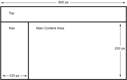
| When you're designing a layout table, it's only natural to think in terms of the fewest number of cells. It's easier on the design software, it's easier on your coders, and, most importantly, it's easier on you. Depending on what element of the page goes where, you might be able to get away with a layout like the one in Figure 22.1. Just fill the cells with the appropriate content, let the table expand vertically to infinity, upload to the Web, and call it a day. Listing 22.1. View Source for Figure 22.1.<table width="600"> <tr> <td colspan="2">Top</td> </tr> <tr> <td width="125">Nav</td> <td height="250">Main Content Area</td> </tr> </table> Figure 22.1. A simple layout like this can save you time and effort.
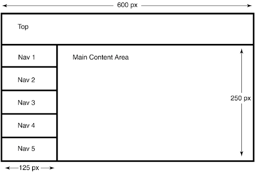
In the spirit of simplicity, you might be tempted to break the cell on the left into discrete rows for nav-bar buttons using the rowspan attribute, as in Figure 22.2. Figure 22.2. To keep things nice and simple, you might try to break the cell on the left into rows for nav-bar buttons.
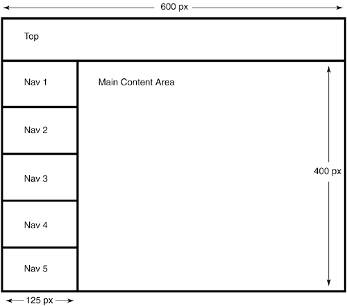
The layout in Figure 22.2 works as long as you know beforehand the height of the main content area. (In this case, the height is 250 pixels.) This height value isn't always easy to xguess. Maybe your design needs to service a number of different pages, each having a different amount of content. Maybe your site will change in the future, and the design needs to be flexible enough to deal with variable amounts of content. Listing 22.2. View Source for Figure 22.2.<table width="600"> <tr> <td colspan="2">Top</td> </tr> <tr> <td width="125">Nav 1</td> <!-- Here comes the cell with the rowspan --> <td height="250" rowspan="5">Main Content Area</td> </tr> <tr> <td>Nav 2</td> </tr> <tr> <td>Nav 3</td> </tr> <tr> <td>Nav 4</td> </tr> <tr> <td>Nav 5</td> </tr> </table> Even if you have this all figured out, remember the old saying about the best laid plans. A user will probably come along with his browser's default text option cranked up to Largest. Better yet, he'll use his own style sheet with some obscure font. Someone out there will find some way to push the borders of the layout beyond the height you specified in the design. Figure 22.3 shows you what happens. As the height of the main content area increases, the heights of all the nav-bar cells increase to keep step. Figure 22.3. As the height of the main content area increases, the heights of the nav-bar cells keep pace.
It might not seem like too big of a deal in the abstract, but look at Figure 22.4. Notice how the buttons of the nav bar spread out when the main content area pushes past the maximum height. The white background of the page shows through the gaps in the design, giving you an unsightly mess. Figure 22.4. Too much content causes the nav bar to break.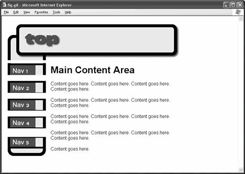 This is a problem for at least two reasons. First, it ruins the consistency of your site's design. Your users are impatient people, and they don't want to have to search each new page for the location of the right nav button. They want it to stay in the exact same place from page to page. Second, your bottommost nav-bar buttons might disappear below the fold. Users don't want to have to scroll to find the main navigation of your page. Your navigation should be clear and immediately accessible throughout your site. Why does the nav bar break? Blame it on the rowspan. Check out Listing 22.2, and notice that the td tag of the main content area is the one that gets the attribute rowspan="5". In other words, the main content area spans the five nav-button cells in the layout table, which means that the heights of the nav-button cells depend entirely on the height of the main content area. Naturally, as the content area changes size, the rows that span ityour nav-bar cellschange size proportionately. So that's the problem. You might try fixing it by specifying heights for each of the five nav-bar cells, but, alas, that approach doesn't work. The browser automatically pads the nav-bar cells to force them to span the content area, no matter what height values you give. As soon as the main content area exceeds your predetermined height, the browser ignores the height value of this cell and the heights of the spanned rows, and your nav bar breaks anyway.
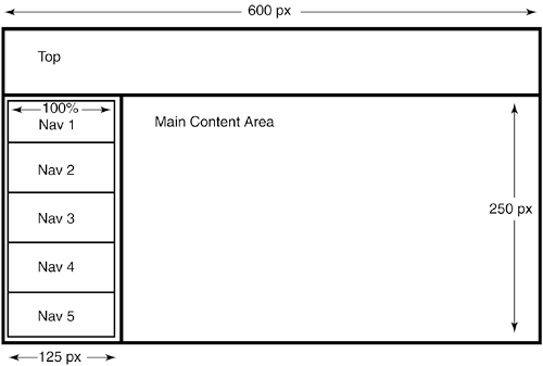
The easiest way to make this layout work is to use nested tables, or tables within tables. Go back to the original layout, the one in Figure 21.1. That commodious table cell on the left can hold any type of content: text, an image, a media file, or even another table, as Figure 22.5 shows. Listing 22.3. View Source for Figure 22.5.<table width="600"> <tr> <td colspan="2">Top</td> </tr> <tr> <td width="125" valign="top"> <!-- Begin nested table. --> <table width="100%"> <tr> <td>Nav 1</td> </tr> <tr> <td>Nav 2</td> </tr> <tr> <td>Nav 3</td> </tr> <tr> <td>Nav 4</td> </tr> <tr> <td>Nav 5</td> </tr> </table> <!-- End nested table. --> </td> <td height="250" valign="top">Main Content Area</td> </tr> </table> Figure 22.5. Create a nested table for the nav bar in the cell on the left.
Notice that you set the width attribute of the nested table to 100%. This forces the table to expand to fill the width of its cell. Notice also that the cell with the nested table has the attribute valign="top". This forces the browser to top-align the content of the cell, which keeps your nested table against the uppermost edge of the cell at all times, right where your visitors expect to find it.
Now, you can add as much content to the main cell as you like. Since you didn't use a rowspan to create the nav-bar cells, you can add as much content to the main cell as you like, and the nav bar doesn't break. Figure 22.6 proves it. The cell that contains the nested table grows, but the nested table itself won't change size unless you change the contents of the nested table's cells. Figure 22.6. The nested table eliminates the rowspan, which keeps your nav bar intact no matter how much content you add.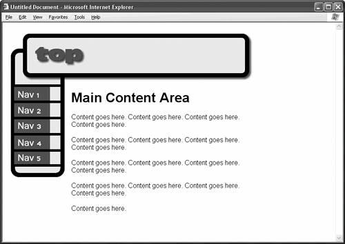
|