| Just as you used a nested table to create a multicolumn layout for table-based designs in Topic 20, you use nested div elements to create a multi-column layout in CSS. Drop the nested divs into the main content div of your layout, as in Figure 21.1, and you're golden. The only catch is, your main content div has to be fixed-width. It can't be liquid, or certain browsers choke when you apply the technique given here. Listing 21.1. View Source for Figure 21.1. <div style="position: relative; width: 560px; height: 100px;"> Banner </div> <div style="position: relative; width: 560px;"> <!-- Nested divs start here --> <div style="position: absolute; width: 172px; left: 0px;"> Text Column 1 </div> <div style="position: absolute; width: 172px; left: 186px;"> Text Column 2 </div> <div style="position: absolute; width: 172px; left: 372px;"> Text Column 3 </div> <!--Nested divs end --> </div>
Figure 21.1. The main content div of this layout has a nested div for each of the columns of text. 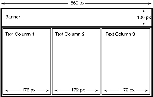
Follow these steps to create the nested divs: 1. | Take the width of the main content div, and divide by the number of columns you want to create. In Figure 21.1, the main content div is 560 pixels wide, so 560 divided by three columns is roughly 186 pixels. This is the unadjusted width of each column.
TIP One way to work around the fixed-width limitation is to use a layout table for the multicolumn structure inside the main content div. Mixing tables and CSS for layout is perfectly workable, although proponents of CSS usually cringe at the mere mention of the idea. The fact remains that tables give you more reliable layout overall. See Topic 20 for how to create multicolumn layouts with tables, and then drop that table into the main content div of your CSS layout. |
| 2. | You need whitespace between the columns, so knock a few pixels off the width you calculated in Step 1. Fourteen pixels is a good amount of whitespace, so 186 minus 14 gives you a width of 172 pixels per column.
| 3. | You need the horizontal position of each column as expressed as an offset from the left side of the parent divin this case, the main content holder. The first column is always 0 pixels from the left. The next one falls at the original width you calculated in Step 1, or 186 pixels from the left. The next one falls at twice that width, or 372 pixels from the left, and so on and so on, depending on how many columns you have.
TIP As with tables, don't try to fit more than two or three CSS columns in your layout. |
| 4. | Write the code for the nested divs using the values from the previous steps. The Toolkit that follows gives you a template.
|
 | FAQWhy are the positions of the columns relative to the position of the main content div, not the browser window? Because the column divs are nested, they inherit their baseline position from the parent div. The same code in unnested divs would give you columns that begin at the extreme left of the browser window. |
|
|
 to right starting with 0, not 1, or the formula in the code won't