Section 3.1. The Too-Simple Information Model
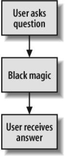
3.1. The "Too-Simple" Information ModelThere are different models of what happens when users look for information. Modeling users' needs and behaviors forces us to ask useful questions about what kind of information the user wants, how much information is enough, and how the user actually interacts with the architecture. Unfortunately, "too-simple" is the most common information model, and it's also the most problematic. It looks something like Figure 3-1. Figure 3-1. The "too-simple" model of information needs Or, expressed as a simple algorithm:
Input, output, end of story. This is a very mechanistic and ultimately dehumanizing model for how users find and use information on web sites. In fact, in this model, the user, like the site itself, is just another systempredictable in behavior, rational in motivation. Why do we have a problem with this "too-simple" model? Because it rarely happens this way. There are exceptionsfor example, when users know what they're looking for, as in the staff directory scenario. Here, users have a question for which there is a right answer, they know where to find the answer, they know how to state the question, and they know how to use the site to do so. But users don't always know exactly what they want. Have you ever visited a site just to poke around? By exploring the site, you're trying to find information of a sort; you just don't exactly know what you're looking for. Even when you do, you may not have the language to express it: is it "PDA," "Palm Pilot," or "handheld computer"? Users often complete their efforts at finding information in a state of partial satisfaction or outright frustration. Example: "I was able to find information on synchronizing my Palm Pilot, but nothing specific on syncing to a Macintosh." Or, during the process of finding, they may learn new information that changes what they're looking for altogether. Example: "I realized that a Keough retirement plan is ideal for me, even though when I started I was trying to learn about IRAs." We also dislike the "too-simple" model because it narrowly focuses on what happens while the user is interacting with the information architecture. The information need's contextall the related stuff that happens before and after the user ever touches the keyboardgets left out. It also assumes an ignorant user who brings little, if any, prior knowledge to the table. So the model essentially ignores any context for this scenario. Finally, by oversimplifying, this model cedes so many great opportunities to understand what goes on in users' heads and observe the richness of what happens during their interactions with an information architecture. This model is dangerous because it's built upon a misconception: that finding information is a straightforward problem that can be addressed by a simple, algorithmic approach. After all, we've solved the challenge of retrieving datawhich, of course, is facts and figureswith database technologies such as SQL. So, the thinking goes, let's treat the abstract ideas and concepts embedded in our semi-structured textual documents the same way. This attitude has led to the wasting of many millions of dollars on search engine software and other technological panaceas that would indeed work if this assumption were true. Many user-centered design techniques carry this misconception forward, assuming that the process of finding is simple enough to be easily measured in a quantifiable way. So we think we can measure the experience of finding by how long it takes, or how many mouse clicks it takes, or how many viewed pages it takes to find the "right" answer, when often there is no right answer. OK, enough complaining about this model. Let's take a closer look at information needs and seeking behaviors so that we can build better models. |
EAN: 2147483647
Pages: 194