How to Use Color Choosers
| < Day Day Up > |
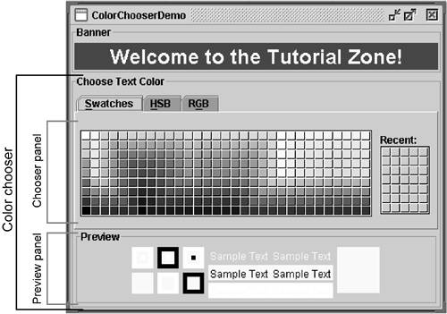
How to Use Color ChoosersUse the JColorChooser [16] class to provide users with a palette of colors to select from. A color chooser is a component that you can place anywhere within your program's GUI. The JColorChooser API also makes it easy to bring up a dialog (modal or not) that contains a color chooser. Figure 5 shows an application that uses a color chooser to set the text color in a banner.
Figure 5. The ColorChooserDemo application with callouts added to identify the color chooser and the chooser and preview panels.
The color chooser consists of everything within the box labeled Choose Text Color . This is what a standard color chooser looks like in the Java look and feel. It contains two parts : a tabbed pane and a preview panel. The three tabs in the tabbed pane select chooser panels. The preview panel below the tabbed pane displays the currently selected color. Here's the code from the example that creates a JColorChooser instance and adds it to the demo's window: public class ColorChooserDemo extends JPanel ... { public ColorChooserDemo() { . . . banner = new JLabel("Welcome to the Tutorial Zone!", JLabel.CENTER); banner.setForeground(Color.yellow); . . . tcc = new JColorChooser(banner.getForeground()); . . . add(tcc, BorderLayout.PAGE_END); } . . . frame.setContentPane(new ColorChooserDemo()); The JColorChooser constructor in the code snippet takes a Color argument, which specifies the chooser's initially selected color. If you don't specify the initial color, then the color chooser displays Color.white . See the Color [18] API for a list of color constants you can use.
A color chooser uses an instance of ColorSelectionModel to contain and manage the current selection. The color selection model fires a change event whenever the user changes the color in the color chooser. The example program registers a change listener with the color selection model so that it can update the banner at the top of the window. The following code registers and implements the change listener: tcc.getSelectionModel().addChangeListener(this); . . . public void stateChanged(ChangeEvent e) { Color newColor = tcc.getColor(); banner.setForeground(newColor); } See How to Write a Change Listener (page 652) in Chapter 10 for general information about change listeners and change events. A basic color chooser, like the one used in the example program, is sufficient for many programs. However, the color chooser API allows you to customize a color chooser by providing it with a preview panel of your own design, by adding your own chooser panels to it, or by removing existing chooser panels. Additionally, the JColorChooser class provides two methods that make it easy to use a color chooser within a dialog. Another Example: ColorChooserDemo2
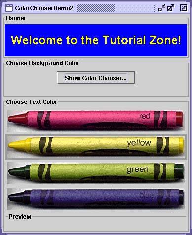
Figure 6. The ColorChooserDemo2 application. This program customizes the banner's text color chooser in these ways:
Removing or Replacing the Preview Panel (page 171) covers the first customization. Creating a Custom Chooser Panel (page 171) discusses the last two. The program also adds a button that brings up a color chooser in a dialog, which you can use to set the banner's background color. Showing a Color Chooser in a DialogThe JColorChooser class provides two class methods to make it easy to use a color chooser in a dialog. ColorChooserDemo2 uses one of these methods, showDialog , to display the background color chooser when the user clicks the Show Color Chooser... button. Here's the single line of code from the example that brings up the background color chooser in a dialog: Color newColor = JColorChooser.showDialog(ColorChooserDemo2.this, "Choose Background Color", banner.getBackground()); The first argument is the parent for the dialog, the second is the dialog's title, and the third is the initially selected color. The dialog disappears under three conditions: (1) the user chooses a color and clicks the OK button, (2) the user cancels the operation with the Cancel button, or (3) the user dismisses the dialog with a frame control. If the user chooses a color, the showDialog method returns the new color. If the user cancels the operation or dismisses the window, the method returns null . Here's the code from the example that updates the banner's background color according to the value returned by showDialog : if (newColor != null) { banner.setBackground(newColor); } The dialog created by showDialog is modal. If you want a nonmodal dialog, you can use JColorChooser 's createDialog method to create one. This method also lets you specify action listeners for the OK and Cancel buttons in the dialog window. Use JDialog 's show method to display the dialog created by this method. For an example that uses this method, see Using Other Editors (page 402) in the How to Use Tables (page 388) section later in this chapter. Removing or Replacing the Preview PanelBy default, the color chooser displays a preview panel. ColorChooserDemo2 removes the text color chooser's preview panel with this line of code: tcc.setPreviewPanel(new JPanel()); This effectively removes the preview panel because a plain JPanel has no size and no default view. To set the preview panel back to the default, use null as the argument to setPreviewPanel . To provide a custom preview panel, you also use setPreviewPanel . The component you pass into the method should inherit from JComponent , specify a reasonable size, and provide a customized view of the current color. To be notified when the user changes the color in the color chooser, the preview panel must register as a change listener on the color chooser's color selection model as described previously. Version Note: In some releases, you either couldn't replace the preview panel or couldn't remove it properly (the titled border would remain ). We believe that both problems have been fixed as of v1.4.2. If your program depends on removing or replacing the preview panel, you should test it against all releases that it supports. Creating a Custom Chooser PanelThe default color chooser provides three chooser panels:
You can extend the default color chooser by adding chooser panels of your own design with addChooserPanel , or you can limit it by removing chooser panels with removeChooserPanel . If you want to remove all of the default chooser panels and add one or more of your own, you can do so with a single call to setChooserPanels . ColorChooserDemo2 uses this method to replace the default chooser panels with an instance of CrayonPanel , a custom chooser panel. Here's the call to setChooserPanels from that example: //Override the chooser panels with our own. AbstractColorChooserPanel panels[] = { new CrayonPanel() }; tcc.setChooserPanels(panels); The code is straightforward: It creates an array containing the CrayonPanel ; next it calls setChooserPanels to set the contents of the array as the color chooser's chooser panels. CrayonPanel is a subclass of AbstractColorChooserPanel and overrides the following five abstract methods defined in its superclass: void buildChooser()Creates the GUI that comprises the chooser panel. The example creates one toggle buttons for each of the four crayons and adds them to the chooser panel. void updateChooser()This method is called whenever the chooser panel is displayed. The example's implementation of this method selects the toggle button that represents the currently selected color. public void updateChooser() { Color color = getColorFromModel(); if (Color.red.equals(color)) { redCrayon.setSelected(true); } else if (Color.yellow.equals(color)) { yellowCrayon.setSelected(true); } else if (Color.green.equals(color)) { greenCrayon.setSelected(true); } else if (Color.blue.equals(color)) { blueCrayon.setSelected(true); } } String getDisplayName()Returns the display name of the chooser panel, which is used on the tab for the chooser panel. Here's the example's getDisplayName method: public String getDisplayName() { return "Crayons"; } Icon getSmallDisplayIcon()Returns a small icon to represent this chooser panel. It's currently unused. Future versions of the color chooser might use this icon or the large one to represent this chooser panel in the display. The example's implementation of this method returns null . Icon getLargeDisplayIcon()Returns a large icon to represent this chooser panel. It, too, is currently unused. Future versions of the color chooser might use this icon or the small one to represent this chooser panel in the display. The example's implementation of this method returns null . The Color Chooser APITables 7 through 9 list the commonly used JColorChooser constructors and methods. Other methods you might call are listed in the API tables in The JComponent Class (page 53) in Chapter 3. Refer to the JColorChooser API documentation at: http://java.sun.com/j2se/1.4.2/docs/api/javax/swing/JColorChooser.html. Table 7. Creating and Displaying the Color Chooser
Table 8. Customizing the Color Chooser's GUI
Table 9. Setting or Getting the Current Color
Examples That Use Color ChoosersThe following table shows examples that use JColorChooser and where those examples are described.
|
| < Day Day Up > |
EAN: 2147483647
Pages: 171
- Structures, Processes and Relational Mechanisms for IT Governance
- Assessing Business-IT Alignment Maturity
- Linking the IT Balanced Scorecard to the Business Objectives at a Major Canadian Financial Group
- Measuring and Managing E-Business Initiatives Through the Balanced Scorecard
- Technical Issues Related to IT Governance Tactics: Product Metrics, Measurements and Process Control

