Recipe 3.20. Making Images Scalable
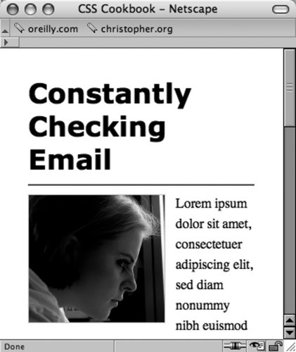
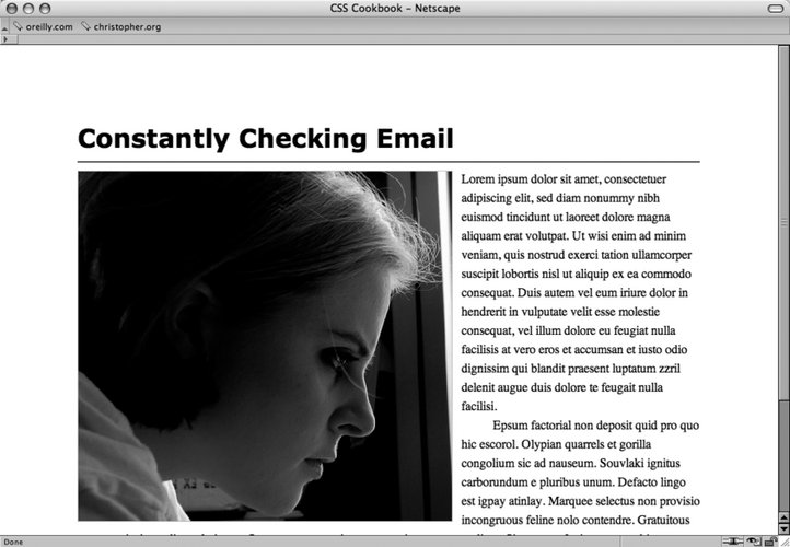
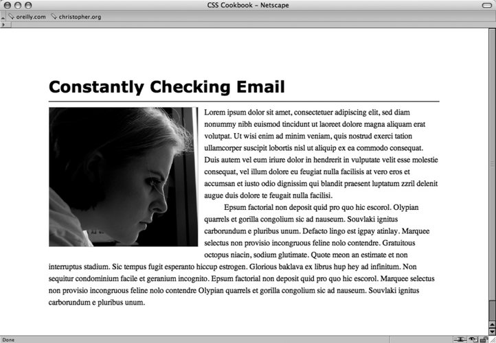
ProblemYou want images to resize as the browser window resizes. SolutionDefine the width of images to percentages (see Figures 3-51 and 3-52): img { border: 1px solid #cecece; width: 60%; float: left; margin-right: .7em; margin-bottom: .5em; }Modern browsers will scale the height of the images in the relative proportion to the width, so defining both the width and height is not necessary. Figure 3-51. The image scaled down Figure 3-52. The image at a larger size since the browser window is larger DiscussionWhen building fluid or flexible layouts, the HTML text set in columns is set to expand and retract as the browser resizes. However, images with dimensions that are commonly set in pixels retain their size. To make sure all the page elements are resized in proportion to each other in flexible layouts, developers may set the width and height to percentages. When images are set to percentage-based dimensions, browsers may stretch images beyond the point where they retain image integrity. For example, artifacts that are nearly invisible in a JPEG start to show or the pixilation of a GIF image becomes apparent when they are expanded. To keep the images from expanding beyond a defined width, use the max-width property with length units (see Figure 3-53): img { border: 1px solid #cecece; width: 60%; max-width: 300px; float: left; margin-right: .7em; margin-bottom: .5em; }Figure 3-53. The image expands only to the value of the max-width property See AlsoRecipe 9.4 and Recipe 9.6. |
EAN: 2147483647
Pages: 235