The Swamp Report
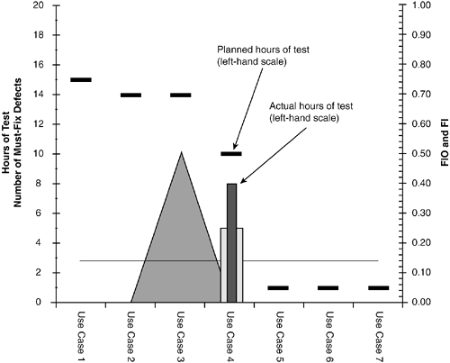
| Deciding it's time to stop testing is one of those things that is easier to get wrong than right. There are ample opportunities to either stop too early or test too long. Finding that sweet spot in final system test that strikes that perfect balance between releasing the product too early and releasing the product too late is by comparison much more difficult. Having a quantifiable definition of reliability, such as failure intensity, is the key to measuring and tracking reliability during testing as a means of helping decide when to stop testing. There are, however, two other factors that need to be tracked, in conjunction with failure intensity, that play into the decision of when to stop testing. The first is the number of known, open defects. An assumption of software reliability engineering is that known, open (unresolved) defects are fixed at the end of each iteration of testing, and a new version of the software is used for the next testing iteration. In my experience, fixing all known defects before proceeding to the next iteration of test is not a practice that one can always count on. Of the severe defects that will eventually get fixed before release, some portion typically goes unresolved for several iterations of testing, how many actually get fixed being a function of their number and difficulty to resolve. So the capability to measure and track the number of open, unresolved defects becomes a key to making the decision to stop testing. A second key assumption of software reliability engineering is that testing is being carried out as per the operational profile. For example, if we are testing to the risk profile of Figure 3.25, we would expect Place National Order use case to receive 25% of the budgeted test effort and 1% to be for the Request Catalog use case. Tracking to see that you are actually meeting this planned test coverage is part of the decision making that goes into knowing when it's time to stop testing. In this section, we look at a spreadsheet-based dashboard that lets you track these three key factorsfailure intensity, open defects, and test coverage as per the operational profilefor a large package of use cases. I have used variations of this dashboard for years as a tool for helping project teams and cross-company, multi-project program teams decide when to release a product. This dashboard was created to provide at-a-glance monitoring of reliability growth across a large number of "pieces" that form a whole (use cases of a component, components of a product, whole products that are part of a program), where the pieces all need to be reliable for the whole to ship. I call this dashboard the "Swamp Report" after the analogy of draining a swamp that is sometimes used to describe the test and fix activities of system test leading up to product release. Dashboard LayoutBefore looking at how to use and read the dashboard, let's review the various parts that make it up. All examples will be given in terms of hours as the unit of measure: planned hours of test as per the operational profile, actual hours of test, and failures per hour. The dashboard is based on a bar chart with use cases across the bottom. Each use case has a horizontal bar showing the number of staff hours of testing planned for the iteration as spelled out by the operational profile. Each use case also has a vertical bar showing the actual hours expended during the iteration. If actual expenditure of test hours equals plan, the vertical bar touches the horizontal bar (see Figure 4.8). Figure 4.8. Horizontal bar indicates planned test hours per use case as per the operational profile. Vertical bar shows actual expenditure. Both use left-hand scale.
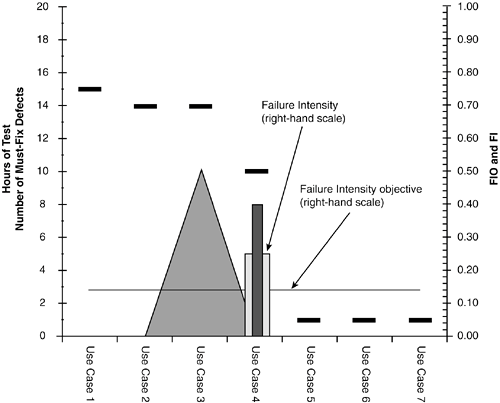
Both the horizontal and vertical bar use the left-hand scale of the dashboard marked Hours of Test (also marked with # of Must Fix Defects; we'll get to this soon). Each use case also has a vertical bar that indicates the failure intensity that was experienced during the test iteration, and a line that indicates the target failure intensity objective (see Figure 4.9). When the vertical bar drops to or below the line, that use case has reached its failure intensity objective. These two indicators share the right-hand scale marked FI (Failure Intensity) and FIO (Failure Intensity Objective). Each use case can have a different failure intensity objective; however, in Figure 4.9, all use cases are shown with the same failure intensity objective, resulting in a straight, horizontal line spanning the dashboard. Figure 4.9. Horizontal line indicates target failure intensity objective. Vertical bar shows actual failure intensity experienced during test iteration. Both use right-hand scale.
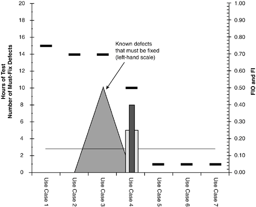
Finally, the dashboard uses an area graph (looks like mountains) to show the number of defects that remain to be fixed before the product can be released; this is "The Swamp," and it looks good color-coded in algae green for effect! The number of defects to be fixed is tracked on the left-hand scale (Figure 4.10). Figure 4.10. Area graph (looks like mountains) tracks the number of defects that must be fixed before release (uses left-hand scale).
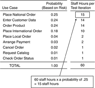
Now that we've reviewed the parts that make up the dashboard, let's move on to how to actually use and read the dashboard in helping you make the critical decision: Is it time to stop testing? Establish Planned Test Coverage as per Operational ProfileLet's say that the sales order component of Figure 3.11 has finally been completed and is ready to undergo testing as part of system test. Testing of the sales order component will consist of a series of test iterations where two testers will spend about 30 hours each during a week testing the sales order component. After each iteration, development will have several days to fix defects, then rebuild and deliver a new version for the next iteration of testing. Using the operational profile of Figure 3.25, which includes use case criticality, you build the following spreadsheet shown in Figure 4.11 to allocate each test iteration's 60 staff hours of testing (two testers at 30 hours each) across the nine use cases of the sales order component. Figure 4.11. Allocation of each test iteration's 60 staff hours of testing across the nine use cases of the sales order component as per the operational profile.
Initialize Dashboard Before Each Test IterationThe dashboard is driven from a simple spreadsheet that is initialized before each test iteration and then updated at the end of each test iteration (see Figure 4.12). Figure 4.12. Dashboard spreadsheet table typical of just prior to each test iteration.
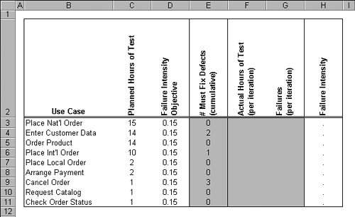
For tracking projects with multiple component teams or cross-company multi-project programs, you can implement this as a database to allow concurrent updates from multiple test teams. Each row of the spreadsheet in Figure 4.12 is a use case. You start by initializing the spreadsheet portion of the dashboard with the planned staff hours of testing for the iteration, plus the failure intensity objective per use case; see Figure 4.12, columns Planned Hours of Test and Failure Intensity Objective. For a failure intensity objective, you decide to keep things simple and use a single failure intensity objective for all use cases (i.e., a single failure intensity objective for the sales order component as a whole).[5] From an analysis of a past release similar to that illustrated in Figure 4.7 you arrive at a failure intensity objective of 1.50 severe defects per staff day of testing. But instead of failures per day, you will be working in failures per hour; your sales order department is open ten hours a day, so you divide by ten to arrive at .15 severe defects per hour. Unless there are changes in plan, these two columns will remain unchanged for the duration of testing.
It is quite likely that at the beginning of system testing there are known defects that you know must be fixed before product release but have not yet been fixed. This number is recorded per use case in column # Must Fix Defects. This column is cumulative (i.e., it is not cleared at the start of a test iteration) but rather reflects the accumulation of defects that must be resolved before product ship. This is The Swamp! Until it is drained, the product cannot release. There are two points about this column worth emphasizing:
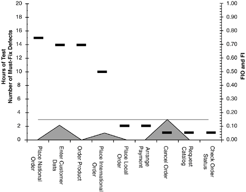
The next two columns in Figure 4.12, Actual Hours of Test and Failures, will be filled in at the end of each test iteration. The last column, Failure Intensity, is a calculated field for each use case and equals Failures divided by Actual Hours of Test. At the start of the first test iteration, and the start of all subsequent test iterations, the dashboard will look something like Figure 4.13, which reflects the settings of the spreadsheet in Figure 4.12. Figure 4.13. At the start of each test iteration the dashboard looks something like this.
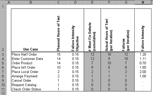
Update the Dashboard at the End of Each Test IterationAt the end of each test iteration, the spreadsheet portion of the dashboard is updated to reflect the vital stats of testing. Let's look at some common configurations you are likely to find the dashboard in at the end of a test iteration. Early Iterations: Low Test Coverage, High Failure Intensity and Open DefectsFigures 4.14 through 4.17 show the dashboard in a state typical of the end of an early test iteration where defects are so prevalent that the testing team is unable to actually expend the total planned amount of test time running tests due to delays from having to re-start failed runs, logging defects in the defect tracking tool, and the inability to run some features of the product. Figure 4.14. Spreadsheet portion of dashboard indicative of end of an early test iteration.
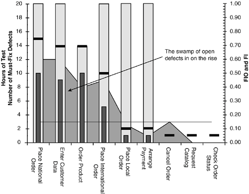
Figure 4.17. Dashboard showing swamp of defects that must be fixed is rising.
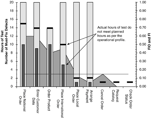
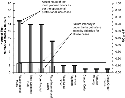
This is indicated in Figure 4.15 in that the bars showing actual expended test hours do not reach up and touch the target horizontal bars showing planned expenditure via the operational profile. Indeed, some use cases received no testing at all. Figure 4.15. Dashboard showing that actual hours of testing did not meet with planned expenditure. Some use cases (Cancel Order, Request Catalog, and Check Order Status) receive no testing at all.
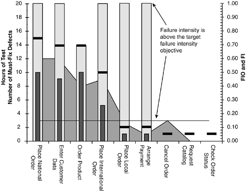
It's important to emphasize that if your unit of measure for the operational profile is staff hours or days expended, this needs to reflect time spent actually running tests, not time spent on other activities such as defect tracking, reports, and so on. On the other hand, practically speaking, I think it's more important to be consistent in the reporting than it is to be accurate; after all, it is the relative improvement in reliability we are looking for. And if it came down to tracking reliability with guesstimate data versus not doing it at all, I'd definitely say do it with guesstimate data. Another key indicator in the dashboard is that the failure intensity experienced in testing is much higher than the target failure intensity objective; this is pointed out in Figure 4.16. For the product to release, the gray bar indicating experienced failure intensity needs to drop down to or below the failure intensity line. Figure 4.16. Dashboard showing that experienced failure intensity was much greater than target failure intensity objective.
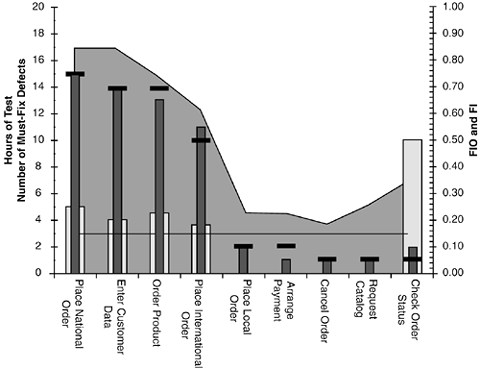
And finally, as Figure 4.17 points out, the swamp of defects that need to be fixed before release is on the rise. Remember, open defects are tracked using the left-hand scale. Good Test Coverage, But…Let's look at another typical dashboard configuration. Figure 4.18 is typical of the state of the dashboard as you might see it during a middle test iteration. Looking at Figure 4.18, this picture looks rather optimisticimproved coverage of tests, failure intensity droppingexcept for the fact that the swamp seems to be rising yet higher. This dashboard display is indicative of a test team that is spinning its wheels until the backlog of defects can be worked off. Yes, the test team is able to spend the planned amount of time on testing each use case, and yes the failure intensity rate is dropping. But it's probably because the test team is running over the same working bits of the system, steering around the known, already reported problems. Unless a significant number of the backlog of defects is fixed, the next test iteration will have a dashboard that looks very much like this one; the test team has found all they can. Figure 4.18. Dashboard that may indicate more testing is a waste unless backlog of open defects is lowered.
After the development group starts fixing the backlog of open defects, two things are going to happen. First, functionality that was previously un-usable will finally be tested, revealing yet more defects that had previously been hidden; bugs hidden by other bugs are an effect a colleague of mine calls the "bug shadow." Second, some portion of the fixes will introduce yet more defects. In short, as the swamp of open defects is lowered, the failure intensity will likely rise again. Do We Really Need Another Test Iteration?This next example requires a bit of explanation as to how such a dashboard could even come to be. Very late in system testing, when the product begins to stabilize and the release date (original or probably revised) looms near, defects that are discovered receive a new type of scrutiny. Not only are they prioritized in terms of their effect on the customer, but they now receive prioritization in terms of their risk to the project. The risk of fixing a defect late in the game, close to the release date, is weighed against three factors:
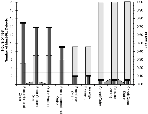
An easy way to remember this is R-E-V: Risk of breaking something else; Effort to make the fix; Verification effort to check the fix and regression test the system. Given this tightened triaging of new defects, a team will sometimes opt to document a severe defect in the release notes rather than fixing it. As the old saying goes, "'Tis better to go with the devil you know than the devil you don't." When this happens, it is quite possible to find yourself staring at a dashboard like that of Figure 4.19. Figure 4.19. Good test coverage, and virtually no open defects. But is it safe to release with failure intensity levels still so high?
In this dashboard, test coverage looks goodactual testing was given to use cases in accordance with the plan as per the operational profileand there are very few defects that are going to be fixed (some were identified as too risky to fix and were removed from the "Swamp"). Why not just fix those few defects that you plan on fixing, do a spot check on the build, and release the product? The problem, of course, is that you have not met your failure intensity objective. And a high failure intensity is the indicator for a high population of latent defects (i.e., defects that still remain waiting to be discovered). If you were to run another test iteration and vary tests a bit, chances are you would keep finding defects. So the question is, do you go ahead and run another iteration and find a new round of defects or let the customer do it? Stop Testing!Figure 4.20 illustrates the dashboard you want to see when it's time to stop testing and ship the product! The testing team is able to run tests on all use cases in proportion to the operational profile; the swamp of defects has been drained and the failure intensity experienced during test is at or under the failure intensity objective. Figure 4.20. Dashboard indicative of time to stop testing.
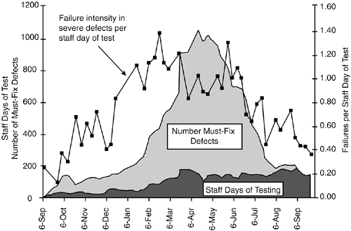
One drawback of the Swamp Report is that it is a look at the system at one instance in time. In the next section, you'll see how to extend that view to provide a look at the system over time, across multiple test iterations, for the entire project length if so desired. Tracking the Swamp Through TimeA companion report of the Swamp Report that I've found useful is to plot snapshots of the dashboard through time in a format as shown in Figure 4.21, allowing you to gain a perspective on progress through time. Dates of snapshots run across the X-axis; each snapshot plots the key stats from the Swamp Report: failure intensity, open defects, and testing effort expended. Figure 4.21. Companion report provides snapshots of the Swamp Report through time.
The example in Figure 4.21 shows a large cross-company program consisting of about 35 products and nearly as many project teams that were required to release at the same time as part of a box-set of products. Tools, such as the Swamp Report, were used to track the reliability growth of each of the individual products, with this companion report providing a look at the progress of the whole. To wrap up our look at the "Swamp Report," it is an easy to implement, spreadsheet-based dashboard that provides at-a-glance monitoring of reliability growth across a large number of "pieces" that form a whole (e.g., use cases making up a component, components making up a project, or multiple projects making up a program). |
EAN: 2147483647
Pages: 109
