Defining Colors
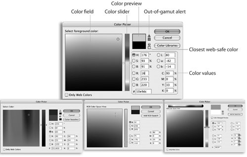
| "Mommy, where do colors come from?" asks the four-year-old. "Well, dear, some colors are already installed in your software. Others you can import from libraries or other documents. Still others are defined manually using one of several different color spaces including CMYK, RGB, Lab, and Grayscale," says the doting mother, knowing it's never too early to start explaining the intricacies of color in graphics programs. So, in case your mother never taught you the essentials, here are the details of defining, importing, and managing colors in the Creative Suite 2 applications. Defining Colors Using the Color PickersConsidering the different uses and features for each application, it's surprising how consistent the tools are in Creative Suite for defining and applying colors. For instance, Photoshop, Illustrator, InDesign, and GoLive each feature a Color Picker that you can use to define color. To open the Color Picker in Photoshop, double-click a foreground or background color in the Tools palette. In Illustrator or InDesign, double-click the fill or stroke color in the Tools palette. To open the Color Picker in GoLive, double-click a color displayed in the Toolbar or Inspector. Figure 10-8 shows the four different versions of the color pickers. Figure 10-8. Color Pickers in Photoshop (top), Illustrator (bottom left), InDesign (bottom middle), and GoLive (bottom right). Although there are differences among the pickers, they are each divided into three main sections:
In addition, some of the color pickers have special features for working with colors. Table 10-1 lists which pickers contain each of these features:
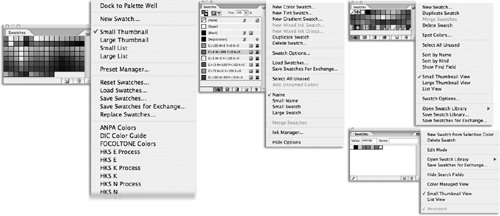
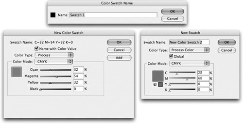
Defining Colors Using the Color PalettesAs ubiquitous as it is among the Creative Suite applications, the Color Picker is actually not a convenient way to define colors. The dialog box is rather big, so it obscures most of the screen. Fortunately, the Color palette is a handy mini-version of the Color Picker. Instead of a large, bulky dialog box, the Color palette floats above the document window, available at any time. Once again, the Color palette in each of the applications closely resembles those in the others (Figure 10-9). The palettes let you choose different color modes to define colors. All the palettes contain sliders that let you control the colors in different color modes. Photoshop, Illustrator, and InDesign all have ramps at the bottom of their palettes that let you choose colors. Instead of a ramp, GoLive lets you keep a record of recently designed colors. Figure 10-9. Color palettes in Photoshop (left), InDesign (top middle), GoLive (bottom middle), and Illustrator (right). There are major differences between them, though. Photoshop displays squares that allow you to control the foreground and background colors. Those same squares in InDesign and Illustrator control the fill and stroke. InDesign has an added control that lets you switch between working on object color and text color. The Color palette in GoLive varies the most from the other palettes, with more controls to change the type of sliders as well as an Eyedropper tool, which allows you to choose colors from anywhere on the screen, even outside the document itself. This is extremely handy if you need to match a desktop pattern or any system color. Defining and Arranging Colors with the Swatches PalettesMost of the artists we know like to define colors on the fly, without worrying about the exact numerical specifications and whether they match other colors in the document. That's great for artists, but production people who have to lay out books, brochures, and ads need a more structured environment for defining and using colors. That's when we recommend working with the Swatches palette in each of the Creative Suite applications. Instead of sliding color values around trying to match previously defined colors, the Swatches palette lets you define and store colors so that they are identically defined across many documents, and even across applications. Your print service provider would prefer that you use swatches as well. With swatches in your document, they can easily make global adjustments to all the colors in your file. They can also easily check the values of all the colors in your file to make sure there are no errors in how the colors have been defined. Tip: Adding Unnamed Colors to the Swatches Palette Colors applied to objects with the Color palette are also called unnamed colors. To add these colors to the Swatches palette in either InDesign or Illustrator, you can drag a color from the color square in the upper left of the Color palette directly onto the Swatches palette, or choose Create New Swatch (Illustrator) or Add To Swatches (InDesign) from the Color palette menu. InDesign has an even slicker way: You can add all unnamed colors in a document by choosing Add Unnamed Colors from the Swatches palette menu. As shown in Figure 10-10, the Swatches palettes, with their default settings, look very different. The Swatches palettes in Photoshop, Illustrator, and GoLive are arranged in what's called small thumbnails. This allows the most swatches to be displayed in the smallest area. In addition, in InDesign you can store swatches for gradients and tints in the Swatches palette, and in Illustrator you can store swatches for gradients and patterns. Figure 10-10. Swatches palettes in Photoshop (left), InDesign (middle), Illustrator (top right), and GoLive (bottom right). The Swatches palette in InDesign, by default, is in Name (or list) view. This displays the swatch name, type-of-color icon, and color-mode icon. However, the palettes in the other applications can be arranged similarly by choosing their list views. Likewise, the palette in InDesign can be arranged in a thumbnail view by choosing Small Swatch from the palette menu. Defining New SwatchesThe primary way to create and store swatches in all Creative Suite applications is via a command in the Swatches palette menu. In Photoshop and Illustrator it's the New Swatch command. InDesign breaks the task down into New Color Swatch, New Tint Swatch, New Gradient Swatch, and New Mixed Ink Swatch. In GoLive, choose New Swatch From Selection Color. The applications have very different dialog boxes for defining new swatches, as shown in Figure 10-11. These range from the barebones, single-field dialog box in Photoshop to the more-robust controls found in Illustrator and InDesign. GoLive has no dialog box for new swatches. Figure 10-11. New swatch dialog boxes in Photoshop (top), InDesign (left), and Illustrator (right). The dialog boxes for new swatches in Illustrator and InDesign have very similar features. These control not just the name of the swatch, but how the color is modified and printed. Here is a summary of the new-swatch controls for Illustrator and InDesign:
There are also differences in where swatches are kept. In Illustrator and InDesign, swatches are contained in each specific document. If you add new swatches when working in one document, those swatches are not going to appear in other documents. In Photoshop, however, any time you modify the Swatches palette, the modifications appear in all Photoshop documents. What if you want certain swatches to appear in all new documents? In Photoshop, just change the Swatches palette to the way you want it. The Swatches palette stays in the new arrangement until you change the palette or the Photoshop preferences. In InDesign, simply define new swatches with no document open. This changes the default setup for all new documents. Things are very different for Illustrator; you need to open the Adobe Illustrator Startup_CMYK or the Adobe Illustrator Startup_RGB file (use the CMYK document for CMYK files and the RGB document for RGB files). Make whatever changes you want to the swatches in this document, and then close the file. These changes will then be the default for new Illustrator documents. The startup documents are located in the Plug-ins folder in the Adobe Illustrator CS2 application folder. Understanding the Swatch IconsWhen you look at the Swatches palette in any CS2 application, each of the swatches is displayed with different symbols and icons. These symbols and icons explain the type of color and its mode. Table 10-2 shows the meanings behind these icons.
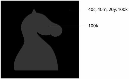
The "protected" icon, found only in InDesign, is applied to the swatches for Black, Registration, and None. These swatches cannot be deleted or modified. The Registration and None swatches in Illustrator are also protected, but they don't display the protected icon. Tip: Watch Your Swatch! If a swatch has a CMYK display, that doesn't necessarily mean it's a process color. It only means that the display of the color has been set using CMYK colors it could be a spot color that was defined using CMYK colors. Many people set colors with CMYK values, especially if they feel that a spot color may be converted into a process color. But the mere fact that a CMYK icon is displayed in the list view does not automatically create a process color. Working with Rich BlackBlack is such a basic color that we sometimes forget that it is a dynamic design element in its own right. The most widely used "trick" designers do to enhance black in artwork is to create a color called rich black (sometimes also called four-color black). This involves adding cyan, magenta, and perhaps even yellow to 100% black in a color definition. The addition of the other process colors produces a deeper, richer shade than black ink alone can achieve. Another way to use a rich black is if you have a four-color image that you would like to blend into a larger black background. Creating a rich black ensures that the four-color black in the image does not abruptly change into a single-color, flat black. Perhaps the best way to understand the effect of adding these extra colors is to look at the color plate based on Figure 10-12. In that illustration, the outside of the image has been filled with a black defined as 40% cyan, 40% magenta, 20% yellow, and 100% black. The silhouette of the chess piece has been filled with a simple 100% black. The flat black image is visible within the rich black color. This effect is sometimes called a poor man's emboss or, as our production manager, David Van Ness, calls it, a stealth logo. Figure 10-12. A simulation of the effect of a rich black with a flat black logo. (See the Color Insert on page C-2 for the actual effect.) The recipe for rich black can vary. Our rich black has an equal amount of cyan and magenta. However, you can also create a rich black that is 40% magenta and 100% black. This is sometimes called a warm black because the magenta color adds a warmth to the final color. Similarly, a rich black of 40% cyan plus 100% black is sometimes called a cool black. See the color plate section for examples of these two colors. Tip: Talk To Your Print Shop Before you define a rich black, talk to the print shop that will be printing your document. We did that for the rich black example in our color plates. Many designers get stuck when they fail to realize that the black they are looking at on their monitor is not a rich black, but is actually just a single black plate. Because a monitor is an RGB device, they don't see the difference between a rich black that contains several colors mixed in with black and a flat black that is just the single black ink. Fortunately, Illustrator and InDesign each have a setting that allows you to see the differences between rich black and flat black on monitors and on color proofs. From the Preferences menu, choose Appearance Of Black. Choose an option from the On Screen menu:
You can also set the Printing/Exporting preference to determine how documents are printed on non-Postscript printers or displayed when exporting to an RGB PDF file or web page:
|
EAN: 2147483647
Pages: 192
