20.1. Designing Your Own Themes Word's built-in themes define three kinds of document elements: colors, fonts, and effects. To create your own theme, you make your own choices from each of these areas. -
Colors . Each theme defines a dozen colors for specific document elements such as body text, headings, and accents. These definitions include four text and background colors, six accent colors, and two hyperlink colors. -
Fonts . Each theme defines two fonts (also know as typefaces )one for headings and one for body text. -
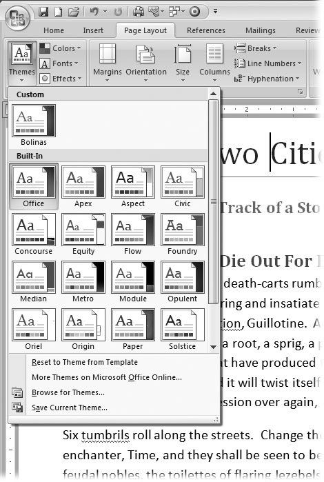
Effects . Each theme can have one of 20 built-in effects that define graphics features such as shadows, lines, highlighting, and 3-D effects. The tools you need to create new themes are in the Page Layout  Themes group (Figure 20-1). Themes group (Figure 20-1).  | Figure 20-1. Use the three buttons on the right side of the Themes group to customize a theme by choosing individual fonts, colors, and effects. The Themes menu ( open here) shows you the themes you can apply to your documentyour Custom created themes as well as the Built-In ones. | |
20.1.1. Defining Theme Colors Color is perhaps the most important element in communicating a company's image. Most companies have an identifying color that's prominent in the logo. When you apply a theme with your company colors to letters , memos, reports , and PowerPoint presentations, everyone knows they came from you. The same goes for colors you identify with your club or groupor yourself as an individual. Right out of the box, Word gives you some serviceable color combinations to use. If these colors aren't quite right for your business, you can create your own theme colors. You define colors in your theme for three different purposes: -
Text/Background colors are the hardworking, everyday colors in your document that are used for the body text. A theme defines light and dark variations, so you have two optionsfor example, standard black text on a white background and an alternative, like white text on a dark blue background. -
Accent colors are the flashier variants used for headers, artwork, table formattinganywhere you need a splash of color. In your theme, you define six accent colors, but that doesn't mean you have to use all these colors in a document. For most documents, a less is more color policy works best. -
Hyperlink colors are used to highlight links in your document and to show links that have been visited. Here are the steps to create a new color theme: -
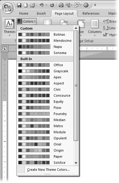
Choose Page Layout  Themes Themes  Colors (or press Alt+P, TC) to open the drop-down menu . Colors (or press Alt+P, TC) to open the drop-down menu . The Theme Colors menu shows all the themes on your computer, with a row of colors beside each name (Figure 20-2). -
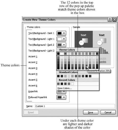
At the bottom of the Theme Colors menu, choose Create New Theme Colors to open the Create New Theme Colors dialog box (Figure 20-3) . At left, you see 12 drop-down menus showing color swatches. At right, you see two examples sporting the theme colors. One example has a dark background, as you may use for a PowerPoint slide; the other example has a lighter background. Each theme consists of 12 colors. The four colors shown at the top of the Create New Theme Colors box are text and background colors. Leave the first two colors (Text/Background Dark 1 and Text/Background Light 1) set to Automatic, and then you always have black and white available for word processing's white pages and black type. -
Using the drop-down menus, replace the Text/BackgroundDark 2 and Text/ Background Light 2 colors . When you click the Text/BackgroundDark 2 drop-down menu, you see a palette of colors in three groups. At the top, you see the current Theme colors, in the middle you see a group of standard colors and at the bottom you see the colors you recently used.  | Figure 20-2. Click one of the color options to change the colors used in your document independently of the fonts and effects. To see all the color themes, you may need to use the scroll bar or drag the menu's bottom border. Custom colors you create appear at the top of the menu while Microsoft's built-in colors are below. | | From left to right, each column in the palette lists the same colors that appeared in the Create New Theme Colors box. The colors below the first row are lighter or darker shades of the color in the top row. When you hover the mouse cursor over each swatch, you see the color's name (Accent 5, for example) and a description ( Darker 25%), as shown in Figure 20-3. If you want to make minor adjustments to your theme colors, click one of the lighter or darker Theme Colors shown in the palette. The color you click replaces the Text/BackgroundDark 2 theme color. If you're looking for a dramatic change, you want to choose colors that aren't part of the current theme, as described in the next step. -
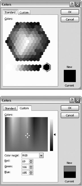
Click the More Colors option at the bottom of the palette to open the Colors box, as shown in Figure 20-4 . The Colors box gives you a much more varied palette to work from. Click the Standard tab to reveal the Windows color hexagon, which is arranged by hue and by shade . If you need even finer control over color creation, or if you want to specify a color by RGB or HSL number, use the Custom tab. (For details on the RGB and HSL color systems, see the box in Section 3.3.3.)  | Figure 20-3. The Create New Theme Colors box shows drop-down menus with color swatches. When you click a color, a palette appears. Theme colors are shown at the top. To create select custom colors, click the More Colors button at the bottom. | | After you select a color and click OK, the new color shows in the swatch in the drop-down menu. Review your color choices for Text/BackgroundDark 2 and Text/BackgroundLight 2 in the Sample pane. For the sake of your readers' eyesight, make sure there's enough contrast between the text and the background in both examples. -
Use the drop-down menus to select colors for the six highlight colors . Repeat steps 3 and 4 to select six highlight colors. As you make selections, check the Sample shown on the right. Make sure the highlight colors complement the two background colors while showing distinctly against the background. -
Use the last two drop-down menus to choose colors for Hyperlinks and Followed Hyperlinks . There are two colors for hyperlinks in documents. Hyperlinks are usually displayed in a different color from other text so people know to click them. After clicking, the link text changes color so readers know they've already followed it. As a general rule, use a brighter color for hyperlinks to make them stand out clearly from (usually black) body text, and a lighter or fainter color for followed hyperlinks for that "used" look.  | Figure 20-4. You have a choice of two tabs to specify colors. Left: The Standard tab looks like a prism. You choose colors by clicking the little hexagons. Right: The Custom tab has two controls. Move the crosshairs to select a color, and then move the triangle to adjust the lightness and darkness of the color. | | -
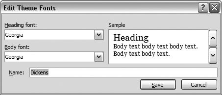
At the bottom of the Create New Theme Colors box, name your new color theme, and then click Save . Always name your themes, or Word will do it for you, and you'll end up with names like Custom 1, Custom 2, and so on. Whatever the name is, your new Color Theme shows up on the Colors menu's Custom group (Figure 20-2). 20.1.2. Defining Theme Fonts To make changes to the Theme Fonts, click Page Layout  Themes Themes  Fonts, and then click Choose Create New Theme Fonts at the bottom of the menu. The simple Edit Theme Fonts dialog box opens (Figure 20-5). You choose fonts for headings and body text from two drop-down menus. The Sample box on the right side shows how your combinations look together. Use the Name text box to give your new font theme a name. Fonts, and then click Choose Create New Theme Fonts at the bottom of the menu. The simple Edit Theme Fonts dialog box opens (Figure 20-5). You choose fonts for headings and body text from two drop-down menus. The Sample box on the right side shows how your combinations look together. Use the Name text box to give your new font theme a name.
Tip: Microsoft uses the same name for themes and the colors, fonts, and effect that make a complete theme. You may want to name theme elements consistently as well, so you'll remember which ones go together. For example, if you're creating a theme for your company (All Year), you can create All Year colors, All Year fonts, and an All Year effect.
 | Figure 20-5. Use the Create New Theme Fonts box to choose two fonts for your theme. Use the drop-down menus to choose a heading font and a font for the body text. The Sample pane provides a preview of your font theme. | |
UP TO SPEED
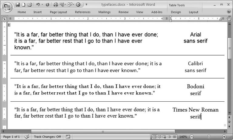
Tips for Choosing Fonts | | Unless you're a graphic artist, choosing the right fonts can be a little intimidating. You want people to read your documents, so it's important to choose fonts that are easy on the eyes. You have a choice between two major typeface categories (Figure 20-6): serif fonts (like Times and Times New Roman) and sans-serif fonts (like Arial and Helvetica). Serifs are the tiny "feet" at the ends of each stroke in a letter or number. Sans serif means without serifs, so sans-serif typefaces tend to be simpler, made up of straight lines. In general, serif types are easier to read, especially when there's a lot of text. The serifs help the reader's eye track along the horizontal line. That's why most magazines and newspapers use serif fonts. On the other hand, computer screens don't display type as sharply as the printed page, so sans-serif fonts can be more readable on computer screens. You often see sans-serif type on Web pages and on the menus in programs like Word. Sans-serif fonts tend to be more decorative and stylish. Magazines often use serif type for body text and sans-serif type for eye-catching headlines. Still, matching two fonts can be a tricky business and successful font matching, like beauty, can be in the eye of the beholder. If you're in doubt, you can never go wrong using the same font for both headings and body text. A heading that matches but is larger than the body text always looks good. |
20.1.2.1. New Office 2007 fonts Reading long documents on the computer screen is a challenge for most people. It's simply not as easy as reading from the printed page. To make matters worse , typefaces that are easy to read on the printed page are sometimes hard to read on a computer screen. In an effort to provide typefaces that are readable both on the computer screen and on the printed page, Microsoft introduced several new fonts in Office 2007. Even if you're familiar with the common typefaces, these names will be new to you. The list below provides a two-second introduction to each font.  | Figure 20-6. The two fonts (or typefaces) at the top, Arial and Calibri, are sans serif. The two at the bottom, Bodoni and Times New Roman, are serif typefaces. | |
-
Consolas is what's known as a monospaced typeface, where each character is exactly the same width whether it's a capital "M" or a lowercase "i." Programmers tend to like monospaced type because each character is distinct, and there are no decorative elements to cause confusion. -
Calibri is a modern sans-serif typeface, and you'll be seeing it a lot in the future: Microsoft is positioning it as a replacement for Times New Roman. Calibri is a little more varied in the thickness of its lines than Helvetica or the Helvetica clone Arial, which makes it easier to read in body text than most sans-serif fonts, without the drawback of displaying tiny serifs onscreen. -
Cambria is another very readable type, meaning people can quickly discern the letters even at smaller sizes. Cambria is an appropriate typeface for most business uses from letters and memos to Web design. -
Constantia is a serif typeface designed for both onscreen viewing and printed documents. Constantia is versatile and looks good in Web pages, letters, email, and printed publications . It's a good choice for PDF or XPS documents that your readers may either print or read onscreen. -
Corbel is a sans-serif type with a clean, open look. It's quite readable onscreen even at relatively small sizes, making it good for Web pages or business reports. -
Candara is ideal for Web pages. This sans-serif font has an informal, modern, artsy look, similar to Frutiger and Optima. With the wealth of fonts available in Word, why do you see the same typefaces used over and over? Well, many people are wary about choosing new fonts. And Web designers don't use exotic fonts because they can't be sure their visitors will have the fonts on their systems. Microsoft's new fonts are widely distributed, so you can use them with confidence for good looks and variety. The chart below lists some of the most overused fonts and possible replacements . Table 20-1. | Microsoft font | Similar Mac and Linux fonts | Consider as a replacement | Use for | | Arial | Helvetica | Calibri, Corbel, Candara | Web pages, headings, body text | | Times New Roman | Times, Georgia | Constantia, Cambria | Printed documents, reports, journals | | Courier New | Courier, Andale | Consolas | Computer code, email (monospaced) | | Verdana | Frutiger, Optima | Candara, Corbel | Web pages, informal documents |
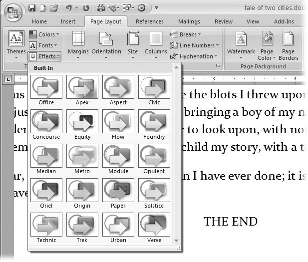
20.1.3. Defining Theme Effects Effects have less impact in your Word documents than in, say, PowerPoint presentations. The effects in a theme change the line styles, shadow, and fill for tables, charts , and lines. Office's built-in graphics like SmartArt and AutoShapes also take their visual cues from the theme's effects. Unlike colors and fonts, you can't customize any of these effects, you can't create your own, and you can choose only one effect per theme. All you can do is choose one from the available effects. Go to Page Layout  Themes Themes  Effects and click the effect that you want to add to your theme(Figure 20-7). Effects and click the effect that you want to add to your theme(Figure 20-7).  | Figure 20-7. Open the Themes Effects menu with Alt+P, TE, and you see 20 different styles of effects that you can apply to the artwork, charts, and lines in your document. | |
20.1.4. Modifying and Saving Themes As mentioned at the beginning of this section, a complete theme is a combination of colors, fonts, and effects. Once you've customized colors and fonts and chosen the effects you want to use, you can name and save the whole bundle. Once you've saved a theme, you can apply it to a document. If you've got a theme that works well for your business, you can distribute it to coworkers. Here are the complete steps for creating your own theme and then saving it: -
Choose Page Layout  Themes Themes  Colors (or Alt+P, TC) to open the Colors menu, and then select colors from the Custom or Built-in color lists . Colors (or Alt+P, TC) to open the Colors menu, and then select colors from the Custom or Built-in color lists . Color themes that you've created appear under the Custom heading. Microsoft's color themes appear under the Built-In heading. If you want to create new custom colors for this project, follow the steps for defining theme colors in Section 20.1.1. -
Go to Page Layout  Themes Themes  Fonts (or Alt+P, TF) to choose heading and body fonts . Fonts (or Alt+P, TF) to choose heading and body fonts . Consider how your document is going to be distributed, and choose fonts that match the job. You can choose from one of Microsoft's built-in font sets or create your own custom font set. For more details on font choice, see Section 20.1.2. -
Choose Page Layout  Themes Themes  Effects (or Alt+P, TE) to choose the effects you want to use for your document . Effects (or Alt+P, TE) to choose the effects you want to use for your document . The menu shows different styles for shapes , lines, shadows, and borders. To select an effects theme, click one of the examples in the menu. -
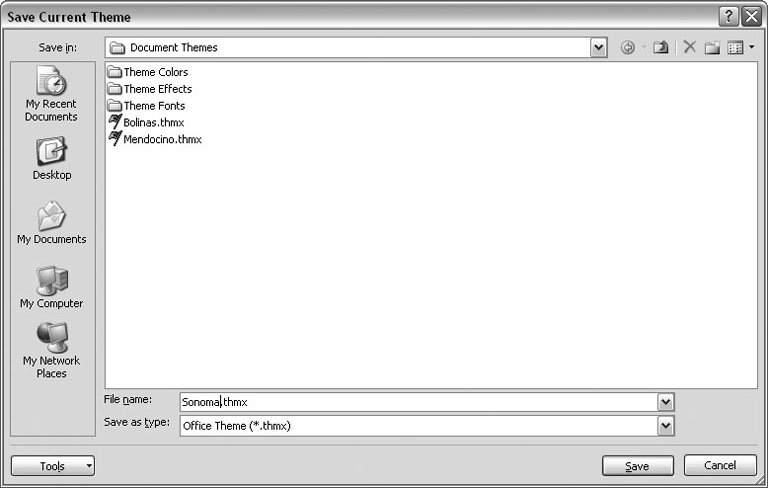
Go to Page Layout  Themes Themes  Themes to open the Themes menu, and then, at the bottom of the menu, click Save Current Theme (its the last option on the menu) . Themes to open the Themes menu, and then, at the bottom of the menu, click Save Current Theme (its the last option on the menu) . A Windows file box appears showing the folder where themes are saved, as shown in Figure 20-8. -
Type a file name for your theme in the "File name" text box, and then click Save . After you type a name and save your theme, the Save Current Theme box closes , and you see your new theme listed when you go to Page Layout  Themes Themes  Themes. Themes.  | Figure 20-8. Word automatically saves themes in the Document Themes folder that's inside your Templates folder. As you can see, the colors, fonts, and effects for your themes are each stored in their own folders inside the Document Themes folder. | |
|
 Themes group (Figure 20-1).