The Elements of Visual Interface Design
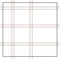
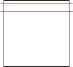
| Interaction designers mostly create interfaces that are visual or at least have some visual component. Visual interface components include buttons, labels, the position of items on a screen, the position of the screen on the device, and a host of other interaction design elements. Unlike the visual and industrial designers they often work alongside, interaction designers are typically less concerned about branding and pure aesthetic elements than they are about the controls and responses of the producthow the interface affects the interaction designand those are the elements of visual interface design that we'll focus on here. Visual interfaces consist, essentially, of only a handful of elements. The way those elements work together is what defines the visual interface. LayoutAt the core of all screen (and print, of course) visual design is layout: where and how the features, controls, and content are placed. Layout provides the structure that these elements reside within. Layout provides hierarchy, letting users know what is important and what is less soa control that is visible at all times is perceived as more important than one that is buried in a drop-down menu. Layout is particularly important for small screens, since screen real estate is at a premium. Grid SystemsDesigners can seldom go wrong starting with a grid system (Figure 6.1). A grid system helps designers organize information into a coherent pattern. Designers start by dividing the screen into basic, rational chunks, including gutters, which are the blank spaces that separate rows and columns. Designers can let elements such as images, toolbars, and working spaces cross over gutters when necessary, creating larger blocks of combined rows and/or columns. The grid lines are only suggestions, not rigid areas. Grid systems aren't just designs on graph paper; done well, they help structure screens so that there is a clear visual hierarchy and flow through the elements on the screen. Figure 6.1. Grid systems help designers organize information into a coherent pattern. Note the gutters: the blank spaces that separate rows and columns.
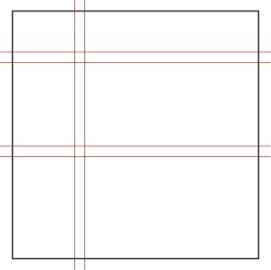
Several grid systems have become standards in interface design. Figure 6.2 shows a typical layout seen in applications such as Microsoft's PowerPoint and Apple's iTunes: a thin, left panel and a large central window, along with top and bottom rows. Figure 6.2. A grid system seen in such applications such as PowerPoint and iTunes. Top and left panels are used for controls or navigation, while a large central panel is the work area.
Figure 6.3 shows another familiar grid, used frequently in e-mail clients and RSS readers: a thin, left panel with two panels on top of each other on the right. Figure 6.3. A grid system used in e-mail and RSS clients. The large right panels are used for displaying multiple items such as a list of e-mail in the top pane, and a more detailed view such as a single e-mail in the bottom pane.
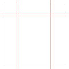
Figure 6.4 shows a common three-column Web site grid. Figure 6.4. A grid system frequently used by Web sites. Navigation features or a banner is in the top row, while content, advertising, and other navigation features are in the bottom columns.
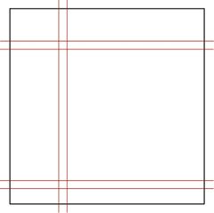
Even applications that seem freeform like Internet Explorer and the simple screens of mobile phones can be designed using a very simple grid system (Figure 6.5) that contains only a thin row at the top for a menu bar or tools such as a battery-life indicator, and a larger display or working space below. Figure 6.5. A simple grid system used as the main screen in many applications. The top panel is for menus and/or icons, and the bottom area is a working space.
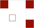
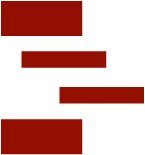
One thing that grid systems do well is help designers plan whitespace in the visual design. Whitespace is an area of blank screen that separates one filled area from another. A common mistake of interaction designers is to cram as many features onto a screen as possible, creating a very cluttered screen. Clutter creates visual noise and makes an application hard to use. The eye bounces from one thing to another, without seeing a clear flow and distinct parts of the screen. Whitespace between features will create a cleaner, clearer design. Another reason not to cram too much onto a screen is that when objects are close together, Gestalt psychology tells us, the mind will assume that they are related. This is a good thing when designers want objects to seem relatedfor instance, a Submit button next to a text boxbut not so good when the pieces of functionality drifting into each other are unrelated. Visual FlowVisual flow can be achieved in a number of ways, including by the use of the aforementioned whitespace. In the Western world, the eye generally travels from left to right, top to bottom, and designers should be aware of this flow and design for it. Don't force users' eyes to jump all over the screen. Designers need to provide cues regarding where the user should look. Color (discussed later in the chapter) can be used to attract the eye, as can contrasting fonts (larger, bold, and so on). Lines and boxes can group objects together, but these should be used sparingly, lest the users focus on the lines and boxes and not the featurestry to use whitespace instead. Positioning and alignment of objects are also important. Objects that are aligned (Figure 6.6) will appear to be related, and objects should ideally be aligned horizontally and vertically to create a clean look. Objects that are indented beneath other objects (Figure 6.7) will appear to be subordinate to those above them, and objects near the top of the screen will generally seem more important than those farther down. Figure 6.6. Objects that are aligned appear to be related.
Figure 6.7. Objects indented beneath other objects will appear subordinate.
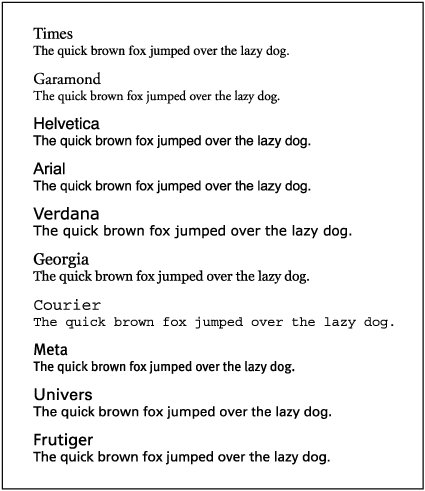
Designers should always perform the squint test on their visual interfaces. By squinting at the screen, designers can manually smudge the details and see which items on the screen have prominence. This test can often lead to surprise, revealing that secondary or unimportant items seem overly important in the design. The squint test helps ensure that the layout is strong. TypographyTypography is an important choice in any visual interface, providing not only a platform for usable, readable, and clear labels and text, but also personality. TypefacesTypefaces, commonly called fonts, are generally categorized into two groups: serif and sans-serif. Serif typefaces, such as Times and Garamond, have detailsserifson the end of the strokes that make up their letterforms (Figure 6.8). Serif typefaces are easy to read and are excellent for long passages of text, as in books. Sans serif typefaces, such as Helvetica and Arial, have no or less prominent details at the ends of the strokes that make up their letterforms. They are traditionally used for shorter passages of text and for text that is meant to be scanned quickly, such as signage. Thus, sans serif typefaces have become the default choice for interaction designers in screen or physical designs. They are excellent for button labels, instructional text, and menus. Some typefaces, such as Verdana and Georgia, have been specifically designed for the screen. If you need each letter to be the same width, look for monospace or fixed-width typefaces such as Courier. For most projects, however, a typeface of medium width is best. Figure 6.8. A collection of standard and classic typefaces.
There are a lot of typefaces out there. Avoid typefaces that appear very heavy or very light. For optimum legibility, designers can seldom go wrong choosing classic, time-tested typefaces such as Meta, Univers, and Frutiger. Avoid using lots of typefaces at once, and avoid combining typefaces that are too similarthe result will look like a mistake. Typographic GuidelinesIn general, designers should avoid using too many different type sizes and weights (book, semibold, bold, italic, black) at the same time. It's best to start with book weight and a standard point size and sparingly use other sizes and weights for things like labels and headers. Setting text in all capital letters severely retards readability. Use uppercase and lowercase letters for optimum readability, except for single words or phrases, and never combine small caps and regular caps. Always maintain the integrity of the typeface. Avoid stretching or distorting typefaces or putting text on a curve. Here are some other general typographic guidelines:
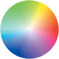
ColorColor has a number of functions in visual interface design. While color can be used to create personality and tone, interaction designers are most interested in how color can provide cues for use. Red buttons, for instance, as on a mobile phone, can signal stop or end, while green ones can signal go or send. Color also can establish relationships between disparate objects; for example, buttons at a Web site, no matter where they are placed, could all be one color. Color can indicate importance: a highly saturated blue box will attract the eye more quickly than a pale yellow one. However, color can be greatly misused. Most of us have seen applications or Web sites that either are flat and dull from lack of color or look like a circus from too many colors or colors that are too saturated. Designers should also remember that about 10 percent of the male population have some sort of color blindness, which renders greens and reds as shades of gray. Color BasicsAll colors have three main properties: hue, value (or brightness), and intensity (or saturation). Hue refers to the color itself, or, technically, the particular color within the optical (visible) spectrum of light. Value refers to the amount of black in a colorhow dark or light it is. Intensity refers to the brightness or dullness the of color is. Designers should become familiar with the color wheel (Figure 6.9), which is helpful not only for choosing a color scheme, but also for avoiding color-related problems. There are three primary colors: red, blue, and yellow. Mixing two primary colors together creates the secondary colors: purple, green, and orange. Analogous colors are those that are adjacent to each other on the color wheel. Analogous colors are excellent for creating color schemestry using three or four of them together, such as red, orange, and yellow, or blue, green, and yellow. Complementary colors are those that are across the color wheel from each otherfor example, red and green. Although they have been used by artists for centuries, care should be taken when using complementary colors together. Although they will make each other vivid, used together they can also be difficult to focus on. Figure 6.9. The color wheel. Knowing its basic principles will help designers avoid clashing colors.
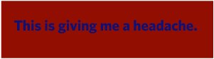
The painter Josef Albers noted that a color doesn't exist until it meets another color. Designers should look at the edges of colors and see how they work together. White backgrounds tend to darken, and can even deaden, colors. Black backgrounds tend to lighten colors. Try backgrounds that aren't pure white or black, such as light gray. Very pale yellow backgrounds with black type are good for older eyes. Care should be taken to avoid an effect called chromostereopsis, which occurs when two colors side by side seem to cause both colors to vibrate. Red and blue togetherfor instance, blue text on a red background (Figure 6.10)will often create this effect, irritating viewers' eyes. In general, colored text on a colored background is difficult to execute well. Figure 6.10. Blue text on a red background creates chromostereopsis. Avoid this.
When working in color, ensure that sufficient contrast exists between the foreground color and its background. Vary the saturation and brightness to make foreground items stand out. But when initially picking a suite of colors, try to keep them all at around the same value. Colors with equal values and saturation will create a coherent, even appearance. Since the human eye is very attuned to color and the human brain responds to color both consciously and unconsciously, color is one of the most powerful tools in visual interface design. Material and ShapeVisual interface design isn't only about screens. What surrounds those screensif there even is a screenmatters greatly as well. As noted in Chapter 3, the physical form of a device tells a lot about how and where the device is meant to be used. That physical form is made of some sort of material, often metal and plastic, but also wood, clay, ceramic, cloth, rubber, glass, leather, or some combination. Each of these materials has its own characteristics, feeling different in the hand and with a different visual impact. And these basic materials themselves can have drastically different looks and feelsmetal may be industrial iron or high-end brushed nickel; plastic may be a thick slab or a brittle strip. Materials also determine weight, which is an important factor especially in mobile or portable devices. Imitating another material (typically with plastic materials) can cause a device to be viewed and treated differently. Clear plastic, although it can be firm and solid, is often treated like glass, for instance. You don't see many clear mobile phones, although they could be made.
The material and form of any physical controls (discussed later in this chapter) are crucial components of any device. After all, if a device cannot be turned on, it can't be used. Keyboard keys need to be set firmly enough for many repeat pressings, but not so firmly so that they are a chore to press. Ergonomics and human factors come into play in the size and shape of controls. How small can a button be before most people can't press it? Should a dial have a ridged edge or be smooth? The overall size and shape of a device are important visually as well. A thick black box made of plastic with knobs and dials on it probably belongs on the shelf with other multimedia equipment, while a thin sliver of the same black plastic about the size of a pack of cards probably slips into a purse or pocket. Does it have a strap? If so, it's supposed to be carried around. Are its buttons visible or hidden? Is the on/off control a switch or a button or a knob? There are literally dozens of design decisions for the physical form of a device, and each has meaning and, from a business standpoint, an associated cost. An extra nice button might add only an extra 2 cents to each unit, but 10 million devices later, those 2 cents have added up to $200,000. |

 Creating Smart Applications and Clever Devices")
EAN: 2147483647
Pages: 110