| Imagine for a moment that our fictitious Dorknozzle website used the same font face, color, and size consistently throughout the site. Also imagine that the Dorknozzle site consists of three hundred pages and you need to change the font from Arial to Verdana and from a black color to gray throughout the site. You can imagine how frustrating it would be to open every single one of those three hundred files and manually change every place you had applied a font to a section of text. At its foundation, CSS solves this dilemma. With CSS, you can create one file (styles.css) and apply the style rules in that CSS file to dictate how the text in your website should look. If the time ever comes to change the font properties, you do it in that one CSS file, and your changes appear throughout the entire site. But how does this work? Style sheets are usually contained in an external CSS file (but they don't have to be) and are linked in to every web page you are working with using the <link> tag within the <head> tag of your document. Therefore, any and all styles from that CSS file can be applied to the web pages you are working with, ultimately providing you with the flexibility to quickly and easily modify one CSS file that propagates changes to all the web pages that share the CSS file. I've mentioned one way of creating style sheets (external CSS file), but there are, in fact, three different ways of creating them: External file: Arguably the most popular and time-efficient way to create style sheets is using an external CSS file. By creating an external style sheet file, you can link this file to any and all your web pages using the <link> tag and placing it within the <head> tag of your web pages. Later, when the time comes to make changes, you make modifications to the one CSS file, and all the pages of your website change accordingly. Document wide: Another efficient way to create styles is by simply adding them straight to your web page using the <style> tag and placing it within the <head> tag of your page. Using a document-wide style sheet doesn't afford a global repository for styles in your site, but it does allow you to create styles that can be used throughout the page. Inline: Inline styles allow for quick and dirty additions of styles within a tag. An example of an inline style could look similar to this: <input type="text" style="border-style:groove" />
This code effectively adds a border to a form element on your web page. An excellent example of inline styles in use in Dreamweaver is layers. When Dreamweaver adds a layer to the page, it simply adds a <div> tag, with an ID and an inline style to control the positioning aspects of the <div> tag. You'll see this with more detail in Chapter 11, "Working with Layers in Dreamweaver."
Now that you have an idea about how style sheets can be created, let's take a look at how styles are defined in style sheets. A Cascading Style Sheet, or a CSS, file consists of numerous parts working together to form rules that enhance the look of your web pages. These rules can consist of font properties, positioning properties, border properties, and more. Figure 7.1 shows what a typical CSS file can look like. Figure 7.1. A typical CSS file. 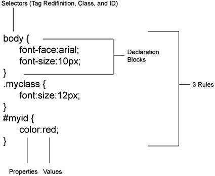
A typical CSS file contains selectors, declaration blocks, properties, and values, all organized to form rules. These rules are typically structured in an external file or document-wide <style> tag to form a style sheet. NOTE Throughout this book, I use the terms CSS, Cascading Style Sheets, style sheets, and styles. Don't be confused by the different terms because they are all synonymous.
In detail, there are four ways of defining styles in Dreamweaver: Classes: Arguably the most popular way of defining styles in a style sheet, classes allow you to set up a custom style and use the class name as an attribute value later in the tag. For instance, if you were to set up a class named .myclass and give it the appropriate properties and values, you could later add the class as a style reference to a paragraph of text as follows: <head> <style> .myclass {font:Arial;} </style> </head> <body> <p >Dorknozzle</p> </body>
In this case, the rule is defined (as a document-wide style sheet) such that a class is set with the font property. The property value is set to Arial. The <p> tag uses the class, accessing it with the class attribute, and renders the text Dorknozzle as Arial in the browser. Pseudo-Classes: Pseudo-classes are similar to classes in that they define rules for use on your web pages. The difference between classes and pseudo-classes, however, is that pseudo-classes aren't applied to elements in your web pages as classes are. For the most part, pseudo-classes are reserved for modifying links, visited links, active links, and hover states for links. Here is an example of pseudo-classes in use: <head> <style> a.link {font:Arial; color:blue;} a.hover {color:Red;} </style> </head> <body> <a href="index.htm">Home</a> </body>
In this case, the link and hover pseudo-classes are used to define the font and color of all hyperlinks on the page. Pseudo-classes are outlined with greater detail later in the chapter. ID: Generally used for JavaScript purposes, an ID allows you to set up a custom style as well as reference the uniquely named element from JavaScript. For instance, if you were to set up an ID named #myclass and give it the appropriate properties, you can later add the ID to your code and have it referenced in JavaScript as follows: <head> <script> function alertme() { window.alert(document.form1.mytextbox.value); } </script> <style> #mytextbox {background-color:silver;} </style> </head> <body> <form name="form1"> <input type="text" /> <input type="button" value="Click Me" onClick="alertme()" /> </form> </body>
In this example, I've created a text box with an ID named mytextbox. Although this ID uniquely identifies the element, it also allows me to set its style using the # identifier in the document-wide style sheet. Even better, I can reference the same ID in JavaScript to extract the value and present it in a JavaScript alert when the button is clicked. It's safe to say that, by using IDs, you are effectively "killing two birds with one stone." Tag Redefinitions: Tag redefinitions are an excellent way of redefining the properties of HTML tags as they are defined in the browser. For instance, Heading 1, represented by the <h1> tag, is generally defined by the browser as having a font size of 7, a font face of Times New Roman (depending on user settings in the browser), and having a color of black. You could change the way the tag appears in the browser by redefining the tag using a CSS tag redefinition as follows: <head> <style> h1 {font:arial;font-size:12px;color:red;} </style> </head> <body> <h1>Welcome to the Dorknozzle site!</h1> </body>
In this scenario, the <h1> tag redefinition is defined with properties of Arial for the font, 12 pixels for the size, and red for the color. In the body, we do little more than wrap the literal text with the <h1> tag. In the browser, our text is defined with the properties we set in the document-wide CSS style sheet.
The power of CSS is virtually limitless. With three methods for creating style sheets and four methods for defining styles in those style sheets, you now have an opportunity to greatly improve the look and general feel of your website using a flexible and robust environment. But you still might be in the dark about the differences between HTML and CSS. In the next section, we'll dissect the differences. CSS versus HTML Although CSS properties can create the same types of presentation effects as HTML tags and attributes, CSS styles go far beyond the restrictive aspects of HTML, enabling you to create stunning effects that ordinarily can't be created using HTML. Beyond simple text effects, CSS styles can also be used to lay out the entire page, entirely avoiding the use of HTML tables. This allows HTML to be used for its primary purpose of conveying the structure of the content while the style sheet defines the presentation and overall "look." A list of differences is provided in Table 7.1. Table 7.1. Comparisons of HTML and CSSElement | HTML | CSS |
|---|
Font Face | Limited to 6 font faces with slight variations for families. | Limited to 7 font faces with slight variations for families. | Font Size | Limited to absolute sizes of 17 and relative sizes of +1+7 and 17. | Virtually limitless. You can use pixels, points, picas, inches, centimeters, metric, and so on. Even better, the size is limited only by the space available on your page. Therefore you can use 11.25 points, 2.25 inches, and so on. | Color | Standards compliancy dictates 256 web-safe colors. | Standards compliancy dictates 256 web-safe colors. | Font Weight | Limited to <strong> and <em>. | Options include Bold, Bolder, Normal, Light, Lighter, and weight values of 100900. | Case | No automatic conversion to uppercase or lowercase. | Supports automatic conversion of uppercase and lowercase or even the ability to capitalize the first letter in the word. | Text Decoration | Supports underline and strikethrough. | Supports underline, strikethrough, overline, and can even remove underlines from links using the None property. | Link Rollovers | Not supported. | Using contextual selectors such as Hover, you can have links on the page that change color when a user rolls over them. | Background Color and Images | Can set the background color of the page, tables, cells, and layers. Unfortunately background images always tile. | Supports background color for the page, tables, cells, layers, and even text. Tiling can be limited to tile just vertically or horizontally, or prevented from tiling at all. | Block Formatting | Limited to nonbreaking spaces, paragraph breaks, and line breaks. Text indenting is limited to <blockquote>. | Properties exist to control word spacing, letter spacing, vertical alignments, text indenting using pixel spacing, and so on. | Table Formatting | Cell padding and cell spacing must be defined for the entire table. Thus, padding and spacing appears around all edges of the table and cell. | Cell padding and cell spacing can be adjusted on each side of the table independent of other sides. This means that the left edge of all tables and cells can have a spacing and padding of 0 while other sides can have a spacing or padding of 5. | Borders | Tables, layers, images, and cells can contain simple borders. Sizes are controlled by pixel, and the color is limited depending on element type. | All elements (including text) can have borders. Even better, border styles can be set, widths can be set in pixels, percentages, inches, and so on, and the color can be customized as well. | Lists | Lists are limited to bullets, squares, numbers, and roman numerals. | All options available in HTML are relevant in CSS including the ability to customize your own image to use with the list item and also to control the positioning of the image in the list item. | Positioning | Limited to using tables to control the placement of elements on the page. | CSS positioning properties in conjunction with the <div> HTML tag expose functionality for creating draggable and precisely positioned elements in the Document window and, ultimately, the browser. This feature set mocks the functionality of print design programs. | Cursor Customization | Not supported. | Cursor can be customized to 14 different icon types. |
Although we're merely scratching the surface in our comparison of HTML and CSS, you can begin to see the overall benefits that CSS has over HTML. To further elaborate on the differences between the two, I need only point to the structure of properties that control the look on the page. For instance, Figure 7.2 shows a typical formatted page using HTML formatting elements. As you can see, elements formatted using HTML are difficult to pick out because of the abundance of code. Even worse, all elements on the page are formatted independently of one another making global changes nearly impossible. Figure 7.2. Elements formatted using HTML are hard to spot because of the abundance of code. 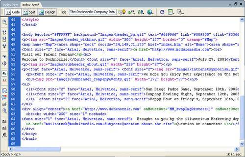
Alternatively, take a look at Figure 7.3, which shows a similar page formatted using CSS. As you can see, CSS cleanly separates the formatting of the page into a separate file, effectively making your HTML cleaner and easier to manage. Furthermore, separating the formatting of the page into a separate file that uses the power of CSS enables you to work with that file across your entire website. Figure 7.3. CSS cleanly separates formatting elements into a separate page. This causes the HTML code to appear cleaner and makes it easier to manage. 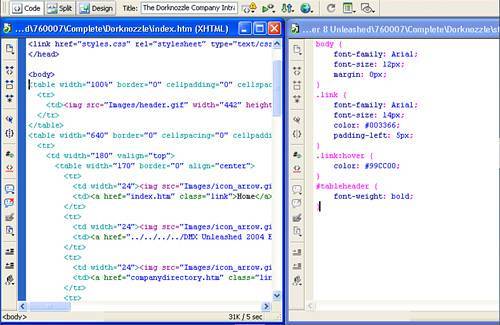
Although I've attempted to shed some light on the differences between HTML and CSS formatting, the real comparison will be made by you as the chapter unfolds. Browser Support for CSS CSS has been around for nearly a decade, but it's only recently that widespread support for CSS has been integrated into browsers. Early implementations of CSS, notably Internet Explorer 3 and Netscape 4, were well-meaning but left much to be desired. To that end, most web developers wisely avoided using CSS until browsers would correctly interpret their designs. The listing of browser versions in Table 7.2 should give you a rough idea about the adoption of CSS. This is just a representative sample of the most common browsers and doesn't include many of the other browsers out there, such as OmniWeb, Konqueror, or iCab. Table 7.2. A Comparison of Browsers and Their Support for CSSBrowser and Version | CSS Implementation |
|---|
Internet Explorer 3 | Poor | Internet Explorer 4 | Fair | Internet Explorer 5 (Win) | Good | Internet Explorer 5 (Mac) | Good | Internet Explorer 6 | Exceptional | Lynx | None | Netscape 3 | None | Netscape 4 | Poor | Netscape 6 | Great | Netscape 7 | Exceptional | Netscape 8 | Exceptional | Opera 3 | Fair | Opera 4 | Good | Opera 5 | Good | Opera 6 | Great | Opera 7 | Excellent | Opera 8 | Excellent | WebTV | Fair | FireFox 1 (Mozilla) | Exceptional | Safari | Great |
The good news is that CSS support continues to improve, and the newest browser versions are quite good at displaying most CSS styles. The bad news is that older browsers are still out there. What that means is that you must test pages you've designed using CSS in as many browsers as you can. NOTE Several newer browsers have a special compatibility mode for HTML and CSS, where they adhere more closely to the published standards. FireFox, Netscape 6 and 7, and Internet Explorer 6 turn on this mode when they encounter a valid DOCTYPE for HTML Strict and for a few other DOCTYPE declarations; other pages are done in a "quirky" mode for backwards-compatibility with older browsers. For more information, visit http://www.mozilla.org/docs/web-developer/quirks or http://msdn.microsoft.com/library/default.asp?url=/library/en-us/dnie60/html/cssenhancements.asp
Now that you've seen the CSS support by browsers, let's divert our attention to Dreamweaver's support of CSS. As you know, Dreamweaver is merely a development tool for web pages that will ultimately be viewed in the browser. Your designs are ultimately limited only by your knowledge of CSS and your knowledge of Dreamweaver's CSS support and formatting capabilities. |