Controlling Eye Movement
| We know that eight seconds is the average attention span on any visual. You can leave the visual up as long as you want, but the first eight seconds set the tone for how long someone reads and how quickly that person can begin to listen. Face it, you can't read and listen at the same time. Want to test this? Hand a newspaper article to a loved one. Begin speaking right away. You'll hear, in an angry tone, "How can I read this if you keep talking?" Try it (once). Given the need to direct the eye quickly, ask yourself some questions. When a visual is displayed, where does a person look first? At what point on the image is the concentration of attention? Where does a person look next ? If you can control a physical element of the audience, you will command more attention per visual. You can do this by controlling eye movement. The part of the body most used by an audience member is the eyes. A presentation is mostly watched. You need to find effective ways to direct the eye to the most important element in the visual. NOTE For this discussion, I'll use the word "eye" to mean both eyes. Another way to think about the word "eye" is as a focal point. When designing the visuals, you need to think about several things to control eye movement. These include
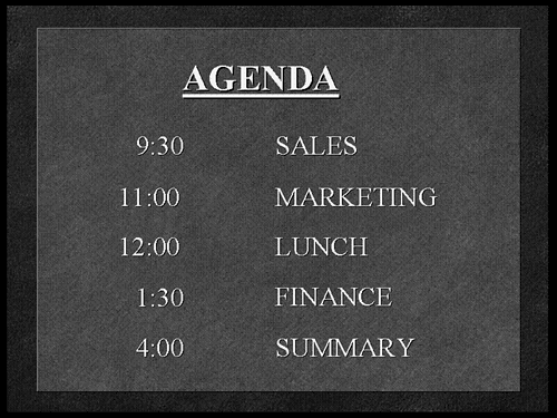
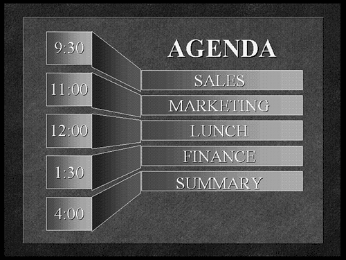
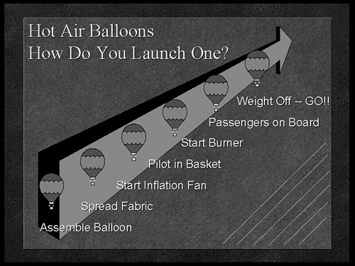
Establishing AnchorsAn anchor in a visual is really just the solid footing for the brain. It's where we dock our attention to a focal point to begin processing the information. Usually, the starting point is the upper-left corner of the visual because our reading pattern is left-to-right in the English language. But all visuals are not the same. Text changes size, charts are used, artwork appears, lines are drawn, and shapes are placed in varying spots. It can get very confusing. Figure 25.1 is a simple text chart. The typical way your eye moves on the visual is first you read the word "agenda" in the title. Then you begin reading the numbers on the left side of the visual. Because they look the same, you scan them in a downward fashion. At about the third line (12:00), you say, "Wait, I should be reading this left to right. Let me go back." In the few moments it takes to readjust and start again, you have not been listening to the presenter. Figure 25.1. Without an anchor, the eye initially scans the text as if it were two separate columns . In Figure 25.2, the geometric shape in the background helps guide the eye across instead of down. Text alone cannot guide the eye. Geometric shapes guide the eye. Figure 25.2. The geometric shape provides an anchor to guide the eye horizontally, allowing a faster scan of the information. Geometric shapes are universal. They are not subject to cultural limitations in the way languages are. A square is the same shape in Toronto as it is in Tokyo. We process universal shapes first, and then the language next. So think global! In Figure 25.3, the list of items covers the basic steps necessary for launching hot air balloons. It is a text chart with no geometric shapes. Figure 25.3. While looking at this visual, your eye will move from top to bottom, as in reading a list. In Figure 25.4, your eye stops after the question mark in the heading and jumps to the tip of the arrowhead . But once you start checking out a geometric shape, you have to finish it to form the image in your mind. So, your eye travels to the end of the arrow at the bottom left corner of the visual to complete the shape. But, you then process the next shape (the bottom balloon) and after that, the text element near it ("Assemble Balloon"). Without thinking, you'll read the steps from bottom to top (backward, technically). Figure 25.4. The arrow is an anchor in the background. It forces you to find its origin (lower-left corner) and then you end up reading the text in an upward pattern. The whole image is designed to redirect your eye. Even the thin diagonal lines on the right side of the visual continue to help your eye move upward. In fact, as the visual forces your eye upward from the bottom, it matches the concept of launching a balloon from the ground.
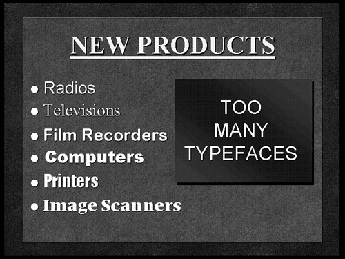
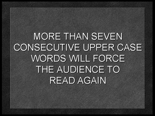
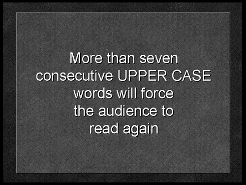
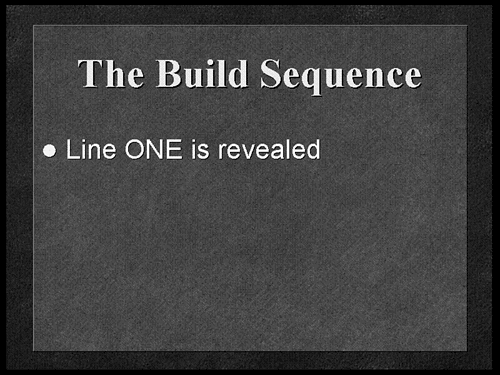
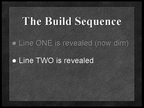
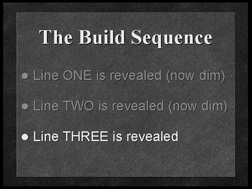
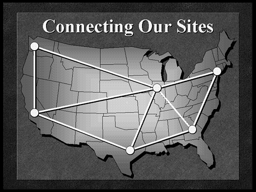
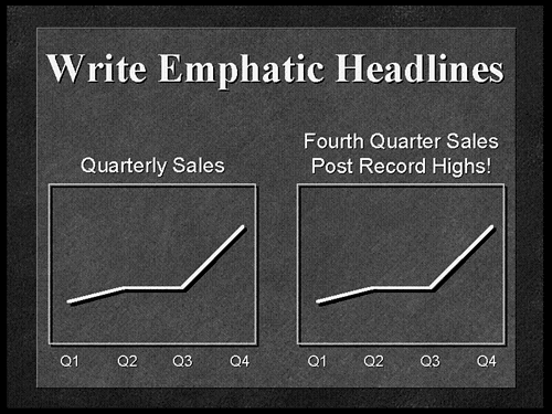
Choosing Typefaces and FontsThe eye moves from the simplest shapes to the more complex. Geometric shapes are easiest and text gets more difficult. I mean, when you think about it, the letters of the alphabet are shapes, but because you need to interpret text (language), you can understand why the eye scans text last. That means the design of the letters (the typefaces and fonts) affects the eye movement of the audience. Basically there are only two kinds of typefaces, serif (fancy) and sans serif (plain). You can be sure that all the fonts you have on your computer fall into one of those two categories. Fancy typefaces have little curls (or serifs) at the ends of the letters, plain (sans serif) typefaces don't. The eye slows down on the fancy fonts and speeds up on the plain ones. Think of the font as a road. The more hooks and turns, the longer it takes to travel that road. Fancy fonts have more contours (hooks and turns), so we read them more slowly. TIP If you choose to use two different fonts ( please ”no more than two!), use a serif typeface for the heading (title) and a sans serif typeface for the body of the chart. When you make a presentation, you want the eye to slow down while reading the heading (which has the key words), and speed up when reading the body of the chart (where there tends to be more text). Once the audience locks in on the title, they are more likely to get the rest of the text that follows . The heading is where the emphasis belongs because it's usually the first place the person looks. The use of fonts and typefaces are the opposite of that in a newspaper. When you see a newspaper, the headlines are usually bold, Helvetica (sans serif), so that you can quickly scan them as you walk past the newsstand. But the body of the paper, Times Roman (serif), takes longer to read and therefore increases comprehension. That's why I keep my email messages in a plain font (Arial). I can't be bothered with comprehension . It might lead to responsibility, and who wants that? If you look at Figure 25.5, you can see that the contours of the letters themselves cause distraction because the patterns keep changing. Don't you hate it when that happens? The eye travels along the contours of each letter and gets distracted as the different text shapes keep appearing. There should be a law against this! Figure 25.5. The heading "NEW PRODUCTS," is a Times Roman font. In contrast, the word "Radios" in the first bullet is Helvetica, which is a sans serif, or plain, font. CAUTION If you have the entire True Type Font library and feel compelled to use every font on every visual, you may be suffering from CTD, Compulsive Typeface Disorder. Seek help immediately! Capitalization also affects eye movement. Take a look at Figure 25.6. Did you read it again? It's true. A series of all capital letters makes the text look the same. Our language thrives on ascends and descends as seen in letters like "b" and "g." These extenders give letters character. ALL CAPS leave no room for emphasis or inflection . This causes the eye to read the information again. If the words in all caps were read out loud, the sound would be monotone. Figure 25.6. When all the words have equal weight, it makes it harder to know what's important. By structuring text phrases similarly to the way we read (uppercase and lowercase), you can then use capitalization to place emphasis at a particular point on the visual. Figure 25.7 shows the verbal inflection. If you read the text out loud in this example, the capitalized words would sound louder than the rest. Figure 25.7. The proper use of upper- and lowercase allows the visual to "speak" for itself by indicating the intended inflection. One other capitalization issue involves the use of "initial caps" or "first caps," as some refer to it. This is the choice to capitalize the first letter of every "major" word in a given text line to create emphasis. The problem is that there is a lack of consistency on which words to initial cap. After all, what is a "major" word? Is it one with more than four letters? Is it one that is not a preposition? How do you decide? If you are not consistent, the audience begins to get distracted since reading initial caps is not the norm, especially if the pattern in not consistent. Stick to the natural way we read by initial capping only the first word of a text line, rather than using inconsistent or distracting capitalization methods . Using Builds and OverlaysEye movement can be affected by the sheer amount of information the audience is allowed to see on a given visual. Sometimes I look at a visual and think the heading should start with, "It was the best of times, it was the worst of times." You don't want A Tale of Two Cities showing up on your visuals! Obviously, it's easy for me to tell you to reduce the clutter. But the real world doesn't always work that way. The visuals get wordy for one reason or another and maybe you can't be the one to say stop. So what can you do? One way to soften the blow for the audience is to use the build sequence. This simple technique is used to reveal elements of a visual in stages in order to maintain a steady focus for the audience. Examine Figures 25.8, 25.9, and 25.10. They are shown as three visual impressions , even though only one visual would appear if you look in the Slide Sorter. That's because the build is a transition effect in PowerPoint. Figure 25.8. The first in a series using builds. One line appears and limits the distraction from additional items to maintain focus. Figure 25.9. The next item in the build sequence is revealed while using the dim-down approach to darken or dim the color of the prior item. Figure 25.10. The last bulleted point in the build sequence is revealed, and you can still see the dimmed text as a reference to what has been covered. Figure 25.8 shows the beginning of a build sequence with the first line revealed and the remaining information hidden. The presenter is able to concentrate on this element of the visual until the next item is needed. When ready, the presenter reveals the next bulleted item, as shown in Figure 25.9. I prefer using the dim-down ”or gray-down ”approach for a more effective text build sequence. Dimming the color of the prior item ”usually to a shade of gray ”then revealing the next item allows the eye to focus on the brighter and most current element and still maintains some visibility for what has already been covered. I do this to help all those people who are waking up and want to know exactly what bullet point I'm discussing before they doze off again! I'm kidding, they aren't sleeping ”they are usually on their way home by that point! Figure 25.10 shows the next bulleted item, which is revealed at whatever pace the presenter chooses, allowing direct manipulation of eye movement in a downward pattern throughout the entire visual. Another sequencing method that helps with data clutter is when you reveal a section of information at a time. Text, data, and graphic elements ”each of which contain complete thoughts ”are revealed in segments called overlays. If you show the audience the completed image, too many elements would distract the eye and reduce the effectiveness of the visual. When the eye is bombarded with multiple activities or thoughts, it doesn't know where to look first. If it takes time to design the visual, you have to give the audience time to digest it. If, however, the audience clearly sees the creative thought process that went into the complete visual, they will not be confused . So, imagine a busy puzzle. If you watch the pieces of the puzzle fall into place, you can appreciate the whole picture. Have you ever put together a model or a toy with a lot of pieces? There's always that diagram in the instruction pamphlet that shows the "exploded" view of how all the pieces come together to form the object. Have kids and you'll experience these diagrams constantly! The point is that the exploded view diagram lets you see the pieces spread apart and helps you understand how they fit together. Figures 25.11, 25.12, 25.13, and 25.14 show the base image and the three subsequent overlays used to show a communications network linking certain office locations in the United States and connected to a central hub. Yet the image can be separated into several little stories or thoughts which, when combined, create the final impression . Consider the amount of information on each of your visuals. Ask yourself if it would be more effective to reveal some of the elements in stages by using overlays. Figure 25.11. The base image for an overlay sequence. The map of the U.S. appears with only a title above it. Figure 25.12. The first overlay or "layer" appears showing the office locations (dots) that the communications network will link together. Figure 25.13. The next piece of the overlay "puzzle" shows the communications network connecting the locations. Figure 25.14. The last overlay in the sequence shows the hub or central communication area noted by the "star"in the center of the map (Chicago). Creating EmphasisYou can control eye movement by designing ways for the audience to immediately know where to look when the visual is displayed. If people are searching around, looking for something on the screen that remotely matches your words, then you have a problem. When people don't "get it," the attention span drops and boredom sets in very quickly. You can guide the eye using words or pictures. Headlines and arrows are both effective when designing guidance into visual content. HeadlinesHow would you feel if every time you picked up the morning paper the headline read "News"? That's it, just News. Every day the same thing, News. You wouldn't be as interested. I know I wouldn't. Headlines, baby, headlines! That sells newspapers. So, the best way to direct the eye to the important area of a visual using words is to start with emphatic headlines . Too many visuals have flat titles these days. Quarterly Sales ”1st Quarter, Quarterly Sales ”2nd Quarter, Quarterly Sales ”stop already!
In Figure 25.15, the two charts contain the same data. In the one to the left, I have a 25% chance that the audience will be looking at the exact part of the line chart I will refer to, even before I begin speaking. The heading is flat. However, in the same figure, the chart to the right includes the emphatic headline "Fourth Quarter Sales Post Record Highs!" which directs the eye quickly to the part of the line chart I want attention brought to ”the fourth quarter as opposed to the other quarters . In fact, the headline even tells the audience how I feel about the information. Figure 25.15. The headline tells a story. On the left, a flat heading doesn't help guide the eye. On the right, the headline quickly gets you to the exact part of the visual to be discussed. Don't waste the valuable real estate in the heading. If something is important, try to emphasize it in the title of the visual. Okay, you can't do this on every visual, but you can at least review all your headings and see where emphasis can be placed. Used wisely, emphasis in the right areas of a visual can affect both the physical and emotional reactions of the audience.
ArrowsThe simplest graphic element for controlling eye movement is the arrow. In many instances, using arrows as part of the visual can create the emphasis you need. Arrows not only show direction, but they can also indicate conflict, options, choices, and trends. But be careful with arrows. Eye movement can easily be distracted when arrows point in too many directions on the same visual. Take a look at Figure 25.16. The eye scans the visual elements and eventually wanders or gets lost. The colors, text sizes, inconsistent capitalization methods, and the variety of geometric shapes add to the confusion. Try to limit the number of arrows used for emphasis on a single visual. Figure 25.16. This chart uses too many arrows! Your eye movement is actually disrupted rather than enhanced. When this happens it takes longer to scan the image, which reduces attention to the message being delivered. |

 For more information about slide effects,


EAN: 2147483647
Pages: 261
- Basic MPLS VPN Overview and Configuration
- Option 4: Non-VPN Transit Provider
- Case Study-Inter-AS Implementing Route-Reflector and BGP Confederation in Provider Networks
- Virtual Private LAN Service (VPLS)
- Case Study 3: Implementing Layer 2 VPNs over Inter-AS Topologies Using Layer 2 VPN Pseudo-Wire Switching