Using Color
Using ColorI have always been fascinated with color. In 1985, my wife, Joan, worked as a fashion designer for a large sportswear company. She had to do all this research on color theory and the effect of certain colors on the emotions. I waded through several of the library reference books she gathered and said, "This stuff is great! Now when we prepare presentations at MediaNet, we can apply these color theory principles to help shape the story!" She said, "Yes, but think about the cost factor." I said, "What cost factor?" She smiled and said, "Well, it's going to take you a few days to look at all these books and they are already two weeks overdue!" Of course, the big problem with those reference books was that the information related only to fabric and dyes, which made it difficult to relate to presentations. That's why, through experience, our company had to rely on its own research to draw conclusions as to the way colors influenced business presentations. Over the years I've learned that correct color choices can have a tremendous impact on the success of the presentation. At the beginning of this chapter I pointed out that presentations delivered in black and white are less effective than those in color. We live in world of color and that, in itself, is an anchor to our understanding of information. Consider the following areas when using color:
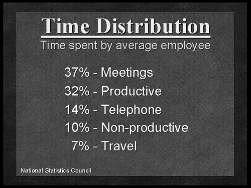
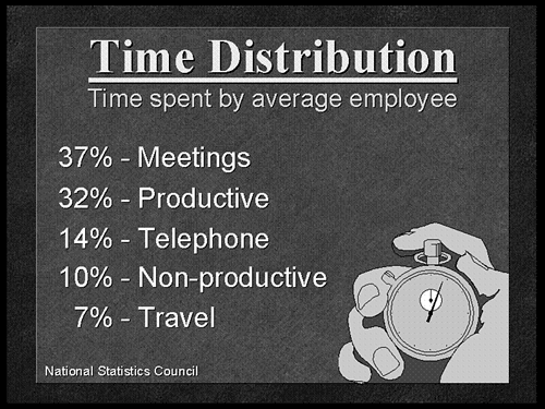
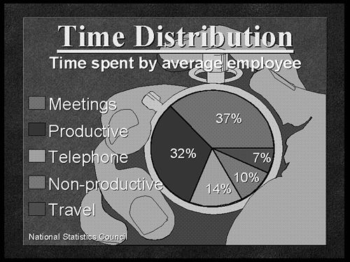
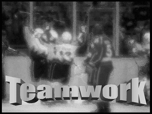
Incorporating SymbolsAlthough geometric shapes are more universal, often you'll find that you need to use actual objects to describe something or make a point. You've heard the saying, "A picture is worth a thousand words." Of course today the saying has changed to, "A videotape is worth a million dollars," but that's another issue. Anyway, the use of imagery in a visual can be very helpful. Symbols, to me, represent ideas. Clip art is basically a collection of symbols depicted as artistic renderings and available in PowerPoint or from other sources. Let's concentrate on how these elements can be used effectively or, for that matter, ineffectively. I look for flexibility with symbols. Can I use them in the background of the visual? Can I make them into a silhouette for more utility? Can I avoid the distraction of details? DepthThere is a whole area in the background of each visual just waiting to be used. Sometimes a template is used to fill the background. If the template already contains a lot of elements, you have less chance to use symbols as part of the background. That's why I like simple templates. Figure 25.17 is a text chart showing how employees spend their time. It's clear, readable, and to the point. The background template is pretty simple. This allows you the option of adding a symbol to support the message. Figure 25.17. This is a simple text chart. A series of percentages, arranged from highest to lowest , shows how employees spend their time during the workday . Okay, so you see the word "time" in the heading and you search the clip art library for a descriptive symbol and you find the stopwatch. As shown in Figure 25.18, if you just use a two-dimensional approach, you'll shift the text to one side and pop the clip art on the other side. This is fine, but the clip art is still pretty small and less obvious from a distance. Figure 25.18. The hand with the stopwatch (clip art) is added and the text is moved to one side to make room for the artwork. This is a two-dimensional approach. But if you think deep into the visual, there is another interpretation available. The percentages could be displayed as a pie chart. A pie chart is round, the stopwatch is round. Instead of making the graphic part of the chart, you can make a chart part of the graphic! Figure 25.19 shows a three-dimensional view of the information. The symbol is now in the background but still retains its meaning. You know it's a hand, even though text covers some of the fingers. You know it's a stopwatch, even though there's a pie in its face! The symbol and the text occupy similar space on the visual, only in layers , and create the illusion of depth. Figure 25.19. The clip art is sized to fill the background. This three-dimensional approach creates depth while allowing the data to take a more graphical form, a pie chart. One of the best uses of the background is to incorporate photographs or natural images. A photo is the real-life symbol of an idea. Figure 25.20 is one example of how a photograph of people in a situation adds to the message in a way that clip art just can't. In keeping with our recurring theme of a visual presenter, it makes a lot of sense to use real people in real situations, not only in the message but in the media as well. Figure 25.20. The photograph in the background is blurred, yet still representative of the "team" concept noted in the title. Keep in mind that photos usually contain hundreds of thousands of colors in various degrees of brightness. If you add text or other elements on top of a photo, be aware of light and dark spots. Sometimes the foreground information may blend right into the photo and not be as visible. This usually happens with text. You may have to adjust the brightness and contrast of the entire photo in order for lighter text to be readable.
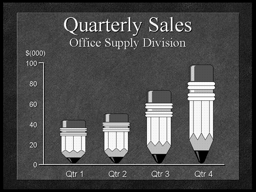
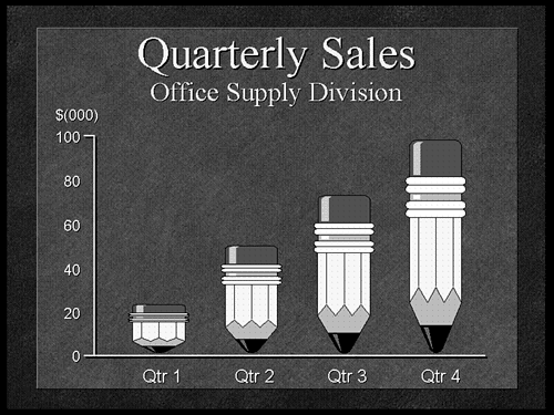
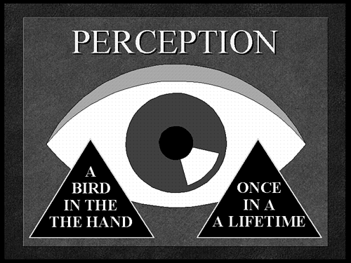
SilhouettesI like symbols that translate well across media. Sometimes you have to think about the utility of symbols in a variety of venues . One of the things I look for is the ability to make the symbol into a silhouette. If you fill the symbol completely with black, does it still translate its meaning? Since a silhouette is only two-dimensional, the loss of depth may cause the original object to lose its meaning. For example, a stack of quarters when silhouetted would look like a cylinder. The link to money is gone. But a coffee cup would only lose depth, yet still maintain its shape as a cup. I find this important when printing in pure black and white. Sometimes, objects in the background end up printing like big blobs and no one knows what they are. Printers today are sophisticated enough to print grayscale images, but what if you have to fax a copy of the printouts to someone? Forget about that grayscale definition you got from your laser jet! Not every element can or needs to be a silhouette. But if the symbol translates well to a purely solid shape, you can use the shape in a lot of situations. Think about it! Distractions and DistortionsClip art images, if filled with many details, can actually become a distraction when the visual stays in view too long. The audience can get caught up in the artwork and begin to forget about the message. This can happen from the use of graphics that have a cartoonish or silly appearance. It can also happen from very sophisticated renderings that resemble a Rembrandt. The look of something is really up to you. If you don't like it, don't use it, if you don't have to. But a more obvious distraction is a distortion. This happens when you do something to the symbol to alter its natural appearance. The alteration forces the audience to concentrate on what the symbol looked like before the distortion. In Figure 25.21, the original bars in the chart are replaced with clip art in the form of pencils, to match the subheading of office supplies . You should always try to match a symbol closely to a concept to help clarify the message. Figure 25.21. The pencil symbols (clip art) are sized to match the height of the original bars. In this case, the pencils are the proper shapes to substitute for the vertically positioned bars. But wait a minute. It doesn't always work out so conveniently. Figure 25.22 shows what happens if the height of the first pencil is not 42. Would you give someone a pencil this little? That deformed, stubby little pencil looks ridiculous. You do stuff like that to your visuals and people will wonder how you make money! Just because you have access to a clip art library doesn't mean you have to incorporate colorful symbols on every chart. Figure 25.22. Symbols can get distorted ! To match the value for the actual data, the first "pencil" is crushed down to the point of being a distraction. Also, be aware of the geometric shape you replace with a symbol. The bars in the previous examples were all vertical. The choice of pencils made sense. What if you decided to use a stapler as the symbol? Although a stapler is an office supply, it is meant to be viewed horizontally, not vertically. This means you would have to rotate the stapler and stand it on end to fit the vertical form of the chart. If you have to rotate a piece of clip art, you probably picked the wrong clip art! Why? Because the audience is going to have to re- orient the clip art in their minds just to place it in context. It's even worse when you rotate text. The only people who can quickly read text at any angle are librarians. The rest of us have to tilt our heads! Avoid distractions and distortions when incorporating symbols into your visuals. Investigating Perception and ContrastAlthough numerous studies have shown the beneficial results of using color in presentations, the most important reaction from color is more of a reflex. Perception is a reflex you cannot change. It happens so quickly that you barely notice it. Try this audio perception test. As fast as you can, spell the following three words out loud and then answer the question. The key is to spell the words out loud. Come on now, you have to spell the words out loud or it doesn't count. Ready?
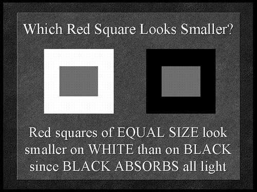
Blaaammmmmp. Wrong, if you said toast! You put bread in a toaster. It comes out as toast, but goes in as bread. If you said toast, it's because you followed the natural reflex of perception to spell the three O-S-T words and then blurt out " toast " instead of "bread." You'll try this on the next person you see. You will. I know you too well, now! Figure 25.23 is a test in content perception. Read each of the phrases in the triangles out loud. Yes, you have to say this out loud, too. Did you read the words in both triangles ? Okay, now read the phrase in each triangle, backward, one word at a time. Notice anything different on the way back? In both phrases you'll see a duplicate word. Figure 25.23. Are you reading too much into these phrases, or not enough? TIP Always proofread your visuals backward, one word at a time. Reading phrases backward lets you spot not only typos, but other mistakes, as well. If you scanned the visual and didn't notice the duplicate words, it's because you've probably heard the phrases so many times that you perceived your version to be correct. The anticipation happens because the mind moves faster than the mouth! Drink ”and you can attest to this! Color perception works much in the same way. Depending on contrast, some elements may appear closer to the eye, which may or may not enhance the message. NOTE The remainder of this chapter discusses color in a number of situations. Although this book is not in color, the examples I'll use should still translate well using black and white as well as contrasting shades of gray. So, when I mention a color on a visual, you'll be able to tell what I'm talking about from the shading or from the object itself. Figure 25.24 shows how color can change perception, but it also explains why black-and-white presentations are a problem. The two red squares (the inside dark-color squares) are compared against contrasting backgrounds. The shapes appear to be different sizes but are really the same size. Figure 25.24. The inside (red) squares are set against contrasting outer squares of white and black. Can you see a difference? A Matter of ContrastIf you want to talk about contrast, remember that black absorbs all light. The darker the color, the more light it absorbs and therefore it seems to push the object away from the eye. White, on the contrary, reflects all light. The lighter the color, the closer the object appears to the eye. In presentations, contrast between background and foreground is critical. The objects in the background should be darker and the ones in the front should be lighter. This is the major reason why black-and-white overhead presentations are less effective. The contrast is opposite from the norm. The data on a black-and-white overhead is black. It pulls the eye into the visual because the information seems more distant . But, the clear (white) background is reflecting white light into the audience. The problem is that the body cannot handle white light reflected into the eye for very long. It's too distracting. When you use your computer, you can look away whenever you want. But when you watch a presentation, you are being asked to keep your attention fixed for a longer period. Proper contrast is needed to keep attention. Because too much white light is a distraction, after a while, the eye tries to avoid the conflict and with it, the content of the presentation. Try staring at a fluorescent light for a while or glancing at the sun for a few moments. Your body simply rejects massive quantities of white light. So the rule of contrast for presentations is to use darker-color backgrounds and lighter-color foregrounds. This is why I can never understand why anyone using an electronic presentation would choose a bright background and a dark foreground. The only time I can see this option is if you will be in a room with so much ambient light that your visuals are washed out. In that case, the backgrounds would be less visible and wouldn't matter anyway. That's the only time I would recommend dark foregrounds. Of course, the software is partly to blame. For many years I have been critical of all software programs, not just PowerPoint, for having only about half the templates following the dark background/bright foreground model. Perhaps this is one of the reasons why so often someone presenting electronically ignores effective contrast ”they picked the wrong template!
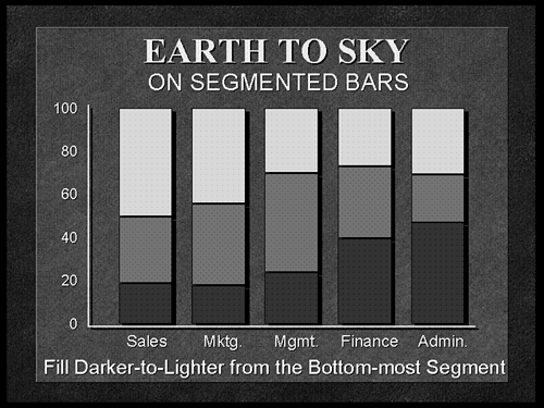
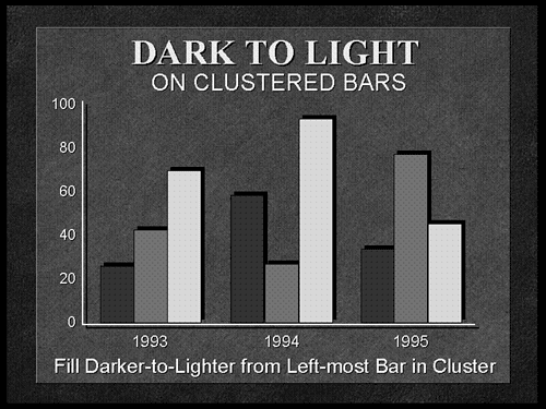
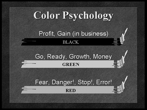
Red/Green DeficiencyCertain color combinations may pose a problem for some people, particularly men. We just can't do anything right, can we? Yeah, but we still have control of the remote and that will never change. Never! HA ha hahhh! Sorry where was I? Some studies show that nearly 15% of men have a red/green deficiency; MediaNet's research has shown that close to 22% of men have some form of this deficiency. Women do not suffer from this problem (in significant numbers ), but they should be aware of this fact when selecting colors for visuals. If you have this deficiency, you might see purple more as blue, or you may mix up brown and green. The effect is not as noticeable with large areas of color as it is with small areas. For example, if a line chart has three lines with one line beige, one line tan, and one line orange, it's possible that someone with a red/green deficiency will not be able to tell the difference between the three lines. The result will be confusion and a loss of attention. Try to avoid red-green color combinations, especially in small areas. Earth-to-Sky Color TheoryWhen you have related elements in the foreground, arrange them in a darker-to-lighter pattern from the bottom of the chart, upward. This "Earth-to-Sky" pattern is the way we view color naturally, from the earth to the sky. The earth is darker than the trees, which are darker than the sky, which is darker than the clouds. It's the same way a room generally appears as you look from floor to ceiling. It's even a pattern in the way we dress, with darker colors usually toward the bottom. So, when you have related foreground items that might have different colors, you can choose an order of those colors from darker to lighter. For example, in Figure 25.25, the segmented vertical bar chart shows the darker-to-lighter Earth-to-Sky pattern used effectively. If the top segment had been the darkest color, the chart would appear top-heavy. The arrangement of colors, done naturally, allows the eye to scan the visual more quickly. A faster scan gives the audience more time to listen to the message. Since the order of the colors can make a difference, why not use it to your advantage? Figure 25.25. The Earth-to-Sky color theory applied to a segmented vertical bar chart. Note the arrangement of colors in a dark-to-light pattern from the bottom upward. When displaying clusters of bars, as in Figure 25.26, choose a darker-to-lighter pattern starting from the left-most bar in each cluster. Don't use the "piano-key" approach by putting the lightest color between surrounding darker colors. When looking from left to right, the eye scans colors more easily when the arrangement is a dark-to-light pattern, similar to the Earth-to-Sky pattern. Figure 25.26. For related elements such as clusters of bars, keep the darker-to-lighter pattern beginning with the left-most bar in each cluster. Remember that the Earth-to-Sky theory is for the foreground elements in the visual, not the background color. So, if you choose gradient shading in the background of the visual, it doesn't matter if it's darker at the top, bottom, left, right, or fans out in both directions from the center. Specifically, the theory is most useful in data-driven charts, which usually shows a series of related items distinguished by color. Understanding Background Colors and EmotionsColor affects the central nervous system and the longer you see a particular color, the more it stimulates your emotions. During a presentation, it's best to stay consistent with your backgrounds, so the audience ends up seeing the background more often than each different foreground. The colors in the foreground keep changing and do not really affect the general feeling that the audience gets from the entire event. It's the background color choice that determines the emotional response from the audience. TIP I always suggest you maintain a consistent background color and template for the entire presentation. But, if you have several different topics to cover, you can switch background colors and even design templates. I have a number of different seminar topics I deliver and the backgrounds are different in all of them, although throughout any one of the topics, the visual template is the same. Keep in mind that a society makes psychological associations with colors based on appearances or cultural habits. Figure 25.27 shows some of these associations shared in the United States. Green is associated with money, for example. True, it is the color of money in the United States, but does green actually mean money? That would have to be true for all people everywhere. Is green the color of money all over the world? Then it can't mean money. Or else, over one hundred years ago in the United States the color gold would have meant money. Figure 25.27. The cultural associations made with certain colors are not universal. But it's interesting to see what some colors have grown to signify in our American society. We all live under the same light of the sun. Blue looks the same in Borneo as it does in Bolivia. The effect of color on our emotions is from nature, not heritage. All people, regardless of culture, share a universal range of emotions, such as happiness, sadness, excitement, anxiety, desire , passion, and so forth. The ability to tap into these emotions using correct color choices can increase the effectiveness of the presentation. NOTE Be careful with colors. Don't make the presentation look like a circus. The use of too many foreground colors with a poorly selected background will become a distraction for the eye and result in an ineffective presentation. Studies have shown that the background color of the visual produces an emotional response from the audience. Although there may be a number of different cultural interpretations of colors, the physical effect of the color is always the same. For example, red is the warmest color in the spectrum and is seen that way, regardless of any cultural associations we make such as negativity or loss (as in, "the company is in the red"). Lots of books and articles are available about color, but the following may help you in choosing a possible background color for your presentation. These recommendations are based on MediaNet's experience in developing over 3,500 presentations. Gray
Gray represents a neutrality and lack of commitment. Depending on how persuasive you need to be, use of gray backgrounds may be a help or a hindrance. I would avoid using gray backgrounds when displaying any critical business information where you need to sway the audience. However, in situations where the information is left for the audience to make a decision, gray frees the presenter from influencing the audience to respond to the issue. For best readability, we recommend charcoal or dark gray. Anything brighter than medium gray will ultimately cause glare from the visual, and any brightly colored items in the foreground will be harder to see. Blue
Blue represents a conservative, secure, yet more vulnerable approach to information. Deep, dark blue is the color of the night sky. At night, when you sleep, you're at peace with the world and most trustful in that vulnerable state. Blue has a calming effect on the emotions and is useful for situations where you want to create an impression that appears conservative or traditional. You can definitely put critical information on blue backgrounds. The blue helps to develop credibility with the audience, especially when you introduce data based on tested facts and figures rather than speculation. A blue background also tends to make the statement "This is the worst case scenario." It takes the "hype" out of the information and seeks to elicit an emotion of trust for the argument being presented. TIP When in doubt about colors, choose dark blue backgrounds with yellow and white shadowed text. This combination is the easiest to read from any distance. Green
Green stimulates interaction because it represents the operation of the will. If you want to involve your audience in a discussion of the topic, you should consider using green backgrounds. Green brings out the opinions in people. In fact, presentations requiring feedback such as management issues or policy decisions may be more effective when green is introduced in the background. I would choose deep forest green or olive green, or even a teal (blue-green) background in these situations. Avoid very bright green because foreground colors such as yellow or white will not contrast enough to be seen. Red
A red background is stimulating. Why? Red is a warm color and warmer colors are linked to an arousal of emotion. In presentations that seek to heighten the emotions of the audience, such as sales or marketing events, or for any situations that strive to motivate the audience to action, you might choose a red background. Since red is the warmest color of the spectrum, the tendency is for the eye to move toward red more quickly than other colors. This eye movement is most evident with foreground elements, such as a red slice in a pie chart. From a background perspective, when you look at the color red, your heart and pulse rate increase. You can keep looking at red and keep liking it! You see this in advertising all the time. What color is the fast car, the woman 's dress, the uniform of the guy shooting the basket ? Typically, it's red. Face it, red backgrounds tend to be stimulating for the audience and can lead to a heightened sense of realism about the topic, even to the point of increasing enthusiasm . Want to pump up that sales meeting? Go red! The intensity of the red you choose is important. I suggest you stick to the darker shades such as maroon or crimson as opposed to fire engine red or bright cherry red. It's better to tone down the intensity of the red and use a dark contrast for readability. Black
Black is the absence of all light. This contrast is what makes black such a powerful color (or should I say non-color?) Because black absorbs all light, anything on a black background will appear closer to the eye than the background itself. An object reflecting more light appears closer to the eye than an object reflecting less light. Because black reflects no light, it offers no emotional stimulus. When the emotional response to a color is removed, the reaction is one of surrender or relinquishment, as in having "no other choice." This can be a very effective tool. Information on a black background leaves the audience with "no choice" on how to react to the data. It exists, as is, and the audience can do nothing about it. Thus, black is usually associated with things that have already occurred and will not change. Financial presentations, especially those filled with a lot of accounting data, are usually best represented on a black background since the data cannot be changed; it has already happened . Violet
Also called purple or magenta , violet is a color that represents something magical or mystical. Violet is the mixture of red and blue, and the result is fantasy. Why? Because red and blue are opposites in emotional appeal and for those two colors to get along ”that has to be fantasy! Because purple is more charming, it is also adolescent and somewhat childlike. This is a tough background color to use for critical business information. For one thing, the data might be viewed as unimportant or unrealistic and, second, those who suffer from a red/green deficiency would see the violet background color as a washed-out shade of blue ”a color that cannot be easily recognized, named, or judged. If someone can't understand the color, the information carries less importance. If your objective is to entertain or to amuse, a violet background is great for less critical information such as humor, special effects, or even for the awards dinner presentation at the annual company meeting. Brown
Pure brown is the search for something permanent to plant your feet on. Brown suggests a need to build a solid foundation that currently doesn't exist. Brown is the mix of red and green, and it actually creates an uneasy physical condition by toning down the sense of energy that red usually gives. This reduced intensity makes brown seem more passive. For that reason, I would avoid using pure brown as a business background, especially for critical business information. The data on a brown background may be interpreted as "not standing on solid ground," hence, less credible and somewhat unstable. Not the best choice for gaining the support of your audience! So, brown is out as a background! Now the people at UPS hate me. Keeping It in PerspectiveThe support of your message with well-designed media provides the springboard to the delivery skills you'll use to inspire the crowd . A visual presenter constantly strives to stimulate the audience in as many different ways possible. Whether it be background colors, eye movement, or a well-placed graphic, the presenter works with the message through the media in order to get the audience to react. Although the information in this chapter may appear comprehensive, the good news is that if you simply maintain a consistency in layout and design, you'll end up with clear, concise visuals that do what they are supposed to do ”support the speaker, nothing more, nothing less! |
EAN: 2147483647
Pages: 261