Creating Text
| Creating text is as simple as creating objects, with a few more functions and details thrown in. Decide on the orientation of your texthorizontal versus vertical, inside of a box or on a pathand click the associated text creation tool: Type, Vertical Type, Area Type, Vertical Area Type, Path Type, or Vertical Path Type. Click in the drawing area to create an instance for text to be added and begin typing. As you type, the text appears in the default style (Figure 10.18). Figure 10.18. Using the Type tool, you can enter text in the drawing area by clicking with the tool and then typing. Notice that the text uses the default style, which is the swatch marked with the small diamond in the Styles panel. Also notice where the font for the style appears and the attributes in the Properties panel match the ones associated with the style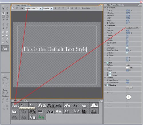 Text creation tools have two states: Create mode and Edit mode. Select a text creation tool and mouse over blank space in the drawing area. See the little dotted lines around the tool? These dotted lines tell you that when you click you will create a new instance where you can add text. With the same text tool selected, mouse over existing text: The dotted lines are gone. Click within the boundaries of existing text to select a specific character position to modify or add to. To select multiple words or characters, you need to click and drag inside the text area. If you want to move text, either switch to the Selection tool and drag it or, with the current text active and the text tool still selected, move and adjust the text's position properties in the Transform panel (see Figure 10.19). Figure 10.19. Use the Selection tool to select, resize, rotate, or move text. Hold down the Shift key and adjust the text's scale to change the font size dynamically without changing the aspect and distorting the font. Here, the Shift key is not pressed and the aspect of the font is changed along with the size. Height and Width update to display the rectangular dimension value of the text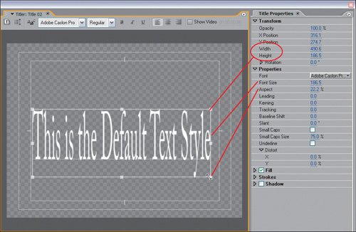 If you click on the Selection tool and select a text element, a box with handles appears around that text. Pulling the side or corner handles makes the same alterations as for objects. Holding the Shift key constrains the adjustment so that the text does not distort as you enlarge or shrink it. Type AlignmentWhen entering text, you can specify how you would like it aligned: centered, left justified, or right justified. You can do this in a few different ways: Select the text box, and choose Title > Type Alignment from the main menu bar, then pick your alignment format (Left, Center, or Right). You can also right-click on a text selection and choose Type Alignment from the context menu that appears. Or, simply click one of the alignment buttons from the top row of controls. Text StylesYou can apply styles to active text by clicking a swatch in the Styles Library. Once the style is activated for the selected text, you can fine-tune that style by adjusting the listed parameters in the Object Style panel. A key feature of applying styles to text is that you can select either entire words or individual letters and apply different styles (Figures 10.20a, andb,andc). Figures 10.20a, b, and c. When you first add text to the drawing area, it appears in the default style (a). Select all the text and click a swatch in the Styles panel to apply a new style (b), or select only a portion of the text and apply a new style to that (c)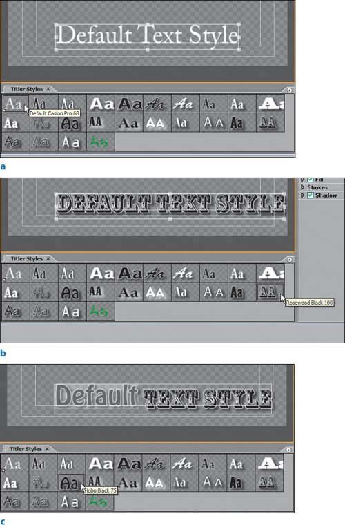 The Properties panel's Fill, Strokes, and Shadow twirl downs for text are the same as for objects. The Properties twirl down for text, however, has 11 additional attributes to adjust. The first is the Font drop-down menu. To specify your text's font, choose one from the menu's list or click Browse to access the Font Browser. The text automatically updates to display the new font. Clicking and dragging the Font Size hot-text box dynamically and visually adjusts the size of the font. This is where I get jazzed about the Titler; most titlers force you to enter specific number values for text properties, then you have to wait for a preview of the property after you enter the value. With the Aspect parameter, you can adjust the stretch of your text. Settings above 100% pull the text from its first character's position; settings below 100% squish the text closer together. The Leading attribute adjusts the space between lines of text. Adding to the value creates more space between lines, and reducing brings the lines closer together (Figure 10.21). Figure 10.21. Reducing Tracking for the first line brought all the letters closer together. The extra spaces on the third line were created by clicking between pairs of characters and increasing Kerning. The Leading setting determined the distance between the lines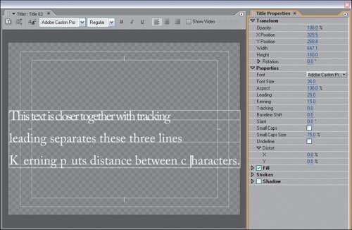 To change the space between individual characters, use Kerning. Say you want a comma to fit more snugly next to the character on its left. With the Type tool, you would click between the letter and the comma, then change the Kerning setting to a negative value to bring the characters closer together. Positive Kerning values move characters farther apart (Figure 10.20). The Tracking setting enables you to adjust the kerning for all characters equally. To add more space between every character of text, slide the Tracking hot text value to the right into positive numbers. Sliding left into negative numbers reduces the space between all characters (Figure 10.20). The invisible line on which all your text is written is referred to as the baseline. To move the entire text or a specific character above or below the baseline, increase or decrease the Baseline Shift value, respectively. If you want something more creative than a flat horizontal line, use the Path Type tool or Vertical Path Type tool to define the line. Combining Kerning and Baseline Shift, you could very easily move that example comma closer to the character on its left and then up or down to an even better position. The Slant attributes give you a pseudo italics look, slanting your characters based on the angle you choose. The next attribute is very cool. The Small Caps check box enables you to convert all of your text to capital letters in one click (Figure 10.22). By keeping Small Caps Size set to less than 100%, you can preserve the text's original hierarchy of lowercase to capital letters. The default Small Caps Size is 75%, meaning that lowercase letters will be capitalized but their size will be 75% of the full size. Of course, your font must support lowercase letters for this to be most effective. Figure 10.22. The second line of text is a duplicate of the first, but with Small Caps turned on and Small Caps Size set to 62%. Notice how Small Caps keeps the same proportions as in the sentence with both upper- and lowercase letters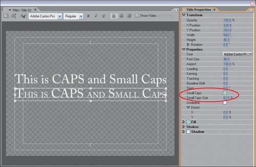 The last unique text property is Underline. Clicking on the Underline check box adds an underline beneath your text. The underline always respects the bottom of the character. In other words, if you add a baseline shift, the underline adheres to the bottom of the text, not the default baseline. Although they apply distortion based on the X and Y axis for text as they do for objects, the Distort hot-text boxes are worth a mention. Although you can easily see distortion on large objects, the result is often very subtle on text. Playing with the Distort settings, however, can result in cool-looking characters. I encourage you to tinker with these, as well as fills, shadows, and strokes. Chapter 15 will guide you through some creative alterations on the way to making a custom style. |
EAN: 2147483647
Pages: 200