Custom Controls
 | |||||||||||
| Chapter 7 - Windows Applications | |
| bySimon Robinsonet al. | |
| Wrox Press 2002 | |
Custom controls are a very important aspect of Windows Forms development. These types of controls were called ActiveX controls or UserControls in Visual Basic. The basic concept is to allow a developer to generate new functionality and/or aggregate existing controls into a single common control that can be easily reused across the application or in multiple applications throughout an organization.
Custom controls allow developers to wrap functionality and presentation into a single class package that can be reused easily throughout an application. The user interface, events, properties, and methods can all be set and configured by the developer. This group of functionality can then be easily inserted into the project where it is needed. It is also possible to reuse custom controls across the enterprise as well, and entire control libraries can be developed for use by all developers within an organization.
In addition, if a custom control is very useful and exposes functionality that other developers external to a single organization will likely want, it is possible to sell the control commercially. An entire industry exists that provides custom controls for application developers. These companies have concentrated their time and resources into developing their controls' functionality extensively; therefore it is almost always cheaper to purchase one of these controls than attempt to duplicate the behavior manually. This is the classic build versus buy argument, and most businesses today agree that purchasing functionality off-the-shelf saves a significant amount of time and money.
To summarize, a custom control is a custom class that combines business logic functionality and/or multiple controls and custom display logic in a single package. This package can then be reused multiple times in a Form, just like a standard Button or Label control. An example of this in a business application might be a TextBox that contains special e-mail validation logic. E- mails are entered in many places throughout the application, so encapsulating the code into a single entity would cut down on the amount of code to write, debug, and maintain. A custom e-mail TextBox control could be created and used in place of the standard TextBox in all locations that require e-mail text entry.
The UserControl Class
Most custom controls should inherit from the System.Windows.Forms.UserControl class. This puts the appropriate plumbing in place that is required to host Controls, manage scrolling, and provide a design surface for the developer. This class acts much like the base Form class in that it provides a basic implementation and custom derived classes provide the business functionality. A control that does not need this plumbing code because the developer is going to write all of it themselves or it is not going to display a user-interface can simply inherit from System.Windows.Control directly.
In fact, building a custom control is very similar to building a Form. A User Control contains a client area in which Windows Forms controls can be situated and manipulated. Event handlers can be attached to these controls to respond to user interaction, and the overall look of the control is completely customizable. The difference is that one must always think about how another developer will utilize this custom control in a hosting application. The custom control acts as a simplification layer for the third-party developer who does not need to understand how the control works. The control will never exist independently; it will always execute within a hosting application.
Constituent Controls
The controls that make up the user interface of the custom control are called constituent controls. These are controls that are owned by the UserControl object. These are very useful for building reusable user interface components that can be manipulated and positioned as a group. For example, suppose every window in an application contains the same group of RadioButton controls. Instead of copying and pasting these controls into every Form, an alternative would be to create a custom control that contained this common RadioButton control group. A developer could then add this custom control to any Form, position it to the correct location, and the constituent RadioButton controls in the User Control would display and update properly without any interaction by the hosting application.
However, constituent controls are not accessible from outside the UserControl object, as they are declared as private variables by default. Although a developer can manually change this to expose certain constituent controls as public, this is generally regarded as violating encapsulation. The correct method of exposing required information is to define public properties, methods, and/or events in the custom UserControl class and map these requests to the constituent controls' various properties, methods and events. This allows the User Control to be editable within the Visual Studio .NET IDE, and provides a consistent design environment for the client developer.
Custom controls can be added to a Windows Forms project like any other class or component object. However, one can also create a standalone Windows Control Library application. This outputs an assembly DLL containing the custom control classes defined in the project. This assembly can then be included in other projects across the organization and enterprise. As custom controls are developed and refined this library can be expanded and shared across all applications, providing easy access to common functionality and user interface elements for developers.
Creating Constituent Controls
Let's create a custom control to demonstrate some of these concepts. We are going to create a custom control to encapsulate a common menu of RadioButtons featured across many Forms in an application. The menu exists on every window to allow the user to provide feedback to the application as to their likes and dislikes. In our fictional application, this data could be aggregated over time to develop user profiles and prediction data.
Create a new C# Windows Control Library application titled ControlLib . We will be creating several custom controls in this section, and we will package them all together in this single control library. The code for this project can be found in the code download in the ControlLib folder .
When the project is created, a default empty User Control is displayed in the design view. Much like a standard Form object, we can drag controls from the Toolbox onto this design surface and set their properties using the Properties window.
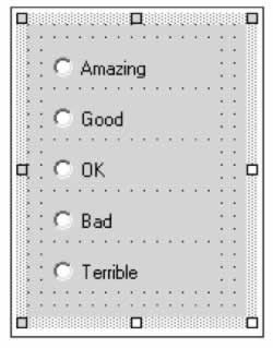
Add five RadioButton controls to the User Control design surface. You will have to resize the User Control to accommodate the RadioButton controls. Change the Name property of the User Control itself to UserMenu , and set the following properties of the RadioButtons .
| Property | radioButton1 | radioButton2 | radioButton3 | radioButton4 | radioButton5 |
|---|---|---|---|---|---|
| Name | rbtnAmazing | rbtnGood | rbtnOK | rbtnBad | rbtnTerrible |
| Text | Amazing | Good | OK | Bad | Terrible |
At this point you should have a User Control that looks close to the following picture:
Recall that the radio buttons themselves cannot be accessed from the hosting application, as they are private members of the UserMenu class. To allow a hosting application to use this control we need to provide an easy way to query and update the selected option. Remember, part of the advantage of custom controls is the abstraction away from client developers; a developer using this control does not need to worry about looping through the radio buttons to get the selected one. Instead they should just be able to access a property and have the details abstracted away.
We are going to create a public property to represent the currently selected option. This property will be a custom enumeration, which will provide a friendly interface for the client developer that is more intuitive than an alternative like integer codes. Using an enumeration will also allow the Visual Studio .NET IDE to display the available options in the Properties window as a drop-down list. Add the following code to the UserControl1.cs file.
namespace ControlLib { public enum SelectedOptionEnum { Amazing, Good, OK, Bad, Terrible, None } We will now declare a public property with both set and get commands. When this property is set it will update the correct RadioButton to Checked . When the value is queried, the enumeration value representing the selected RadioButton will be returned. Add the following code to the UserMenu class:
public class UserMenu : System.Windows.Forms.UserControl { private System.Windows.Forms.RadioButton rbtnAmazing; private System.Windows.Forms.RadioButton rbtnGood; private System.Windows.Forms.RadioButton rbtnOK; private System.Windows.Forms.RadioButton rbtnBad; private System.Windows.Forms.RadioButton rbtnTerrible; public SelectedOptionEnum SelectedOption { get { if(rbtnAmazing.Checked) return SelectedOptionEnum.Amazing; else if(rbtnGood.Checked) return SelectedOptionEnum.Good; else if(rbtnOK.Checked) return SelectedOptionEnum.OK; else if(rbtnBad.Checked) return SelectedOptionEnum.Bad; else if(rbtnTerrible.Checked) return SelectedOptionEnum.Terrible; else return SelectedOptionEnum.None; } set { if (value == SelectedOptionEnum.Amazing) rbtnAmazing.Checked = true; else if (value == SelectedOptionEnum.Good) rbtnGood.Checked = true; else if (value == SelectedOptionEnum.OK) rbtnOK.Checked = true; else if (value == SelectedOptionEnum.Bad) rbtnBad.Checked = true; else if (value == SelectedOptionEnum.Terrible) rbtnTerrible.Checked = true; else { rbtnAmazing.Checked = false; rbtnGood.Checked = false; rbtnOK.Checked = false; rbtnBad.Checked = false; rbtnTerrible.Checked = false; } } } This code is long, but it is very simple to understand. On a get request it returns the correct enumeration value based on the currently selected RadioButton . On a set command it updates the correct RadioButton control. A client utilizing this control can simply use this property and never worry about the process required to actually get this value. Let's add a hosting application to understand how this control can be consumed.
Add a new project to the solution by selecting File New Project . An entirely new project must be added because a Windows Control Library project cannot execute; the controls are meant to be included within a hosting application. Select a new C# Windows Application, and ensure the Add to Solution option is checked on the bottom of the dialog box. Title the project HostApp .
Once this is completed we have our familiar looking Form ready for controls. Open the Toolbox and scroll to the very bottom to see the custom UserMenu control we created. Note that this is available in the Toolbox because Visual Studio .NET automatically adds a reference to existing projects when a new project is added. Incorporating a separate control library into the Toolbox would require the developer to add a reference to the location of the assembly file, just like the process for importing standard class libraries or components. Note that the ControlLib project must be compiled before a UserMenu control can be added to the Form .
Add a UserMenu control to the Form in the same way standard controls are added drag and drop it onto the Form surface. Note that you can resize and position the UserMenu object, and the Properties window the control itself updates the radio buttons to reflect the changes. Design-time support for developers is a very important aspect of control development.
Add a Button control to the Form , the position and size being irrelevant. Add a Click event handler with the following code.
private void button1_Click(object sender, System.EventArgs e) { MessageBox.Show(userMenu1.SelectedOption.ToString()); } This is a very simple way to test the control, but it is effective. The SelectedOption property is queried and displayed in a MessageBox . In a real application the value could be queried and persisted to a back-end database when the user clicked a Submit or Save button. As this code shows, using our custom UserMenu allows a developer to do this in a single line of code.
To actually run the application one last thing must be done. By default Visual Studio .NET has enabled the Windows Control Library project as the default project because it was the first project loaded, but it cannot run without a Form . Therefore, right-click on the HostApp project in the Solution Explorer and select the Set as StartUp project option. Compile and run the solution to see the custom control in action. The different menu options can be selected, and when the button is clicked the currently selected option is displayed in a MessageBox .
Extending Controls
Custom controls do not always need to be created by combining multiple constituent controls. Extending and customizing the functionality of a single Windows Forms control can be very useful because it can hide the customization behind a standard control for the user. The e-mail validation TextBox is a good example. Instead of rewriting a TextBox control, it makes much more sense to use the existing TextBox and simply add the additional functionality required. The e-mail validation TextBox can then be used in applications as a replacement for a standard TextBox and the user will never know the difference. This can be done in .NET using inheritance, and can be a very effective way of creating a custom control.
To extend an existing control the declaration for a User Control must be changed to inherit from the existing control instead of System.Windows.Forms.UserControl . Because of the power of inheritance, you now have access to all of the base class's properties, methods, and events.
Let's create a simple example to illustrate this properly. We are going to create an ActiveButton control that will provide visual feedback to the user when they position the mouse pointer over the button. The BackColor of the button will change gradually to reflect the user's position, and when the user's mouse pointer leaves the button its BackColor will gradually fade back to normal. This provides a very professional-looking user interface that gives users good subtle feedback as to their current selection.
Add a new User Control to our existing Windows Control Library project. Title the new file ActiveButton.cs . Note that even though we will be changing what class the control is derived from we still want to add a UserControl object in the project because then we get the correct Toolbox support in Visual Studio .NET. It is also important to name the file correctly, because this is used as the name of the control in the Toolbox, and cannot be updated once the base class is changed from UserControl .
Switch to the code view and change the declaration of the class to no longer derive from UserControl but instead from Button .
public class ActiveButton : System.Windows.Forms.Button Switch back to design view and note the U ser Control design surface has changed. The same options are not available when a control does not inherit from UserControl . A derived control will assume the same look as the base class, and Visual Studio .NET does not allow for the option of building a custom user interface for the control.
The design surface can still accept non-visual controls from the Toolbox (in fact it can accept visual controls as well, but these will simply become private data members). One such non-visible control that is very useful is the Timer control. This can be found under the Components tab in the Toolbox. We will be using a Timer control to control the gradual changing of the background color . Add a Timer control to the design surface, and ensure that its Enabled property is set to true .
Add two private variables to record the state of the transformation in the control:
public class ActiveButton : System.Windows.Forms.Button { private System.Timers.Timer timer1; private bool m_bActive; private int m_nSteps; The Boolean variable m _ bActive indicates the current state of the control. If this is true the user's mouse pointer is currently over the control and the background color should be increasing. If this is false it should be gradually decrementing the background to the original color. The m_nSteps variable represents the current step in the "animation" loop. This variable is used to stop the animation when it has reached the upper and lower limits.
These values need to be set in the constructor.
public ActiveButton () { // This call is required by the Windows.Forms Form Designer. InitializeComponent(); m_nSteps = 0; m_bActive = false; } Finally we are ready to add some more interesting code. Back in the design view, select the background, causing the User Control itself to be active in the Properties window. Switch to the event view to see the list of possible events. Note that this is the list of exposed Button events, since this User Control now inherits from a Button control. We are going to hook into the MouseEnter and MouseLeave events to trigger the animation loops . Add an event handler for each of these events and add the following code:
private void ActiveButton_MouseEnter(object sender, System.EventArgs e) { m_bActive = true; timer1.Interval = 50; } private void ActiveButton_MouseLeave(object sender, System.EventArgs e) { m_bActive = false; timer1.Interval = 150; } This code merely sets the m_bActive flag, as well as telling the Timer control how often to fire off its Elapsed event. This event is fired every Interval milliseconds . When the user enters the area of the button the Timer's Interval property is set to a small value, causing the button to change color relatively quickly. When the user leaves the control this value is reduced, so the button will slowly lose its color. This is just a style issue, and can be easily played with to get your preferred look and feel.
Lastly we are going to add the Elapsed event of the Timer control, where the magic happens. Using the Properties window, add an event handler for the timer1's Elapsed event. Add the following code to the event; this is where the actual updates to the BackColor occur.
private void timer1_Elapsed(object sender, System.Timers.ElapsedEventArgs e) { if(m_bActive && m_nSteps != 10) { try { BackColor = Color.FromArgb(BackColor.R- 10, BackColor.G- 10, BackColor.B- 10); } catch(Exception) { } finally { m_nSteps++; } } else if (!m_bActive && m_nSteps > 0) { try { BackColor = Color.FromArgb(BackColor.R + 10, BackColor.G + 10, BackColor.B + 10); } catch(Exception) { } finally { m_nSteps--; } } } This method checks to see if the control is currently under the user's mouse pointer and if it has not already executed the correct number of steps. The m_bActive flag indicates if the control is currently under the user's mouse pointer, and the m_nSteps variable represents the current state of the 'animation'. Based on these two factors the BackColor property is either incremented or decremented. The code to manipulate the BackColor property modifies the color by incrementing each constituent component of the color a set amount. This could raise an exception if one of the RGB values is modified above 255 or below 0. This exception is caught and ignored, and to ensure the m_nSteps variable is always incremented or decremented it is modified within a finally block.
This ActiveButton control is now done, and can be incorporated into other Windows applications just like any standard Windows Forms Button. The exact same properties, methods and events are exposed for this control as a Button control. The only difference is the visual interface exposed to the user, but a developer working on a hosting application that utilizes this custom control never need worry about this animation code. It is encapsulated away behind the implementation of the ActiveButton .
To see this button in action, add several ActiveButton controls to the Form in the HostApp project. It helps to add a number of them, as it is easier to see the effect of the gradual selection and de-selection. Run the application and move the mouse pointer over the ActiveButton controls. By providing good visual clues to the user an application interface is easier to use and more friendly to the end user. By extending existing Windows Forms controls a component designer can work to create custom business functionality while relying on the existing infrastructure for much of the plumbing code required. It is also convenient for client developers to be able to utilize the custom control exactly like the original control type in their applications.
Exposing Events
Events are another very important aspect of control development, and providing useful events to developers allows them to react to actions occurring within the custom control and respond in their own applications.
When designing custom controls several options are available for exposing events. One or more events of the constituent controls located within the User Control itself can be exposed. Recall that the constituent controls are declared private by default, and as such are not accessible by the client developer. For example, suppose a developer creates a custom control containing a ListBox control and a Button control, and the ListBox control is pre- populated with States and State codes. This custom control can be used to allow a user to choose a State from the list and click the button when they have made the correct selection. The client developer needs to be able to write code that is processed when the Button within the User Control is clicked, just like a developer would write code behind a standard Button's click event.
To perform this magic the User Control must raise the event to the hosting application. This is done by first adding an event handler behind the constituent control event that will be monitored . This is done in the User Control. For example, using the States User Control example, adding a Click event handler to the Button would be the first step.
From within this event handler an event must be raised to the hosting application. All Windows Forms controls contain a method for every exposed event that can be called to raise the event. This method is called " On " plus the name of the event. For example, to raise the Click event from the User Control the following code could be used.
private void button1_Click(object sender, System.EventArgs e) { OnClick(e); }
Note that the event handler required a System.EventArgs object. This can be created new and filled with custom information, which we will see next , or it can simply use the EventArgs object supplied by the Button's Click event.
Custom Events
Note that this process only works for events that are available to the UserControl class. We are not creating any new events; we are merely specifying when these events should be raised to a client application. Something that is often required in a User Control is to expose a custom event that can be processed by the hosting application.
The process for creating a custom event in a User Control uses the same technique that is used across the entire .NET Framework for exposing and consuming events delegates.
A User Control must contain or utilize the following things in order to expose a custom event:
-
A class to hold event state data. This must derive from System.EventArgs . This is how data is passed from an event to the client. This must be defined outside the UserControl class.
-
A delegate for the event, again defined outside of the UserControl class.
-
The User Control itself must contain the event declaration using the delegate type and a method that raises the event.
Exposing Custom Events
We will be creating a login User Control that contains UserID and Password TextBox controls and a Submit Button control. Instead of forcing client developers to manage the security of the application, this control will encapsulate the functionality of the entire user authentication process, and merely expose events the hosting application can respond to. The following events will be exposed:
-
GoodLogin the user has successfully entered their UserID and Password and it has been accepted.
-
FailedThreeTimes the user has failed to login three times. This event allows the hosting application to take some form of administrative action if required.
-
Cancel the user selected the Cancel button, indicating they do not want to log in to the application.
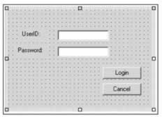
Add a new User Control to our existing Windows Control Library project. Add two Label controls, two TextBox controls, and two Button controls to the User Control design surface. The exact positioning is not important, but the following properties should be set.
| Property | Label1 | Label2 | TextBox1 | TextBox2 |
|---|---|---|---|---|
| (Name) | n/a | n/a | txtUserID | txtPass |
| Text | UserID: | Password: | (Blank) | (Blank) |
| PasswordChar | n/a | n/a | n/a | * |
| TabIndex | n/a | n/a |
| 1 |
| Property | Button1 | Button2 | UserControl |
|---|---|---|---|
| (Name) | btnLogin | btnCancel | ActiveLogin |
| Text | Login | Cancel | n/a |
| PasswordChar | n/a | n/a | n/a |
| TabIndex | 2 | 3 | n/a |
Note that when you change the name of a User Control you must close the design surface and reopen before the name is reflected in the Toolbox.
When you are finished you should have a User Control that looks something like the following screen. Again the exact positioning is not important, only that all of the individual controls exist and are named correctly.
We are now ready to add the custom events to the class. Switch to the code view and add the class declaration below to the top of the file. This needs to be outside the User Control class definition, but within the namespace declaration. This is the event state data class and it represents the event data that will be passed to hosting applications when an event is raised. It contains the information a client application may require, such as the UserID and Password. Note that this class must derive from the System.EventArgs class.
namespace ControlLib { public class LoginEventArgs : System.EventArgs { public LoginEventArgs(string sUserID, string sPassword, bool bValid) { UserID = sUserID; Password = sPassword; Valid = bValid; } public string UserID; public string Password; public bool Valid; } The delegate objects must be added as well. Hosting applications will use these to hook into the custom events of this User Control . Add the following three declarations directly below the LoginEventArgs definition but still outside the class definition for the User Control . The LoginEventArgs class will be used for the GoodLogin and FailedThreeTimes event handlers; but the base EventArgs class will be used for the Cancel event. This is because the Cancel event does not need to pass any data back to the hosting application. Events not required to pass any additional information should use the base EventArgs class.
//Delegate declarations public delegate void GoodLoginEventHandler(object sender, LoginEventArgs e); public delegate void FailedThreeTimesEventHandler(object sender, LoginEventArgs e); public delegate void CancelEventHandler(object sender, EventArgs e);
Now add the event declarations within the ActiveLogin class itself. These will act as the bridge between the user code and our class. They are defined as public events of each of the delegate types. Add the following code within the class itself.
//Event declarations public event GoodLoginEventHandler GoodLogin; public event FailedThreeTimesEventHandler FailedThreeTimes; public event CancelEventHandler Cancel;
The code that will raise the events must be added next. The .NET Framework coding convention advises us to name these methods " On " plus the name of the event. While it is possible to name them anything, it is wise to stick with the convention. Add the following three methods to the ActiveLogin class. These methods each first verify that the particular event property has at least one client attached before raising the event.
protected virtual void OnGoodLogin(LoginEventArgs e) { if (GoodLogin != null) { //Invokes the delegates. GoodLogin(this, e); } } protected virtual void OnFailedThreeTimes(LoginEventArgs e) { if (FailedThreeTimes != null) { //Invokes the delegates. FailedThreeTimes(this, e); } } protected virtual void OnCancel(EventArgs e) { if (Cancel != null) { //Invokes the delegates. Cancel(this, e); } }
We have now successfully exposed three events from this UserControl class, and a hosting application could utilize them. However these events will never be raised because the ActiveLogin control never actually raises them it only contains code that allows them to be raised. The actual business functionality needs to be added so the control can react and raise the events at the appropriate times.
First add a private state variable that will hold the number of times a user has attempted to login:
//Event declarations public event GoodLoginEventHandler GoodLogin; public event FailedThreeTimesEventHandler FailedThreeTimes; public event CancelEventHandler Cancel; private int m_nLoginTimes; Finally, to actually raise the different events add event handlers for each of the constituent Button controls. These will call the methods we just created that actually raise the event. In the Click event handlers for each Button add the following code.
private void btnLogin_Click(object sender, System.EventArgs e) { //Increment this attempt m_nLoginTimes++; //Check userid and password if(txtUserID.Text == "Wrox" && txtPass.Text == "Wrox") { //Successful Login OnGoodLogin(new LoginEventArgs(txtUserID.Text,txtPass.Text,true)); m_nLoginTimes = 0; } else if(m_nLoginTimes >= 3) { //Failed Three Times OnFailedThreeTimes(new LoginEventArgs(txtUserID.Text,txtPass.Text,false)); m_nLoginTimes = 0; } else MessageBox.Show("Invalid Login","Login",MessageBoxButtons.OK); } private void btnCancel_Click(object sender, System.EventArgs e) { //Raise the cancel event OnCancel(new EventArgs()); } This code causes the events to be raised and called in the hosting application. In a real application the login process would query a database, Active Directory, or LDAP data store, but for this example we simply compare the login values with simple static values. If the user successfully logs into the application the GoodLogin event is raised by calling the OnGoodLogin() method. Note that an object of type LoginEventArgs is created and passed into this method.
Note that the control does not do any branching after the user logs in successfully. It is up to the hosting application to respond to this event and navigate the user to the main screen of the application, open the requested resource, or perform whatever action the user required authentication for. This control simply encapsulates the login logic, and once that process is completed the control is passed back to the hosting application.
If the login failed, a MessageBox is displayed to the user for the first three times. On the third failure the FailedThreeTimes event is raised with an instantiated LoginEventArgs object. This allows the hosting application to perform any logging or lockout procedures when a user fails to login three times.
In the Cancel button's Click event the Cancel event is raised. This event uses only the basic EventArgs object to pass data since there is no state information passed to the hosting application on this event.
Consuming Custom Events
We are now ready to use this control from a hosting application. Navigate back to the Form in the HostApp project and scroll to the bottom of the Toolbox. If the ActiveLogin control is not displayed correctly you need to rebuild the Control Library project, as well as close the design surfaces of the open User Controls. This forces the changes to commit to the Toolbox.
Add an ActiveLogin control to the Form . Position it in a convenient location and switch to the Event view in the Properties window. Note that our three custom events, Cance l, FailedThreeTime s, and GoodLogin are all listed as events. Add event handlers to these three events in the same manner we have added events to any other control. Add the following code to handle the events raised by our custom control.
private void activeLogin1_GoodLogin(object sender, ControlLib.LoginEventArgs e) { MessageBox.Show("Welcome " + e.UserID); } private void activeLogin1_FailedThreeTimes(object sender, ControlLib.LoginEventArgs e) { MessageBox.Show("Failed to login three times."); } private void activeLogin1_Cancel(object sender, System.EventArgs e) { MessageBox.Show("Cancel"); } The event handlers are very simple, but they illustrate how to consume custom events. Note that there is basically no difference between consuming custom events and standard Windows Forms events. In the GoodLogin event and the FailedThreeTimes event we have the custom LoginEventArgs object passed in as a parameter to the handler method. This can be queried for the various properties set by the User Control , such as UserID and Password .
Run the application and note that the client code is now responding to the business logic events exposed by the custom User Control . The hosting application can now delegate the responsibility of login processing to this control and receive notifications (through events) when significant state changes occur, such as a successful login. This is the essence of utilizing custom controls allow the client application to concentrate on business functionality and hide the functional minutiae of tasks behind the interface to the custom control.
EAN: 2147483647
Pages: 244