Section 33. Pareto Chart
33. Pareto ChartOverviewThe ubiquitous Pareto Chart is a simple but extremely useful Lean Sigma tool. The tool is applicable at any point in a project where a narrowing of focus is required based on volume or count data, for example, to help a Belt identify key areas to focus the project on, to help scope it better. Most projects start out broadly scoped, focusing on all problems that the process exhibits. Such projects are almost impossible to manage, and, hence, the use of a tool to identify what the biggest opportunities are and focusing there. Typically, the tool is applied to defects in the process, as shown in Figure 7.33.1, to allow a rescope by major defect, in this case perhaps focusing on Missing Screws, where more than 60% of all defects emanate from this one defect. Figure 7.33.1. An example of a Pareto Chart for defects by type (output from Minitab v14).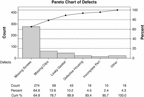 The scoping factor does not have to be defect type though; it could be, for example:
Whatever makes a useful split of the data to separate out the key focus areas from the noise. RoadmapThe roadmap is as follows:
Interpreting the OutputInterpretation is reasonably straightforward. The purpose was to try to split a large quantity of Y data into meaningful pieces by an X (a "scoping factor" for want of a better name), so that the project could continue in a more focused way. After Step 5 in the roadmap, the Team should have a number of Pareto Charts splitting the data by various factors. A useful Pareto is one that exhibits one or possibly two large bars explaining the majority of the counts and then the rest of the counts are split across multiple bars. A Pareto similar to Figure 7.33.1 is extremely useful to a Team, whereas a Pareto, such as Figure 7.33.2, is not, because no discrimination is found between the defect types. Figure 7.33.2. An example of a Pareto Chart by defect type.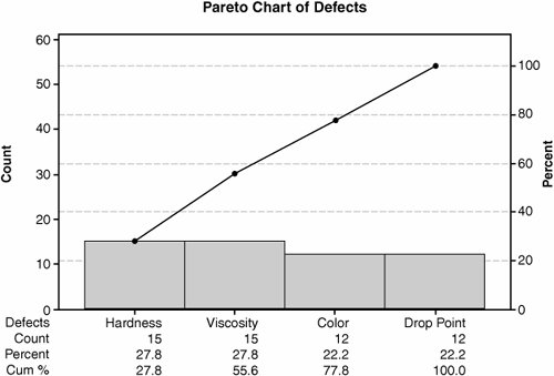 Sometimes the Belt might wish to split the data one step further, as shown in Figure 7.33.3. This is valid provided that there is enough data to go around. Figure 7.33.3 has little data represented in any of the four charts; thus, no meaningful conclusions could really be drawn. Each sub-Pareto needs at least 50100 data points to make it meaningful. Figure 7.33.3. An example of a Pareto Chart split by two factors, Flaw and Period (output from Minitab v14).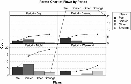 |
EAN: 2147483647
Pages: 138