Styling Form Controls
| < Day Day Up > |
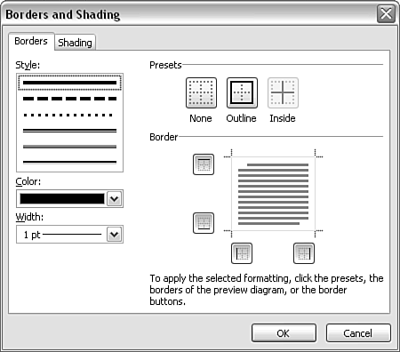
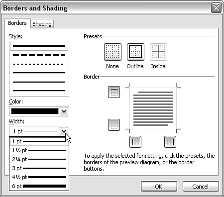
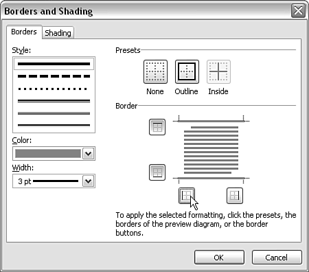
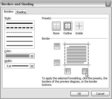
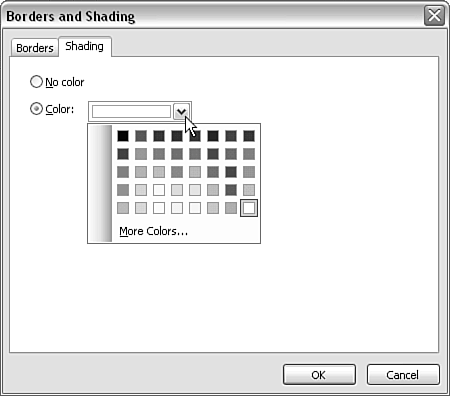
| You can color-style most form controls (each of which was described in Chapter 4) almost identically. To apply a background color , called shading in InfoPath, or to create a colored border for the form control, use the Borders and Shading option on the context menu. The Borders and Shading window opens; it has two tabs named, not surprisingly, Borders and Shading (see Figure 6.11). Figure 6.11. The Borders and Shading window. Creating a Border for a Form ControlThe border for a form control is defined on the Borders tab. Three characteristics of the border can be defined: the style, the color, and the width. Border StyleSix border styles are offered :
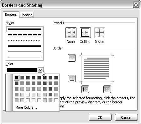
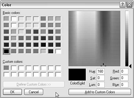
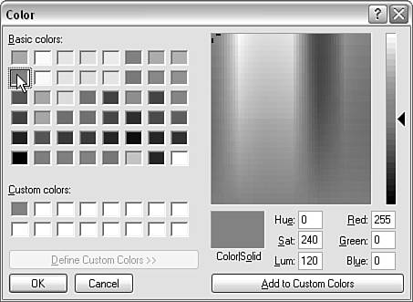
It's possible to distinguish the effect of some styles only when the border width is set to the maximum 6pt. If you want a specific border width, watch carefully the order in which you click options. For example, if you click the dotted line, the default line width jumps to 2.25pt. If you choose any of the last three border style options, the border width jumps to 3pt. If you move to, say, the plain line, the border width stays at 3pt, even if you did nothing explicitly to increase border width. Border ColorTo select a color for the border, click on the drop-down menu in the Color section of the Borders tab. The appearance is as shown in Figure 6.12. Figure 6.12. The default colors offered. No color information is offered by default. You might expect that resting the mouse pointer over a colored square would provide information about its RGB composition or name , but none is provided. In addition, no information is provided to indicate whether the colors offered match colors in any color scheme available in the Color Schemes task pane. This makes color selection unnecessarily difficult. To select an additional range of colors and/or to specify custom colors, click More Colors. The Color window opens (see Figure 6.13). Figure 6.13. The Color window. You can access color information about each of the basic colors, in both the HSL and RGB formats, by clicking on the small color square. For example, Figure 6.14 shows the display of color information for the basic red color. Figure 6.14. Displaying color information for a basic color. You can specify additional custom colors by either clicking on the colored spectrum to the right of the Color window or entering numbers for RGB or HSL values. After you choose a color, click the Add to Custom Colors button to add the newly defined custom color to the available palette. In large InfoPath views, you do not need to choose each color for each form control. On the form area, select several form controls using the Ctrl or Shift keys and the mouse. Then apply borders and/or shading as described. The same style is applied to each control. Border WidthYou choose a border width from the drop-down menu in the Width section of the Borders and Shading window (see Figure 6.15). Figure 6.15. The Width drop-down menu in the Borders and Shading window. Six fixed widths are offered: 1pt, 1.5pt, 2.25pt, 3pt, 4.5pt, and 6pt. As mentioned earlier, if you select some styles the width also changes, which can be confusing at first. Applying the Chosen StylesYou might assume that having chosen a style, color, and width, all you need to do is click the OK button. If you do that, nothing will change. You also need to click one of the three buttons in the Presets section on the right side of the Borders tab. When that is done, the chosen border is displayed in the Border section of the Borders tab. To remove a previous border, click the None button in the Presets section. To add an outer border, click the Outline button. In a Custom Table layout table, to add inner divisions you click the Inside button in the Presets section. Surprisingly, the Inside button is grayed out in the Borders tab for the Repeating Table form control. To apply borders to the repeating rows of a repeating table form control, you need to select the row, choose Borders and Shading in the context menu, select the border characteristics in the left part of the Borders window, and then click the Outline button in the Presets section of the Borders tab. After you have clicked the relevant button in the Presets section, click the OK button. Borders with Mixed ColorsInfoPath allows you to mix colors in the outline of many form controls. Select a color as described earlier, and all four parts of the border ”top, bottom, right, and left ”are styled identically. If you click one of the square buttons in the Border section of the Borders tab (see Figure 6.16), you can then choose a different border style for that edge. Figure 6.16. Turning off a selected border style on two edges. Select a style, color, and width as before. Click again the square buttons that you clicked previously. If in the second selection you want a dashed line (which makes a usable black and white illustration for this book) on the right and left edges, you can apply it using this technique (see Figure 6.17). Figure 6.17. Adding a dashed border to the right and left edges. If the preview in the Border section meets your requirements, click the OK button. Adding ShadingTo specify shading, right-click on the form control and select formControlName Properties from the context menu. The Borders and Shading window opens. Select the Shading tab. The Shading tab contains two option controls and a drop-down menu to allow you to select the background color (see Figure 6.18). The default is No Color. Figure 6.18. Choosing a background color (shading). To select a background color, click on the Color drop-down menu (you don't need to also click on the option control). From the drop-down menu, you can choose one of the basic colors offered, or you can click More Colors to select a custom color or specify a new custom color. |
| < Day Day Up > |
EAN: 2147483647
Pages: 206