Using the Menu Control The Menu control enables you to create two types of menus. You can use the Menu control to create the left-column menu that appears in many websites. In other words, you can use the Menu control to display a vertical list of links. You also can use the Menu control to create a menu that more closely resembles the drop-down menus that appear in traditional desktop applications. In this case, the Menu control renders a horizontal list of links. Unlike the SiteMapPath control, the Menu control can represent other types of data than Site Map data. Technically, you can bind a Menu control to any data source that implements the IHiearchicalDataSource or IHiearchicalEnumerable interface. In this section, you learn how to create different types of menus with the Menu control. First, you learn how to add menu items declaratively to a Menu control. Next, we discuss how the Menu control can be used with the MultiView control to display a tabbed page. You also examine how you can bind the Menu control to different types of data sources. You learn how to use the Menu control with Site Map data, XML data, and database data. Declaratively Adding Menu Items You can display a menu with the Menu control by adding one or more MenuItem objects to its Items property. For example, the page in Listing 17.5 uses a Menu control to create a simple vertical menu (see Figure 17.5). Figure 17.5. Displaying a menu with the Menu control. 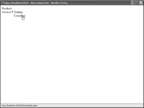
Listing 17.5. MenuHyperLink.aspx <%@ Page Language="VB" %> <!DOCTYPE html PUBLIC "-//W3C//DTD XHTML 1.1//EN" "http://www.w3.org/TR/xhtml11/DTD/xhtml11.dtd"> <html xmlns="http://www.w3.org/1999/xhtml" > <head runat="server"> <title>Menu HyperLink</title> </head> <body> <form runat="server"> <div> <asp:Menu Runat="server"> <Items> <asp:MenuItem Text="Products" NavigateUrl="Products.aspx" /> <asp:MenuItem Text="Services" NavigateUrl="Services.aspx"> <asp:MenuItem Text="Training" NavigateUrl="Training.aspx" /> <asp:MenuItem Text="Consulting" NavigateUrl="Consulting.aspx" /> </asp:MenuItem> </Items> </asp:Menu> </div> </form> </body> </html>
|
The Menu in Listing 17.5 is created from MenuItem objects. Each menu item in Listing 17.5 contains a link to another page. Notice that MenuItem objects can be nested. The second MenuItem objectServicesincludes two child MenuItem objects. When you hover your mouse over a parent menu item, the child menu items are displayed. Each MenuItem in Listing 17.5 includes a Text and NavigateUrl property. Rather than use a MenuItem to link to a new page, you also can use a MenuItem to link back to the same page. In other words, each MenuItem can act like a Linkbutton control instead of a HyperLink control. For example, each MenuItem object in Listing 17.6 includes a Text and Value property. When you click a menu item, the same page is reloaded and the value of the selected menu item is displayed (see Figure 17.6). Figure 17.6. Selecting menu items. 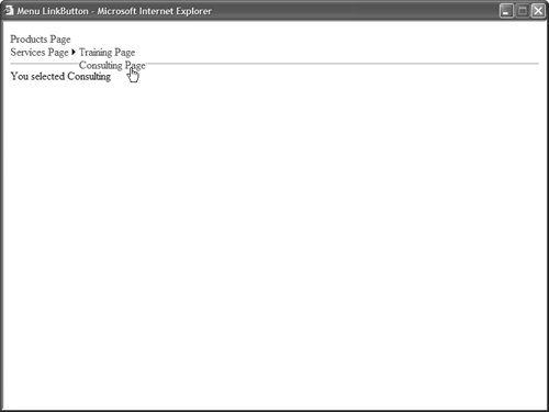
Listing 17.6. MenuLinkButton.aspx <%@ Page Language="VB" %> <!DOCTYPE html PUBLIC "-//W3C//DTD XHTML 1.1//EN" "http://www.w3.org/TR/xhtml11/DTD/xhtml11.dtd"> <script runat="server"> Protected Sub Menu1_MenuItemClick(ByVal sender As Object, ByVal e As MenuEventArgs) lblMessage.Text = "You selected " & Menu1.SelectedValue End Sub </script> <html xmlns="http://www.w3.org/1999/xhtml" > <head runat="server"> <title>Menu LinkButton</title> </head> <body> <form runat="server"> <div> <asp:Menu OnMenuItemClick="Menu1_MenuItemClick" Runat="server"> <Items> <asp:MenuItem Text="Products Page" Value="Products" /> <asp:MenuItem Text="Services Page" Value="Services"> <asp:MenuItem Text="Training Page" Value="Training" /> <asp:MenuItem Text="Consulting Page" Value="Consulting" /> </asp:MenuItem> </Items> </asp:Menu> <hr /> <asp:Label EnableViewState="false" Runat="server" /> </div> </form> </body> </html>
|
Notice that the page includes a MenuItemClick event handler. When you click a MenuItem (and the MenuItem does not have a NavigateUrl property), the MenuItemClick event is raised. In Listing 17.6, the MenuItemClick handler displays the value of the selected MenuItem in a Label control. Using the Menu Control with the MultiView Control When the Menu control is used with the MultiView control, you can create tabbed pages. You use the Menu control to display the tabs, and the MultiView control to display the content that corresponds to the selected tab. For example, the page in Listing 17.7 displays three tabs (see Figure 17.7). Figure 17.7. Displaying a tabbed page. 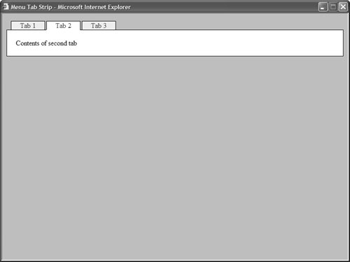
Listing 17.7. MenuTabStrip.aspx <%@ Page Language="VB" %> <!DOCTYPE html PUBLIC "-//W3C//DTD XHTML 1.1//EN" "http://www.w3.org/TR/xhtml11/DTD/xhtml11.dtd"> <script runat="server"> Protected Sub menuTabs_MenuItemClick(ByVal sender As Object, ByVal e As MenuEventArgs) multiTabs.ActiveViewIndex = Int32.Parse(menuTabs.SelectedValue) End Sub </script> <html xmlns="http://www.w3.org/1999/xhtml" > <head runat="server"> <style type="text/css"> html { background-color:silver; } .menuTabs { position:relative; top:1px; left:10px; } .tab { border:Solid 1px black; border-bottom:none; padding:0px 10px; background-color:#eeeeee; } .selectedTab { border:Solid 1px black; border-bottom:Solid 1px white; padding:0px 10px; background-color:white; } .tabBody { border:Solid 1px black; padding:20px; background-color:white; } </style> <title>Menu Tab Strip</title> </head> <body> <form runat="server"> <div> <asp:Menu Css StaticMenuItemStyle-Css StaticSelectedStyle-Css Orientation="Horizontal" OnMenuItemClick="menuTabs_MenuItemClick" Runat="server"> <Items> <asp:MenuItem Text="Tab 1" Value="0" Selected="true" /> <asp:MenuItem Text="Tab 2" Value="1"/> <asp:MenuItem Text="Tab 3" Value="2" /> </Items> </asp:Menu> <div > <asp:MultiView ActiveViewIndex="0" Runat="server"> <asp:View runat="server"> Contents of first tab </asp:View> <asp:View runat="server"> Contents of second tab </asp:View> <asp:View runat="server"> Contents of third tab </asp:View> </asp:MultiView> </div> </div> </form> </body> </html>
|
After you open the page in Listing 17.7 and click a tab, the MenuItemClick event is raised. The MenuItemClick event handler changes the ActiveViewIndex property of the MultiView control to display the content of the selected tab. Web Standards Note The Menu control in Listing 17.7 is pushed down one pixel and pushed right 10 pixels to hide the border between the selected tab and the contents of the tab. (The Menu control has a relative position.) Notice that the style rule for the selected tab includes a white bottom border. This trick works in Internet Explorer 6, Firefox 1, and Opera 8.
Binding to a Site Map Like the SiteMapPath control, you can use the Menu control with a Site Map. Users can click menu items to navigate to particular pages in your website. Unlike the SiteMapPath control, however, the Menu control does not automatically bind to a Site Map. You must explicitly bind the Menu control to a SiteMapDataSource control to display nodes from a Site Map. For example, the page in Listing 17.8 contains a menu that contains links to all the pages in a website (see Figure 17.8). Figure 17.8. Displaying a Site Map with a Menu control. 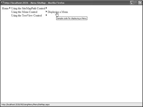
Listing 17.8. UsingMenu/MenuSiteMap.aspx <%@ Page Language="VB" %> <!DOCTYPE html PUBLIC "-//W3C//DTD XHTML 1.1//EN" "http://www.w3.org/TR/xhtml11/DTD/xhtml11.dtd"> <html xmlns="http://www.w3.org/1999/xhtml" > <head runat="server"> <title>Menu SiteMap</title> </head> <body> <form runat="server"> <div> <asp:Menu DataSource Runat="server" /> <asp:SiteMapDataSource Runat="server" /> </div> </form> </body> </html>
|
When you initially open the page in Listing 17.8, the only menu item that appears is the link to the Home page. If you hover your mouse over this link, links to additional pages are displayed. Normally, you do not want the Home link to be displayed in a navigation menu. Instead, you want to display the second level of menu items. You can use the ShowStartingNode property of the SiteMapDataSource control to hide the topmost node in a Site Map. For example, the page in Listing 17.9 uses a Menu control that renders a standard left-column navigational menu (see Figure 17.9). Figure 17.9. Displaying a navigation menu. 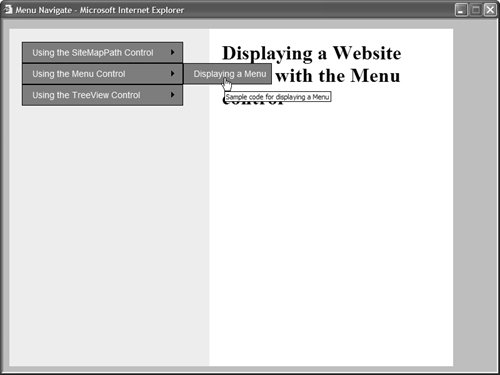
Listing 17.9. UsingMenu/MenuNavigate.aspx <%@ Page Language="VB" %> <!DOCTYPE html PUBLIC "-//W3C//DTD XHTML 1.1//EN" "http://www.w3.org/TR/xhtml11/DTD/xhtml11.dtd"> <html xmlns="http://www.w3.org/1999/xhtml" > <head runat="server"> <style type="text/css"> html { background-color:silver; } .navigation { float:left; width:280px; height:500px; padding:20px; background-color:#eeeeee; } .content { float:left; width:550px; height:500px; padding:20px; background-color:white; } .menuItem { border:Outset 1px black; background-color:Gray; font:14px Arial; color:White; padding:8px; } </style> <title>Menu Navigate</title> </head> <body> <form runat="server"> <div > <asp:Menu DataSource StaticMenuItemStyle-Css DynamicMenuItemStyle-Css Runat="server" /> <asp:SiteMapDataSource ShowStartingNode="false" Runat="server" /> </div> <div > <h1>Displaying a Website menu with the Menu control</h1> </div> </form> </body> </html>
|
When you open the page in Listing 17.9, the second-level nodes from the Site Map are initially displayed. Furthermore, the Menu control is styled to appear more like a traditional website navigation menu. Binding to an XML File As an alternative to binding a Menu control to a SiteMapDataSource control, you can bind the control to an XML document by using the XmlDataSource control. For example, suppose that you have the XML file in Listing 17.10. Listing 17.10. Menu.xml <?xml version="1.0" encoding="utf-8" ?> <menu> <appetizer> <soup /> <cheese /> </appetizer> <entree> <duck /> <chicken /> </entree> <dessert> <cake /> <pie /> </dessert> </menu>
|
The page in Listing 17.11 displays the contents of Listing 17.10 by using an XmlDataSource control to represent the XML document. Listing 17.11. MenuXML.aspx <%@ Page Language="VB" %> <!DOCTYPE html PUBLIC "-//W3C//DTD XHTML 1.1//EN" "http://www.w3.org/TR/xhtml11/DTD/xhtml11.dtd"> <html xmlns="http://www.w3.org/1999/xhtml" > <head runat="server"> <title>Menu XML</title> </head> <body> <form runat="server"> <div> <asp:Menu DataSource Runat="server" /> <asp:XmlDataSource DataFile="Menu.xml" Runat="server" /> </div> </form> </body> </html>
|
When using the XmlDataSource control, you can use the XPath property to supply an xpath query that restricts the nodes returned by the XmlDataSource. You also can use either the transform or TRansformFile property to apply an XSLT Style Sheet to the XML document and transform the nodes returned by the XmlDataSource. The XML file in Listing 17.10 is very simple. The nodes do not contain any attributes. When you bind the Menu control to the XML file, the ToString() method is called on each XML file node. You also can bind the Menu control to more complex XML documents. For example, the item nodes in the XML document in Listing 17.12 include two attributes: text and price. Listing 17.12. MenuComplex.xml <?xml version="1.0" encoding="utf-8" ?> <menu> <category text="appetizer"> <item text="soup" price="12.56" /> <item text="cheese" price="17.23" /> </category> <category text="entree"> <item text="duck" price="89.21" /> <item text="chicken" price="34.56" /> </category> <category text="dessert"> <item text="cake" price="23.43" /> <item text="pie" price="115.46" /> </category> </menu>
|
When you bind to the XML document in Listing 17.12, you must specify one or more menu item bindings. The menu item bindings specify the relationship between node attributes and the menu items displayed by the Menu control. The Menu control in Listing 17.13 includes MenuItemBinding subtags (see Figure 17.10). Figure 17.10. Displaying an XML document with the Menu control. 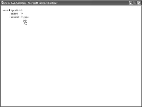
Listing 17.13. MenuXMLComplex.aspx <%@ Page Language="VB" %> <!DOCTYPE html PUBLIC "-//W3C//DTD XHTML 1.1//EN" "http://www.w3.org/TR/xhtml11/DTD/xhtml11.dtd"> <html xmlns="http://www.w3.org/1999/xhtml" > <head runat="server"> <title>Menu XML Complex</title> </head> <body> <form runat="server"> <div> <asp:Menu DataSource Runat="server"> <DataBindings> <asp:MenuItemBinding DataMember="category" TextField="text" /> <asp:MenuItemBinding DataMember="item" TextField="text" ValueField="price" /> </DataBindings> </asp:Menu> <asp:XmlDataSource DataFile="MenuComplex.xml" Runat="server" /> </div> </form> </body> </html>
|
Notice that the Menu control includes a <DataBindings> element. This element includes two MenuItemBinding subtags. The first subtag represents the relationship between the category nodes in the XML file and the menu items. The second subtag represents the relationship between the item nodes in the XML file and the menu items. Binding to Database Data You can't bind a Menu control directly to database data. Neither the SqlDataSource nor ObjectDataSource controls implement the IHierachicalDataSource interface. Therefore, if you want to represent database data with the Menu control, then you need to perform some more work. One option is to create your own SqlHiearachicalDataSource control. You can do this either by deriving from the base HiearchicalDataSourceControl class or implementing the IHiearchicalDataSource interface. We'll take this approach in the final section of this chapter, when we create a custom SqlHierarchicalDataSource control. A second option is to build the menu items programmatically in the Menu control. This is the approach that is followed here. Imagine that you want to represent the contents of the following database table with a Menu control: CategoryId | ParentId | Name |
|---|
1 | null | Beverages | 2 | null | Fruit | 3 | 1 | Milk | 4 | 1 | Juice | 5 | 4 | Apple Juice | 6 | 4 | Orange Juice | 7 | 2 | Apples | 8 | 2 | Pears |
This database table represents product categories. The categories are nested with the help of the ParentId column. For example, the Orange Juice category is nested below the Juice category, and the Juice category is nested below the Beverages category. The page in Listing 17.14 illustrates how you can display this database table with a Menu control (see Figure 17.11). Figure 17.11. Displaying database data with the Menu control. 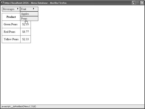
Listing 17.14. MenuDatabase.aspx| [View full width] <%@ Page Language="VB" %> <%@ Import Namespace="System.Web.Configuration" %> <%@ Import Namespace="System.Data" %> <%@ Import Namespace="System.Data.SqlClient" %> <!DOCTYPE html PUBLIC "-//W3C//DTD XHTML 1.1//EN" "http://www.w3.org/TR/xhtml11/DTD/xhtml11.dtd"> <script runat="server"> ''' <summary> ''' Only populate the menu when the page first loads ''' </summary> Private Sub Page_Load() If Not Page.IsPostBack Then PopulateMenu() End If End Sub ''' <summary> ''' Get the data from the database and create the top-level ''' menu items ''' </summary> Private Sub PopulateMenu() Dim menuData As DataTable = GetMenuData() AddTopMenuItems(menuData) End Sub ''' <summary> ''' Use a DataAdapter and DataTable to grab the database data ''' </summary> ''' <returns></returns> Private Function GetMenuData() As DataTable ' Get Categories table Dim selectCommand As String = "SELECT CategoryId,ParentId,Name FROM Categories" Dim conString As String = WebConfigurationManager.ConnectionStrings("Categories")  .ConnectionString Dim dad As SqlDataAdapter = New SqlDataAdapter(selectCommand, conString) Dim dtblCategories As DataTable = New DataTable() dad.Fill(dtblCategories) Return dtblCategories End Function ''' <summary> ''' Filter the data to get only the rows that have a ''' null ParentID (these are the top-level menu items) ''' </summary> Private Sub AddTopMenuItems(ByVal menuData As DataTable) Dim view As DataView = New DataView(menuData) view.RowFilter = "ParentID IS NULL" Dim row As DataRowView For Each row In view Dim NewMenuItem As MenuItem = New MenuItem(row("Name").ToString(), row( "CategoryId").ToString()) Menu1.Items.Add(NewMenuItem) AddChildMenuItems(menuData, NewMenuItem) Next End Sub ''' <summary> ''' Recursively add child menu items by filtering by ParentID ''' </summary> Private Sub AddChildMenuItems(ByVal menuData As DataTable, ByVal parentMenuItem As MenuItem) Dim view As DataView = New DataView(menuData) view.RowFilter = "ParentName").ToString(), row ("CategoryId").ToString()) parentMenuItem.ChildItems.Add(NewMenuItem) AddChildMenuItems(menuData, NewMenuItem) Next End Sub </script> <html xmlns="http://www.w3.org/1999/xhtml" > <head runat="server"> <style type="text/css"> .menuItem { border:Solid 1px black; width:100px; padding:2px; background-color:#eeeeee; } .menuItem a { color:blue; } .grid { margin-top:10px; } .grid td, .grid th { padding:10px; } </style> <title>Menu Database</title> </head> <body> <form runat="server"> <div> <asp:Menu Orientation="horizontal" StaticMenuItemStyle-Css DynamicMenuItemStyle-Css Runat="server" /> <asp:GridView DataSource Css AutoGenerateColumns="false" Runat="server"> <Columns> <asp:BoundField DataField="ProductName" HeaderText="Product" /> <asp:BoundField DataField="Price" HeaderText="Price" DataFormatString="{0:c}" /> </Columns> </asp:GridView> <asp:SqlDataSource ConnectionString="<%$ ConnectionStrings:Categories %>" SelectCommand="SELECT ProductName,Price FROM Products WHERE CategoryId=@CategoryId" Runat="server"> <SelectParameters> <asp:ControlParameter Name="CategoryId" Control /> </SelectParameters> </asp:SqlDataSource> </div> </form> </body> </html> .ConnectionString Dim dad As SqlDataAdapter = New SqlDataAdapter(selectCommand, conString) Dim dtblCategories As DataTable = New DataTable() dad.Fill(dtblCategories) Return dtblCategories End Function ''' <summary> ''' Filter the data to get only the rows that have a ''' null ParentID (these are the top-level menu items) ''' </summary> Private Sub AddTopMenuItems(ByVal menuData As DataTable) Dim view As DataView = New DataView(menuData) view.RowFilter = "ParentID IS NULL" Dim row As DataRowView For Each row In view Dim NewMenuItem As MenuItem = New MenuItem(row("Name").ToString(), row( "CategoryId").ToString()) Menu1.Items.Add(NewMenuItem) AddChildMenuItems(menuData, NewMenuItem) Next End Sub ''' <summary> ''' Recursively add child menu items by filtering by ParentID ''' </summary> Private Sub AddChildMenuItems(ByVal menuData As DataTable, ByVal parentMenuItem As MenuItem) Dim view As DataView = New DataView(menuData) view.RowFilter = "ParentName").ToString(), row ("CategoryId").ToString()) parentMenuItem.ChildItems.Add(NewMenuItem) AddChildMenuItems(menuData, NewMenuItem) Next End Sub </script> <html xmlns="http://www.w3.org/1999/xhtml" > <head runat="server"> <style type="text/css"> .menuItem { border:Solid 1px black; width:100px; padding:2px; background-color:#eeeeee; } .menuItem a { color:blue; } .grid { margin-top:10px; } .grid td, .grid th { padding:10px; } </style> <title>Menu Database</title> </head> <body> <form runat="server"> <div> <asp:Menu Orientation="horizontal" StaticMenuItemStyle-Css DynamicMenuItemStyle-Css Runat="server" /> <asp:GridView DataSource Css AutoGenerateColumns="false" Runat="server"> <Columns> <asp:BoundField DataField="ProductName" HeaderText="Product" /> <asp:BoundField DataField="Price" HeaderText="Price" DataFormatString="{0:c}" /> </Columns> </asp:GridView> <asp:SqlDataSource ConnectionString="<%$ ConnectionStrings:Categories %>" SelectCommand="SELECT ProductName,Price FROM Products WHERE CategoryId=@CategoryId" Runat="server"> <SelectParameters> <asp:ControlParameter Name="CategoryId" Control /> </SelectParameters> </asp:SqlDataSource> </div> </form> </body> </html>
|
The menu items are added to the Menu control in the PopulateMenu() method. This method first grabs a DataTable that contains the contents of the Categories database table. Next, it creates a menu item for each row that does not have a parent row (each row where the ParentId column has the value null). The child menu items for each menu item are added recursively. The ParentId column is used to filter the contents of the Categories DataTable. The page in Listing 17.14 also includes a GridView control that displays a list of products that match the category selected in the menu. The GridView is bound to a SqlDataSource control, which includes a ControlParameter that filters the products based on the selected menu item. Formatting the Menu Control The Menu control supports an abundance of properties that can be used to format the appearance of the control. Many of these properties have an effect on static menu items, and many of these properties have an effect on dynamic menu items. Static menu items are menu items that always appear. Dynamic menu items are menu items that appear only when you hover your mouse over another menu item. First, the Menu control supports the following general properties related to formatting: DisappearAfter Enables you to specify the amount of time, in milliseconds, that a dynamic menu item is displayed after a user moves the mouse away from the menu item. DynamicBottomSeparatorImageUrl Enables you to specify the URL to an image that appears under each dynamic menu item. DynamicEnableDefaultPopOutImage Enables you to disable the image (triangle) that indicates that a dynamic menu item has child menu items. DynamicHorizontalOffset Enables you to specify the number of pixels that a dynamic menu item is shifted relative to its parent menu item. DynamicItemFormatString Enables you to format the text displayed in a dynamic menu item. DynamicPopOutImageTextFormatString Enables you to format the alt text displayed for the popout image. DynamicPopOutImageUrl Enables you to specify the URL for the dynamic popout image. (By default, a triangle is displayed.) DynamicTopSeparatorImageUrl Enables you to specify the URL to an image that appears above each dynamic menu item. DynamicVerticalOffset Enables you to specify the number of pixels that a dynamic menu item is shifted relative to its parent menu item. ItemWrap Enables you to specify whether the text in menu items should wrap. MaximumDynamicDisplayLevels Enables you to specify the maximum number of levels of dynamic menu items to display. Orientation Enables you to display a menu horizontally or vertically (the default value is Vertical). ScollDownImageUrl Enables you to specify the URL to an image that is displayed and that enables you to scroll down through menu items. ScrollDownText Enables you to specify alt text for the ScrollDown image. ScrollUpImageUrl Enables you to specify the URL to an image that is displayed and that enables you to scroll up through menu items. ScrollUpText Enables you to specify alt text for the ScrollUp image. SkipLinkText Enables you to modify the text displayed by the skip link. (The skip link enables blind users to skip past the contents of a menu.) StaticBottomSeparatorImageUrl Enables you to specify the URL to an image that appears below each static menu item. StaticDisplayLevels Enables you to specify the number of static levels of menu items to display. StaticEnableDefaultPopOutImage Enables you to disable the default popout image that indicates that a menu item has child menu items. StaticItemFormatString Enables you to format the text displayed in each static menu item. StaticImagePopOutFormatString Enables you to specify the alt text displayed by the popout image. StaticPopOutImageUrl Enables you to specify the URL for the popout image. StaticSubMenuIndent Enables you to specify the number of pixels that a static menu item is indented relative to its parent menu item. StaticTopSeparatorImageUrl Enables you to specify the URL to an image that appears above each static menu item. Target Enables you to specify the window in which a new page opens when you click a menu item.
This list includes several interesting properties. For example, notice that you can specify images for scrolling up and down through a list of menu items. These images appear when you constrain the height of either the static or dynamic menu. The Menu control also exposes several Style objects. You can use these Style objects as hooks to which you can attach Cascading Style Sheet classes: DynamicHoverStyle Style applied to a dynamic menu item when you hover your mouse over it. DynamicMenuItemStyle Style applied to each dynamic menu item. DynamicMenuStyle Style applied to the container tag for the dynamic menu. DynamicSelectedStyle Style applied to the selected dynamic menu item. StaticHoverStyle Style applied to a static menu item when you hover your mouse over it. StaticMenuItemStyle Style applied to each static menu item. StaticMenuStyle Style applied to the container tag for the static menu. StaticSelectedStyle Style applied to the selected static menu item.
Furthermore, you can apply styles to menu items based on their level in the menu. For example, you might want the font size to get progressively smaller depending on how deeply nested a menu item is within a menu. You can use three properties of the Menu control to format menu items, depending on their level: LevelMenuItemStyles Contains a collection of MenuItemStyle controls, which correspond to different menu levels. LevelSelectedStyles Contains a collection of MenuItemStyle controls, which correspond to different menu levels of selected menu items. LevelSubMenuStyles Contains a collection of MenuItemStyle controls, which correspond to different menu levels of static menu items.
For example, the page in Listing 17.15 illustrates how you can apply different formatting to menu items that appear at different menu levels (see Figure 17.12). Figure 17.12. Applying styles to different menu levels. 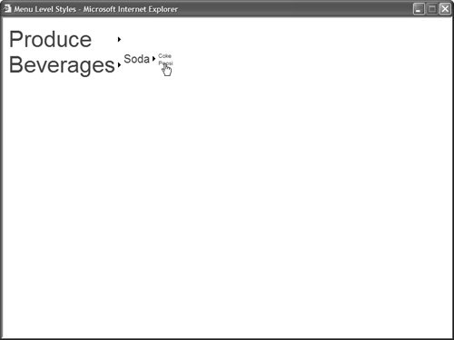
Listing 17.15. MenuLevelStyles.aspx <%@ Page Language="VB" %> <!DOCTYPE html PUBLIC "-//W3C//DTD XHTML 1.1//EN" "http://www.w3.org/TR/xhtml11/DTD/xhtml11.dtd"> <html xmlns="http://www.w3.org/1999/xhtml" > <head runat="server"> <style type="text/css"> .menuLevel1 { font:40px Arial,Sans-Serif; } .menuLevel2 { font:20px Arial,Sans-Serif; } .menuLevel3 { font:10px Arial,Sans-Serif; } </style> <title>Menu Level Styles</title> </head> <body> <form runat="server"> <div> <asp:Menu Runat="server"> <LevelMenuItemStyles> <asp:MenuItemStyle Css /> <asp:MenuItemStyle Css /> <asp:MenuItemStyle Css /> </LevelMenuItemStyles> <Items> <asp:MenuItem Text="Produce"> <asp:MenuItem Text="Apples" /> <asp:MenuItem Text="Oranges" /> </asp:MenuItem> <asp:MenuItem Text="Beverages"> <asp:MenuItem Text="Soda"> <asp:MenuItem Text="Coke" /> <asp:MenuItem Text="Pepsi" /> </asp:MenuItem> </asp:MenuItem> </Items> </asp:Menu> </div> </form> </body> </html>
|
The MenuItemStyle controls are applied to the menu level that corresponds to their order of declaration. The first MenuItemStyle is applied to the first menu level, the second MenuItemStyle is applied to the second menu level, and so on. Finally, the MenuItem class itself includes several useful formatting properties: ImageUrl Enables you to specify the URL for an image that is displayed next to a menu item. PopOutImageUrl Enables you to specify the URL for an image that is displayed when a menu item contains child menu items. SeparatorImageUrl Enables you to specify the URL for an image that appears below a menu item. Selectable Enables you to prevent users from selecting (clicking) a menu item. Selected Enables you to specify whether a menu item is selected. Target Enables you to specify the name of the window that opens when you click a menu item.
For example, the page in Listing 17.16 displays a menu that resembles a traditional desktop application menu (see Figure 17.13). Figure 17.13. Displaying a desktop application menu. 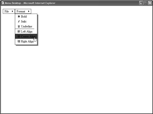
Listing 17.16. MenuDesktop.aspx <%@ Page Language="VB" %> <!DOCTYPE html PUBLIC "-//W3C//DTD XHTML 1.1//EN" "http://www.w3.org/TR/xhtml11/DTD/xhtml11.dtd"> <html xmlns="http://www.w3.org/1999/xhtml" > <head runat="server"> <style type="text/css"> .staticMenuItem { color:black; border:solid 1px black; padding:2px 4px; } .menuHover { color:white; background-color:blue; } .dynamicMenuItem { color:black; padding:2px 4px; } .dynamicMenu { border:Solid 1px black; filter:progid:DXImageTransform.Microsoft.dropshadow(OffX=5, OffY=5, Color='gray', Positive='true')" } </style> <title>Menu Desktop</title> </head> <body> <form runat="server"> <div> <asp:Menu Orientation="Horizontal" StaticMenuItemStyle-Css StaticHoverStyle-Css DynamicHoverStyle-Css DynamicMenuItemStyle-Css DynamicMenuStyle-Css Runat="server"> <Items> <asp:MenuItem Text="File" Selectable="false"> <asp:MenuItem Text="Save" /> <asp:MenuItem Text="Open" /> </asp:MenuItem> <asp:MenuItem Text="Format" Selectable="false"> <asp:MenuItem Text="Bold" ImageUrl="Images/Bold.gif" /> <asp:MenuItem Text="Italic" ImageUrl="Images/Italic.gif" /> <asp:MenuItem Text="Underline" ImageUrl="Images/Underline.gif" SeparatorImageUrl="Images/Divider.gif" /> <asp:MenuItem Text="Left Align" ImageUrl="Images/JustifyLeft.gif" /> <asp:MenuItem Text="Center Align" ImageUrl="Images/JustifyCenter.gif" /> <asp:MenuItem Text="Right Align" ImageUrl="Images/JustifyRight.gif" /> </asp:MenuItem> </Items> </asp:Menu> </div> </form> </body> </html>
|
Using Templates with the Menu Control The Menu control supports templates. You can use templates to completely customize the appearance of the Menu control. The Menu control supports the following two templates: The page in Listing 17.17 uses both templates to display menu items. The templates display a count of child items for each menu item (see Figure 17.14). Figure 17.14. Using templates with the Menu control. 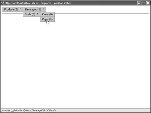
Listing 17.17. MenuTemplates.aspx <%@ Page Language="VB" %> <!DOCTYPE html PUBLIC "-//W3C//DTD XHTML 1.1//EN" "http://www.w3.org/TR/xhtml11/DTD/xhtml11.dtd"> <script runat="server"> Protected Sub Menu1_MenuItemClick(ByVal sender As Object, ByVal e As MenuEventArgs) lblMessage.Text = Menu1.SelectedValue End Sub </script> <html xmlns="http://www.w3.org/1999/xhtml" > <head runat="server"> <style type="text/css"> .menuItem { color:black; border:Solid 1px Gray; background-color:#c9c9c9; padding:2px 5px; } </style> <title>Menu Templates</title> </head> <body> <form runat="server"> <div> <asp:Menu OnMenuItemClick="Menu1_MenuItemClick" Orientation="Horizontal" StaticMenuItemStyle-Css DynamicMenuItemStyle-Css Runat="server"> <StaticItemTemplate> <%# Eval("Text") %> (<%# Eval("ChildItems.Count") %>) </StaticItemTemplate> <DynamicItemTemplate> <%# Eval("Text") %> (<%# Eval("ChildItems.Count") %>) </DynamicItemTemplate> <Items> <asp:MenuItem Text="Produce"> <asp:MenuItem Text="Apples" /> <asp:MenuItem Text="Oranges" /> </asp:MenuItem> <asp:MenuItem Text="Beverages"> <asp:MenuItem Text="Soda"> <asp:MenuItem Text="Coke" /> <asp:MenuItem Text="Pepsi" /> </asp:MenuItem> </asp:MenuItem> </Items> </asp:Menu> <hr /> <asp:Label EnableViewState="false" Runat="server" /> </div> </form> </body> </html>
|
Notice that you do not need to create LinkButton controls in the templates. The content of the template is wrapped in a link automatically when it is appropriate. | 