Section 3.2. THE COST OF NAVIGATION
3.2. THE COST OF NAVIGATIONWhen you walk into an unfamiliar room, you look around. In a fraction of a second, you take in the shape of the room, the furnishings, the light, the ways out, and other clues; very quickly, you make some assumptions about what this room is and how it relates to why you walked in. Then you need to do what you came in to do. Where? How? You might be able to answer immediatelyor not. Or maybe you're just distracted by other interesting things in the room. Similarly, bringing up a web page or opening a window each incur a cognitive cost. Again, you need to figure out this new space: you take in its shape, its layout, its contents, its exits, and how to do what you came to do. All of this takes energy and time. The "context switch" forces you to refocus your attention and adjust to your new surroundings. Even if you're already familiar with the window (or room) you just went into, it still incurs a cost. Not a large cost, but it adds upespecially when you figure in the actual time it takes to display a window or load a page. This is true whether you're dealing with web pages, windows, dialog boxes, or device screens. The decisions that users make about where to go are similar, whether they use links or buttonslabels still need to be read, or icons decoded, and the users still will make leaps of faith by clicking on links or buttons they're not sure about. 3.2.1. KEEPING DISTANCES SHORTKnowing that there's a cost associated with jumping from page to page, you can understand now why it's important to keep the number of those jumps down. Two of the patterns in this chapterGlobal Navigation and Pyramidgive you specific ways to do that in complex applications and sites, by taking common navigation paths and turning them into easy single jumps. Patterns in other chapters, like Card Stack (Chapter 4), can help you pack more into a single page, thus sparing you the need to jump to a new one. But the real efficiency gains come from the structure of the application. One of the nastiest things a designer can do is force a user to go into multiple levels of subpages or dialogs. every time they need to accomplish a simple, everyday task. (Worse is to lead him there, tell him he can't accomplish it because of some missing precondition, and send him back to Square One. Happens to the best of us.) Can you design your application to do the most common 80 percent of use cases with zero or one "context switches"? This is hard to do with some kinds of applications. You might think that some kinds of tools just have to be inside dialog boxes, two levels down in your site structure, or wherever. Is a certain tool too big to put on your main page? Try shrinking it: eliminate controls, shorten labels, and use specialized controls that save space (see Chapter 7). Is it too distracting when combined with everything else on the main page? Again, try shrinking it or putting it in an out-of-the-way spot. Do you need that wizard? Maybe its functionality is better rendered in one page than many. Be creative! Now that I've given you a rule to follow, I'll tell you to break it. Sometimes it's appropriate to bury functionality inside pages that take more than one jump to get to, such as that extra 20 percent left over from the 80 percent you made easily available. It also could be that on your application, simplicity of presentation is more important than saving one or two jumps. Extras on Demand is a pattern from Chapter 2 that recommends putting little-used functionality behind an extra "door" (also using the 80/20 rule). As always, use your judgmentand usability-test it if you have any doubt. Designers today seem to be taking all this to heart. Most modern desktop applications now are built around a single main window, often tabbed or tiled, with assorted toolbars and panes around it. It's become less fashionable to use separate windows or dialog boxes for every piece of functionality, and that's a good thing. Web applications also use more clientside validation, progressive disclosure, and other techniques for presenting changeable content without loading a new page each time something changes. Yet sometimes, you still end up four dialog boxes deep in an application (see Figure 3-1). Figure 3-1. Four dialogs deep in Microsoft Outlook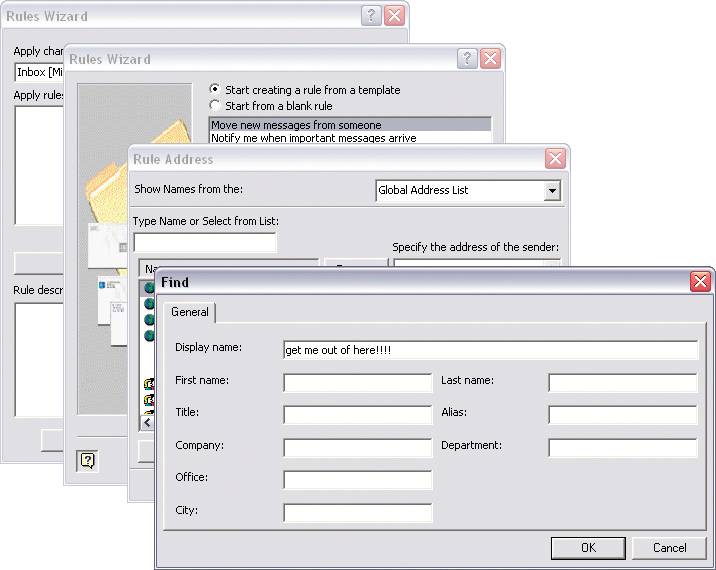
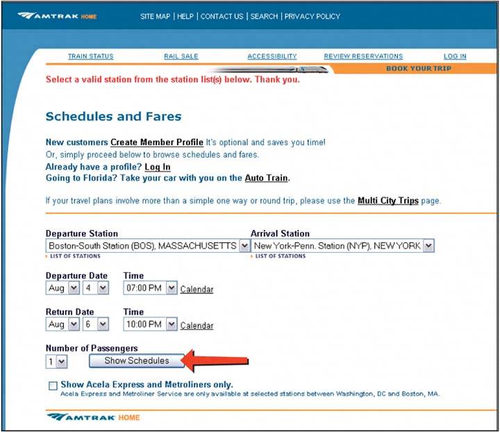
3.2.2. TOO MANY JUMPSTo demonstrate what I mean by reducing the number of jumps, I'll walk through a short case study of an interactive site that's not actually all that bad. The task is probably common, though the site designers obviously didn't optimize the site for this task. You'll see what I mean. I am visiting Amtrak's web site to find out how much it might cost to ride the train from Boston to New York City. My departure and arrival times are flexible, so I'd like to look at several to find the cheapest ones. To my delight, there's a "Fast Fare Finder" on their home pageI can get this information in one quick step! All I need to do is .ll in this mini-form (Figure 3-2), click Go, and I'm there. Right? Figure 3-2. Amtrak's home page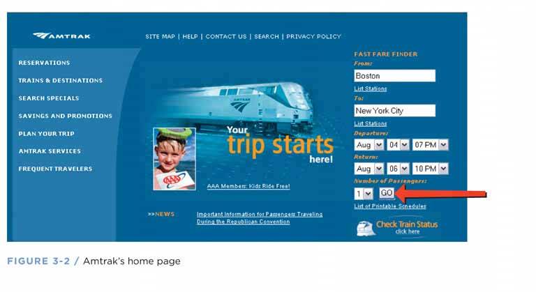
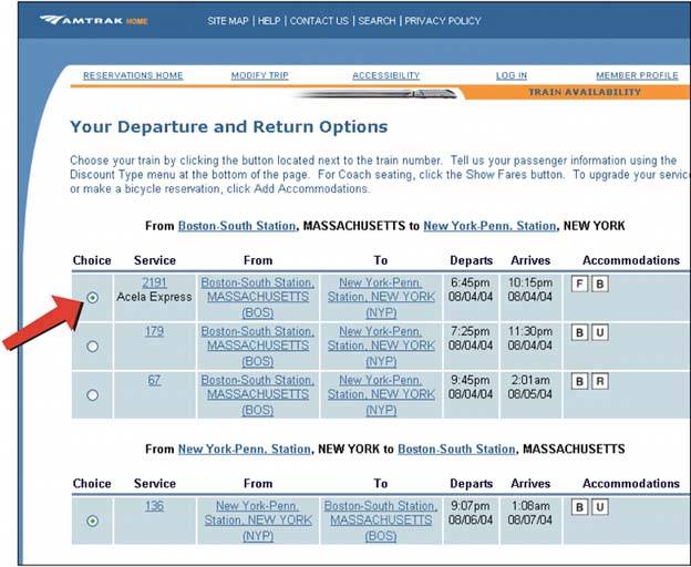
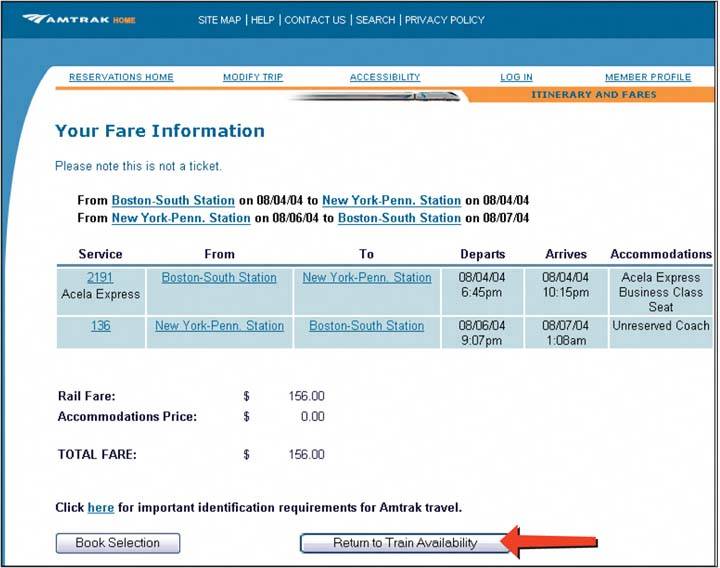
Seven steps. Seven context switchesand eight page loadsfor something that I thought could be done in one step. Remarkable! Figure 3-6 shows what this use case looks like using a UML sequence diagram hacked for use as a navigation diagram. Each vertical line represents a page, each arrow represents a jump, and each rectangle shows what page I'm on. As you follow the arrows down the page, the diagram shows how the interaction progresses over time. Figure 3-6. Sequence diagram for the Amtrak scenario: four pages and seven jumps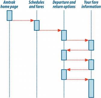 How can we streamline this process down to one jump? First, can we remove the extraneous "Schedules and Fares" page back at the beginning when we simply confirmed information we'd already typed in? Well, it turns out that that page asks the user for one more critical piece of information: the actual train stations in the source and destination cities. We could solve that problem with two new client-side dropdown lists that .ll in with default stations after the cities are typed. (The default train station often is what the user wants anyway.) Alternatively, we could do this on the second page. With that hand-wave, we're one jump gone, five to go. The next improvementthe big oneis simply to show the fares on the same page as the rest of the train info. We can add a "Fares" column to the table, which eliminates the remaining five jumps! Figure 3-7 shows the much-simplified navigation. Figure 3-7. Two pages, one jump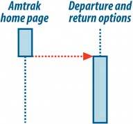 |
EAN: 2147483647
Pages: 75