3.3. THE PATTERNS To recap, this chapter talks about several aspects of navigation: overall structure, knowing where you are, figuring out where you're going, and getting there efficiently. The patterns address these issues to varying degrees. The structure of an application or site is tied intimately to navigation within it. It's impossible to separate them, actually. One could arguably put structure-related navigation patterns like Clear Entry Points, Hub and Spoke, and Pyramid into Chapter 2, which discussed how to organize the content, because these patterns talk about how multiple pages interrelate. You can "tack on" some othersGlobal Navigation, Color-Coded Sections, Sequence Map, Breadcrumbs, and Escape Hatchto individual pages after the basic navigational structures are designed, and thus they might move further down the design progression into page layout (the topic of Chapter 4). And there's one more thing to note. Clear Entry Points, Modal Panel, and Hub and Spoke restrict access to navigation, not expand it (as many of the others do). Complete freedom to move anywhere at any time isn't an unalloyed good; sometimes clarity of understanding means that less is better. In any case, we'll start with the patterns that describe navigational structures: how the pages (or windows or dialog boxes) of a UI interlink. If you draw a picture of the links between the pages of the UI, you might see some of these patterns: Clear Entry Points Global Navigation Hub and Spoke Pyramid Modal Panel
The next four patterns work well as "You are here" signposts (as can Global Navigation, and Chapter 6's Overview Plus Detail). Sequence Map, Breadcrumbs, and Annotated Scrollbar also serve as interactive maps of the content. Annotated Scrollbar is intended more for single spaces, like large documents, than for multiply connected pages. But that's still navigation, after a fashion. It's still important for document users to know where they are, where to go, and how to move around quickly. Sequence Map Breadcrumbs Annotated Scrollbar Color-Coded Sections
Animated Transition helps users stay oriented as they move from one place to another. It's a visual trick, and nothing more, but it's very effective at preserving a user's sense of where they are and what's happening. Finally, Escape Hatch is the "navigational trump card" mentioned earlier. With this on the page, users know they can always get back to a familiar place. 21. clear entry points Figure 3-8. From http://ingdirect.com 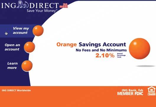
3.3.1.1. what Present only a few entry points into the interface; make them task-oriented and descriptive. 3.3.1.2. use when You're designing a task-based application, or any other application used largely by first-time or infrequent users. It's also helpful for some web sites. But if the application's purpose is clear to basically everyone who starts it, and if most users might be irritated by one more navigation step than is necessary (like applications designed for intermediate- to-expert users), then don't use it. 3.3.1.3. why Some applications and web sites, when opened, present the user with what looks like a morass of information and structure: lots of tiled panels, unfamiliar terms and phrases, irrelevant ads, or toolbars that just sit there disabled. They don't give the hesitant user any clear guidance on what to do first. "Okay, here I am. Now what?" For these users' sake, list a few options for getting started. If those options match a user's expectations, he can confidently take one of those options and begin workthis contributes to Instant Gratification (Chapter 1). If not, at least he knows now what the application actually does because you've defined the important tasks or categories right up front. You've made the application more self-explanatory. 3.3.1.4. how When the site is visited, or the application started, present these entry points as "doors" into the main content of the site or application. From these starting points, guide the user gently and unambiguously into the application until he has enough context to continue by himself. Collectively, these entry points should cover most reasons why anyone would be there. There might be only one or two entry points, or many; it depends on what fits your design. But you should phrase them with language first-time users can understandthis is not the place for application-specific tool names. Visually, you should show these entry points with emphasis proportional to their importance. In Figure 3-8, for instance, ING Direct clearly wants to point people toward their current special savings account; they put it front-and-center, in bold lettering and colors, surrounded by whitespace. The three other tasks (probably used more frequently by most customers) are rendered in a group, each with equal visual weight. The most commonly used entry point, "View my account," is at the top. On a page like this, most sites list other navigation linksAbout, Contact, Privacy Policy, etc.which are much smaller, visible only to those actually looking for them. They're more specialized; they don't lead you directly into the heart of the site, no more than a garage door leads you directly into the living room of a home. (Splash screens, by the way, are not a manifestation of Clear Entry Points, since they don't present a decision point to the user. They merely pass the captive user along from one screen to another. Other than being a progress indicator while something is loading, or a demonstration of a designer's prowess, they add no value.) 3.3.1.5. examples Small-screen devices benefit from this pattern, too. Most PDAs and cell phones have a Hub and Spoke design, in which applications are chosen from a starting screen. But when there gets to be a lot of them, do you present them all together, as PalmOS does, or do you instead split out the most common ones? Presenting too many at once may overload a first-time user; 80 percent of your use cases may go through only four or five applications. If you do separate them into first-tier and second-tier choices, the users of the second-tier applications incur one or more extra clicks to get where they're going. Only you can decide if that's worth it. Figure 3-9. Google is best known for doing one thing amazingly well. Its home page design focuses users' attention on that one thing: you can't miss that search box! The other stuff is ranked into secondary (such as Web or Images) and tertiary tiers, plus utility navigation (such as Advanced Search). Like ING Direct's site, this design's cleanness gives a user confidence in taking one of the few major choices. 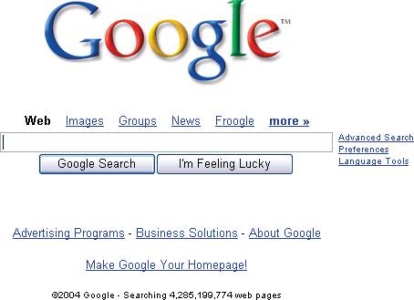
Figure 3-10. Here, a Motorola cell phone gives single-button-click access to six features: four from the central four-way button, and two from the softkeys at the bottom of the screen. The rest of the phone's applications are two clicks away, in a menu. Sensibly, the phone book is easiest to hitselectable via a button right under one's left thumb. (This is more about convenience than information overload, I suspect, but it works toward both goals.) 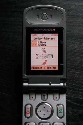
22. global navigation Figure 3-11. From Microsoft Money 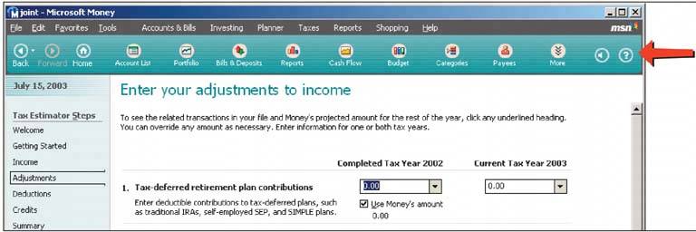
3.3.2.1. what Using a small section of every page, show a consistent set of links or buttons that take the user to key sections of the site or application. 3.3.2.2. use when You build a large web site, or an application with several separate sections or tools. In either case, users are likely to want to move directly from one section to another. You have plenty of space to work with, and you don't mind having extra elements on each page. Hub and Spoke is an alternative to this pattern. It is better for tools that are more self-contained, with more tightly constrained workflow, or for very small screens. 3.3.2.3. why On the Web, a global navigation bar is a well-established convention, so users expect it there. More importantly, though, a set of links or buttons that reflects the UI's highest-order structure makes that structure visible to users from every page. It gives them an overview of the UI and helps them find what they need in it (if the naming scheme makes sense, anyway). It also facilitates exploration and easy movement by putting each section only one click away from anyplace else. You can add to the utility of a global navigation panel by making it show what section the user is currently in, like tabs do. Thus it becomes a "You are here" signpost as well as a navigational device. 3.3.2.4. how First, devise a sensible organizational structure. Keep the number of sections down to something you can display in the available space, and name the sections wellmake them meaningful to the user, don't use too many words, and follow whatever conventions are appropriate (such as "About Us" or "Products"). As for the global navigation panel, design a single panel that looks the sameand goes into the same placeon each page where it appears. On the Web, that should be every page (with the notable exception of applications using a Hub and Spoke structure). A desktop UI has far fewer conventional uses of such a thing, but it should probably go into every major application window (not every dialog box). A good global navigation panel is one component of a well-designed Visual Framework (see Chapter 4). To show where the user is now, simply make the link for the current section look different from the others. Use a contrasting color, perhaps, or an unobtrusive graphic like an arrow. One design issue that you may run into, especially on web pages, is how to present this kind of navigational device along with other sets of links. They ought to be distinct from one another. Users may look to the top of the page for the global navigation; that leaves the left- and righthand sides for other links, or you could put them in the content area itself. You also could also use two very different sets of affordancessimple clickable text for the global navigation, and tabs for more "local" things, for instance. As with Center Stage (Chapter 4), remember that home pages and main windows may require different layouts than other pages in the UI. If getting to the different sections of the UI is a purpose of the home page or opening window, then global navigation may need to be more prominent than everywhere else, and you might want to flesh it out with details or sublinks. Finally, understand that not every user will use, or even notice, a navigational device like this. Engineers and designers share a common misconception that users will logically look for the overview first, and then decide where to go. They won't. They often don't care to know how the site or UI is organized, but simply follow the nearest and most obvious signposts until they find what they need (this is called Satisficing; see Chapter 1). It's analogous to someone looking for the restrooms in an airportthey probably won't bother reading a map if there are signs or architectural clues. 3.3.2.5. examples Figure 3-12. Palms and similar PDAs use a hardware form of Global Navigation. The four round buttons at the bottom of the device bring the user directly to the calendar, phone list, To-Do list, and memo pad applications. Similarly, the silkscreened "soft" buttons above it bring the user to the Applications hub, calculator, and two helper tools, Menu and Find.
Notice that the calendar application shown has no explicit "Close" or "Exit" button. I suppose the designers expected that people would use global navigation to move around. This implies that the applications retain their state as the user switches applications, so no changes get lost inadvertently. It's a very different model from Hub and Spoke (the next pattern). 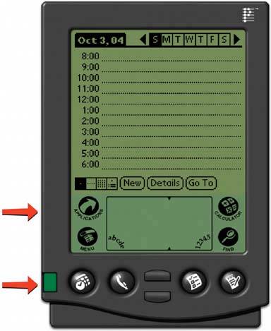
23. hub and spoke Figure 3-13. Nokia Series 60 phone interface 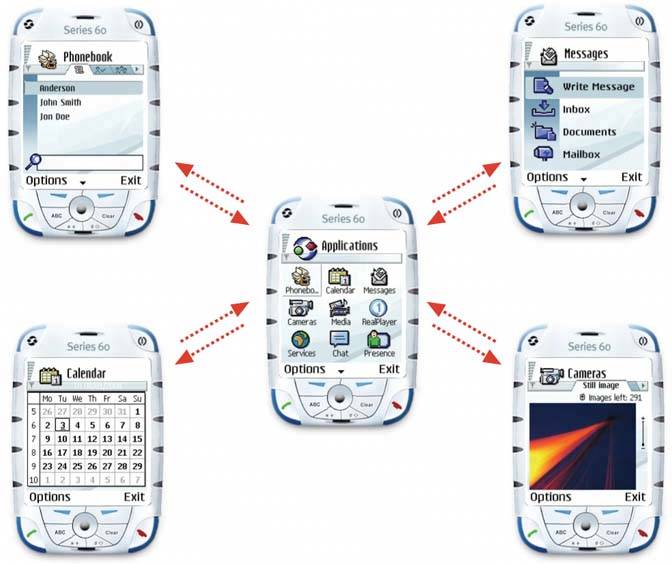
3.3.3.1. what Isolate the sections of the app into mini-applications, each with one way in (from the main page) and one way out (back to the main page). 3.3.3.2. use when Your UI contains several discrete tasks, sub-applications, or content elements, such as forms, demos, games, articles, transactions, or self-contained tools. You can reach all of them from one central page or screen. However, you don't want to connect each of them to all the others, for several possible reasons: To reinforce the separateness of these sub-applications To restrict workflow to force the completion (or explicit cancellation) of a task To eliminate visual and cognitive clutter Physical space constraints
You may not want to use Hub and Spoke if users have a good reason to move directly between the tools that constitute the spokes. Use Global Navigation in that case. These two patterns are different solutions to a similar problemstructuring the users' typical movement paths. (They can coexist, but one usually ends up dominating the other in everyday use.) Hub and Spoke is especially well-suited for small-screened mobile devices, usually in conjunction with a One-Window Drilldown architecture. 3.3.3.3. why When you apply Hub and Spoke, you use navigation to structure the user experience into something different from the freeform browsing on the Web, or window-to-window hopping on desktop applications. You ask the user to focus on one section at a time, and then go back to the hub to get to another section. This certainly reduces clutter on the "spoke" pagesthe user has less to look at and think about. But by restricting the available navigation paths through interactive pages, you can also prevent errorsusers can't shoot themselves in the foot so easily. With no navigation buttons, they can't leave a web form half-finished by jumping to a different page (the "abandoned edits" problem). With a modal window in a desktop application, they can't "lose" the dialog box on the screen. In general, they have less opportunity to get the UI into a self-inconsistent or confusing state. Furthermore, restricted navigation means you have much tighter control over what circumstances the interface needs to handlethis often results in simpler (and thus cheaper) implementation. The architecture scales well, too; as more functionality comes on line, it's easy for you to add more spoke links to the hub page. Finally, you may simply want to design the user's experience of the "spokes" as simple, self-contained UIs. This isn't always appropriatein fact, it can be downright annoying to users accustomed to free-form navigation!but the choice is yours. One advantage is that the user will find it very clear what to do, since the Hub and Spoke structure is intuitively obvious in many contexts. You click on a spoke, you do your thing, and you go back to the hub when you need to do something else. 3.3.3.4. how Split up the content into self-contained mini-applications, either by task or tool. Design each however you see fit. These are the spokes. On the hub page, arrange links to the spokes. On each spoke page (and each spoke may have several pages, such as with a Wizard), remove all navigation links that distract from the main task flow. Leave only pertinent actions, such as Back and Next buttons, Cancel, Exit, and perhaps any other actions that won't interfere with the workflow, such as help functions. When the user reaches the end of whatever task they're doing on the spoke, provide a way for the user to say he's finished, such as well-marked "Done" or "Cancel" buttons. Both should take the user back to the hub. Bob Baxley's Making the Web Work: Designing Effective Web Applications (New Riders) first discussed the notion that a hub-based architecture is useful and good. 3.3.3.5. examples In the small-device world, Hub and Spoke is fairly common, but it's rarely seen in its pure form in applications and web applications. I think this is because users find it a bit too constricting on the Web and the desktop. The days of every tool being a modal dialog ended some time ago, and good riddance to them! Occasionally you do see a web site structured this way. Sites that offer free online games often strip most of the navigation from their actual gameplaying pages, for instance. And TurboTax for the Web uses a form of it. TurboTax's home page has the usual large number of linksglobal navigation, secondary navigation, product links, etc.but this group of three "products" takes center stage. Figure 3-14. This fragment of TurboTax's home page offers three products to the user. Clicking "Get Started" on any of them brings you to one of these other pages… 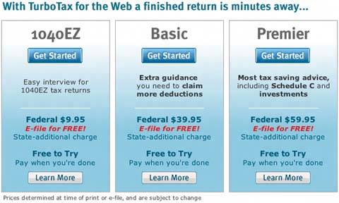
Figure 3-15. These pages have almost no navigation except "Continue" (or "Sign In," or whatever else brings you to the next step) and a few helper links. This figure shows the starting pages for 1040EZ and Basic. Notice the bare-bones headers and sidebars. The users probably don't need any more confusion than that induced by the tax forms themselves! 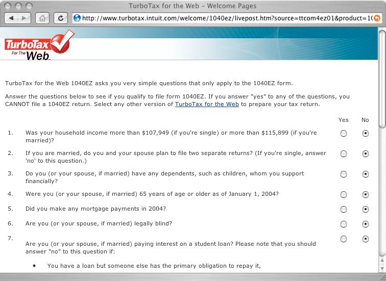
Figure 3-16. This figure shows the first page, but for the Basic tax form. 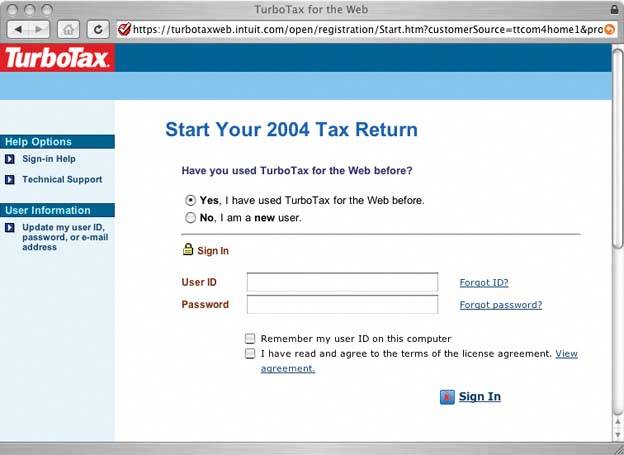
24. pyramid Figure 3-17. Photoshop help tutorials 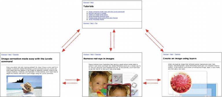
3.3.4.1. what Link a sequence of pages with Back/Next links. Combine this sequential presentation with a main page that links to and from all pages in the sequence. 3.3.4.2. use when The site or application has a sequence of pages that a user normally views one after another, such as a slideshow, a wizard, chapters in a book, or a set of products. The user reaches the first page, and maybe others in the sequence, from a "parent" page that serves as a jumping-off point. You might also consider using this pattern if you have one page that links to a lot of similar but semantically unconnected pages. Pyramid seems to be found most often in single-window applications, like those found in devices and web pages. It is often paired with One-Window Drilldown. 3.3.4.3. why This pattern reduces the number of clicks it takes to get around. It improves navigation efficiency, while simultaneously expressing a sequential relationship among the pages. Back/Next (or Previous/Next) links or buttons are all well and good. People know what to do with them. But a user doesn't necessarily want to be locked into a page sequence that he can't easily get out of: having gone seven pages into it, will he need to click the Back button seven times to get back where he started? Not fun! By putting a link back to the parent page on each sequence page, you increase the user's options. You've now got three main navigation options instead of twoBack, Next, and Up. You haven't made it much more complex, but a casually-browsing user (or one who's changed his mind in midstream) will need far fewer clicks to go where he wants to go. It's more convenient for users. Likewise, chaining together a set of unconnected pages is kind to users who actually want to see all the pages. Without the Back/Next links, they would jump back and forth to the parent page all the time; they might just give up and leave. 3.3.4.4. how This one's pretty simple: put Back, Next, and Up buttons or links on each sequence page, and put links to each sequence page on the parent page. It forms a topology like that shown in Figure 3-18hence the name "Pyramid." Figure 3-18. Typical Pyramid link topology 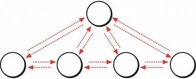
You don't need to label these buttons literally "Back," "Next," and "Up"you can use the actual names of the neighboring pages in the Back and Next labels, for instance, though that wordiness may not be worth the screen space if the user isn't looking for a specific item. Use your judgment. The Up button is generally better labeled "Back to <Page Title Here>," or some variation. Also, co-locating all three links in one little page area often is handy because it minimizes mouse motion and establishes spatial memory. Even better, put the "Next" links or buttons in exactly the same place on each pagethen the user doesn't have to move the mouse at all as he moves from one page to the next! Most uses of Pyramid are in static linear sequences, like slideshows, where the designer simply placed one page after another. There's no reason why you can't also use it for branched sequences, through which the user chooses a path. Consider it. Another variation turns a static linear sequence into a loop, by linking the last page back to the first without going back to the parent. It kind of works, but does the user know she's looped all the way back around? Does she recognize the first page in the sequence? Not necessarilylinking back to the parent page instead would be kinder, since it tells her that she's seen all there is to see. You also can think about this pattern in terms of navigation among list items. A One-Window Drilldown application might have a list of objects that you can navigate into (e.g., entries in an address book). Once you've drilled down into one of them, it sometimes would be nice to go directly to the next one, rather than bouncing up to the parent page and down again. Topologically, the problem is identical to links on a web site, though the context is different.[1] [1] This aspect of Pyramid is very well described by Larry Constantine and Lucy Lockwood in a paper called "Usage-Centered Patterns: A Collection of Abstract Design Patterns for Presentation and Interaction Design." Their version of the pattern, intended for lists, is named Detail View Direct Navigation; see http://foruse.com/patterns/detailnavigation.pdf.
3.3.4.5. examples Figure 3-19. The Museum of Modern Art's web site hosts a delightful applet about skyscrapers. It describes each of the twenty-four tallest buildings (and planned buildings) in the world. The user can choose from a sorted list of buildings to drill down into a description of that building; then the user can either go back to the sorted list, or click "Prev" or "Next" to go straight to another building description.
This screen shows the list of buildings by height. It scrolls horizontally; each building silhouette turns into a fully drawn building when the pointer hovers over it, as shown by the "Jin Mao" tooltip. 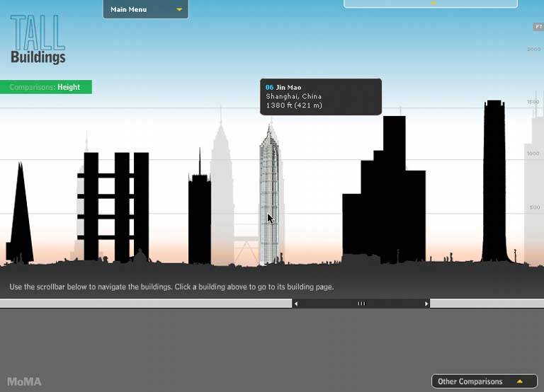
Figure 3-20. This is the page you get when you click on the Jin Mao building. Note the small "Prev," "Next," and "By Heights" buttons, all clustered in a predictable place. See http://moma.org/exhibitions/2004/tallbuildings. 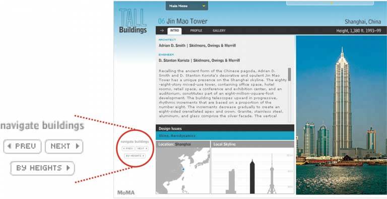
25. modal panel Figure 3-21. The Save dialog box from TextEdit 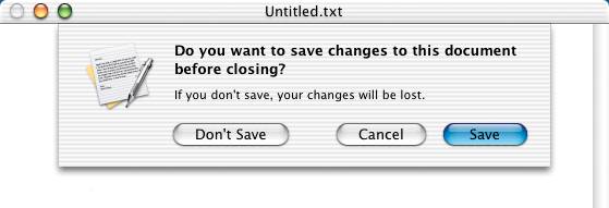
3.3.5.1. what Show only one page, with no other navigation options, until the user solves the immediate problem. 3.3.5.2. use when The application is in a state from which it cannot proceed without help from the user. In a document-centric application, for instance, a "save" action might need the user to supply a filename, if one wasn't already given. 3.3.5.3. why A modal dialog box (or other modal mechanism) cuts off all other navigation options from the user. He can't ignore the dialog box and go somewhere else in the application: he must deal with it here and now. When it's done, he gets sent back to where he was before. It's an easy model to understandand programthough it was overused in applications of past years. A modal panel is disruptive. If the user isn't already prepared to answer whatever the modal panel asks, then it interrupts the user's workflow, possibly forcing him to make a decision about something he just doesn't care about. When used appropriately, a modal panel channels the user's attention into the next decision that he needs to make. There are no other navigation possibilities to distract him. 3.3.5.4. how In the same space on the screen where the user's attention lies, place a panel, dialog box, or page that requests the needed information. It should prevent the user from bringing up any other page in that application. This panel ought to be relatively uncluttered, keeping with the need to focus the user's attention onto this new task with minimal distractions. Remember that this is a navigation-related pattern. You should carefully mark and label the ways out, and there shouldn't be many of them; one, two, or maybe three. In most cases, they are buttons with short, verbish labels, such as "Save," "Don't Save," or "Cancel." Upon clicking them, the user should be taken back to the page she came from. Web-application designers have a small problem. The browser's Back and Forward buttons (and its history mechanism, bookmarks, URL bar, etc.) will function as they always do, regardless of the designer's wishes to cut off all other navigation options. This will be an interesting area to watch as standards for web applications evolve over the next few years. As of this writing, I don't think there's any good modal-panel solution for web applications, except the one shown in the Google example in Figure 3-23. 3.3.5.5. examples Figure 3-22. This is a typical modal dialog box for Windows applications. It's from Firefox, so its look and feel differs slightly from most Windows applications, but the familiar elements of modal dialog boxes are here: OK and Cancel buttons, a limited number of titlebar options (just a Close button), and content that's tightly focused on one task. However, Firefox may be able to proceed with its usual businessbeing a web browserwithout requiring that this question be answered right now. Thus a solution other than a modal dialog box may have been more appropriate (albeit harder to design). 
Figure 3-23. Here's a possible solution for web apps. The Google News page contains an interactive "Customize" feature that, like the Firefox dialog box, is focused tightly on one small task. However, it only uses a small panel within the large Google News page. When you double-click on a page icon (such as "World" or "U.S."), the panel changes its contents to show a dialog-like form. When you press "Save changes" or "Cancel"the only navigation options within this self-contained panelit shows the previous contents again.
Essentially, it behaves like a One-Window Drilldown mini-application within the web page. You can still click the browser's Back or Next buttons, or any other link on the Google News page, but it's clear from context that they lie outside the scope of this customization mini-application. 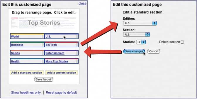
26. sequence map Figure 3-24. TurboTax, 2004 version 
3.3.6.1. what On each page in a sequence, show a map of all of the pages in order, including a "You are here" indicator. 3.3.6.2. use when You've designed a written narrative, a slideshow, a wizard, or anything else through which a user progresses page by page. The user's path is mainly linear. If the navigation topology is large and hierarchical (as opposed to linear), you may want to consider using Breadcrumbs instead, because you won't have room to show a Sequence Map. 3.3.6.3. why A computer game player once said in a public forum, "Being lost is not fun." And part of the appeal of such games is the navigation through strange places to accomplish tasks! It's even less fun with applications intended to be serious, where people do not want to waste time figuring out where they are. Most of the time, actually, "being lost" in an application is not the real problemit's not knowing how much further you have yet to go. A good map of the page sequence, shown on each page, helps the user stay oriented in several ways: he can see the steps already completed (and possibly the skipped steps or branches too), his current location (with a "You are here" signpost), and how many steps remain. A Sequence Map should also serve as a navigational device itself; it should let the user jump among different steps by clicking on the map. 3.3.6.4. how Near an edge of the page, place a small map of the pages in the sequence. Put it on one line or column if you can, to keep it from competing visually with the actual page content. Give the current page's indicator some special treatment, such as making it lighter or darker than the others; pick another treatment for the already-visited pages. For the user's convenience, you might want to put the map near or next to the main navigation controls, usually Back and Next buttons. How should you label each page on the map? If the pages or steps are numbered, then obviously use the numbersthey're short and easy to understand. If not, put the page titles in the map. If the titles are long, that might make it completely unwieldy! Try shortening the titles, or if you can't, try hiding them inside tooltips or small rollover windows. 3.3.6.5. examples Figure 3-25. News sites often break up long articles into multiple pages. The New York Times web site places a sequence map at the bottom right of each article segment. The Previous and Next links are placed conveniently on either end, and the previously read pages will turn the same color that followed links would turnit takes advantage of what users already know (and what CSS already controls) about link behavior.
Note that the tiny numeric links might be a frustratingly small hit target for some users. Will all New York Times readers be young and nimble? 
27. breadcrumbs Figure 3-26. From http://java.sun.com 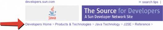
3.3.7.1. what On each page in a hierarchy, show a map of all the parent pages, up to the main page. 3.3.7.2. use when Your application or site has a straightforward tree structure, without much interlinking among the tree elements. Users work their way up and down this tree, either via direct navigation or searching. Applications constructed as One-Window Drilldown applications frequently use Breadcrumbs. In fact, I've never seen this used for multi-window desktop applications, though tiled panels can use them; see the iTunes screenshot in this pattern for an example of using Breadcrumbs on the main panel. Breadcrumbs are an alternative to Sequence Maps. You may have wanted to use a Sequence Map to help the user stay oriented, but the map would be too large and unwieldy to render into a small space, so you need another solution. 3.3.7.3. why Breadcrumbs show each level of hierarchy leading to the current page, from the top of the application all the way down. In a sense, it shows a single linear "slice" of the overall map of the site or application, thus avoiding the complexity of an entire map. So, like a Sequence Map, Breadcrumbs help a user figure out where he is. This is especially handy if he's jumped abruptly to somewhere deep in the tree, as he would by following search results (or a bookmark, if it's a web site). Unlike Sequence Map, though, Breadcrumbs don't tell the user where he's headed next, nor where he came from. It deals only with the present. Many texts tell you that Breadcrumbsnamed for the Hansel and Gretel story, in which a child drops breadcrumbs on a forest trail to mark his way homeare most useful for telling the user how he got where he is from the top of the site or application. But that's only true if the user has drilled straight down from the top, with no sidetracking, or following other branches, or dead ends, or searching, or linking directly from other pages…not likely. Instead, Breadcrumbs are best for telling you where you are relative to the rest of the application or siteit's about context, not history. Look at Figure 3-26 above. I reached this page in Sun's Java web site by some meandering path, but it tells me that I ended up deep in the "Products & Technologies" section, in "Reference." Now I know where to go if I want to learn about other products or find other reference material. Breadcrumbs thus reveal useful clues about the site or application's information architecture. Finally, Breadcrumbs usually are clickable links or buttons (like Sequence Maps), which turns it into a navigational device in its own right. 3.3.7.4. how Near the top of the page, put a line of text or icons indicating the current level of hierarchy. Start with the top level; to its right, put the next level; and so on down to the current page. Between the levels, put a graphic or text characterusually a right-pointing arrowto indicate movement from one level to the next. The labels for each page's indicator should be the titles of each page. Users should recognize them if they've been to those pages already; if not, the titles should at least be self-explanatory enough to tell the user what those pages are about. If the titles are too long, try shortening them, or hiding them inside tooltips or small rollover windows. 3.3.7.5. examples Figure 3-27. A typical iTunes Music Store screen. I've done a keyword search for a particular song, and I'm at a Search Results page. (I hesitate to call it a "page" because this isn't really a web site in the traditional sense; it's a web-connected desktop application.) Anyway, the breadcrumbs trail shows two levels: Home (shown as an icon), and Search Results. Now I click on the first album I see under "Top Albums," and… 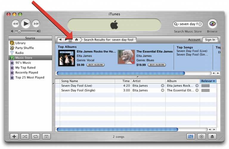
Figure 3-28. …I get this page. Look at how the breadcrumb trail has changed. Now it shows where I am in iTunes's standard three-level music hierarchy: genre (vocal), artist (Etta James), and album. This gives me one-click access to the genre and artist pages, both of which might be of interest to me. I still could click the Back buttonjust to the left of the breadcrumbsto go back to the search results. Again, it's about context, not history.
So the breadcrumbs here have achieved two things: establishing a sense of place in the iTunes world, and providing a rich set of navigation options within that space. 
28. annotated scrollbar Figure 3-29. Microsoft Word's scrollbar tooltips 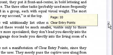
3.3.8.1. what Make the scrollbar serve double-duty as a map of the content, or as a "You are here" indicator. 3.3.8.2. use when You've built a document-centric application, or anything else that contains a large scrolled virtual space, such as a text document, list, or image. Users will scan this application for items of note, such as specific page numbers or landmarks, and they might have trouble keeping track of where they are and where to go next as they scroll. 3.3.8.3. why Even though the user remains within one "UI space" as she scrolls through the content, signposts still are useful. When scrolling quickly, it's really hard to read the text flying by (or impossible, if the screen can't refresh quickly enough), so some other indicator of position is necessary. Even if she stops briefly, the part of the document she can see may not contain anything she can orient herself by, like headers. Why a scrollbar? Because that's where the user's attention is focused. If you put signposts there, the user will see them and use them as she scrolls, rather than trying to look at two different screen areas at once. You can put signposts close to the scrollbar and still get the same effect; the closer, the better. When the scrollbar shows indicators in the scrollbar track itself, you get something that behaves just like a one-dimensional Overview Plus Detail (Chapter 6). The track is the overview; the scrolled window is the detail. 3.3.8.4. how Put a position indicator on or near the scrollbar. Either static or dynamic indicators might workstatic indicators are those that don't change from second to second, such as blocks of color in the scrollbar track (see the tkdiff screenshot in Figure 3-30). Make sure their purpose is clear, though; such things can baffle users who aren't used to seeing graphics in the scrollbar track! Dynamic indicators change as the user scrolls, and they often are implemented as tooltips. As the scroll position changes, the tooltip shown next to the scroll thumb changes to show information about the content there. This will vary with the nature of the application. Word, as shown above in Figure 3-29, puts page numbers and headers in these tooltips. In either case, you'll need to figure out what a user is most likely to be looking for, and thus what you need to put into the annotations. The content structure is a good starting point. If the content is code, you might show the name of the current function or method; if it's a spreadsheet, show the row number; and so on. Also consider whether the user currently is in a specialized mode, such as searching for a stringthe annotation should show something about it, if that's what the user is scanning the document for. This pattern description was taken partially from About Face: The Essentials of Interaction Design (Wiley). 3.3.8.5. examples Figure 3-30. Annotated Scrollbar is an uncommon technique. tkdiff is one of very few applications that currently have the flexibility to show nonstandard items in scrollbars. This program visually highlights the differences between two versions of a text file; newly-added sections are marked in green, changed sections in blue, and deleted sections in red. An annotated scrollbar serves as an overall map, thus making large files much easier to comprehend. 
29. color-coded sections Figure 3-31. From http://johncoltrane.com 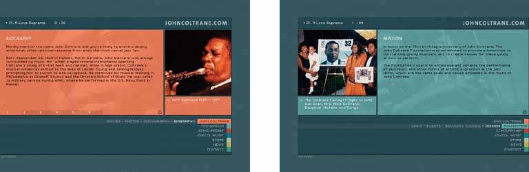
3.3.9.1. what Use color to identify which section of an application or site that a page belongs to. 3.3.9.2. use when The UI is a large application with many pages or windows, which can be organized into sections (or chapters, sub-applications, etc.). You might use a Visual Framework (Chapter 4) to unify them visually, but you also want each section to have a distinctive look. Perhaps each section needs separate branding, or each has a different purpose or audience. 3.3.9.3. why This is an example of a signpostsomething that gives the user a clue where he is. It does so with some subtlety; colors work visually instead of verbally, and it's not even something that users will necessarily notice immediately (though it's hard to miss in the vivid Coltrane example in Figure 3-31). Once users are attuned to the color schemes, they can use them. Even before then, they'll know when they've left one section for another, if they notice that the color scheme changed. So color-coding works to distinguish one section from another; it makes the boundaries clear. It's easier for users to mentally map out smaller chunks of a navigational space, such as one section, than the whole space at onceyou should do this with a large UI in any case, whether you use color coding or not. Creative uses of different colors also can make your interface look nicer and less boring. It might even contribute to the branding of the UIsee the Apple example in Figure 3-32. 3.3.9.4. how Pick one of the interface colors and change it for each section. Usually, the background color is too much changethe Coltrane example works only because the Visual Framework is so strong and distinctive. Most designs work better with a trim color, like a border, or the background of a small amount of text. Remember that colorblind users won't necessarily see the differences in colors from one section to another. That's why color never should be the only way of distinguishing sections. You also need to have signpostsindicators navigation bars, for instance, and page or window titles. 3.3.9.5. examples Figure 3-32. Apple's web site provides a more typical example of color coding. Look at the top of each screenshot. The tab and the bar below it change color (and texture!) to match the contentfor example, blue for QuickTime or brushed metal for OS X. In the page graphics, you can see the theme colors echoed in titlebars and logos.
The effect is subtle but noticeable. It contributes to both usability and branding, while not detracting from the unity of the overall site. (Note that the tabs are the Global Navigation in this web site, while the secondary navigation links live on the colored bar.) 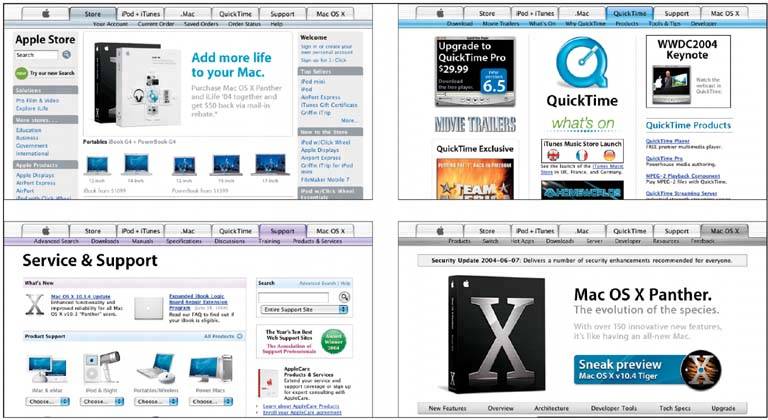
30. animated transition Figure 3-33. Mac OS X's "genie effect" animates a window being minimized. 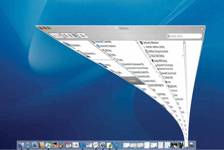
3.3.10.1. what Smooth out startling dislocating transition with an animation that makes it feel natural. 3.3.10.2. use when Users move through a large virtual space, such as an image, spreadsheet, graph, or text document. They might be able to zoom in to varying degrees, pan or scroll, or rotate the whole thing. This is especially useful for information graphics, such as maps and plots. (See Chapter 6 for more about information graphics.) Alternatively, the interface might have sections that can be closed and opened again, either by the system or the usersuch as trees with closable parent nodes, standalone windows that open and close, or an interface built with Closable Panels (Chapter 4). Animated Transition might also be used when users jump from one separate page to another. 3.3.10.3. why All of these transformations can disrupt a user's sense of where she is in the virtual space. Zooming in and out, for instance, can throw off her spatial sense when it's done instantaneously, as can rotation and the closing of entire sections that prompt a re-layout of the screen. Even scrolling down a long page of text, when it's jumpy, can slow a reader down. But when the shift from one state to another is continuous, it's not so bad. In other words, you can animate the transition between states so it looks smooth, not discontinous. This helps keep the user oriented. We can guess that it works because it more closely resembles physical realitywhen was the last time you instantly jumped from the ground to 20 feet in the air? Less fancifully, an animated transition gives the user's eyes a chance to track a location while the view changes, rather than try to find the location again after an abrupt change. When done well, animated transitions bolster your application's "cool factor." They're fun. 3.3.10.4. how For each type of transformation that you use in your interface, design a short animation that "connects" the first state with the second state. For zoom and rotate, you might show the in-between zoom or rotate levels; for closing panel, you may show it shrinking while the other panels expand to take up the space it leaves behind. To the extent possible, make it look like something physical is happening. If any of these patterns are double-edged swords, this one is. Beware of making the user motion-sick! The animations should be quick and precise, with little or no lag time between the user's initiating gesture and the beginning of the animation. Limit it to the affected part of the screen; don't animate the whole window. And keep it short. My preference would be well under a second, and research shows that 300 milliseconds might be ideal for smooth scrolling.[2] Test it with your users to see what's tolerable. [2] See "Benefits of Animated Scrolling," http://hcil.cs.umd.edu/trs/2004-14/2004-14.html.
If the user issues multiple actions in quick succession, such as hitting the down arrow key many times to scroll, combine them into one animated action. Otherwise, the user might sit there through several seconds' worth of animation as the punishment for hitting the down arrow key 10 times. Again: keep it quick and responsive. 3.3.10.5. examples The web application "The Secret Lives of Numbers" lets users explore a very wide range of datait shows zoomable histograms of number usage across the Web, from 0 to 100,000. It uses animated transitions to transport the user from high-level overviews down to very small, detailed views. Figure 3-34 shows what happens when you hold the mouse button down over one number, in this case 2000: the histogram zooms in slowly, smoothly animating everything on the graph as it goes. Figure 3-34. Zooming in on "The Secret Lives of Numbers," at http://www.turbulence.org/Works/nums/applet.html 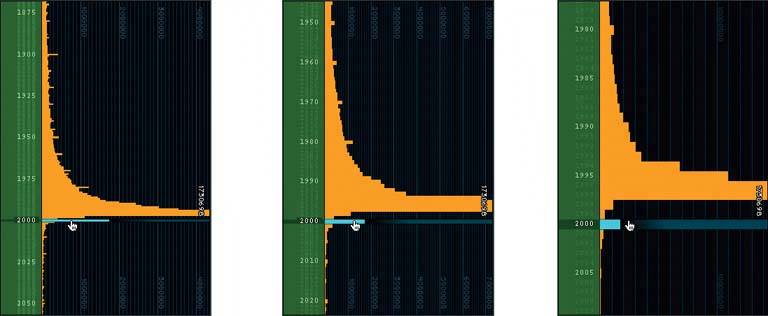
Some things to notice: The histogram bars become wider as the viewer zooms in, thus preserving a sense of size and scale. They behave almost like solid objects. When they're wide, you know that you're zoomed way in. The number labels on the lefthand margin slowly spread apart, revealing lightly-written minor labels between the white ones. The interval between the white labels also changes, from 25 to 10 to 5, while the pixel distance between them is kept relatively constant. (This is important for looking up numbers; you never want an interesting histogram bar to be too far away from a readable label.) The vertical gridlines squish together as the horizontal scale compresses. As the minor gridlines get too close together, they fade into the black background, and the gridline labels are removed selectively. The graph is kept uncluttered.
31. escape hatch Figure 3-35. A dangerous dialog box from Word, made less so by Cancel 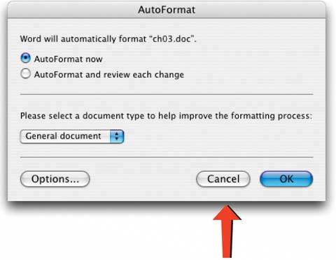
3.3.11.1. what On each page that has limited navigation options, place a button or link that clearly gets the user out of that page and back to a known place. 3.3.11.2. use when You've got pages that constitute some sort of serial process, like a wizard, or any pages that "lock" the user into a limited navigation situation, like Hub and Spoke or Modal Panel. Users might be able to reach these pages out of context, as they could do via search results. (Escape hatches sometimes aren't necessary when you have Sequence Maps or Breadcrumbs on a page. Users who understand them can use them to get back to a known place.) 3.3.11.3. why Limited navigation is one thing, but having no way out is quite another! If you give the user a simple, obvious way to escape from a page, with no strings attached, he's less likely to feel trapped there. This is the kind of feature that helps people feel like they can safely explore an application or site. It's sort of like an Undo featureit encourages people to go down paths without feeling like they're committing to them. See the Safe Exploration pattern in Chapter 1. If users can reach these pages via search results, such as web pages in the middle of a step-by-step process, then it's doubly important to put Escape Hatches on each page. Visitors can click them to get to a "normal" page that tells them more about where they actually are. 3.3.11.4. how Put a button or link on the page that brings the user back to a "safe place." For example, you can use a home page, a hub page in a Hub and Spoke design, or any page with full navigation and something self-explanatory on it. Exactly what it links to depends upon the application's design. 3.3.11.5. examples Web pages often use clickable site logos as homepage links, usually in the upper left of a page. These pages provide an Escape Hatch in a familiar place, while helping with branding at the same time. In some dialogs, a "Cancel" button or the equivalent can serve this purpose. They, too, let the user say "I'm done with this; forget I ever started it." Have you ever called a companysay, your bankand had to work your way through a set of phone menus? The menus can be long, confusing, and time consuming. If you find yourself in the wrong menu, you may just hang up and try again from the top. However, many phone menu systems have a hidden Escape Hatch that they don't tell you about: if you dial "0" at any point, you might be connected to a human operator. | 